

There is a reason IKEA cabinets appear in so many beautiful homes. They are affordable, modular, easy to transport, and available in sizes that make planning a room far less intimidating than starting with a completely custom millwork project. But there is also a reason the best IKEA storage projects rarely look like IKEA projects.
The difference is not the cabinet box. It is the finish work around it.
A freestanding IKEA cabinet usually announces itself through a few familiar details: a visible gap beneath the unit, exposed sides, uneven spacing at the ceiling, repetitive seams, standard-size doors, and hardware that looks selected from a catalog rather than designed for the room. None of those things are inherently bad. They are simply clues that the furniture was placed in the room instead of built into it.
The IKEA built-in formula is the process of removing those clues. You use the IKEA cabinet as the functional core, then add the architectural elements that make it appear permanent: a level base, fillers, finished end panels, a continuous top, crown or scribe molding, carefully aligned doors, and paint or hardware that connects the piece to the rest of the house.
This approach can work for bookcases, wardrobes, media cabinets, mudroom lockers, pantry storage, home-office cabinetry, and even kitchen-adjacent furniture. The specific IKEA product may change, but the visual principles remain remarkably consistent.
Start With the Architecture, Not the Cabinet
The most common mistake is to buy cabinets first and figure out the room later. That reverses the order of the project. A built-in is successful when it responds to the architecture of the space, so begin by studying the room.
Measure the full wall width, ceiling height, baseboard height, door and window trim, outlet locations, vents, switches, and any changes in the floor or wall plane. Measure in several places rather than assuming the wall is square. Older homes, in particular, can have ceilings that vary by an inch or more and walls that bow subtly from one end to the other.
Photograph the wall straight on and from both corners. Note which elements must remain accessible. A built-in that blocks a return-air grille, covers an electrical junction, or prevents a door from opening fully is not a successful built-in, no matter how attractive it looks.
Then decide what the cabinet should feel like. Do you want a piece that reads as traditional millwork, a simple modern wall of cabinetry, or furniture with a built-in footprint? The answer affects every later choice: the thickness of the trim, the door style, the amount of molding, the color, and whether the cabinet should stop below the ceiling or run all the way up.
A useful rule is to match the room’s visual language rather than the cabinet’s original design. If the house has substantial baseboards and paneled doors, a thin strip of trim around a cabinet will look under-scaled. If the room is spare and contemporary, heavy crown molding may feel forced. The built-in should belong to the house first and to IKEA second.
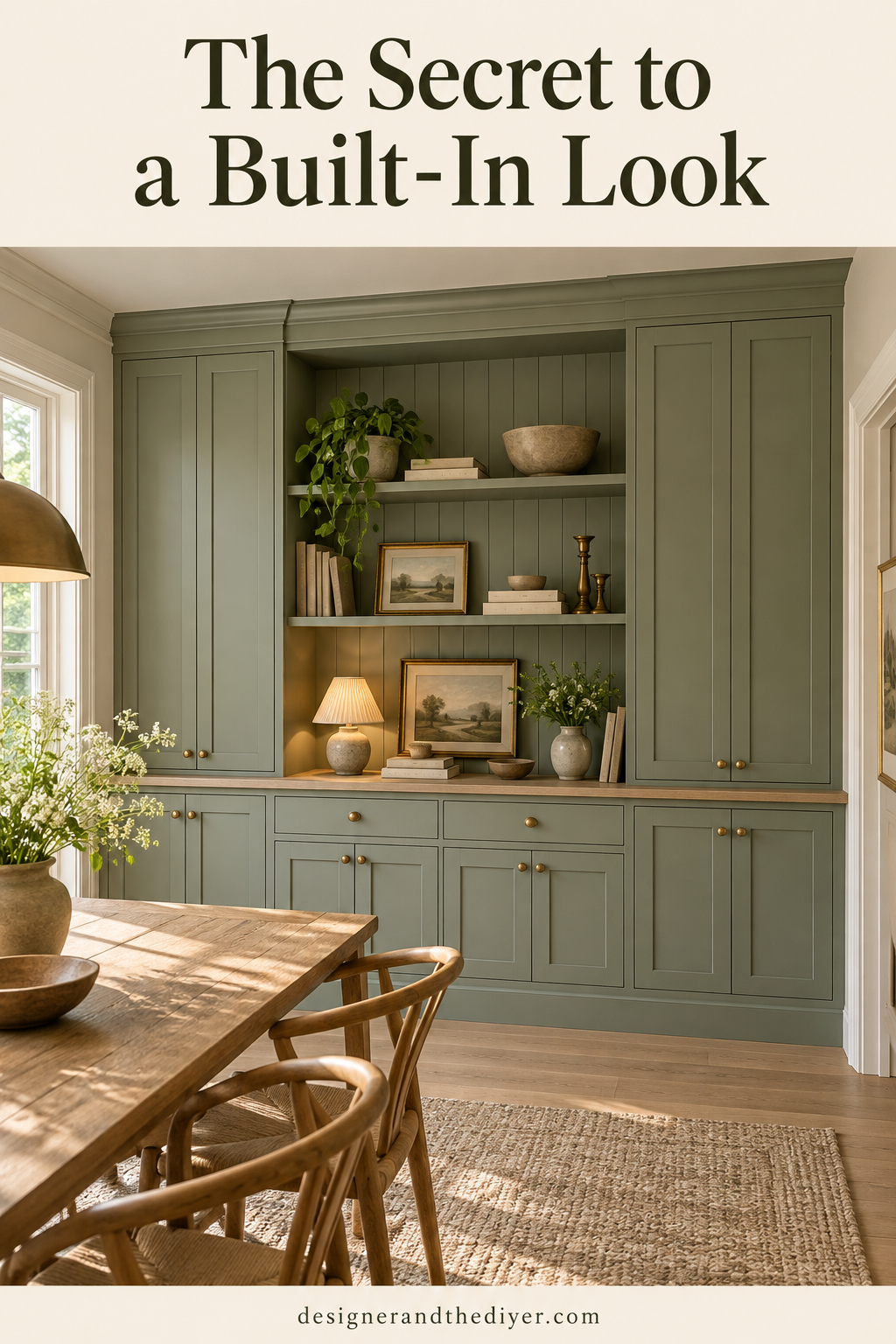
Choose the Cabinet for Function and Proportion
IKEA offers many cabinet systems, but the best choice is determined by more than storage capacity. Consider depth, width, door swing, interior adjustability, and how the cabinet will relate to nearby furniture.
A deep wardrobe can provide excellent storage, but it may overwhelm a narrow room. A shallow bookcase can look elegant, but it may not accommodate baskets, records, office equipment, or a television. A modular kitchen cabinet may offer a more genuinely built-in appearance because it is designed to be installed in a continuous run, while a bookcase system may require more work to look like cabinetry.
Pay close attention to the cabinet’s finished dimensions. IKEA dimensions are often listed in metric measurements or rounded nominal sizes, and the actual finished product may include doors, legs, hinges, or top overhangs that change the footprint. Create a simple elevation drawing before purchasing. Show the wall, the cabinets, the ceiling, the baseboards, the desired trim, and the gaps that need to be filled.
Plan for visual symmetry wherever possible. If a wall is wide enough for two or three cabinet modules, centered spacing usually looks intentional. If the wall width does not divide neatly, avoid leaving one obviously awkward sliver at the end. Use fillers, unequal but balanced margins, or a larger architectural element such as a side panel or open shelf to absorb the difference.
A built-in should look designed for the wall, not like a collection of boxes squeezed into the available space.
The Base Is the First Secret
A freestanding cabinet sits on its own legs, feet, or plinth. A built-in appears to grow out of the floor. The transition between those two impressions is the base.
Most projects benefit from a site-built platform, sometimes called a plinth or toe-kick base. The platform is typically constructed from straight dimensional lumber or plywood, leveled carefully, and anchored to the wall. The IKEA cabinets sit on top of it rather than directly on the floor.
This accomplishes several things at once. It gives the cabinets a continuous, intentional elevation. It allows you to compensate for an uneven floor. It creates space for a toe-kick that can be covered with matching trim. And it makes it easier to align multiple cabinets across a long wall.
Use a long level and check the platform from end to end before setting the cabinets in place. Do not assume the floor is level because it looks level. A small error at the base becomes a very visible error at the top, especially when the cabinets reach the ceiling.
The height of the base is a design decision. A low toe-kick can make a cabinet feel substantial and grounded; a taller one can help match existing kitchen or architectural trim. In a room with prominent baseboards, you may need to decide whether the built-in’s toe-kick should align with the baseboard or step forward from it. There is no universal answer, but the transition should look deliberate.
Once the platform is installed, attach the cabinets to one another and to the wall according to the manufacturer’s instructions. A built-in is not merely decorative. Tall and deep units must be secured against tipping, especially in homes with children or pets. Locate studs where possible, use appropriate fasteners, and never rely on trim to hold the cabinet safely in place.
Fill the Gaps at the Sides
The most revealing sign of a store-bought cabinet is often the narrow gap between the cabinet and the wall. Even a two-inch gap can look accidental if it is left as a dark vertical line.
The solution is a filler strip. A filler is a narrow piece of wood or panel material installed between the cabinet and the wall, or between the cabinet and a nearby obstruction. It allows doors and drawers to open without striking the wall while closing the visual gap.
Fillers should be planned before the cabinets are anchored. A common mistake is to push the unit tightly into the corner and discover that the door cannot open. Leave enough clearance for the door, handle, hinge, and your hand. The exact amount depends on the cabinet and hardware, so make a sample or test the swing before committing.
Walls are rarely perfectly straight. A filler may need to be scribed, meaning its edge is cut to follow the wall’s irregularities. Scribing is one of the techniques that separates convincing millwork from a quick furniture hack. Hold the filler in place, transfer the wall’s contour with a compass or scribing tool, cut along the line, and test the fit. Small gaps can be caulked; large gaps should be corrected with a more accurate cut.
For a more substantial appearance, fillers can be made wide enough to read as vertical stiles. This is especially useful when several cabinets are installed side by side. Rather than treating every seam as a problem, you can create an intentional rhythm of doors, stiles, and panels.

Hide the Exposed Ends
IKEA cabinets are designed to be functional from the front, but their exposed sides may not have the same finish as their doors. Even when the side panel is technically finished, the edge can make the project look unfinished.
End panels solve this problem. They extend over the cabinet side and create a clean, furniture-like surface. Depending on the design, the panel can be flush with the door fronts, slightly proud of them, or set back to create a shadow line.
The key is consistency. If one side panel sits flush and another is recessed without a clear reason, the installation can look improvised. Decide how far the panels should project before cutting anything. Account for the thickness of the panel, the door faces, hinges, and any molding that will be applied later.
For a painted built-in, medium-density fiberboard or cabinet-grade plywood can work well when properly prepared. For a stained or clear-finished project, use a material whose edge and surface can be finished consistently. The side panels should be secured in a way that does not interfere with door operation or create visible fastener marks.
If the cabinet ends at a wall, a scribed filler may be enough. If it ends in open space, treat the end as an architectural elevation. A finished panel, decorative stile, or shallow return can make the difference between a cabinet run that stops and one that appears to have been designed as part of the room.
Create a Continuous Top
A single continuous top is one of the fastest ways to unify separate IKEA cabinets. Without it, each cabinet reads as an individual module. With it, the run reads as one piece.
The top might be a wood countertop, painted MDF, plywood with a finished edge, stone, quartz, or another material appropriate to the room. Choose based on use as well as appearance. A media console may need only a durable painted surface. A mudroom bench or craft counter may require something more resistant to scratches and moisture.
The top should be measured after the cabinets are installed, leveled, and secured. Walls can vary, and the cabinet run may not be exactly the size shown in the original plan. Measure the front, back, and both ends. Decide whether the top will overhang the doors, end panels, or side returns.
A small overhang can create a natural furniture detail and protect the cabinet fronts. A flush top can feel more architectural and contemporary. The choice should repeat elsewhere in the room if possible. For example, a media cabinet might echo the overhang of a nearby window stool or kitchen counter.
Be thoughtful about seams. If the top is wider than the available material, place joints where they are least visible and follow the manufacturer’s recommendations for support. If the top is heavy, make sure the cabinets and platform can carry the load. Do not assume a thin cabinet side is designed to support a large stone slab without reinforcement.
Finish the Ceiling Transition
The gap above a cabinet is where many built-in projects lose their illusion. A visible strip of wall between the cabinet and ceiling makes the piece look like furniture, even when every other detail is correct.
There are two strong approaches. The first is to build the cabinet all the way to the ceiling with a framed soffit or upper filler. The second is to stop the cabinet below the ceiling and finish the gap with molding. Both can work, but the transition must be intentional.
A soffit can be constructed from framing and panels, then finished to match the cabinet. This is useful when the ceiling is high, the cabinet modules are much shorter than the room, or you want a fully architectural wall. Include access panels if plumbing, wiring, or ventilation needs to remain serviceable.
Crown molding is another classic solution. It can bridge the cabinet and ceiling while connecting the installation to existing trim. The molding should be sized for the room and the cabinet. Tiny crown on a tall wall may look timid; oversized molding in a modern room may look decorative rather than integrated.
Ceilings, like floors, are often uneven. Scribing the upper filler or molding may be necessary. Avoid trying to force a rigid piece of trim against a wavy ceiling; that usually produces a more obvious gap. A carefully caulked small irregularity is often less noticeable than a bowed molding line.

Make the Doors Look Custom
The fronts are the part everyone sees, so door treatment deserves special attention. IKEA offers a range of door styles, and some already have a convincing millwork character. Others can be upgraded with paint, applied molding, new hardware, or replacement fronts.
If you are painting IKEA doors, surface preparation is essential. Clean away grease and residue, lightly abrade the surface, and use a primer designed for the material. The exact process depends on whether the front is wood, veneer, laminate, or a foil-like finish. Test the products on an inconspicuous area and allow each coat to cure properly.
Do not expect paint to conceal poor alignment. Adjust the hinges so the gaps between doors are even and the reveals are consistent across the entire run. Stand back frequently and inspect the lines at eye level. A cabinet can have beautiful color and trim but still look inexpensive if the doors drift out of alignment.
Applied molding can change the character of a flat door. Narrow strips can create shaker-style frames, while wider rails and stiles produce a more traditional profile. Use a repeatable layout and keep the corners clean. Small differences in rail width become obvious when several doors are next to one another.
Replacement fronts are another option, particularly when you want a custom color or a door profile unavailable through IKEA. They can be more expensive than the cabinet boxes, but the boxes are usually the least visible part of the project. If budget is limited, spend first on the elements that establish the built-in illusion: base, fillers, end panels, top, and crown. Then upgrade the fronts if the design calls for it.
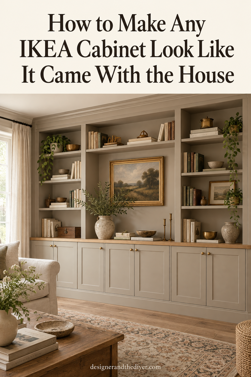
Use Hardware as a Design Signal
Hardware is small, but it communicates whether the cabinet is furniture, millwork, or a temporary storage solution. Knobs and pulls should relate to the room’s other metal finishes and to the scale of the doors.
For tall wardrobe doors, long vertical pulls can emphasize height. For a run of lower cabinets, horizontal pulls may reinforce the line of the countertop. Knobs can make a built-in feel more like a freestanding piece of furniture, while integrated pulls or touch-latch hardware create a quieter modern effect.
Place hardware consistently. Use a template rather than measuring each door by eye. Decide how the hardware aligns with rails, stiles, and neighboring doors. If there are both drawers and doors, establish a visual rule that makes the combination feel unified.
Hardware should also be practical. A beautiful pull that catches clothing in a hallway or a tiny knob that is difficult to grasp on a heavy wardrobe door will become frustrating. Touch the samples, test the clearances, and think about how the cabinet will be used every day.
Connect the Built-In to the Rest of the Room
The final illusion comes from continuity. The built-in should share at least one or two meaningful characteristics with the architecture around it.
Painting the built-in the same color as the walls can make it recede and give a small room a calm, enveloping feel. Painting it the same color as the trim can make it read as millwork. A contrasting color can create a strong focal point, but it should be balanced by other elements such as upholstery, art, rugs, or lighting.
Baseboards and casing deserve special attention. If the existing baseboard runs behind the cabinet, it may need to be removed and returned at the sides. If the built-in has its own toe-kick, the new trim should transition cleanly into the old trim. Abrupt stops and mismatched thicknesses are easy to spot.
Lighting can also elevate the result. Under-cabinet lighting, interior wardrobe lights, picture lights, or integrated LED strips