

If you’ve ever stood in the paint aisle holding two nearly identical swatches, wondering whether your trim should match your walls or contrast them, you’re not alone. It’s one of the most common design questions homeowners face — and one of the easiest to get wrong.
Trim — those baseboards, crown moldings, window casings, and door frames — may seem like a small detail, but it has a huge impact on the overall feel of your room. The right choice can make a space feel cohesive and calm; the wrong one can chop it up visually or make ceilings appear lower.
So, should you paint your trim the same color as your walls? Sometimes yes — sometimes definitely not. Let’s break it down.
Why This Choice Matters
Trim acts like the outline of your room. It defines your architecture, frames your walls, and helps the eye move through the space. Traditionally, trim has been painted white (or off-white) to provide contrast and highlight architectural detail. But in recent years, designers have embraced the monochrome look — painting walls, trim, and even ceilings the same color to create a seamless, enveloping effect.
Neither choice is “wrong.” The magic is in knowing when to use each approach.

Frog Tape Multi-Surface Painter’s Tape (for crisp trim lines) |
When to Paint Trim the Same Color as the Walls
Related: To extend this seamless approach overhead, use colour-capping techniques to make a ceiling appear taller.
1. To Create a Seamless, Modern Look
Painting walls and trim the same color eliminates harsh lines and creates a calm, uninterrupted flow. It’s a technique often used in contemporary spaces, smaller rooms, or homes with less architectural detailing.
Best for:
Modern or minimalist spaces
Rooms with simple, flat trim
Compact rooms that need visual expansion
Designer Tip:
Use a different finish, not a different color. For example, paint both walls and trim in the same shade, but use eggshell on walls and semi-gloss on trim. This adds subtle dimension and durability while maintaining that cohesive, tone-on-tone look.

2. To Make a Small Room Feel Bigger
Related: You can reinforce that open feeling with these use designer tips for making a ceiling feel taller.
When walls and trim are painted in contrasting colors, your eye stops where the trim meets the wall, emphasizing boundaries. But if you paint them the same color, those visual stops disappear — and the space instantly feels larger.
This is especially helpful in:
Narrow hallways
Powder rooms
Small bedrooms
Attic or basement space
Bonus:
Extending the wall color onto trim, doors, and even the ceiling can make low ceilings appear taller and walls appear longer. It’s an easy designer trick that feels intentional and high-end.
3. To Soften Bold or Dark Colors
Related: For help refining a rich, cohesive palette, choose paint colors that create a polished, high-end look.
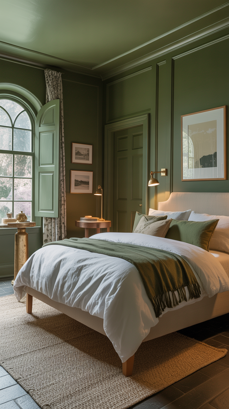
If you’re drawn to dramatic hues like navy, hunter green, or charcoal gray, painting your trim white can sometimes look too stark. Matching your trim to your wall color makes the look feel richer, moodier, and more cohesive — like stepping into a cocoon.
Best for:
Libraries or home offices
Dining rooms with bold wall colors
Bedrooms designed for rest and calm
Pro Tip:
Dark, saturated colors absorb light. By keeping trim and walls the same, you avoid harsh white lines that interrupt the flow and draw attention away from the color itself.
4. To Downplay Imperfections or Odd Angles
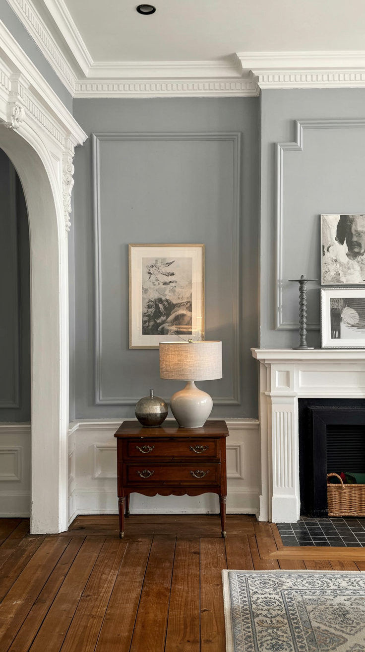
Older homes often come with quirks: uneven trim, mismatched moldings, or awkwardly placed windows. Painting everything one color helps disguise those irregularities and unify the room.
Also helpful for:
Homes with multiple types of trim (different profiles, sizes, or materials)
Open-concept spaces with lots of transitions
Rooms where you want architecture to fade into the background so furnishings take the spotlight
5. To Highlight Texture Instead of Color
Sometimes, texture is the star — not contrast. Painting wood paneling, beadboard, or shiplap the same color as the walls allows the texture and shadows to shine without the distraction of competing colors.
This works beautifully in:
Cottage or farmhouse-style homes
Modern rustic interiors
Rooms with wainscoting or built-ins
Try This Combo:
Soft greige walls and trim in the same shade with a slight sheen difference — timeless, calm, and quietly sophisticated.
When Not to Paint Trim the Same Color as the Walls
Now, there are definitely times when a contrasting trim color is the better design move. Let’s look at when to resist the urge to go all-in on one shade.
1. When Your Architecture Deserves Attention
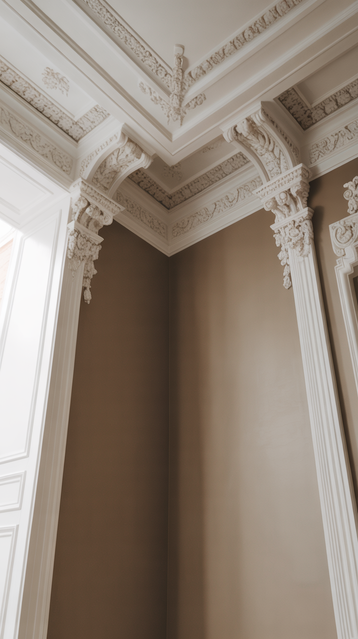
Beautiful moldings, paneled doors, or window casings are worth celebrating. Painting trim a contrasting shade — like crisp white or a complementary neutral — helps those details pop.
Best for:
Traditional or historic homes
Rooms with intricate millwork
Homes with coffered ceilings or wainscoting
Example:
A Victorian-style dining room with pale gray walls and creamy white trim lets those gorgeous crown moldings stand out like jewelry.
2. When You Want a Classic, Timeless Look
White trim is classic for a reason. It provides crisp definition and ties together rooms painted in different colors.
This approach works best when:
You have varied wall colors throughout your home
You want to maintain a clean, cohesive transition between rooms
You love a bright, airy aesthetic
Pro Tip:
Warm whites (like Benjamin Moore White Dove or Sherwin Williams Alabaster) pair beautifully with both cool and warm wall colors without feeling harsh.
3. When You Need to Brighten a Dark Space
Related: Before choosing a contrasting trim color, understand how room lighting affects paint color.
If your walls are dark and your room lacks natural light, white or light-colored trim can add much-needed contrast and brightness. It acts like a built-in highlight, reflecting light around the room.
Perfect for:
North-facing rooms
Basements or shaded spaces
Homes with small or few windows
Designer Trick:
Even a narrow band of white around windows and doors can make the entire wall feel lighter.
4. When You Want Architectural Definition
If your space feels a bit bland or “flat,” contrasting trim can define edges and add structure. It’s like outlining a sketch — suddenly, everything feels more intentional and grounded.
Try it when:
You have monochromatic or tone-on-tone furnishings
You want to emphasize your window or door shapes
You’re working with open-concept layouts that need visual boundaries
Example:
White trim against soft sage walls gives a room that crisp, polished finish — like a tailored outfit with clean seams.
5. When You’re Using a High-Contrast Color Palette
If your design relies on contrast — black and white, navy and ivory, charcoal and pale oak — matching trim to walls can flatten the impact. Trim provides that necessary visual punctuation.
Ideal for: