Lighting plays a huge role in how we perceive color. Have you ever picked out the perfect shade of paint, only to find that it looks completely different once it’s on the walls? That’s because light—whether natural or artificial—has a significant impact on the way colors appear. Understanding how different types of light affect paint colors can help you make the best choices for your home.
I’ve covered quite a few topics related to paint like here and here, but this time I want to talk about how light interacts with color and how you can use this knowledge to create a space that looks just as beautiful in the morning as it does at night.
The Role of Natural Light in Color Perception
Natural light is ever-changing, shifting throughout the day and even across seasons. The direction a room faces—north, south, east, or west—determines how much sunlight it receives and what kind of light it gets. Let’s break it down room by room.
South-Facing Rooms: Bright and Warm All Day
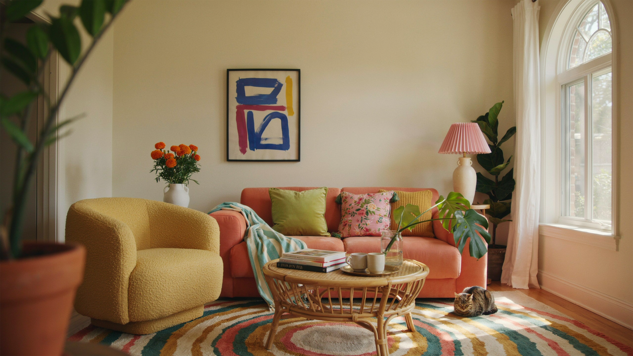
South-facing rooms are flooded with warm, golden light from sunrise to sunset. These spaces tend to have the most consistent lighting throughout the day, making them the easiest to decorate.
- Best Colors for South-Facing Rooms: Soft, pale shades like Pavilion Blue and Borrowed Light enhance the airy, bright feel of the space.
- Want a cozy feel? Try warm neutrals like Joa’s White, which will glow in the sunlight without feeling too stark.
- Trim Tip: Use a crisp white, like Wimborne White, on woodwork to create a fresh, polished look.
North-Facing Rooms: Cool and Shadowy
North-facing rooms receive indirect, cooler-toned light, which can make colors appear darker and grayer than expected. This is where you have two choices: embrace the cool tones or counteract them with warmer hues.
- Brighten the Space: Warm, yellow-based shades like Yellow Ground, New White, and White Tie help reflect and amplify light.
- Lean Into the Mood: Instead of fighting the cool light, embrace it with deep, dramatic tones like Railings or Down Pipe for a rich, cocooning effect.
- Pro Tip: Hanging a mirror opposite a window can help bounce light around and make the room feel brighter.
West-Facing Rooms: Cool in the Morning, Warm in the Afternoon
West-facing rooms change dramatically throughout the day. Mornings bring cooler, shadowy light, while afternoons are filled with warm, golden hues.
- Warm up your space: Pink-based tones like Middleton Pink or Setting Plaster come alive in the evening light.
- Love a classic neutral? Slipper Satin or Shaded White will shift beautifully between cool and warm as the day progresses.
- For a dynamic look: Consider a chameleon shade like Light Blue, which subtly shifts between blue and silver depending on the light.
East-Facing Rooms: Bright Mornings, Cool Evenings
East-facing rooms enjoy bright, crisp morning light but can feel a little cool and shadowy by the afternoon. The trick is choosing colors based on when you use the room the most.
- Morning Lovers: If you’re in the space during the day, embrace the sunshine with lively colors like Whirlybird or Breakfast Room Green.
- Evening Relaxation: Cooler tones like Blue Ground or Teresa’s Green can create a soft, serene retreat in the later hours.
- Go Bold: Darker shades like Inchyra Blue or Hopper Head can add depth and drama to evening spaces.


Choosing the perfect paint color isn’t just about picking a shade you love—it’s about understanding how light will interact with it throughout the day. By considering your room’s natural light exposure and pairing it with the right artificial lighting, you can ensure your space looks beautiful in every condition.
Whether you want to create a bright and airy feel or a moody, dramatic retreat, understanding how light affects color is the key to making your space look its best. So grab some paint samples, test them at different times of the day, and find the perfect hue that shines in your home!