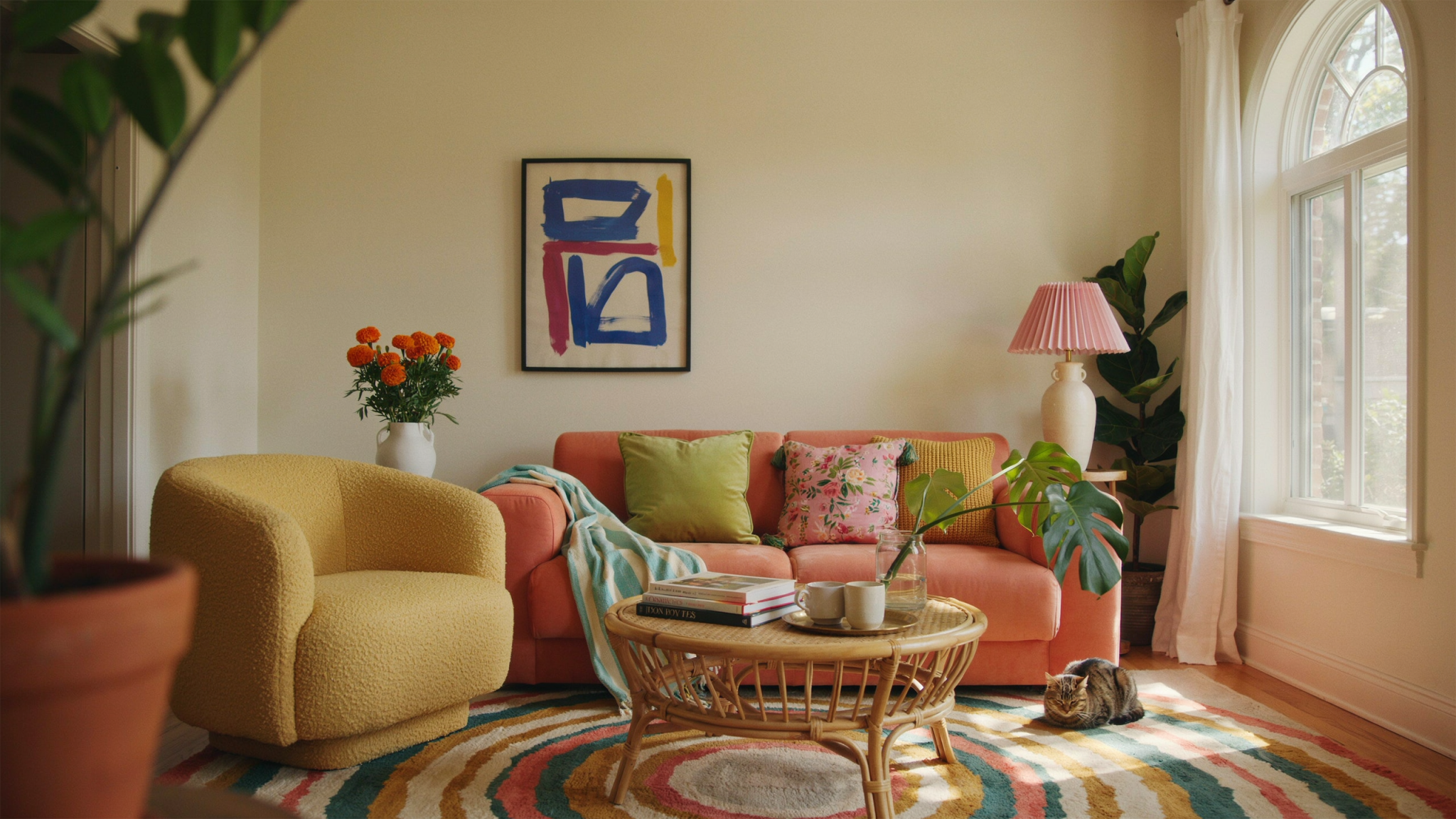
When it comes to achieving a luxury home aesthetic, paint color plays a crucial role. The right hues can transform a space, elevating its elegance and creating an atmosphere of sophistication. Whether you’re looking to refresh your interiors or preparing a home for resale, choosing the perfect paint color is essential. Below are some of the best paint colors that exude luxury and timeless appeal.
Understanding the Role of Color in Luxury Interiors
The psychology of color plays an essential role in luxury interior design. While some colors evoke a sense of grandeur and richness, others bring warmth, calm, and timeless beauty. Choosing the right color palette should align with the architectural style, natural lighting, and overall ambiance you want to create.
1. Classic White and Off-White Tones
Luxury homes often feature pristine white or subtle off-white shades that create an airy and refined ambiance. These colors provide a clean backdrop that allows furniture and décor to stand out.
- Best Shades: Benjamin Moore’s “Chantilly Lace,” Sherwin-Williams’ “Alabaster,” Farrow & Ball’s “White Tie.”
- Why It Works: White walls enhance natural light, making spaces feel brighter and more expansive.
- Best Uses: White and off-white shades work beautifully in living rooms, kitchens, and hallways. Pair them with sleek gold or black fixtures for a contemporary high-end appeal.
- Styling Tip: Use different shades of white for walls, trim, and ceilings to add dimension while keeping a monochromatic theme.
- Additional Advice: Incorporate textures like linen drapes, wool rugs, and marble countertops to enhance the luxurious feel of a white space.
- Alternative Pairings: Off-whites pair beautifully with natural wood tones and subtle metallic accents for a warm, sophisticated aesthetic.
2. Rich and Moody Dark Hues
Deep, bold colors add drama and depth, making rooms feel lavish and high-end. These shades work particularly well in dining rooms, libraries, or bedrooms.
- Best Shades: Farrow & Ball’s “Hague Blue,” Benjamin Moore’s “Wrought Iron,” Sherwin-Williams’ “Iron Ore.”
- Why It Works: Dark tones create a sense of opulence and coziness, especially when paired with gold or brass accents.
- Best Uses: Darker hues work best in intimate spaces such as bedrooms and offices. They also add contrast in spaces with high ceilings and large windows.
- Styling Tip: Balance dark walls with light-colored furniture and luxurious textures like velvet or silk to create a layered, high-end look.
- Additional Advice: Introduce statement artwork or oversized mirrors to break up darker walls and add a sophisticated focal point.
- Alternative Pairings: Dark hues can be softened with plush textiles and strategic lighting to enhance depth and character.
3. Elegant Neutrals
Warm neutrals bring sophistication to any space while providing a timeless appeal. Beige, taupe, and greige are excellent choices for a luxurious yet understated look.
- Best Shades: Benjamin Moore’s “Revere Pewter,” Sherwin-Williams’ “Accessible Beige,” Farrow & Ball’s “Elephant’s Breath.”
- Why It Works: These tones complement various décor styles and create a welcoming, serene environment.
- Best Uses: Neutral colors are perfect for open-concept spaces, living areas, and master bedrooms.
- Styling Tip: Add contrast with darker wood finishes, leather accents, or statement lighting to prevent a neutral space from feeling bland.
- Additional Advice: Use layered lighting solutions, such as chandeliers, wall sconces, and table lamps, to bring warmth and elegance to neutral-toned rooms.
- Alternative Pairings: Pairing neutrals with subtle color accents, such as dusty pinks or deep greens, can create a more refined look.
4. Soft and Muted Pastels
Muted pastels like blush, sage, and pale blue can add a touch of subtle luxury to a space without overwhelming it.
- Best Shades: Farrow & Ball’s “Pink Ground,” Benjamin Moore’s “Palladian Blue,” Sherwin-Williams’ “Sea Salt.”
- Why It Works: These soft hues exude sophistication while maintaining a relaxed and inviting atmosphere.
- Best Uses: Pastels are excellent for bedrooms, bathrooms, and nurseries.
- Styling Tip: Combine pastel tones with white trim and minimalist décor to enhance the airy and elegant feel of the room.
- Additional Advice: Integrate gold or brass hardware and fixtures to add a touch of glamour to pastel-colored spaces.
- Alternative Pairings: Use muted pastels alongside warm neutrals for a layered, timeless aesthetic.
5. Luxurious Jewel Tones
For a bold and glamorous look, jewel tones bring richness and vibrancy to a space. Deep emerald greens, royal blues, and rich plums create a striking visual impact.
- Best Shades: Benjamin Moore’s “Hunter Green,” Sherwin-Williams’ “Naval,” Farrow & Ball’s “Brinjal.”
- Why It Works: These colors add character and a sense of grandeur to any room, especially when paired with velvet or metallic finishes.
- Best Uses: Jewel tones are ideal for accent walls, dining rooms, and study areas.
- Styling Tip: Mix these hues with gold or brass details, and consider using luxurious fabrics like velvet or silk to enhance the effect.
- Additional Advice: Layer jewel tones with neutral-toned furniture to avoid overwhelming the space while maintaining a luxurious aesthetic.
- Alternative Pairings: Rich jewel tones pair exceptionally well with warm wood finishes and modern lighting designs.
6. Earthy and Organic Tones
Earthy colors inspired by nature create a rich, inviting atmosphere that feels luxurious yet grounded. These shades bring a sense of calm and connection to the outdoors.
- Best Shades: Benjamin Moore’s “Terra Cotta,” Sherwin-Williams’ “Cavern Clay,” Farrow & Ball’s “India Yellow.”
- Why It Works: Earthy hues provide warmth and sophistication, making any space feel curated and intentional.
- Best Uses: These colors work well in entryways, kitchens, and reading nooks.
- Styling Tip: Pair with natural materials like stone, wood, and linen for a harmonious and organic luxury feel.
- Additional Advice: Enhance earthy tones with green plants and textured décor elements to complete the natural luxury aesthetic.
- Alternative Pairings: Combining earthy hues with deep blues or soft grays can create a balanced, sophisticated ambiance.
Final Considerations for a Luxury Paint Finish
- Choose the Right Sheen: High-gloss or satin finishes add a touch of glamour, while matte finishes create a soft, elegant feel.
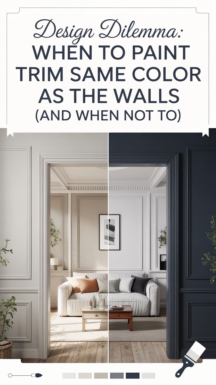
- Coordinate with Trim and Ceilings: Consider painting trims in a crisp white or a complementary shade to frame walls beautifully.
- Layer Lighting: Proper lighting enhances the richness of paint colors, so use a mix of ambient, task, and accent lighting.
- Test Before Committing: Always test paint samples under different lighting conditions before making a final decision.
- Incorporate Luxurious Materials: Marble, brass, and high-end fabrics can further enhance the impact of well-chosen paint colors.
By selecting the perfect hues, your home can exude sophistication, elegance, and timeless charm, ensuring every space feels both luxurious and inviting.