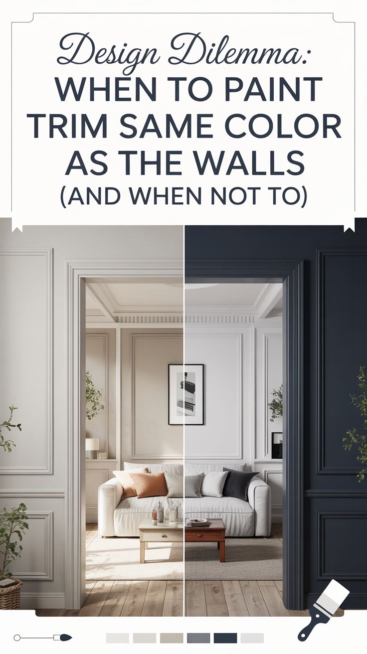
Let me share with you a tale of paint cans, Pinterest dreams, and the many colorful lessons I’ve learned along the way.
One of my first bold DIY adventures happened in my very first apartment after college. I had just landed a “big girl” job, was finally living on my own, and felt more than ready to express my style and independence in the one place I had full control over: my walls. Armed with a few paint cans and even more confidence, I was determined to give my apartment a personality all its own.
I chose a color somewhere between cobalt blue and indigo, but if we’re being honest—it was basically purple. It was bold. It was brash. And it was very, very me… or so I thought.
What began as a weekend DIY project quickly turned into a full-blown lesson in color theory, psychology, and humility. I learned that while I adore bold hues in concept, I don’t necessarily enjoy living in them. That early DIY project shaped how I think about design to this day—especially how I choose color and how that color affects the way I feel in a space.
So in the spirit of sparing you from some of the same mistakes I made, here’s what I’ve learned over the years—plus the steps you should absolutely not take if you want to avoid hating your paint color.

Step One: Buy Paint Blindly (AKA the Fast Track to Regret)
This is the classic rookie mistake. I’ve done it, you’ve probably done it, and if you haven’t yet—oh darling, your time will come. There’s something exhilarating about walking into a hardware store, falling in love with a swatch under fluorescent lights, and walking out with a gallon (or two) of it. No samples. No testing. Just vibes.
Here’s the thing: paint colors change dramatically based on lighting—both natural and artificial—as well as surrounding elements like furniture, flooring, and even ceiling height.
Case in point: that bright blue/purple apartment of mine. I was going for character, and I definitely got it. Unfortunately, what I got was chaotic character—not the cozy sanctuary I had envisioned.
If you’ve ever painted a room and felt like the color looked nothing like it did on the swatch or in the store, you’re not crazy. Paint colors are chameleons, and how they read depends on their context.
These days, I always sample paint colors before committing. I recommend painting generous test swatches on multiple walls in the same room—especially ones that receive different types of light throughout the day. If you saw my Ultimate House Flipping Playbook, I go into detail about how lighting impacts undertones and reflectance, particularly with white paints.
One of my all-time favorites? Gray Owl by Sherwin Williams. It’s subtle, calming, and plays with green and blue undertones depending on the lighting. It’s the kind of color that looks elegant in any room, especially when you want something soft and versatile. But even Gray Owl requires testing. The same color can feel serene in one room and cold in another.
Moral of the story: test first, paint later.
Step Two: Choose a Color from Pinterest, Not Your Home
While Pinterest is an amazing source of inspiration, it can also be a bit of a trap. I call it “Pinterest Paint Syndrome”—when you fall head-over-heels for a color you saw in someone else’s home and assume it’ll translate perfectly in your space.
Spoiler alert: it almost never does.
I once saw the most stunning moody library painted in a deep kelly green. It was in a historic home with soaring ceilings, rich millwork, and loads of natural light. That space could have worn any color and looked like a million bucks. But when I tried to bring that same vibe into a modest apartment with beige carpet and low ceilings? Let’s just say it didn’t quite hit the same.
Instead of copying a color from someone else’s space, let your home guide you. Look at your furnishings, your artwork, your lighting. Even things like rugs, vases, and throw pillows can provide a starting point for a color palette. If you have a meaningful piece—say, a rug you picked up on your honeymoon—use that as your anchor. From there, use a color wheel to either go tonal (choose colors next to each other on the wheel) or create contrast with complementary colors.
Color wheels are a surprisingly helpful investment. You don’t even need to use the original paint brand—most paints can be matched at any major store as long as you know the HEX code (that six-digit combo that defines digital colors). A quick search like “HEX code for Benjamin Moore Iron Ore” will give you exactly what you need.
In short: let your space inspire your palette, not just your Pinterest board.

Step Three: Ignore Your Doubts (a.k.a. Talk Yourself Into a Bad Decision)
Let’s rewind to my fateful purple apartment. About halfway through painting that first wall, I had a feeling. You know the one—the soft, sinking sense of “this isn’t quite right.”
Did I stop? Of course not. I told myself it would look better when the whole room was done. That I’d get used to it. That it was just the lighting. Or the time of day. Or my mood.
I never got used to it.
The worst part? I ended up having to pay a hefty fee to my landlord to repaint the entire apartment. It was a harsh reminder that listening to your instincts isn’t just good design advice—it’s good life advice.
If you’re halfway through a project and something feels off, pause. Step back. Take a breath. Your future self will thank you.
Step Four: Forget the Big Picture
When I chose that vibrant wall color, I wasn’t thinking about my bright yellow bedding or my mint green childhood dresser. It was a full-on Rainbow Brite situation—fun in theory, overwhelming in practice.
This is another common mistake: choosing paint in isolation without considering the full room. A color might look amazing on its own, but when layered with your furniture, textiles, and art, it could throw everything out of balance.
Now, before I ever open a paint can, I create a mood board or lay out swatches next to furniture, textiles, or key decor pieces. You don’t need to be a designer to do this. Just gather the items you already own and consider how they’ll interact with your potential wall color.
Paint should be the supporting actor, not the star—unless, of course, you’re going for a statement wall. Even then, you need to think holistically.
My Paint Can Redemption Story
Now, years and many paint cans later, I’ve found peace in my color preferences. I’ve learned that I’m happiest surrounded by earthy, muted tones. I crave soft sage greens, warm taupes, and cozy ochres. Even when I go bold now, it’s with intention.
One of my favorite recent projects involved redesigning my daughter Willa’s room. She told me she wanted the space to feel “beachy,” which might sound vague—but children have an amazing sense of mood.
We found inspiration in a single image (credit to Molly Basile Interiors!) and used it as the foundation for the entire design. From the soft ocean blues to sandy neutrals and sun-washed textures, the whole room radiates calm and happiness. We haven’t shared the final reveal just yet, but I can tell you it’s one of our favorite transformations.
Willa’s project reminded me that the best designs start with how you want to feel, not just how you want a room to look. That’s what makes paint so powerful—it sets the tone, literally and emotionally.

Color is Emotion. Color is Memory.
Looking back, I don’t regret that purple paint job. Was it a disaster? Yes. But it taught me more about myself, my style, and the power of color than any successful project ever has.
At the time, I was navigating post-college life, working in sales, and spending most of my days either in a car or in that very apartment. The energy of that color—while visually jarring—reflected where I was emotionally: full of ambition, trying to be bold, and still figuring it all out.
Today, I design with more calm and confidence. But I always leave room for change. Because design isn’t static, and neither are we.
Paint with Intention
If you’ve made it this far, thank you for following me through this colorful journey. Here’s a quick recap of what I hope you’ll take away:
Sample before you commit. Always. On multiple walls. In different lighting.
Let your home—not just Pinterest—inspire you. Look at your furnishings and collect meaningful color cues.
Trust your gut. If something feels off, it probably is.
Think holistically. Paint is one part of the whole picture.
Design for feeling. Let emotion guide your color decisions, not just aesthetics.
Choosing a paint color can be overwhelming. But it’s also one of the most DIY-friendly, high-impact ways to transform your home. It’s okay to make mistakes—those are the moments where real design intuition is born.
So here’s to every bold decision, every wrong turn, and every future shade you’ll fall in love with. Here’s to the journey—one paint can at a time.