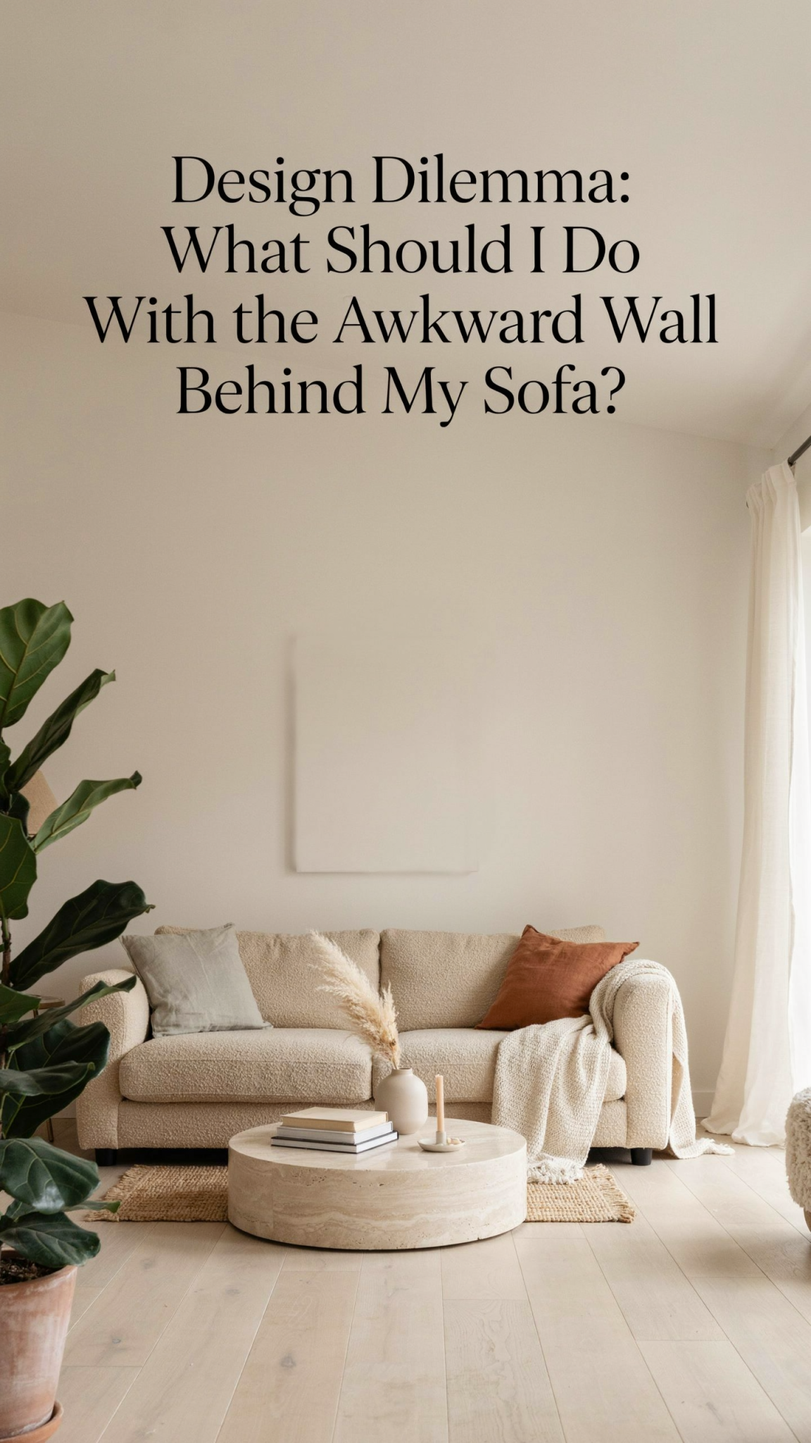
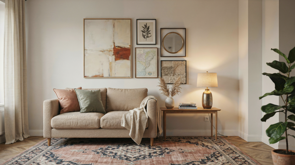
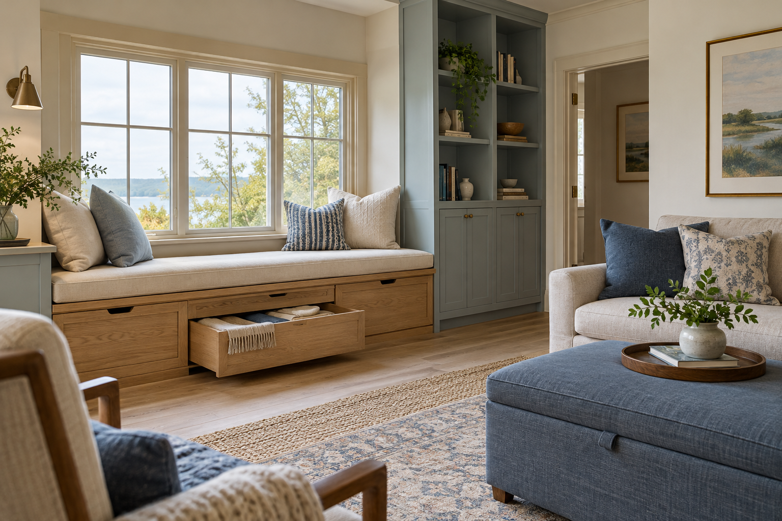
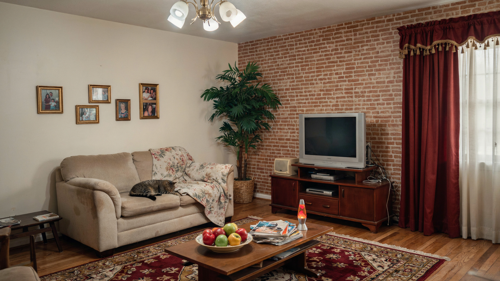
The wall behind a sofa has an outsized effect on a living room. It is often the first big vertical plane you see when you enter, and it sits directly above the furniture that anchors the room’s everyday life. Yet it is also the wall many people leave undecorated the longest. A tiny print looks lost. A large piece feels like a risky purchase. A gallery wall looks charming online but daunting when you picture all those nail holes. So the wall stays blank—not because blank was the design intention, but because every possible alternative seems slightly wrong.
That uncertainty is understandable, but an “awkward” sofa wall is not a problem that needs an elaborate rescue. It simply needs a clear role. Once you read its proportions, light, architecture, and relationship to the sofa, the right direction becomes easier to see. The solution could be one oversized artwork, a flexible picture ledge, a richly painted backdrop, an architectural detail, or an asymmetrical composition that works with—not against—an off-center window or awkward corner.
The goal is not to fill every inch of wall. The goal is to give the seating area balance, personality, and a genuine sense of arrival. A beautiful sofa wall acts like a backdrop in a good film: it establishes atmosphere without distracting from the life happening in front of it.
First, Work Out Why the Wall Feels Awkward
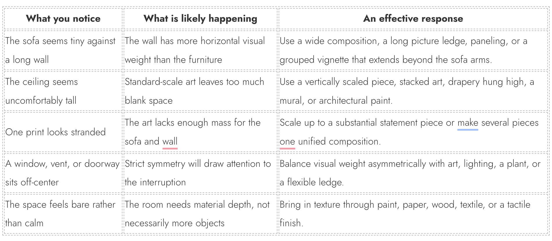
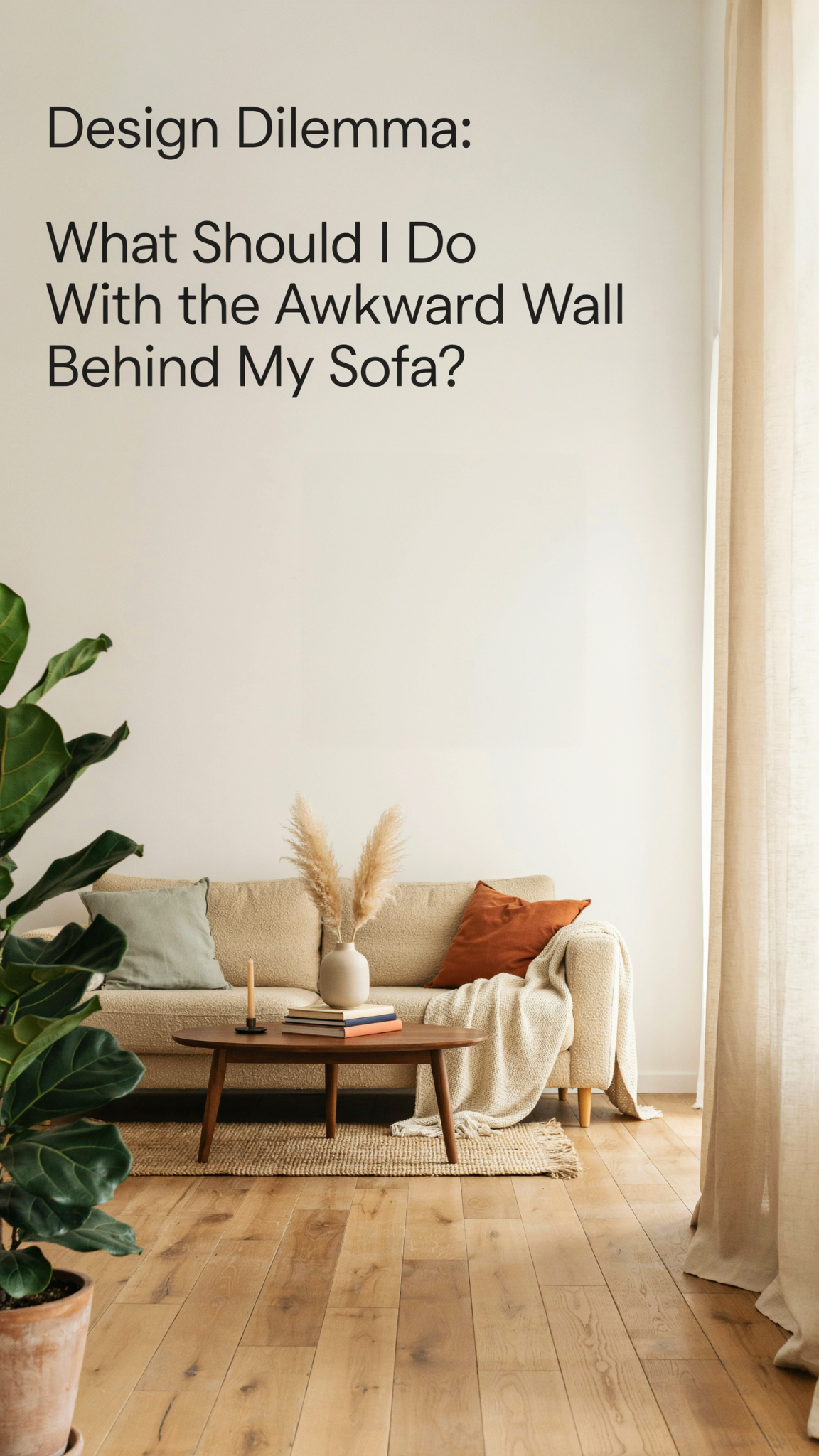
Before buying art or reaching for the drill, identify the real reason the wall is bothering you. “Awkward” can describe a wall that is much wider than the sofa, one with unusually high ceilings, a narrow surface interrupted by a window, or a long expanse that makes ordinary frames seem undersized. It can also mean the room feels cold, the sofa floats too far from the wall, or there is a strange band of emptiness between a low sofa back and the ceiling. Each version has a different, much more useful, solution.
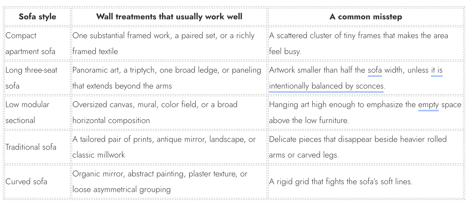
Measure before you start browsing. Note the sofa’s width, the distance from its back to the ceiling, and the wall width that remains visible at either side. A helpful starting point is for the overall art composition to occupy roughly two-thirds to three-quarters of the sofa width. It is not a rule to follow blindly, but it explains why a small, centered print can look apologetic above a broad three-seater. The treatment needs enough presence to belong to the furniture beneath it.
Let the Sofa Dictate the Scale
The most common sofa-wall mistake is treating the wall and the couch as unrelated. They are one visual composition. The sofa provides the width, the weight, and the grounding. Whatever you put above it should acknowledge that foundation, whether it is art, molding, wallpaper, a mirror, or simply a saturated field of paint.
A single, generously sized artwork is often the most reliable option. It can be a painting, a photographic print, a vintage poster, a framed textile, or an abstract canvas. What matters most is scale. If a piece seems almost too big when you are standing in the store or looking at it online, it may be exactly right once it is above a long sofa. Use painter’s tape to mark the outer dimensions on the wall. That simple rehearsal takes the guesswork out of whether an arrangement will look substantial or hesitant.
Leave some air between the sofa and whatever you hang, but not so much that the two lose their connection. In many rooms, six to ten inches from the sofa back to the bottom of the art works well. Bring the piece a little closer if the sofa is very low; give it more space if you have a high-back or sculptural sofa. The aim is for the wall treatment to feel visually attached to the seating zone, not stranded up in the upper third of the room.
The Easiest Answer: One Oversized Piece of Art
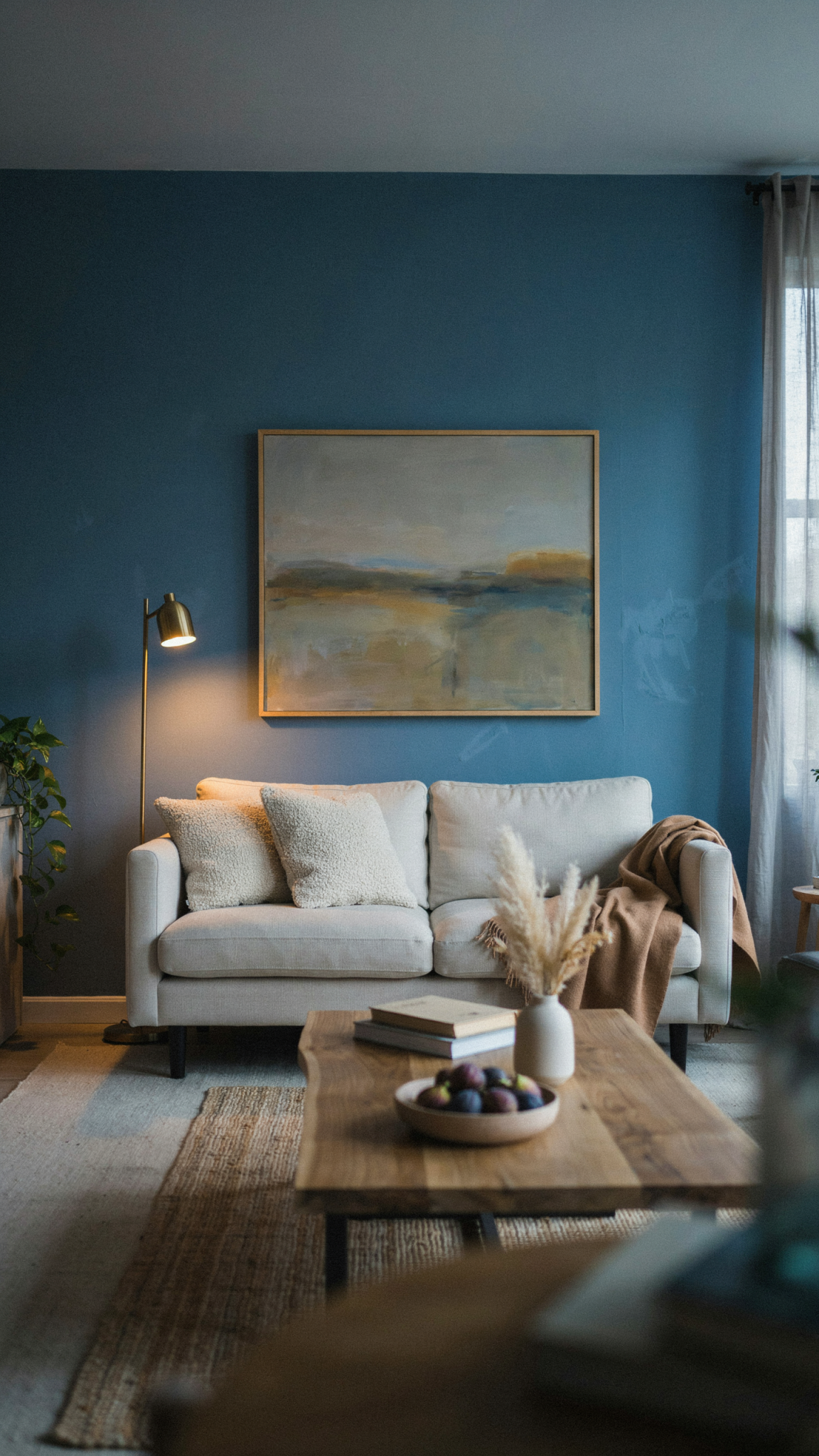
If you want the highest impact with the least visual fuss, choose one large artwork. It gives the sofa wall a calm confidence and makes the room feel designed without looking overworked. A single powerful image or abstract is especially effective in a living room that already has good texture through a rug, window treatments, and furniture. It becomes the focal point while allowing the rest of the room to breathe.
The art does not have to match the sofa exactly. A cream sofa can look wonderful below a moody blue landscape; a charcoal couch might be softened by a sun-faded still life; a tailored neutral sofa can take a large, bold abstract. Instead of trying to coordinate every shade, look for one or two quiet connections: the warm terracotta in a cushion, the green of a nearby plant, the oak tone of a coffee table, or the black line of a floor lamp. Those repeated notes are enough to make the room feel coherent.
This solution is ideal for clean architectural rooms, busy households, and anyone who prefers fewer, better things. It is also a useful way to keep an open-plan living room from becoming visually fragmented. One substantial work tells the eye where to land.
Build a Gallery Wall With a Clear Point of View
🛒 Create a stronger wall behind the sofa
pechpell 3D Mid-Century Modern Boho Wall Art Set of 3
A flexible option for adding scale and visual interest to a blank wall.
As an Amazon Associate I earn from qualifying purchases.
A gallery wall is best when you have smaller pieces you genuinely love, want to incorporate photographs, or need an arrangement that can expand across a wide wall. It can be wonderfully personal, but it needs a point of view. Without one, the wall turns into a collection of unrelated rectangles competing for attention.
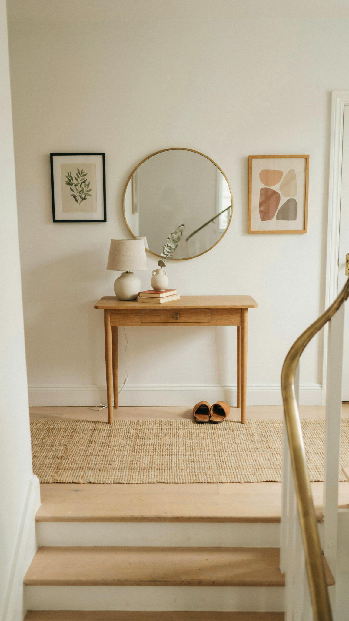
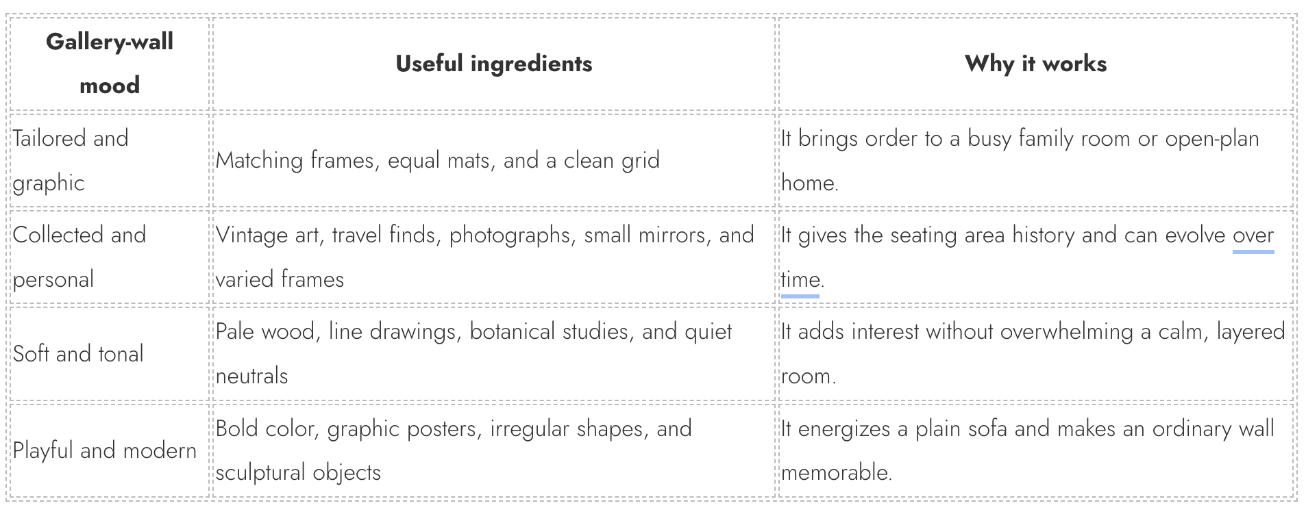
Begin on the floor. Lay out the frames at full scale, including the spaces between them, before you make any holes. Start with the largest or most important piece and build outward. For a crisp, tailored effect, use identical or closely related frames and arrange the work in a grid. This is especially handsome with architectural photography, botanical studies, black-and-white family portraits, or a single print series. For something more layered and collected, vary the frame finishes but repeat a different element: similar paper tones, a focused subject, a limited palette, or consistent matting.
The outer shape matters. The frames do not have to form a perfect rectangle, but the composition should read as one deliberate silhouette. A long, shallow “cloud” of art can suit a long sofa and a lower ceiling. A taller arrangement can help a narrow wall or a room with abundant vertical space. Keep the gaps between frames relatively consistent—often two to three inches—and remember that the negative space is part of the arrangement. If it looks overcrowded, remove one piece before adding another.
Use a Picture Ledge When You Want Flexibility
A picture ledge is one of the most forgiving answers to the awkward-wall question. It creates a sense of architecture without forcing you to decide on the final arrangement immediately. You can lean art, overlap frames, add a tiny sculpture, and change the combination whenever your taste shifts. This works beautifully for renters who can install a few secure anchors, people who collect art gradually, and anyone who wants a relaxed, slightly editorial look.
Choose a ledge that has a real relationship to the sofa’s width. On a wide wall, a ledge extending slightly beyond the sofa arms can make even a compact sofa feel more intentional. On a narrow wall, one long ledge with larger frames is usually calmer than several short shelves. Two stacked ledges can work in a tall room, but give them enough breathing room so the arrangement does not feel compressed.
Style it with a simple rhythm. Start with one or two larger pieces at the back, layer smaller frames in front, and vary the heights gently. Repeating an element—perhaps a pale wood frame, a dark line drawing, or a muted palette—keeps the display from becoming chaotic. Small ceramics and candlesticks can be lovely, but only if the sofa does not sit so close that they become an inconvenience. In a compact living room, use the ledge chiefly for art.
Make the Wall Itself More Interesting
Not every wall needs objects at all. Sometimes the better answer is to make the surface more compelling. This is especially effective for a wall that is exceptionally wide or tall, interrupted by windows, or simply lacking material warmth. A strong backdrop can make a sofa area feel complete even when it remains mostly clear.
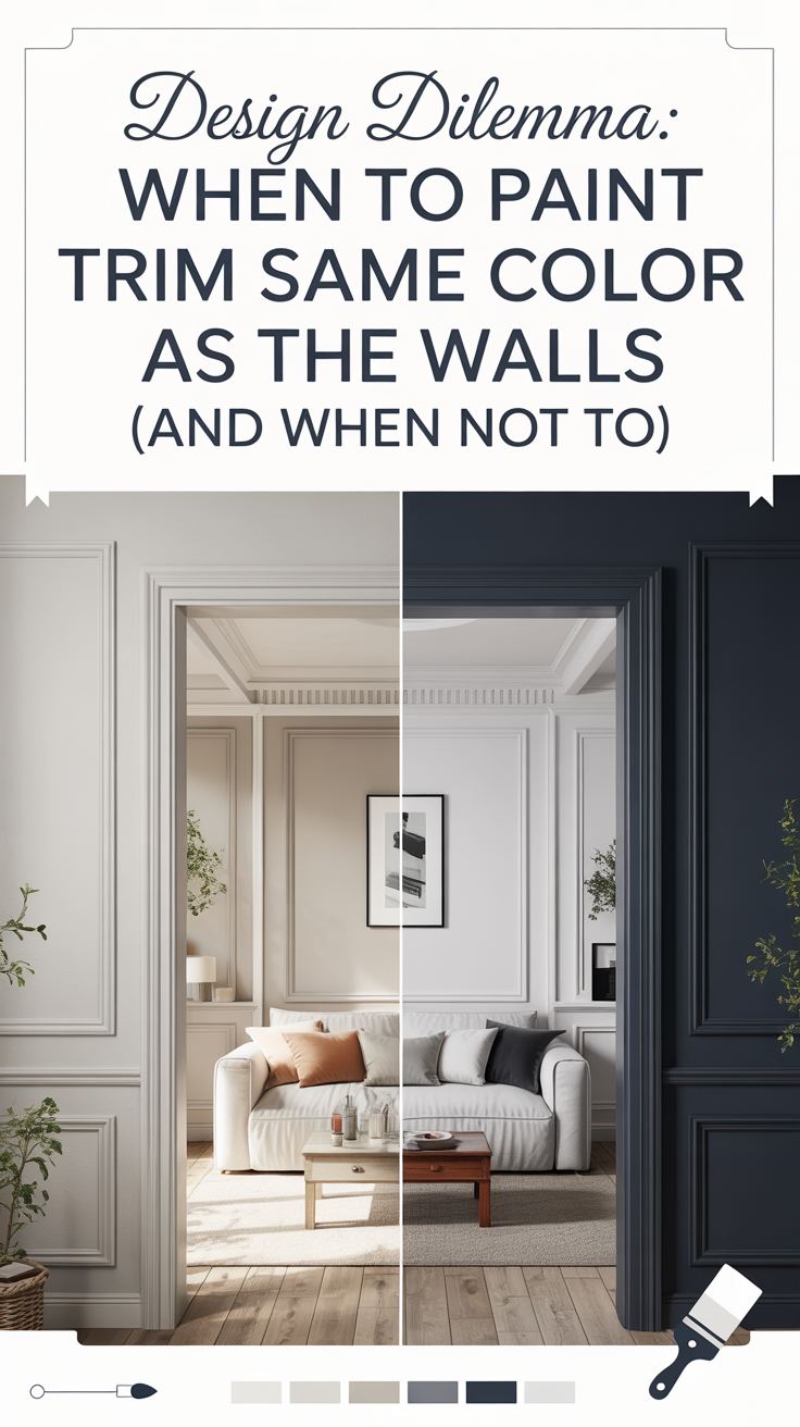
Paint is the most accessible route. A deep, inky green, tobacco brown, mineral blue, or warm aubergine behind a light sofa creates contrast and drama. Pale clay, mushroom, putty, or dusty pink can make a dark sofa feel calmer and more integrated. For rooms with awkward corners or mismatched trim, consider color drenching: painting walls, trim, and perhaps the ceiling in closely related tones. Instead of spotlighting every odd angle, the room reads as an enveloping whole. It is a particularly lovely approach in small living rooms, where a single tonal atmosphere often feels more sophisticated, not more enclosed.
Limewash and mineral paint bring depth through variation, which is particularly attractive behind clean-lined, modern furniture. Slatted wood, fluted panels, or broad painted millwork add rhythm to a wall that feels too broad. Woven wallcovering softens the acoustics of hard-surfaced, open-plan rooms. These finishes feel integrated and long-term, which is exactly why they work when the issue is proportion rather than a lack of decorative accessories.
Add Architecture With Paneling or Molding
If the problem is truly structural—an expanse that feels too tall, too broad, or too empty—architecture may solve it more elegantly than more art. Paneling adds framework, shadow, and visual cadence. It can make a blank wall feel intentional while giving the sofa a more substantial backdrop.
Simple picture-frame molding is an excellent choice for a traditional or transitional room. Wide, flat panels painted the same color as the wall suit a contemporary interior and add texture without creating a period look. Vertical battens can add lift to a low room, while a horizontally emphasized rail or painted lower section can visually lower a lofty ceiling. For a warm, current scheme, oak slats or veneer panels can read almost like furniture, especially when echoed in the coffee table or side tables.
If permanent work is not in the budget, mimic the logic of millwork with paint. A broad color block, tall painted arch, or full-height rectangle can frame the sofa and give the wall a sense of structure. Make the shape generously scaled and clearly connected to the sofa’s width. A small painted accent shape can look decorative; a confident one looks designed.
A Mirror Is a Smart Answer for Dark Rooms
A mirror is the right solution when the real issue is a lack of light. It bounces daylight, reflects a view or pendant, and makes a narrow room feel less closed-in. Above a sofa, it also gives a softer focal point than art because the reflection changes with the weather, time of day, and activity in the room.
The essential question is what the mirror will reflect. If it catches a window, a leafy view, a beautiful light fixture, or another composed part of the room, it will feel generous. If it reflects a television, cluttered kitchen counters, or another blank wall, it can double the problem. Stand where the sofa sits and test likely positions with a hand mirror or your phone camera before committing to a large piece.
Bring in Texture for a Softer, More Lived-In Feel
For a relaxed, organic, or slightly bohemian home, a tactile wall treatment can be more appealing than a formal framed composition. A woven textile, vintage rug, quilt, shallow basket collection, or ceramic wall piece introduces softness and history. This is particularly effective in rooms that feel acoustically hard or overly new. Fabric and handmade objects add a human layer that pristine frames sometimes cannot.
A large textile is a straightforward substitute for oversized art, and it is surprisingly forgiving on a wall with imperfect proportions because its material has movement. Choose one with enough scale and a clear center, and hang it so it feels related to the sofa without touching it. Vintage rugs need secure mounting and protection from harsh direct sun, but they can give a room extraordinary warmth. For a more contemporary look, use a single-tone woven hanging or an abstract fiber piece.
Do Not Create a New Design Problem
A few easy fixes routinely create more awkwardness. The first is hanging art too high. People often center a frame on the wall rather than relating it to the sofa, which creates a conspicuous gap. Lower it until the two elements feel like one zone. The second is choosing art that is too small because it feels safer. Small art does not vanish; it amplifies the empty wall around it.
Another misstep is forcing symmetry when the room does not have it. If there is an off-center window, a nearby doorway, or a floor lamp on one side, exact matching objects can make the discrepancy more obvious. Aim for visual equilibrium instead. A large artwork on one side can balance a tree and floor lamp on the other. A gallery wall can shift gently off-center to acknowledge a window. Rooms feel more comfortable when they respond honestly to their architecture.
Finally, do not design the sofa wall in isolation. Consider the rug, lighting, curtains, coffee table, and views from adjoining rooms. If you already have patterned curtains, a lively rug, and colorful cushions, the wall may need one quiet painting or tonal paneling. If the room is spare and neutral, the wall can carry more personality. Decorating is an editing exercise; every expressive choice looks better when it has enough calm around it.
A Straightforward Way to Decide
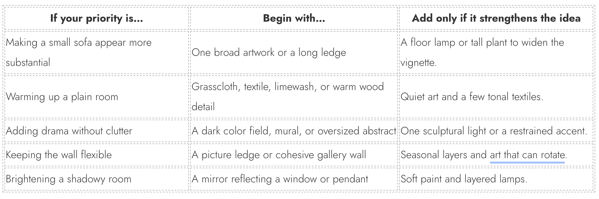
If you are overwhelmed by possibilities, begin with one question: does the room need art, architecture, light, or texture? Art gives a focal point. Architecture corrects proportion. A mirror adds light and movement. Texture brings warmth and softness. More than one can appear in the final scheme, but choose one as the lead idea.
Then consider your commitment level. For an affordable and flexible answer, start with a large framed print, a gallery wall, or a picture ledge. For a longer-term transformation, look to wallpaper, limewash, paneling, or shallow built-ins. Finally, settle on a mood—quiet and tonal, bold and graphic, collected and personal, or warm and textural—before buying individual pieces. That mood gives every later choice a useful filter.
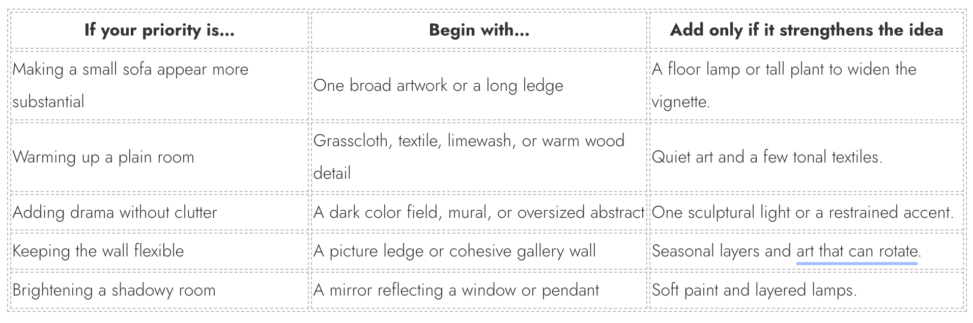
The design win is not filling the wall. It is making the sofa area feel like the place you intended to create all along. That may mean one bold painting, a softly painted backdrop, an evolving ledge of art, or a wall that becomes an architectural feature in its own right. Once the treatment has the right scale and a clear role in the room, the awkwardness usually disappears. What remains is a living room with a stronger center—and a sofa wall that finally feels like part of the story rather than an unfinished sentence.