

You walk into your living room, coffee in hand, ready to sink into that gorgeous velvet sofa you spent months tracking down. You glance over at the mid-century modern credenza that perfectly matches your aesthetic, and the artisanal coffee table you snagged from a local maker. Individually, every single piece in this room is stunning. You love your furniture. You truly do. Yet, as you take in the space as a whole, a familiar, nagging sensation creeps in. Something is just… off.
It is a frustrating paradox that plagues many design enthusiasts. You have curated a collection of beautiful objects, but the room itself feels disconnected, flat, or awkward. It lacks that elusive “magazine-ready” cohesion, feeling more like a holding area for nice things than a welcoming, lived-in space. The truth is, collecting furniture and designing a room are two entirely different endeavors. A cohesive, inviting living room relies on a complex web of invisible elements like scale, layout, lighting, and texture. These are the crucial bridges that close the gap between a pile of pretty objects and a harmonious atmosphere. If your living room feels like it is missing the mark despite featuring furniture you adore, the problem is rarely the pieces themselves. It is almost always how they relate to each other and the architecture of the room. Let us dive into the common culprits behind this design dilemma and explore how to fix them.
The Pitfall of the “Showroom” Approach
🛒 Easy texture upgrades for a collected living room
Seagrass Wicker Storage Basket with Handles
Natural texture and practical storage for a more layered, lived-in room.
As an Amazon Associate I earn from qualifying purchases.
When we fall in love with a piece of furniture, it is usually in isolation. We see it perfectly styled on a website, bathed in flattering studio light, or sitting majestically on a showroom floor. We buy it, bring it home, and expect it to magically infuse our space with that same curated vibe. However, a living room is an ecosystem, not a gallery. When you approach decorating as simply acquiring a series of “statement pieces,” you run the risk of creating a space where everything is shouting for attention, resulting in visual chaos.
Conversely, the other extreme is the matched set trap. Buying the sofa, the matching loveseat, the matching armchair, and the coordinated coffee and end tables might seem like a foolproof way to ensure cohesion. In reality, it often results in a space that feels sterile, predictable, and devoid of personality. It looks like you bought a room out of a catalog rather than curating a home over time.
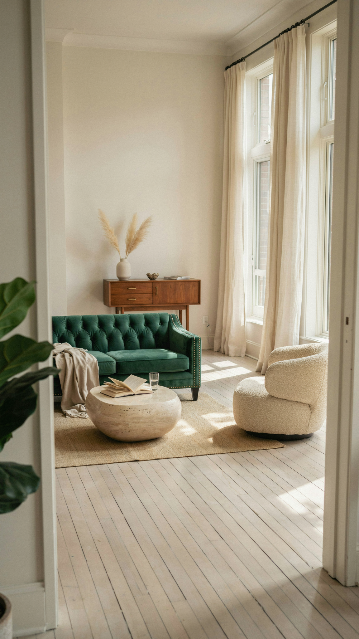
The goal is to strike a balance between eclectic individuality and harmonious flow. This means understanding the concept of “anchoring” your space. Often, when a room feels off, it is because the furniture looks like it is floating aimlessly. A beautiful armchair shoved into a corner without a side table or a reading lamp looks abandoned. A sofa floating in the middle of a large room without a substantial rug beneath it feels unmoored. Every piece of furniture needs a purpose and a context. They need to speak to one another, forming functional groupings rather than standing as isolated islands of design.
Furthermore, we often forget the importance of negative space. In our eagerness to fill our rooms with things we love, we overstuff them. Negative space as in the empty areas around and between your furniture, is what allows your pieces to breathe. It gives the eye a place to rest. If your living room feels heavy or claustrophobic despite featuring lovely items, try removing one piece. You might be surprised at how much better the remaining furniture looks when it is not competing for breathing room.
Scale and Proportion: The Silent Saboteurs
If there is one technical aspect of design that trips up more people than anything else, it is scale and proportion. These are the silent saboteurs of many well-intentioned living rooms. Scale refers to the size of your furniture relative to the size of the room itself. Proportion refers to the size of the pieces relative to each other. When either of these is off, the subconscious mind immediately registers that something is wrong, even if you cannot immediately put your finger on it.
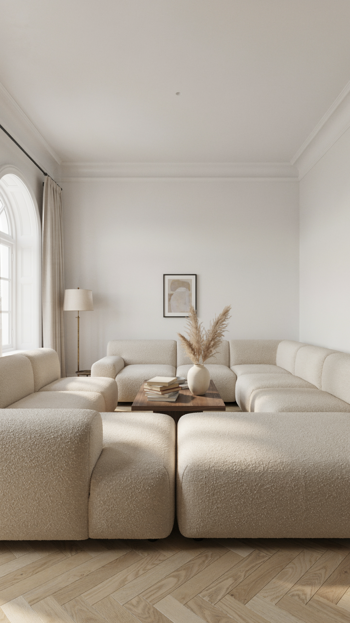
Let us start with scale. A common scenario is the oversized, deep-seated sectional placed in a standard-sized, eight-foot-ceiling living room. The sofa might be incredibly comfortable, but its massive footprint swallows the room, making the space feel cramped and the ceiling feel lower. On the flip side, delicate, leggy furniture in a cavernous room with vaulted ceilings will look diminutive and lost, like dollhouse furniture. Your pieces must acknowledge the architectural boundaries of the space they inhabit.
Proportion is where things get even trickier. Imagine a hefty, overstuffed leather armchair paired with a delicate, spindly-legged glass side table. The visual weight of the chair completely overpowers the table, making the pairing look absurd. Or consider the classic mistake of the tiny rug. A beautiful 5×7 rug floating in the center of a large seating arrangement, barely touching the front legs of the coffee table, makes the entire room look disjointed and smaller than it is. As a general rule, your area rug should be large enough that at least the front legs of all major pieces of furniture in that grouping rest comfortably upon it. This visually anchors the seating area and ties the disparate pieces together.
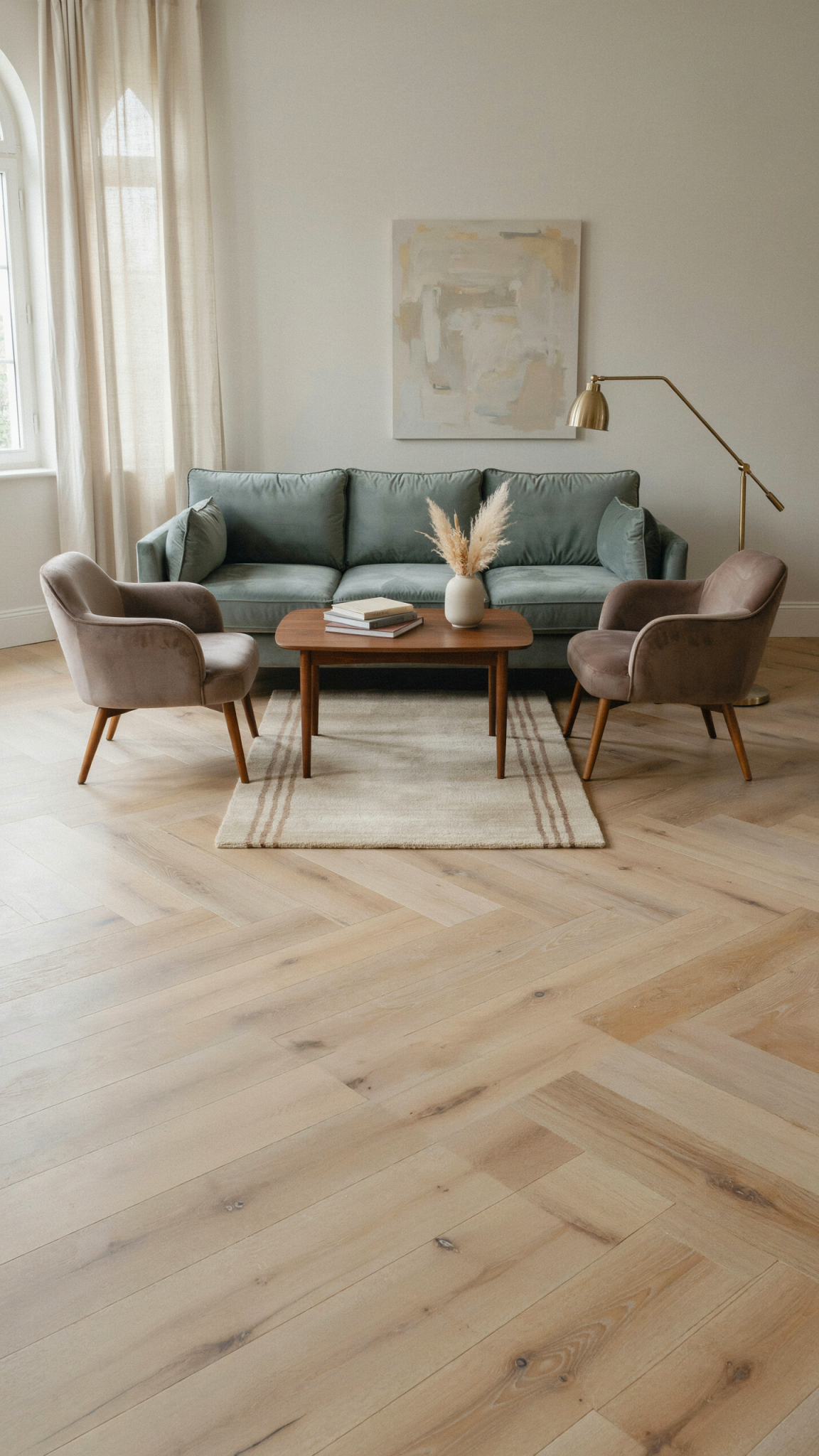
To master proportion, you must balance visual weight. Visual weight is not about how heavy a piece actually is, but how heavy it looks. A solid block of dark wood has more visual weight than an acrylic table of the exact same dimensions. A sofa with a skirt reaching the floor feels heavier than a sofa raised on slender wooden legs. If your room feels off-balance, look at how the visual weight is distributed. Are all your heavy, solid pieces clustered on one side of the room? Are you mixing chunky, grounded items with light, airy ones without providing a visual bridge between them? Mixing different styles and weights is encouraged, but it requires a thoughtful distribution to maintain equilibrium.
Layout and Flow: Creating Conversational Zones
You can own the most exquisite furniture in the world, but if it is arranged poorly, the room will never feel right. The layout dictates how a room functions and how it feels to inhabit it. The most common layout mistake is the instinct to push every piece of furniture flat against the walls, leaving a massive, empty dance floor in the center of the room. This “waiting room” arrangement makes conversation difficult and strips the space of any intimacy.
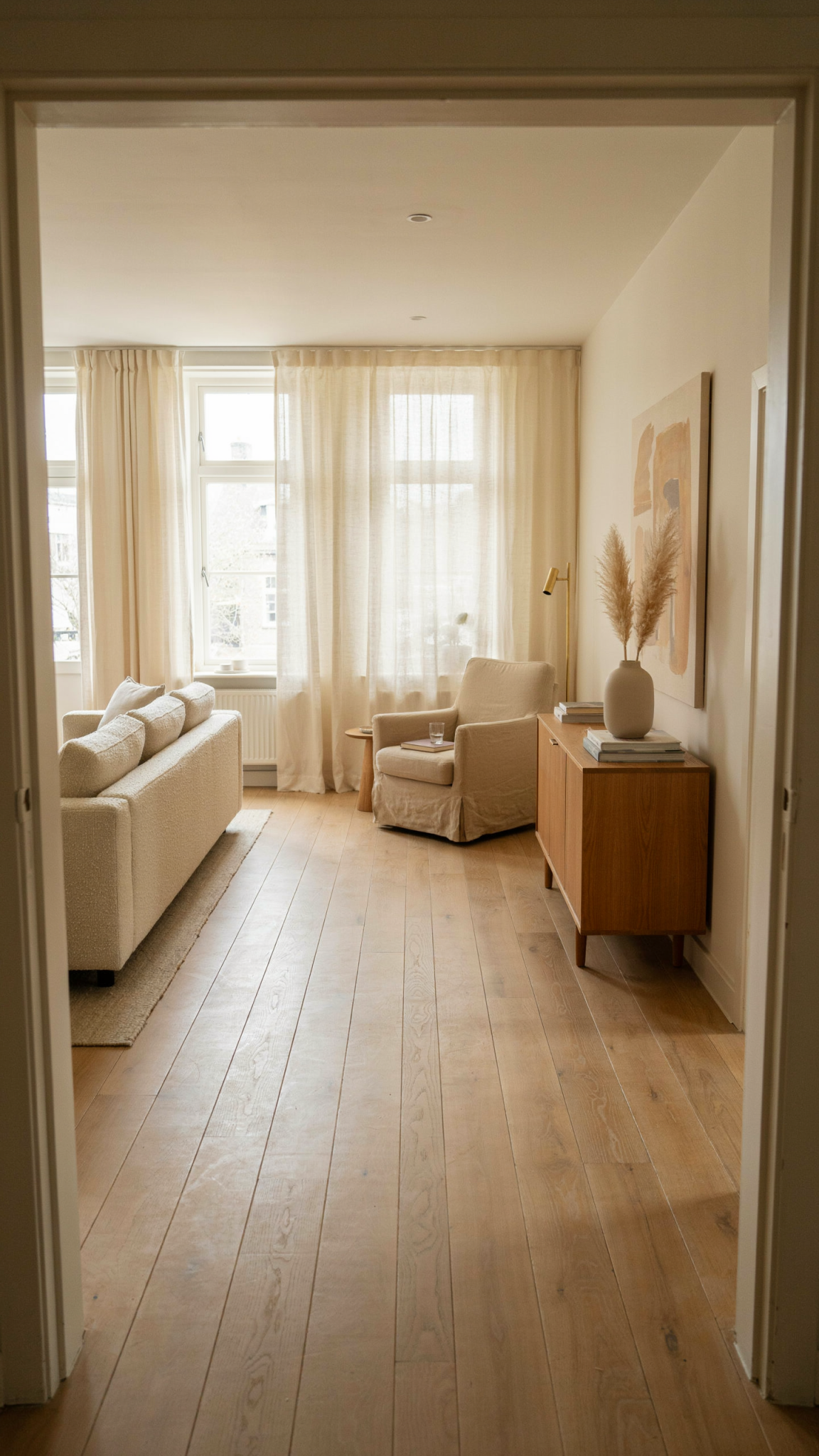
Instead of lining the perimeter, bring your furniture inward to create deliberate conversational zones. Think about how you actually use the room. If it is primarily for socializing, arrange the seating so people face each other, no more than eight feet apart. If the distance is greater, people will feel the need to raise their voices. If the room is large or long, do not feel compelled to create one massive seating area. Break it up. Create a primary zone for watching television or gathering around the fireplace, and a secondary, smaller zone, perhaps two chairs and a small table by a window for reading or intimate chats.
Establishing a focal point is crucial. Every room needs a star of the show. It could be architectural, like a beautiful fireplace or a large window with a great view, or it could be created, like a large piece of art or a media console. Once you identify the focal point, arrange your primary seating to acknowledge and complement it. If your sofa is facing a blank wall while the beautiful fireplace is ignored on the side, the room will feel fundamentally confused.
Equally important is traffic flow. A room feels “off” when navigating it feels like an obstacle course. You should not have to turn sideways to squeeze past the coffee table or trip over a rug edge to get to the sofa. Map out the natural pathways through the room. Are people constantly cutting through the middle of the conversation zone to get to the kitchen? If so, you need to adjust the layout to redirect traffic around the seating area, not through it. A well-designed layout feels intuitive; it guides you through the space effortlessly.
The Missing Layers: Texture, Color, and Contrast
🛒 Simple finishing touches for more character
pechpell Mid-Century Modern Boho Wall Art Set
A flexible way to add scale and visual interest to a bare wall.
As an Amazon Associate I earn from qualifying purchases.
Sometimes, the issue is not the size or placement of the furniture, but a lack of depth. A room filled entirely with brand-new, smooth, similarly finished items will always feel flat and sterile. It lacks the nuance that makes a house feel like a home. This is where layering comes in with the introduction of texture, color, and contrast.
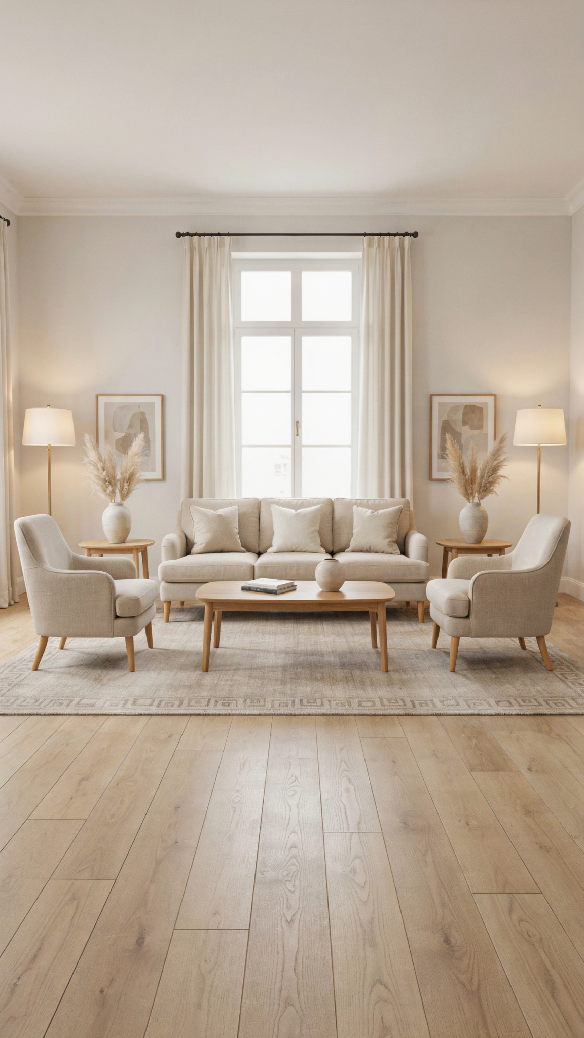
Texture is the unsung hero of interior design. It is what makes a room feel tactile and inviting. If your sofa is a smooth leather, your coffee table is polished glass, and your floors are bare hardwood, the room will feel cold. You need to introduce contrasting textures to warm it up. Drape a chunky knit throw over the leather sofa. Add velvet or linen pillows. Layer a plush, high-pile rug over the hardwood. Incorporate natural materials like woven rattan baskets, a rough-hewn stone vase, or the organic shapes of indoor plants. These textural variations catch the light differently and give the eye something interesting to explore, instantly elevating the coziness of the space.
Color, of course, plays a massive role in cohesion. If your room feels chaotic, it might be because there is no unifying color palette tying your beloved pieces together. You do not need to match everything perfectly, but there should be a thread of continuity. A helpful guideline is the 60-30-10 rule. Choose one dominant color to occupy roughly 60% of the space (usually walls, large rugs, or the main sofa), a secondary color for 30% (accent chairs, curtains, painted furniture), and an accent color for the final 10% (throw pillows, artwork, small accessories). If you have a collection of disparate furniture, using a tight, deliberate color palette for your textiles and accessories can act as the glue that holds the look together.
Contrast is equally vital. A room needs tension to be interesting. If everything is mid-century modern, the room can feel like a museum exhibit. If everything is soft and plush, it feels like a marshmallow. Mix old with new: pair that sleek, modern sofa with a vintage, weathered wood side table. Mix hard with soft: place a structured, angular metal lamp next to a slouchy, relaxed armchair. This friction between different styles, eras, and materials is what gives a room character and prevents it from feeling one-dimensional.
Lighting: The Mood Maker
You can execute the perfect layout, nail the scale, and layer textures beautifully, but if your lighting is wrong, the room will still feel off. Lighting is the ultimate mood maker, and it dramatically alters how we perceive space and color.
The most common lighting offense is relying solely on the “big light”—the overhead fixture in the center of the ceiling. Overhead lighting is often harsh, flattening the room and casting unflattering shadows. It is functional for cleaning, but terrible for creating ambiance. To make your living room feel inviting, you need to layer your lighting.
A well-designed room incorporates three types of lighting: ambient, task, and accent. Ambient lighting is the overall illumination, which can come from dimmable overheads or a series of wall sconces. Task lighting is specific and functional, like a floor lamp arched over a reading chair or a table lamp on a desk. Accent lighting highlights architectural features or artwork, like a picture light over a painting or a small lamp illuminating a dark corner.
By scattering light sources at different heights throughout the room—a floor lamp here, a table lamp there—you create pools of warm, inviting light that draw people in. Pay attention to the color temperature of your bulbs, as well. Cool, blue-toned LED bulbs can make a cozy