

Home design does not become dated simply because a style is no longer featured in every magazine. A room feels dated when its finishes, layout, lighting, or visual language no longer reflect the way people live. In 2027, that distinction matters more than ever. The most appealing homes are not necessarily the ones filled with the newest products. They are the ones that feel intentional, comfortable, adaptable, and personal.
That means you do not need to tear out a perfectly good kitchen, replace every piece of furniture, or chase every social-media trend. A few targeted changes can make a home feel current while preserving its character. The goal is not to make your rooms look like a showroom from a particular year. It is to remove visual habits that now feel overly predictable and replace them with choices that are warmer, more flexible, and better suited to real life.
Here are 10 things that may be making your home look dated in 2027 and what to do instead.
1. The All-Gray Color Scheme
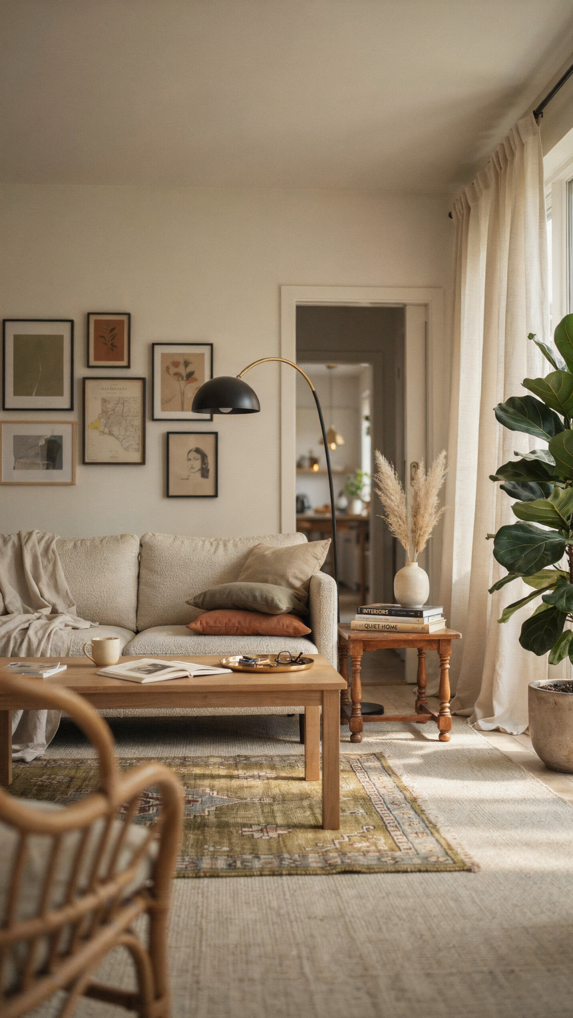
For years, cool gray was the default answer to nearly every decorating question. Gray walls, gray floors, gray upholstery, gray cabinets, and gray accessories created a supposedly safe, sophisticated backdrop. The problem was not gray itself. The problem was repetition. When every surface has the same cool undertone, a room can feel flat, impersonal, and strangely disconnected from its surroundings.
By 2027, homeowners are looking for spaces with more emotional warmth. That does not mean every room needs to be painted terracotta or saturated green. It means color is being used to create atmosphere rather than simply to avoid making a mistake. Soft mineral shades, warm whites, muted clay, mushroom, olive, tobacco, dusty blue, and complex browns can all feel calm without feeling blank.
What to do instead
Start by identifying the gray elements that are easiest to change. Paint is the obvious place, but textiles and lighting can have an even faster impact. Replace icy gray curtains with linen in oatmeal, flax, or warm white. Add a rug with cream, camel, rust, or faded blue. Swap cool white bulbs for warm, high-quality LEDs. Introduce wood, woven materials, aged metal, and natural stone to break up a monochromatic palette.
If you are ready to repaint, do not choose a color in isolation. Test large samples at different times of day, and observe them beside your flooring, trim, countertops, and furniture. A warm neutral can look pink next to one surface and yellow next to another. The best 2027 interiors are not colorless; they are layered. Even a mostly neutral room should contain several related tones and a mix of light and dark values.
2. Matching Furniture Sets
A perfectly coordinated living-room set once signaled that a homeowner had made a decisive purchase. The sofa matched the loveseat, the loveseat matched the armchair, and every piece shared the same fabric, leg shape, and finish. In practice, these sets often made rooms look smaller and less considered. They also made it difficult to replace one worn item without buying an entire new collection.
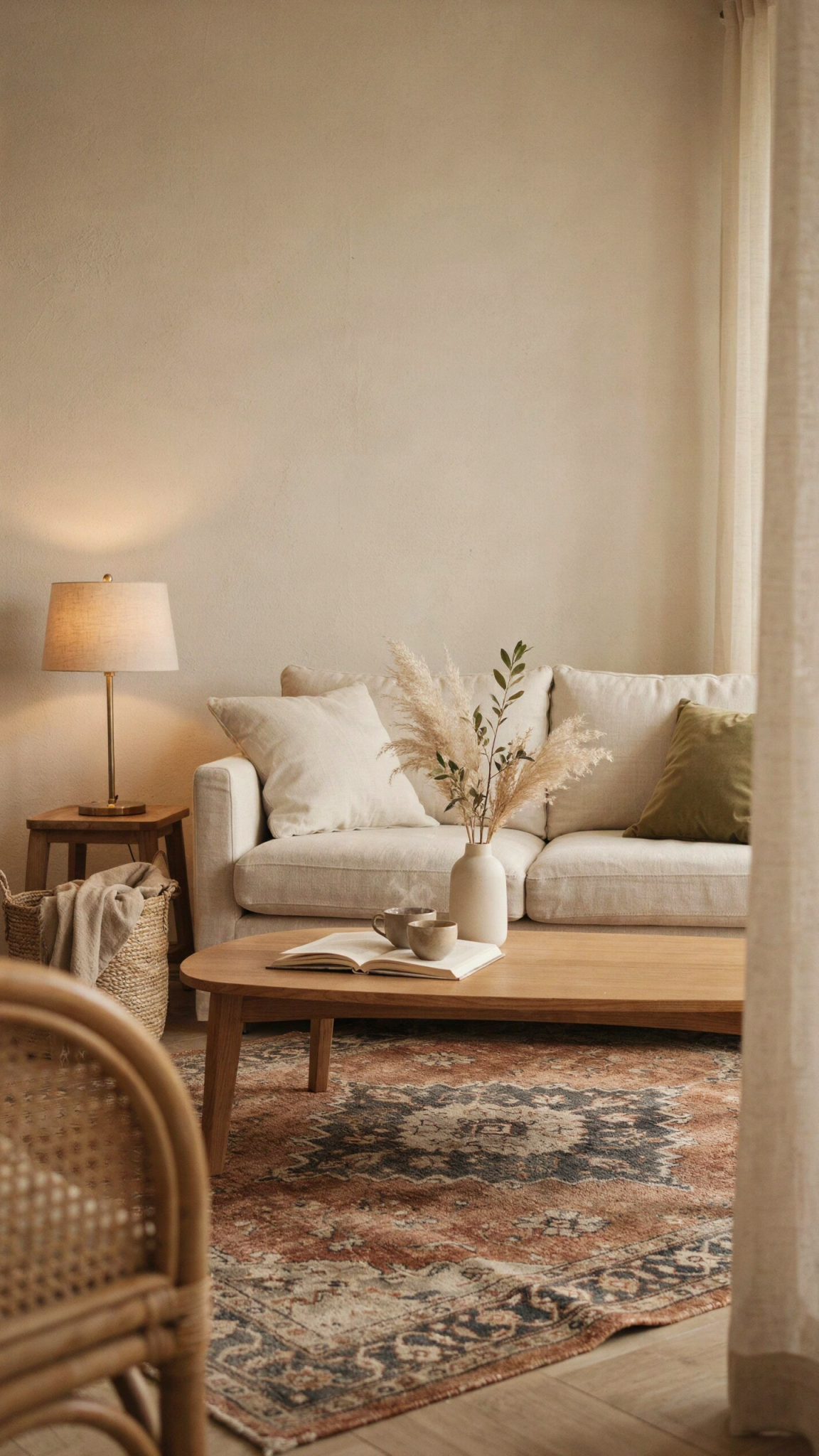
The dated feeling comes from visual uniformity. A room that contains only one furniture style can look more like a catalog page than a home. In 2027, interiors feel more current when pieces relate without being identical. The room can have a common color story or material language, but the shapes and origins should have some variation.
What to do instead
Keep the furniture that is comfortable and structurally sound. Then break up the set gradually. If your sofa and chair match, replace or reupholster just one of them. Add a vintage side table, a sculptural lamp, or a wood bench from a different period. Choose one or two accent chairs with a different silhouette but a related scale. A curved chair can soften a boxy sofa; a woven chair can add texture to a room dominated by upholstery.
Use repetition selectively. Matching cushion covers, coordinated artwork, or a shared accent color can make a collected room feel cohesive. The aim is not randomness. It is balance. Every piece should have a reason to be there, whether it contributes comfort, texture, history, contrast, or function.
A useful rule is to mix at least three visual sources: something new, something vintage or handmade, and something connected to your own life. That combination tends to feel more authentic than a room purchased in a single afternoon.
3. The Feature Wall That Looks Like an Afterthought
Accent walls are not automatically outdated. A well-designed color-blocked room or a dramatic wallpapered wall can be beautiful. What feels tired in 2027 is the random feature wall: one wall painted a slightly darker version of the room’s color, with no architectural or functional reason for the distinction.
This approach often creates an awkward visual stop. Instead of making the room feel designed, it can make the wall look like a sample board. The effect is especially weak when the chosen wall does not frame a bed, fireplace, dining area, or meaningful architectural feature.
What to do instead
If you want a stronger focal point, give the treatment a purpose. Wrap a color around all four walls to create a cocooning bedroom or reading nook. Use wallpaper to define a small entry, powder room, or dining area. Paint the ceiling as well as the walls when you want a more immersive effect. If you have a fireplace, built-in shelves, or a prominent headboard wall, use that feature to establish the natural boundary.
You can also create emphasis through materials rather than a single contrasting paint color. Consider limewash, paneling, fabric, a gallery wall, a full-height curtain, or a large piece of art. A focal point should draw the eye while contributing to the room’s architecture.
Before adding a bold treatment, ask what the room is trying to do. If the answer is “nothing in particular,” solve the layout and lighting first. A dramatic wall cannot compensate for furniture that blocks circulation or a room that has only one harsh overhead fixture.
4. Overly Short Curtains and Bare Windows
Window treatments are one of the easiest ways to reveal a room’s age. Curtains that stop several inches above the floor, rods mounted directly on the window frame, and tiny panels that barely cover the glass can make ceilings appear lower and windows appear smaller. Even expensive fabric looks unfinished when it is poorly proportioned.
In 2027, window treatments are being treated as part of the architecture. They provide privacy, control glare, improve acoustics, and add softness to rooms filled with hard surfaces. They also make a home feel more finished without requiring major construction.
What to do instead
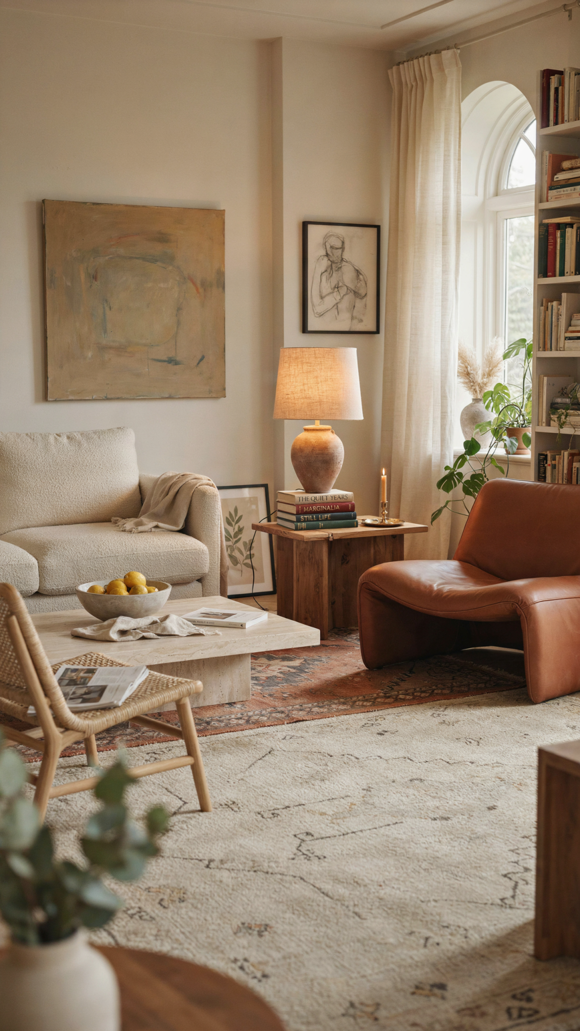
Whenever possible, mount curtain rods high and wide: closer to the ceiling than the window frame, and extending beyond both sides of the glass. This allows the curtains to frame the window rather than cover it when open. Panels should generally kiss the floor or create a very slight break, depending on the fabric and how much maintenance you want.
Use the right fullness. Thin, skimpy panels can look temporary, while generous fabric creates a more substantial effect. You do not have to choose heavy drapes. Linen blends, cotton canvas, wool, woven grass, and textured sheers can add dimension while preserving natural light.
For bedrooms, media rooms, and street-facing spaces, combine layers: shades or blinds for practical control, plus curtains for softness and insulation. If you prefer a minimal look, choose inside-mounted woven shades or simple Roman shades rather than leaving every window completely bare.
The exception is a beautiful architectural window or a view that deserves to remain unobstructed. In that case, keep the treatment quiet and let the structure do the work.
5. Builder-Grade Lighting Everywhere
A single central ceiling fixture is rarely enough to make a home feel welcoming. Yet many rooms still rely on one flush-mount light, a row of bright recessed cans, or a chandelier hung at the wrong height. This creates a room that is technically illuminated but visually flat. It also fails to support the different activities that happen throughout the day.
Lighting has become one of the clearest markers of a current home because homeowners increasingly understand that it shapes color, comfort, and mood. The dated look is not necessarily a particular fixture. It is lighting that has no layers and no relationship to how the room is used.
What to do instead
Build a lighting plan with three levels: ambient, task, and accent. Ambient lighting provides general illumination. Task lighting helps with reading, cooking, grooming, or working. Accent lighting highlights art, shelves, plants, or architectural details. A room does not need a dozen fixtures, but it should be possible to use more than one lighting setting.
Replace harsh, overly cool bulbs with warm LEDs that have good color rendering. Use dimmers wherever possible. Add table lamps, floor lamps, picture lights, under-cabinet lights, or small directional fixtures. In a kitchen, a decorative pendant can provide personality, but it should work alongside useful task lighting rather than serve as the room’s only source.
Think about the fixture itself as furniture. Oversized paper lanterns, ceramic lamps, pleated shades, alabaster, aged brass, darkened bronze, and hand-finished materials can add character. Choose fixtures for their shape and glow, not just their ability to fill an empty electrical box.
6. A Kitchen Designed Only for Photographs
The spotless, all-white kitchen with a huge island and minimal storage may photograph well, but it can feel dated when it ignores everyday life. In 2027, homeowners are more interested in kitchens that support cooking, gathering, homework, grocery storage, small appliances, and multiple people moving through the space.
The problem is not white cabinetry or a large island. The problem is a kitchen designed around appearance alone. A beautiful space becomes frustrating when there is nowhere to put a coffee maker, no landing area beside the oven, insufficient lighting, or an island so large that it interrupts circulation.
What to do instead
Prioritize function before finishes. Make sure frequently used appliances have a practical home. Include drawers where possible, because they often provide easier access than deep base cabinets. Add pullouts for pantry goods, tray storage near the oven, and a dedicated place for recycling and waste. If the kitchen is open to the living room, consider a pantry wall or small appliance station that can be closed when necessary.
For visual warmth, mix materials. Wood cabinetry, painted cabinetry, stone, tile, and metal can coexist without creating a busy look. Open shelving should be used sparingly and only where you are comfortable maintaining it. A backsplash with texture or variation can feel more timeless than a perfectly uniform field of glossy tile.
Choose hardware that is comfortable to use and proportionate to the cabinet doors. Avoid designing every surface around a single short-term trend. A well-planned kitchen will look current because it works well, not because it copies a particular social-media image.
7. The Overuse of Open Shelving
Open shelving became popular as a way to make kitchens feel airy and casual. It can still be useful, especially for frequently used dishes, cookbooks, or decorative objects. But when every upper cabinet is removed, the result can be cluttered, dusty, and difficult to maintain.
The dated feeling comes from treating open storage as a style requirement instead of a lifestyle choice. A shelf full of mismatched packaging, seldom-used appliances, and stacks that are difficult to reach does not make a kitchen feel relaxed. It makes the storage system visible without making it functional.
What to do instead
Use a strategic mix of open and closed storage. Reserve open shelves for items that are attractive, regularly used, or meaningful. Keep bulk purchases, small appliances, cleaning supplies, and visually noisy objects behind doors or in drawers. If you love the open look, install one long shelf instead of several crowded rows.
Pay attention to scale and installation. Shelves should be deep enough for the objects they hold but not so deep that items disappear behind one another. Add under-shelf lighting if the area is dim. Leave negative space around objects so the display can breathe.
You can create the same sense of openness in other ways: glass-front cabinets, a lighter paint color, a tiled backsplash that continues to the ceiling, or a carefully chosen hood. Storage should reflect how much visual maintenance you are willing to do. The most contemporary solution is the one that keeps your daily life manageable.
8. A Room Full of Small Decorations
Small decorative objects can tell a story, but too many of them weaken the story. Collections of tiny signs, miniature plants, generic vases, and unrelated accessories spread across every surface can make a home feel visually noisy. This is especially noticeable when objects are arranged in identical clusters on every shelf or table.
In 2027, decorating is moving toward fewer, more meaningful pieces. The current look is not empty minimalism. It is edited abundance: a room with personality, but enough breathing room for important objects to be seen.