Decorating a room is a lot like cooking — the magic comes from balance. A pinch too much of one element, and the entire recipe feels off. When it comes to home design, few balancing acts are trickier than mixing warm and cool tones. Too much warmth, and your space can feel heavy or dated. Too much coolness, and it can read sterile or flat. But when you find that perfect blend? The result is layered, cozy, and effortlessly sophisticated.
This guide will walk you through how to confidently combine warm and cool tones in one space — whether you’re starting from scratch or trying to make your existing pieces play nicely together.
Understanding Warm vs. Cool Tones
Before getting into the how, let’s start with the what.
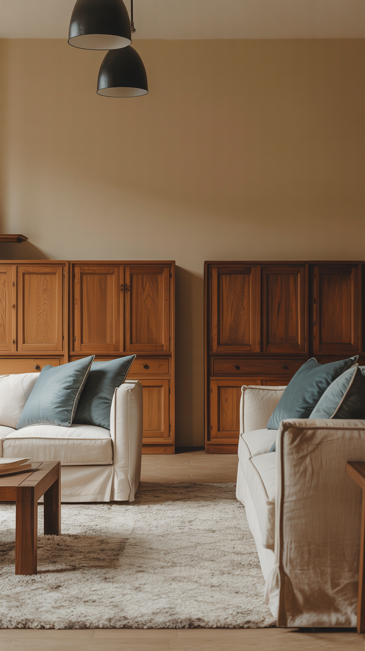
Warm tones are those that remind us of sunlight, firelight, and all things cozy — think reds, oranges, yellows, golds, beiges, and browns. They bring energy and intimacy to a room.
Cool tones, on the other hand, are calming and expansive — blues, greens, purples, grays, silvers, and crisp whites. These shades often create a sense of airiness and calm.
A well-balanced space often includes both, even if one dominates. The trick is learning how to make them complement each other, not compete.
Step 1: Choose a Dominant Temperature
Every successful space has a clear direction.
Before you start mixing, decide:
Do you want your space to feel warm and welcoming or cool and calming?
You can absolutely use both, but one should lead and the other should support.
For example:
If you love coastal vibes, choose cool tones (soft blues, whites, grays) and accent with warm touches (woven textures, brass hardware, beige throw pillows).
If you’re drawn to earthy boho interiors, lead with warm tones (terracotta, taupe, rust) and balance them with cool grays or greens.
Think of your dominant temperature as the “main character” and the opposite tone as the “supporting role.”
Step 2: Use Neutrals as a Bridge
Neutrals are your secret weapon when mixing warm and cool tones. They act like translators, helping one side speak the other’s language.
Some neutral bridge colors include:
Greige: a mix of gray (cool) and beige (warm)
Taupe: soft and flexible with undertones that shift depending on lighting
Soft white: with just a hint of warmth to keep a space feeling balanced
Natural wood: adds organic warmth even in a cooler palette
Example:
A room with cool gray walls can instantly feel cozier with a warm oak sideboard and creamy linen curtains. The neutral tones keep the look cohesive.
Step 3: Bring in Natural Elements
Nature does this balancing act perfectly — think of a mountain landscape with cool stone and warm sunlight.
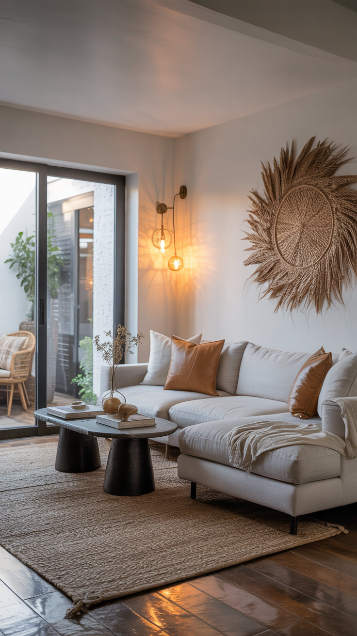
In design, wood, leather, linen, and plants can all help soften hard edges and warm up cooler tones.
Try this combo:
Cool blue-gray walls
Warm walnut furniture
A jute rug
Olive-green plants
These touches keep the space grounded while preventing the palette from feeling flat or cold.
Step 4: Balance Through Lighting
Lighting can completely change how colors appear in your space.
Natural light tends to pull cooler during the day and warmer in the evening. Artificial lighting, meanwhile, varies in color temperature — from soft white (warm) to daylight (cool).
Tips:
For a room with mostly cool tones, use warm bulbs (around 2700–3000K) to add coziness.
For a space heavy on warm tones, neutral or daylight bulbs can freshen and modernize the feel.
Mix light sources: a warm-toned lamp, cool daylight through windows, and candles for evening ambiance.
Lighting is often the final ingredient that makes a warm-and-cool palette feel intentional.
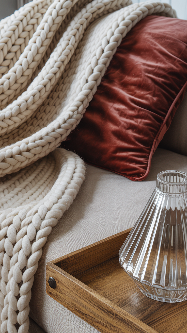
Step 5: Use Texture to Add Warmth (or Coolness)
Texture affects how we feel color, even without changing the actual hue.
Rough, nubby, or organic textures tend to feel warmer, while sleek, smooth, or reflective surfaces lean cooler.
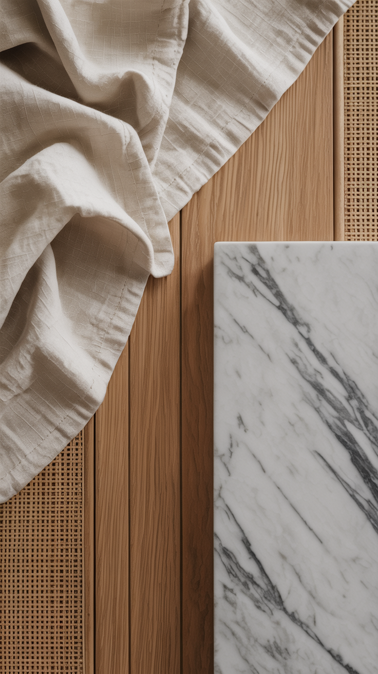
Warm textures: wicker, wool, linen, velvet, unfinished wood
Cool textures: glass, chrome, marble, concrete, silk
If your space feels too sterile, add a chunky throw or woven basket.
If it feels too heavy, introduce a glass coffee table or shiny metal lamp to lighten it visually.
Step 6: Play With Proportion
The 80/20 rule works beautifully here: let 80% of the space reflect your dominant tone and 20% contrast to keep it interesting.
For example:
In a warm living room with beige walls and oak furniture, add a few cool-toned accents like blue pillows or a charcoal rug.
In a cool, modern kitchen with white cabinets and marble countertops, balance with warm brass hardware or rattan barstools.
That small proportion of the opposite temperature adds depth and keeps the room from feeling one-note.

Step 7: Consider Undertones Carefully
Even within “neutrals,” undertones can make or break your palette.
For instance, a gray with a purple undertone might clash with a warm beige.
When choosing paint or fabric, always compare samples side-by-side in your actual lighting conditions.
Pro Tip:
Line up swatches and look for subtle shifts — a “cool” beige might look peachy next to a true gray, or a blue-gray might lean green under warm bulbs.
Real-Life Examples
Let’s put all this into context with three examples you can adapt for your own home.
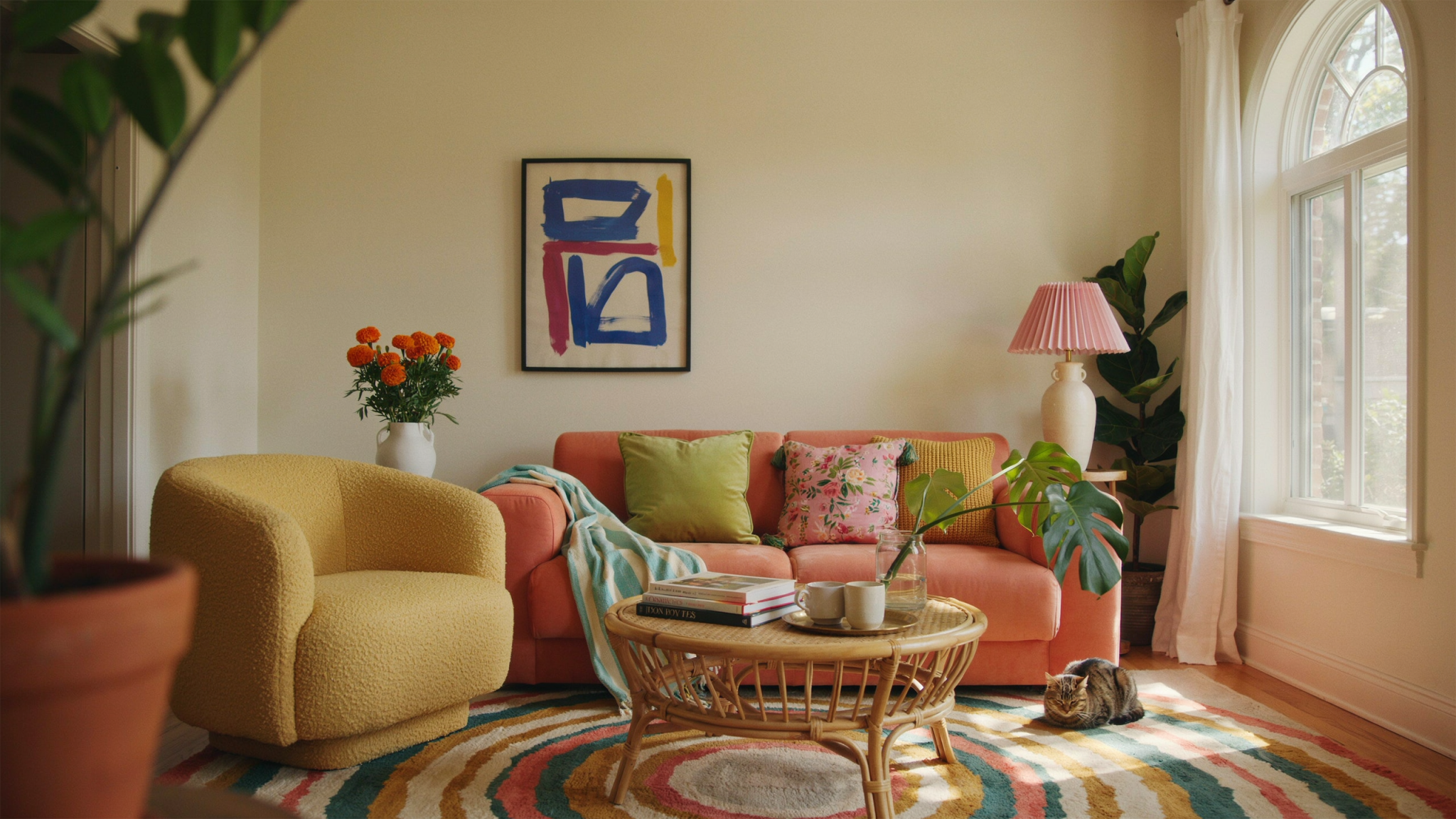
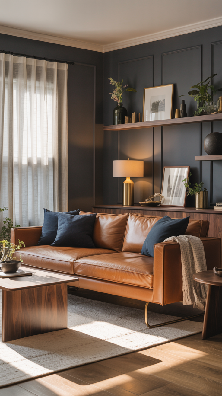
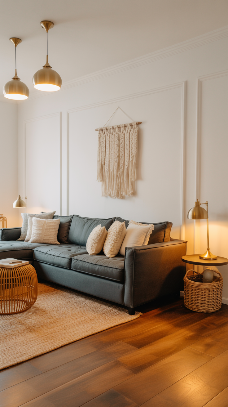
1. The Cozy Modern Living Room
Palette: Warm gray walls, navy sofa, tan leather chairs, brass accents
Why it works: The navy adds calmness, while the tan and brass introduce warmth. The gray bridges the two seamlessly.
2. The Light & Airy Bedroom
Palette: Cool white bedding, sage green walls, oak nightstands, linen drapes
Why it works: Cool greens promote relaxation, and warm oak balances the palette with natural texture. The linen keeps everything feeling organic and soft.
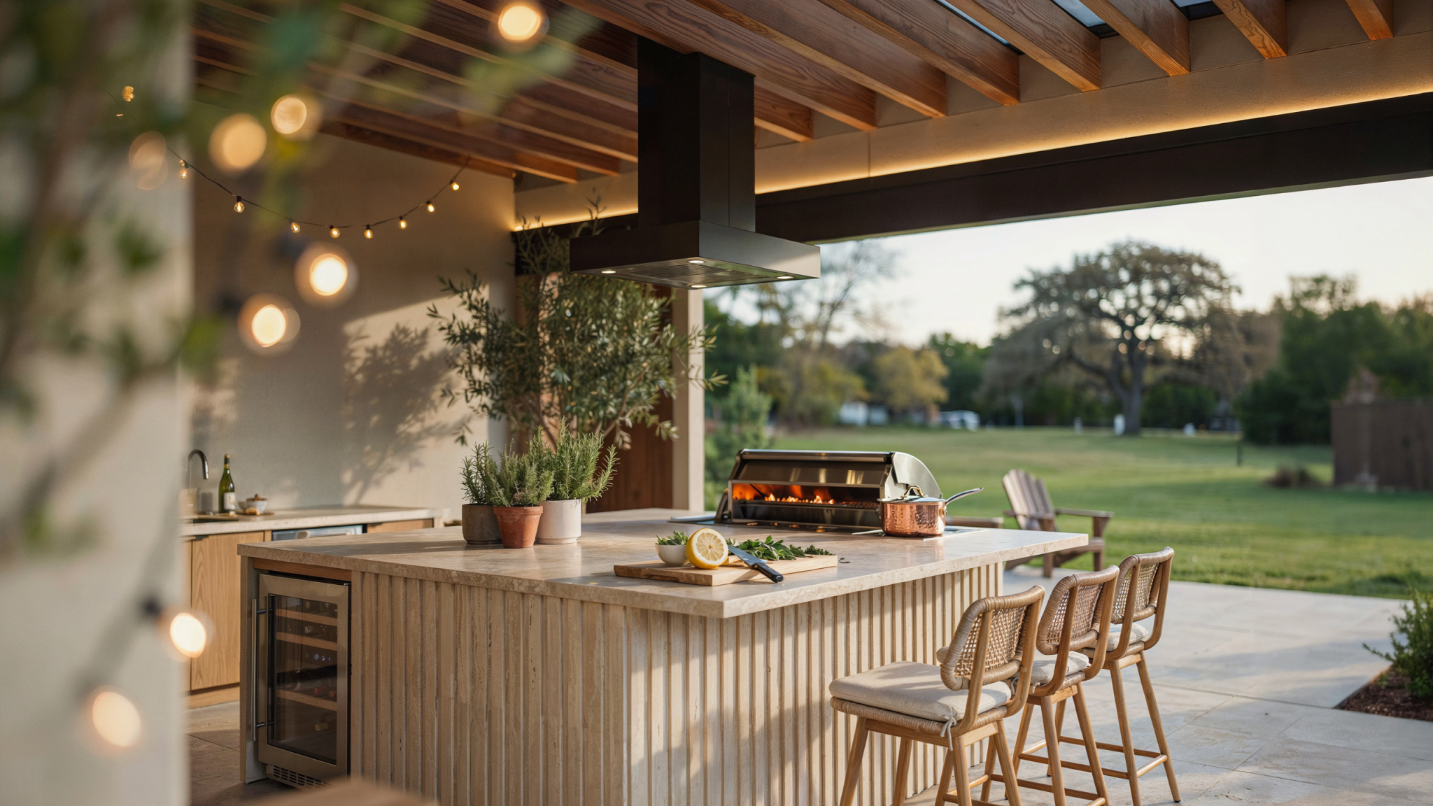
3. The Balanced Kitchen
Palette: White cabinetry, gray marble counters, matte black hardware, warm wood floors
Why it works: The mix of finishes — sleek cool surfaces with earthy flooring — creates a timeless equilibrium.
Step 8: Start With What You Have
If you’re not doing a full remodel, look around your room. What’s already setting the tone?
Dark wood floors? Warm.
Gray sofa? Cool.
Creamy trim? Warm.
Black fixtures? Cool.
Once you identify your room’s base temperature, you can layer in the opposite tone for contrast.
Example:
If your home has cool gray walls, try adding warm brass frames or a terracotta vase to soften the look.
If you have a lot of warm tones (like tan or cream), introduce cool navy pillows or pale gray curtains for visual balance.
Step 9: Create a Color Story
Think of your color palette as a story with a beginning, middle, and end.
Beginning: Your base color (walls, flooring, main furniture)
Middle: Your accent tones (pillows, curtains, decor)
End: Finishing details (hardware, artwork, lighting)
Each should echo either a warm or cool element — but make sure every hue ties back to your dominant temperature.
You can use online palette tools (like Coolors or Canva’s color wheel) to visualize combinations. Try pairing opposites intentionally: navy + tan, blush + gray, forest green + brass.
Step 10: Repeat Colors Strategically
Repetition builds cohesion. If you introduce a warm gold mirror, repeat that warmth in a lamp base or picture frame.
If you add a cool navy throw, repeat it in artwork or a patterned rug.
Repeating tones 2–3 times across the room helps the mix feel deliberate instead of random.
Bonus Tip: Let Art Do the Talking
Artwork is one of the easiest ways to bridge warm and cool tones.
Look for pieces that already combine both — like a landscape with warm sunlight and cool shadows, or an abstract print featuring blush and blue-gray.
When your art naturally blends both temperatures, it anchors the entire palette.

Common Mistakes to Avoid
Even pros sometimes misstep when mixing tones. Here are three pitfalls to steer clear of:
Mixing clashing undertones.
Always test samples together before committing.Ignoring lighting.
The same wall color can look completely different morning to evening.Not repeating tones.
A single warm element in an otherwise cool room can feel out of place — repeat it elsewhere.
Quick Fix Guide
If your space feels…
Too cold:
Add texture, warm metals, or natural materials (wood, leather, rattan).
Too warm:
Bring in cooler accents — blues, grays, silvers — or crisp white decor.
Flat or boring:
Layer both warm and cool tones intentionally; contrast creates visual interest.
The Takeaway
Mixing warm and cool tones isn’t about getting every shade perfect — it’s about creating a feeling.
You’re crafting a space that feels both cozy and balanced, timeless yet dynamic.
Start small: add a warm throw to a cool sofa, hang art that bridges both worlds, or swap out light bulbs for a softer glow. Over time, you’ll train your eye to see how colors play off each other naturally.
The goal isn’t perfection — it’s harmony. When warm and cool elements coexist, your home feels layered, thoughtful, and uniquely yours.