Interior design trends often rise quietly—subtle changes in texture, a new take on minimalism, or a fresh color palette. But every now and then, a trend bursts onto the scene with the power of a viral meme, shaking up the norms and rewriting the rules. One such trend making waves in 2025 is the “Unexpected Red Theory,” a concept that began gaining traction on TikTok in early 2024 and continues to influence design choices in homes across the world.
What Is the Unexpected Red Theory?
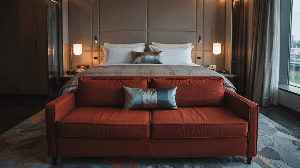
Coined by interior designer Taylor Migliazzo Simon, the Unexpected Red Theory proposes a bold yet simple idea: Adding a random red element to a room—regardless of the existing color scheme—makes the space more visually interesting.
Think of it like this: a navy blue living room with cream accents suddenly becomes elevated with the addition of a cherry-red vase or crimson throw pillow. A beige-toned kitchen? Add a scarlet bar stool, and suddenly it pops. The idea challenges conventional design wisdom, which often prioritizes harmony and cohesion. Instead, the Unexpected Red Theory embraces contrast—and it works.
How It Went Viral
The trend caught fire on TikTok when designers and influencers began showcasing rooms that incorporated a splash of red in unconventional places. Videos tagged with #UnexpectedRedTheory racked up millions of views, with users commenting on how one simple change could transform an entire room. The platform’s bite-sized, visual-first content format made it easy to showcase the before-and-after effects of red accents, making it a perfect breeding ground for viral design trends.
In a social media landscape craving novelty and boldness, the Unexpected Red Theory stood out. It was daring yet achievable—something anyone could try at home without a full-scale renovation.
The Psychology Behind the Color Red
Red is a powerful color. In psychology, it’s associated with energy, passion, urgency, and attention. This is why it’s often used in marketing and warning signs—red demands to be noticed. In interior design, it acts the same way.
When a red object is placed in a room dominated by neutrals, it becomes a focal point. It invites the eye, creating a visual anchor that adds a sense of depth and dynamism to the space. The beauty of the Unexpected Red Theory is that it leverages this effect without requiring an entire red color palette.
Even in color theory, red is known for advancing—appearing closer than it really is—while cooler colors like blue tend to recede. This makes red perfect for creating dimension and layering in interior design.
Red also evokes strong emotional reactions. It’s the color of romance, energy, courage, and even appetite—making it an ideal choice for high-traffic or social spaces like living rooms, kitchens, and dining areas. This may explain why the trend continues to resonate beyond aesthetics—it subtly taps into human emotion.
Designers Embracing the Trend
What started as a TikTok challenge is now being embraced by serious interior designers, decorators, and even major retailers.
- Studio McGee recently released a limited collection featuring red ceramic vessels and statement lamps.
- Anthropologie and West Elm have both leaned into the trend, offering throw pillows, area rugs, and tableware in bold shades of red.
- Luxury design magazines such as Architectural Digest and Elle Decor have featured homes that apply this theory with precision, from red Eames chairs in Scandi-modern spaces to vintage Persian rugs with red detailing in minimalist bedrooms.
Designers like Athena Calderone and Emily Henderson have spoken about the theory’s usefulness in adding life to otherwise muted spaces. For homeowners who fear overcommitting to color, this trend provides a low-risk, high-reward design solution.
The Role of Red in Cultural Symbolism
Red is not just a color—it’s a cultural statement. In many societies, red symbolizes celebration, vitality, and luck. In Chinese culture, for example, red is associated with prosperity and good fortune. In India, it represents purity and sensuality. Western cultures often link red with love and power.
These cross-cultural meanings give the Unexpected Red Theory even more emotional depth. When you place a red object in a space, you’re not just playing with aesthetics—you’re tapping into centuries of symbolic value. The universal recognition of red as a color that means something helps explain why its presence can so powerfully transform a space.
Unexpected Red in Commercial and Public Spaces
While the trend gained traction in residential design, it’s also being adopted in hospitality and retail spaces. Boutique hotels are integrating bold red elements into their lobbies to create strong first impressions. Cafés and co-working spaces are using red chairs or fixtures to energize and draw focus.
A well-known example is a New York boutique hotel that recently renovated its lobby with all-neutral furniture—except for one sculptural crimson bench. The hotel’s designers reported that the bench not only became the most-photographed feature of the space, but also served as a powerful orientation point that helped guests navigate the layout.
Retailers are taking note, too. Pop-up shops and display windows now use red strategically to guide foot traffic or highlight key products. The lesson? Red doesn’t just add visual interest—it can drive behavior.
Unexpected Red in Seasonal Decor
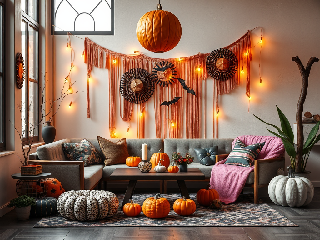
The versatility of the Unexpected Red Theory also extends to seasonal decorating. Red has long been associated with holidays like Christmas and Valentine’s Day, but the theory modernizes its use beyond these traditional associations. In spring, a red tulip arrangement adds vibrancy to an entryway. In fall, a crimson throw layered over a leather chair brings warmth and depth.
What makes this application so compelling is how red can act as a bridge between seasonal palettes. For example, pairing red with gold accents in the winter can feel festive and luxurious, while combining it with white and blush tones in the summer keeps things feeling fresh and playful.
In this sense, the Unexpected Red Theory becomes more than just a trend—it becomes a year-round design tool.
How the Trend Aligns With Sustainable and Budget-Friendly Design
One of the most compelling aspects of the Unexpected Red Theory is its accessibility. At a time when inflation and supply chain issues are affecting renovation budgets, homeowners are searching for affordable ways to update their spaces. Instead of investing in expensive makeovers, they can simply add a red mirror, cushion, or light fixture to breathe new life into a room.
Even better, this trend plays well with secondhand shopping and upcycling. Vintage red objects—from retro stools to ceramic cookware—are readily available at thrift stores and flea markets. Not only does this make the trend sustainable, but it also reinforces the idea of adding character and uniqueness to a space.
Tips for DIY Designers: Making Red Work for You
If you’re eager to try the Unexpected Red Theory in your own home but don’t know where to start, here are a few tips to guide your process:
- Pick Your Moment: Choose one spot in your home to test the theory. This could be a bookshelf, kitchen nook, or side table.
- Avoid Matching Too Much: Let red stand alone. Its power lies in being an outlier, not a coordinated piece.
- Play With Finishes: Glossy red objects reflect light and add modernity, while matte finishes offer sophistication.
- Layer it Gradually: Add one item at a time and observe its effect before adding more.
- Consider Your Lighting: Natural light brings out red’s vibrancy, while dim lighting can make it feel cozy and dramatic.
- Use Red in Unexpected Materials: A red metal bar stool or a red lacquered tray can bring texture and color together in a bold new way.
The Element of Surprise: Why Red Captivates Us
One of the reasons the Unexpected Red Theory has resonated so strongly is because it taps into a fundamental principle of great interior design—surprise. A well-designed space doesn’t just function well or look beautiful; it captivates. And few things capture attention like something you didn’t expect to see.
Pops of red introduce an element of unpredictability that delights the eye. In a sea of beige, taupe, or monochrome, a sudden splash of ruby or crimson feels like a twist in the narrative. It disrupts visual monotony and gives a room personality. This surprise factor isn’t just whimsical—it’s deeply engaging. It causes a double-take. It invites curiosity. And most importantly, it feels alive.
In interior design, this element of surprise adds depth, layers, and a sense of discovery. Much like a statement piece of jewelry or a bold accessory in fashion, red says, “there’s more here than meets the eye.” It encourages exploration, reflection, and emotional response—all marks of good design. That’s why red, when used unexpectedly, doesn’t just look interesting—it feels intentional.
Red in Art and Architecture: A Timeless Influence
The use of red to captivate and inspire isn’t new. In fact, red has held a prominent place in art and architecture for centuries. From Renaissance paintings to Bauhaus buildings, red has consistently been used to provoke emotion, emphasize importance, and guide the eye.
In classical art, red was often used to signify power, divinity, or passion. Artists like Caravaggio and Titian used rich crimson robes and backgrounds to frame central figures, directing the viewer’s gaze and deepening the drama of a scene. In Chinese and Indian art, red pigments—made from minerals or insects—were painstakingly applied to murals and textiles to invoke spiritual or celebratory meanings.
Architecture has also used red with intention and symbolism. The terracotta temples of ancient India, the red brick industrial buildings of the 19th century, and the bold red facades found in mid-century Scandinavian design all share a common thread: red demands attention. It asserts presence.
Today, contemporary architects and designers use red not only for its symbolism but for its ability to activate space. A red accent wall or sculptural feature can define zones, break up monotony, and add energy to otherwise utilitarian structures. It’s proof that red’s power in design isn’t just a trend—it’s a timeless tool of expression.

Looking Ahead: Is Red Here to Stay?
As with any trend, the question becomes: will it last? While some internet trends are fleeting, the Unexpected Red Theory seems to be building real design momentum. Its accessibility, emotional resonance, and versatility make it more than just a flash in the pan.
Design schools are beginning to reference the theory in coursework. Influencers are launching entire product lines inspired by it. Some brands are even marketing their red home goods as “Unexpected Red Approved.” These are clear signs that the theory has moved beyond viral hype into long-term design relevance.
Moreover, the popularity of red opens doors for similar movements. Could we see an Unexpected Blue or a Surprise Yellow theory next? Red might just be the gateway for more expressive, rebellious uses of color across all design disciplines.
In a time when people are craving authenticity and boldness, the Unexpected Red Theory offers both. It’s a trend that’s easy to adopt, fun to experiment with, and rooted in both visual science and personal expression. Whether you’re a design professional or just someone looking to update your space, adding a touch of red might be the design hack you never knew you needed.
So go ahead—buy that crimson lamp or that ruby vase. You might just fall in love with the unexpected.