There’s a quiet revolution happening in design — one painted not in shades of beige or stone, but in unapologetic red, blue, and yellow. After years of minimalism’s hold — the white walls, the creamy neutrals, the calming monotony — homeowners are craving something else entirely: joy.
And in a post-pandemic world where our homes have become both refuge and reflection, that joy is arriving in the form of color. Also, while I’ll be focusing on just color today in regards to the aesthetics of joy, I highly recommend checking out the book Joyful: The Surprising Power of Ordinary Things To Create Extraordinary Happiness!
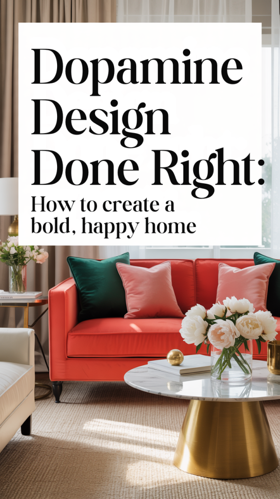
Back to joy in the form of color, we’re calling it Primary Play — an evolution of the “dopamine décor” movement that’s less about chaos and more about confidence. It’s design that embraces boldness with intention. It’s playful but not juvenile, structured yet free, rooted in nostalgia and optimism. It’s about giving yourself permission to feel something again when you walk into a room.
The Return of Joyful Color
Minimalism had a purpose. For years, our visual world was cluttered — with social media noise, with fast fashion, with too much everything. The minimalist aesthetic promised calm and clarity. It worked… for a while. But after nearly a decade of white oak, greige walls, and boucle sofas, a collective boredom set in. People began craving vibrancy, soul, and story again.
The shift started subtly. A cobalt blue vase on a neutral shelf. A sunny yellow throw on a linen sofa. Then, a cherry-red coffee table suddenly felt daring — even exciting. What began as accent color is now taking center stage.

Color isn’t just decorative — it’s emotional. The moment you see a saturated hue, your brain responds. Red increases energy and confidence. Blue calms the nervous system. Yellow literally triggers the part of the brain that processes happiness. This isn’t coincidence — it’s biology.
That’s what makes Primary Play so powerful. It’s not about aesthetic rebellion; it’s about emotional restoration. It’s a mood reset, one wall, pillow, or piece of art at a time.
What Is “Primary Play”?
Primary Play is a design philosophy rooted in three things: color, confidence, and curiosity.
It’s the home version of finger-painting without the mess — a space that invites experimentation, laughter, and lighthearted creativity. The palette leans bold but simple: red, yellow, blue — the colors that defined our earliest understanding of joy. They’re elemental, universal, and surprisingly sophisticated when handled with restraint.
Where dopamine décor is about explosion — think maximalist rooms bursting with every shade imaginable — Primary Play has rhythm. It’s Bauhaus meets playground. It’s structured playfulness, an echo of 1980s Memphis design with a modern sensibility.
In practice, Primary Play can look like:
A cobalt blue velvet sofa in an otherwise white living room.
A mustard yellow door that greets guests with sunshine.
A red lacquered stool tucked into a neutral kitchen.
A trio of colorful pendant lights hovering over a dining table.

These pops don’t compete — they converse. The room feels confident, not cluttered.
Why Now? The Cultural Shift Toward Bold
There’s something deeply emotional about our pivot toward color. The world feels heavy, and neutral minimalism — once a soothing escape — now feels eerily silent. Design, at its best, reflects our collective psyche, and right now, we’re yearning for hope, energy, and play.
Social media trends reveal it clearly: searches for colorful home décor, dopamine decorating, and maximalist design are at record highs on Pinterest. Even traditionally neutral brands are introducing bolder color stories — mustard, emerald, cherry, cobalt.
But it’s not just about trend-chasing. It’s about reclaiming joy as a design value.
Color is no longer seen as “risky.” It’s seen as healing.
The Gen Z influence can’t be ignored either — they’ve redefined what taste means. For them, design isn’t about perfection; it’s about authenticity and play. Mixing red and pink isn’t a faux pas; it’s a power move. Their spaces are expressive, experimental, and unafraid of contradiction — a refreshing contrast to millennial minimalism’s quiet control.
How to Bring Primary Play Into Your Home
Primary Play isn’t about painting your entire house red, blue, and yellow (unless you want to). It’s about energy. You can embrace it in subtle or statement ways, depending on your comfort level.
Let’s explore by space:
Living Room: The Color Anchor
Start with one hero hue. Maybe it’s a cobalt armchair, a cherry-red side table, or a bold art print that commands attention. Once you have that anchor, let the rest of the room breathe. Keep your foundational pieces — sofa, rug, walls — neutral, but bring life through accessories and artwork.
Mix textures. A smooth lacquered table looks even richer beside a nubby woven throw. Add pops of color at different heights — a vase on the mantle, a pillow on the couch, a bright book on the coffee table. The effect is dynamic but balanced.
Lighting matters, too. A brass or colorful lamp base can add a note of joy without stealing the show.

Kitchen & Dining: Playful Functionality
The kitchen is where Primary Play really sings. Cabinets painted in cornflower blue or mustard yellow feel fresh, not childish. Add a graphic tile backsplash — checkerboard, stripe, or geometric — and suddenly your space hums with energy.
If you’re not ready for a paint commitment, start with accessories. Mix colorful dishware. Add a red kettle on your stove. Choose dining chairs in contrasting primaries for an eclectic, casual vibe.
The goal: a space that sparks conversation and appetite.
Bedroom: Color Meets Calm
The bedroom is where balance matters most. Think of it as joy meets serenity.
Start with a grounding neutral base — white walls, linen bedding, warm wood furniture. Then introduce one or two primaries strategically. A cobalt bedframe feels sculptural and serene. A red throw blanket adds warmth without visual noise.
Art plays a key role here. Abstract pieces that use broad color fields of blue, yellow, and red can anchor the room emotionally, not just visually.
The result is modern, sophisticated, and quietly playful.
Bathroom: Small Space, Big Color
Bathrooms are ideal for boldness. Their compact footprint makes them low-risk zones for experimentation.
A striped shower curtain, colorful tile, or painted vanity can transform the entire energy of the room. Primary-hued towels, a quirky mirror, or a red sconce can introduce joy with minimal effort.
Think of it like dressing up — small accessories, big mood shift.

Office or Studio: Creative Energy Zone
For creative workspaces, color directly influences focus and flow. Use blue to stimulate clarity and productivity, yellow for energy, and red for motivation.
Try a two-tone wall, color-blocked storage, or a bold art wall behind your desk. Keep lines clean so the color can shine without distraction.
This space should make you feel awake.
Balancing Bold: The Art of Restraint
Primary Play works best when balanced. Too much saturation can feel overwhelming, but the right ratios create rhythm and excitement.
Designers often follow the 60-30-10 rule — 60% neutral base, 30% complementary tones, and 10% bold accents. In Primary Play, that 10% is your pop — a red lamp, a yellow chair, a blue rug.
To maintain cohesion, repeat your accent color in small doses throughout the room. A cobalt vase on the shelf, a matching throw, a piece of art with that same tone — repetition builds harmony.
Don’t forget the importance of negative space. White, beige, or natural wood act as rest points for the eye, allowing color to command attention without chaos.
DIY & Budget-Friendly Ways to Play
You don’t need a full renovation to embrace this trend. Small projects can have massive impact.
Paint an accent chair or side table. One can of high-gloss paint in cherry red can transform a tired thrift find into a design statement.
Create color-blocked art. Use painter’s tape and leftover paint samples to make your own Bauhaus-inspired wall art.
Update textiles. Swap out throw pillows, curtains, or bedding for pieces in primary hues.
Add playful florals. A Trader Joe’s bouquet in yellow tulips or red poppies is instant color therapy.
Upgrade your lighting. A colorful lamp base or cord instantly modernizes a room.
DIY Primary Play is about curiosity — the willingness to try something bold, even if it’s temporary.
Layering Pattern, Texture & Shape
Primary Play isn’t just about color — it’s about movement.
Curves, pattern, and texture create rhythm in a room. Try pairing a round mirror with striped wallpaper or placing a sculptural lamp beside a square frame. These small contrasts make a room feel alive.
For pattern mixing, stick to simple geometry — stripes, dots, grids. Keep the palette tight (two or three colors max) to maintain coherence.
Texture adds sophistication. Think matte ceramics, velvet upholstery, linen drapes. The tactile variation keeps the space elevated and intentional.
The goal: visual play without visual clutter.
Styling for Mood: Your Personal Palette
Primary Play is emotional — and personal. Each primary carries its own mood, so consider what energy you want to invite in.
Red = Passion, confidence, courage. Best for entryways, offices, or living rooms where you want energy.
Yellow = Joy, optimism, creativity. Perfect for kitchens and social spaces.
Blue = Calm, clarity, balance. Ideal for bedrooms or baths.

You can even build a custom palette by softening or deepening primaries — terracotta instead of red, ochre instead of yellow, navy instead of bright blue. The essence remains; the tone simply matures.
Seasonally, you can shift hues: bright primaries in summer, deeper jewel tones in winter.
Primary Play Meets Real Life
You don’t have to live in an artist’s loft to make Primary Play work. The look adapts beautifully to small spaces and rentals.
In a studio apartment, choose portable color — art, pillows, throws, lamps — so you can change your scheme without painting walls.
In a family home, focus on high-touch zones like the kitchen or mudroom, where bright color feels lively, not overwhelming.
Even traditional homes benefit — a cobalt front door or cherry-red pantry can be the perfect unexpected twist.
Designers are already leaning into this shift. Scandinavian brands are pairing blonde wood with pops of cobalt. Boutique hotels are using red corridors as energetic transitions between serene rooms. Contemporary artists are influencing décor directly — from color field art to graphic wall murals.
The message is clear: joy is the new luxury.
The Emotional Payoff: Why Joyful Design Works
At its core, Primary Play isn’t just about style — it’s about emotional well-being.
Our environments directly impact our moods. Studies show that color can influence energy levels, creativity, and even social behavior. Red encourages action. Blue enhances concentration. Yellow increases serotonin and optimism.
After years of “quiet luxury” and “understated neutrals,” our nervous systems are ready for warmth again. Color reintroduces vitality into spaces that once felt lifeless.
This isn’t to say minimalism is over — it’s evolving. We’re keeping its sense of calm, but reintroducing its missing ingredient: joy.

Color as the New Calm
For years, design trends have equated calm with colorlessness. But maybe calm isn’t about beige — maybe it’s about balance.
A room can be both restful and radiant. A cobalt blue rug can ground you. A yellow kitchen can lift your morning mood. A red reading chair can spark ideas.
Primary Play isn’t about decorating for show — it’s about decorating for feeling. It’s about creating a home that mirrors the full spectrum of life — energetic, hopeful, a little imperfect, and wholly you.
Because when your environment celebrates color, it reminds you that joy isn’t something to be earned. It’s something to be designed.
A Joyful Future in Design
We’ve entered a new era of interiors — one that prizes personality over perfection. The monochrome mood boards are fading, replaced by spaces with life, warmth, and story.
Primary Play is more than a trend; it’s an emotional reset. It encourages you to step away from rules and toward resonance. To decorate not because something is “in,” but because it makes you feel something real.
Your home doesn’t have to whisper. Let it hum, laugh, even sing. Let it hold both calm and color. Let it remind you that play isn’t something we outgrow — it’s something we return to when we need it most.
That’s the essence of Primary Play: a space designed not just to look beautiful, but to help you feel alive.