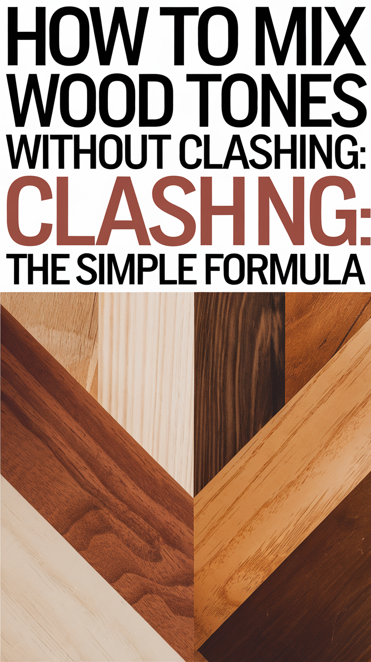
When it comes to designing a space that feels warm, inviting, and stylish, nothing beats wood furniture. But mixing different wood tones in one room? That can feel intimidating. Luckily, with a little guidance and a tried-and-true formula, you can confidently combine oak, walnut, maple, and more without your home looking like a mismatched furniture showroom. Today I want to walk you through everything you need to know to mix wood tones like a designer.
Why Mix Wood Tones in the First Place?
Monochromatic wood tones can look flat or overly coordinated. Mixing woods adds visual interest, depth, and a curated, layered look. Whether you’re going for rustic charm, modern organic, or cozy traditional, combining wood tones is key to a well-balanced room.
Some benefits of mixing wood tones include:
- Adds warmth and texture to your interiors.
- Creates contrast and depth in your decor.
- Feels intentional and collected rather than overly staged.
- Works across styles – from Scandinavian minimalism to modern farmhouse.
Designers often mix wood tones to create a “lived-in” feel that gives it patina or suggests the space has evolved over time, rather than being purchased all at once from a catalog. It makes your home feel personal, curated, and full of character.
Step 1: Identify the Dominant Wood Tone
Start by choosing one wood tone that will anchor the room. This is often the flooring, cabinetry, or a large furniture piece like a dining table or bed frame. This dominant tone will set the stage for the supporting tones.
Pro Tip: If your floors are light oak, you can use them as the base wood tone. Everything else should complement, not compete with, that tone.
You can also draw inspiration from a piece of heirloom furniture, such as a vintage hutch or antique armoire, and build your palette around it.
Step 2: Understand Wood Undertones
Every wood has an undertone – either warm, cool, or neutral. Understanding this will help you avoid clashing tones.
- Warm woods: Red oak, cherry, mahogany (orange, red, or yellow hues)
- Cool woods: Ash, maple, some oaks (gray or taupe hues)
- Neutral woods: Walnut, some white oaks (balanced, versatile)
Try to stick with woods that share similar undertones. For example, mixing cherry wood with gray-washed oak can look disjointed. But pairing cherry with warm walnut creates cohesion.
How to Check Undertones: Look at the wood in natural daylight. Does it lean yellow, red, or pink (warm)? Or does it have gray, blue, or green tones (cool)? If it feels earthy and subdued, it may be neutral.
Step 3: Create Contrast With Purpose
Contrast is your friend. Don’t try to match everything—instead, aim for a variety of tones that work together. Use contrast to create focal points.
Examples:
- Pair a dark walnut coffee table with light oak floors.
- Use a medium-tone wood dresser against a white wall and light flooring.
Avoid: Having all your furniture within one shade of wood. It can feel flat and uninspired.
If you’re nervous about too much contrast, ease into it by pairing medium woods with either light or dark tones for a balanced feel.
Step 4: Use a Balancing Element (The Bridge Piece)
A bridge piece is a wood item or element that includes multiple tones or sits between two extremes. This could be:
- A two-tone wood table
- A woven basket with both light and dark reeds
- Shelving that incorporates mixed materials
- Wall art made from reclaimed wood pieces
Bridge pieces pull everything together visually and help blend tones naturally.
This is especially helpful in open-concept spaces, where too much visual separation between tones can make rooms feel disjointed. A bridge piece creates continuity.
Step 5: Repeat Each Tone At Least Twice
Repetition is the secret to cohesion. Once you’ve introduced a wood tone, echo it somewhere else in the room so it feels intentional.
For example:
- A walnut side table + walnut picture frames
- A whitewashed wood bench + similar tones in woven blinds or accessories
It doesn’t have to be a big piece—even small accents like trays, vases, or lamp bases can help repeat a tone.
Think of it like a rhythm in music: repeated elements give your space a consistent and pleasing flow.
Step 6: Consider the Finish and Grain
Finish and grain pattern can impact how well different woods play together. You don’t want all shiny or all matte finishes, and overly busy grain patterns can clash.
Tips:
- Mix finishes (e.g., matte with semi-gloss) to create variety.
- Choose at least one smooth-grain wood and one with more texture.
- If the grains are bold, balance with solid fabrics or minimal decor.
You can also experiment with distressing techniques or stains to better match existing pieces without replacing them. Customizing finish can be a DIY project that unifies mismatched finds.
Step 7: Add a Unifying Element (Like a Rug or Paint Color)
When in doubt, unify your space with a large area rug, consistent wall color, or neutral backdrop. These design elements allow different wood tones to shine without overwhelming the space.
Neutral wall colors, creamy whites, earthy greens, or even deep charcoals can help ground your design and make the wood tones feel more cohesive.
Rugs are especially powerful. A rug that includes multiple tones from your furniture can tie everything together visually. Similarly, drapery or throw pillows can carry wood-inspired tones through soft textures.
Real-Life Room Examples
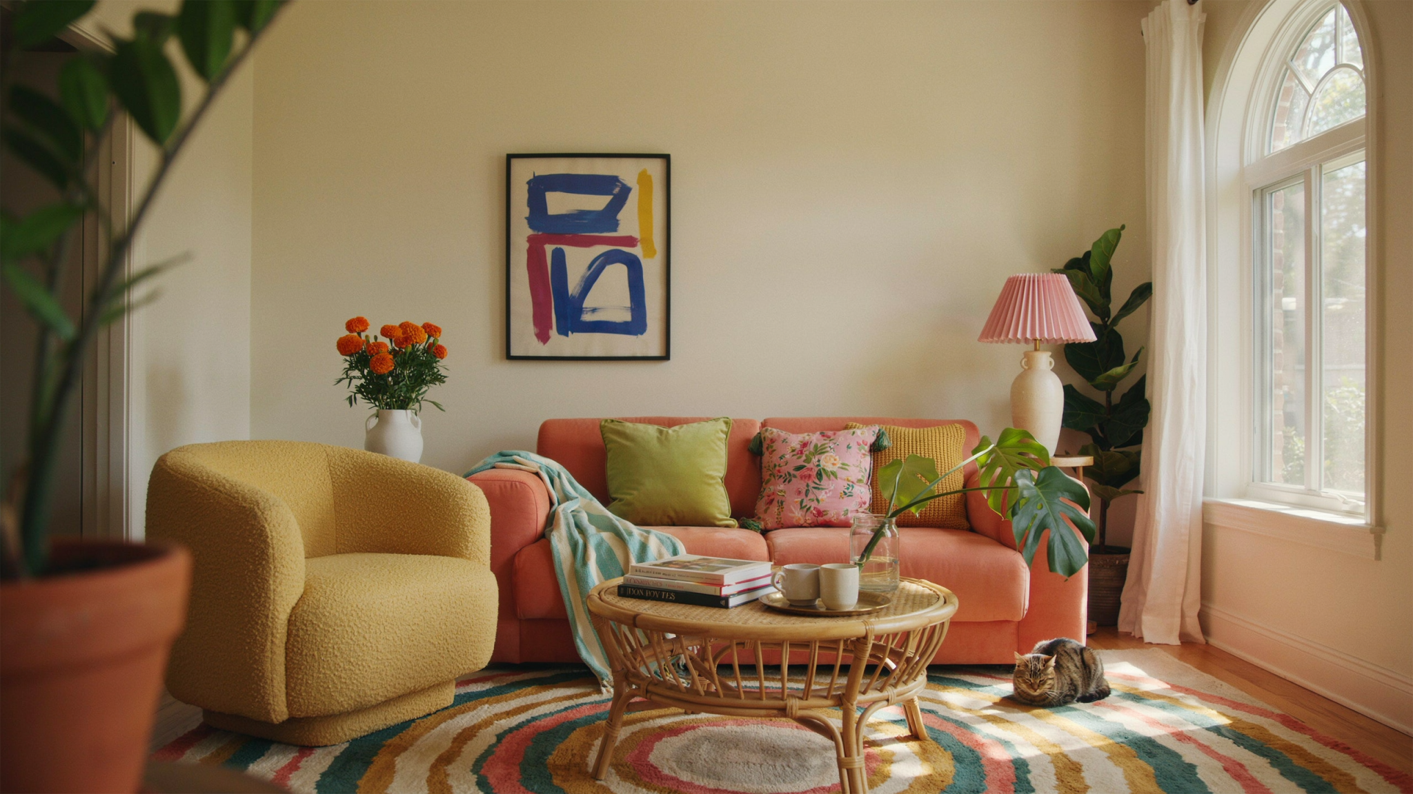
Living Room
- Dominant tone: Light oak floors
- Contrast: Dark walnut media console
- Bridge: Rattan coffee table with warm and cool tones
- Repeat: Walnut picture frames, oak lamp base
Bedroom
- Dominant tone: Walnut bed frame
- Contrast: Whitewashed pine nightstands
- Bridge: Beige linen headboard
- Repeat: Pine picture ledge and decorative bowls
Dining Room
- Dominant tone: Mid-tone acacia dining table
- Contrast: Black stained oak chairs
- Bridge: Light wood credenza
- Repeat: Acacia open shelves, wood-toned art frames
You can also look for inspiration from professional interior designers. Search terms like “mixed wood interiors” or “eclectic modern farmhouse” on Pinterest or Instagram to see real-world examples in action.
Common Mistakes to Avoid
- Trying to match everything. Wood is like denim—matching perfectly rarely works.
- Ignoring undertones. Warm + cool rarely mix well without a neutral buffer.
- Forgetting to repeat. Introduce each tone at least twice.
- Cluttering the space. Let the wood shine with simpler surroundings.
- Choosing trend over harmony. It’s tempting to go for what’s trendy (e.g., whitewashed or black-stained woods), but if it doesn’t work with your base tone, it could feel jarring.
How Lighting Affects the Way Wood Tones Look
One factor that many DIYers and even seasoned decorators overlook when mixing wood tones is lighting. Light dramatically impacts how wood appears in your space—sometimes making undertones more obvious or distorting them entirely. Understanding how lighting affects wood color and texture can help you avoid clashing tones and make smarter design choices.
Natural Light vs. Artificial Light
- Natural light tends to show wood in its truest form. If you’re trying to evaluate whether two wood tones work together, do it during the day when the room is filled with sunlight.
- Artificial light, especially warm bulbs, can cast yellow or orange tones over wood, altering its appearance. A cool wood might suddenly appear warmer, or vice versa.
Tip: Before committing to a piece of furniture or wood decor, test samples in your space at different times of the day. Observe how the tones shift under both daylight and indoor lighting.
Consider the Light Source Color Temperature
Light bulbs come in a range of temperatures, usually measured in Kelvins (K). Here’s how they affect wood tones:
- 2700K–3000K (Warm White): Adds warmth and can enhance reddish or golden woods like cherry, mahogany, and pine.
- 3500K–4100K (Neutral White): Offers balance and is generally flattering to both warm and cool tones.
- 5000K+ (Cool White/Daylight): Can accentuate cooler woods like ash or gray-washed oak, but may wash out warm woods.
Designer Tip: In mixed-tone rooms, stick to neutral white lighting to keep the tones consistent and balanced.
How Shadows Impact Perception
Dark woods, in particular, can appear even darker in shadowy corners. This makes them feel heavier and more dominant than they actually are. You might find that your dark walnut dresser looks sleek in your well-lit showroom but overly bulky in a dim bedroom.
Balance this by layering in table lamps, sconces, or uplighting that helps distribute illumination evenly.
Use Lighting to Highlight Your Best Tones
Strategically placed lighting can enhance your favorite wood elements:
- Pendant lights over dining tables draw attention to the centerpiece wood tone.
- Spotlights or under-shelf lighting can showcase shelving and balance lighter accents.
- Lamps with wooden bases serve double duty: functional lighting and tone repetition.
When to Rethink Your Lighting
If your room feels “off” even after carefully mixing wood tones, lighting might be the missing puzzle piece. Reassess the type, placement, and warmth of your light sources:
- Does your room feel too yellow or orange? Try switching to cooler bulbs.
- Are your dark wood elements disappearing? Add focused lighting to bring them out.
- Is your space too sterile? Warm lighting and texture-rich finishes can help.
Lighting isn’t just functional—it’s a tool that lets your wood mix truly shine.
Mixing Wood Tones in Small Spaces
Small spaces can feel especially tricky when it comes to mixing wood tones. Limited square footage often means fewer opportunities to layer tones gradually, making each design decision even more impactful. But with thoughtful planning, you can still create a beautifully cohesive look without making the space feel cramped or chaotic.
Start with a Neutral Base
In smaller rooms, it’s smart to begin with a neutral dominant tone—something soft and light that won’t visually overwhelm the space. Pale oak, whitewashed pine, or birch make excellent base tones. These woods reflect light and keep the room feeling open and airy.
From there, you can introduce contrast through darker wood accents such as picture frames, a small side table, or floating shelves. Because you’re working with less visual real estate, even small pieces have a big impact.
Limit Your Palette to Two or Three Tones
Unlike in larger rooms, where you can successfully blend three to four wood tones, smaller spaces benefit from a more restrained palette. Stick to two complementary tones and use them purposefully throughout the room.
For example:
- Tone 1: Light oak flooring
- Tone 2: Medium walnut chair legs and wall-mounted shelf
- Bridge element: A rattan pendant lamp or jute rug to blend the tones together
Use Vertical Space Strategically
Vertical design elements—such as tall bookcases, wall art, or curtains—can help draw the eye upward and break up blocks of wood tones. If your floor and primary furniture are different tones, you can visually balance them with mid-tone elements placed at eye level or above.
This could look like:
- A tall, narrow mirror with a warm wood frame
- Wall-mounted wooden hooks
- Floating wood shelves in a medium tone
These additions make the room feel more layered and intentional without taking up valuable floor space.
Lean on Texture for Warmth and Contrast
In small rooms, texture is just as powerful as color when it comes to creating depth. Even if you’re only mixing two wood tones, varying their finishes—like pairing a rough-sawn reclaimed shelf with a smooth matte table—can add richness and interest.
Consider these combinations:
- Smooth, pale wood bench + woven baskets with warm undertones
- Glossy side table + matte-finished headboard
- Light wood stools with black iron legs for contrast
Keep It Cohesive With Repetition
As in larger rooms, repeating each wood tone in at least two places helps keep the design cohesive. In a small space, this might mean:
- A matching wood frame on the wall and on a tabletop accessory
- Table legs and lamp base sharing the same tone
- A wooden tray or cutting board echoing the tone of a shelf or cabinet
Make Every Piece Count
In a small space, clutter is the enemy of style. Choose each wood piece with intention. Opt for furniture with open frames or legs to allow visual flow. Skip overly ornate or bulky designs in favor of clean lines that show off the wood’s natural beauty.
Also, don’t forget the power of multi-functional pieces—think storage benches, nesting tables, or a wood stool that doubles as a nightstand. These reduce crowding while still contributing to your tone mix.
Mixing Wood With Other Materials
Don’t be afraid to incorporate other natural materials like metal, stone, leather, or textiles when mixing wood tones. These elements can add structure and variety.
- Leather warms up a space and pairs beautifully with rich woods like walnut or cherry.
- Black metal offers contrast and looks great against light oak or whitewashed wood.
- Brass or gold accents can help blend warm and cool tones.
- Natural stone like marble or travertine brings balance and a timeless feel.
These complementary materials prevent the space from feeling too “wood-heavy” and add even more richness to your design.
Mixing wood tones doesn’t have to feel like walking a tightrope. With a clear plan and a few designer tricks up your sleeve, your space can feel rich, layered, and effortlessly stylish. Whether you’re tackling a single room or designing an entire home, this formula will help you master the mix with confidence.
So go ahead—embrace the beauty of variety, and let your woods work together in harmony. The result? A cozy, dynamic home that feels perfectly put together—because it is.