For decades, red and green have defined the holiday season—warm, classic, and undeniably festive. But traditions can evolve in design too! This year, designers are embracing a new kind of holiday palette—one that still feels magical but aligns with the cleaner, more curated aesthetic that’s taken over interiors everywhere.
Think soft metallics, cozy neutrals, and nature-inspired tones that complement your home’s year-round design rather than clash with it. These modern palettes are still joyful, but they’re quieter, more sophisticated, and infinitely more versatile.
Here’s what designers are swapping in for the season—and how you can use these 7 palettes to elevate your holiday decor.
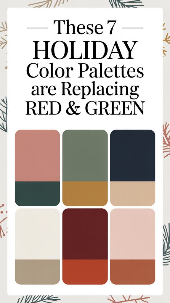
1. Winter Whites & Natural Textures
Minimal, serene, and timeless, the all-white palette has evolved beyond its “snowy” roots. Today’s take on winter whites is layered and textural—creamy off-whites mixed with raw materials and natural warmth.
Color Story: Ivory, linen, oat, soft taupe, warm white

Designer Insight:
“White-on-white doesn’t mean cold or sterile,” says designer Megan Roth, who specializes in neutral modern interiors. “It’s all about mixing tone and texture—think chunky knits, matte ceramics, linen ribbons, and bleached woods. It creates a calm, luxurious feel that lets greenery and candlelight shine.”
How to Style It:
Drape neutral linen runners and add raw-edge napkins for understated elegance.
Mix matte white ornaments with pearl or frosted finishes.
Bring in organic touches like dried citrus garlands, wood bead strands, and foraged branches.
Layer with candlelight to give depth and dimension to the monochrome palette.
This look is perfect for those who crave quiet luxury—the kind that feels like freshly fallen snow on a Sunday morning.

2. Forest Green & Soft Gold
While the classic red-and-green combo has been reimagined countless times, this year’s designers are keeping the green but ditching the red for good. Deep forest green, when paired with muted gold, feels rich yet grounded—a modern nod to tradition without the heavy contrast.
Color Story: Forest, moss, olive, antique gold, warm beige
Designer Insight:
“Green is the most versatile color in design because it already exists in nature,” says Jamie Leland, interior stylist. “Pairing it with soft gold instead of bright red allows the eye to rest—it feels luxurious, not loud.”

How to Style It:
Use velvet or suede in deep green for stockings, ribbons, or pillows.
Accent with brushed brass or aged gold metallics rather than shiny tones.
Add pine, cedar, or eucalyptus to mirror the green palette throughout your home.
Keep neutrals (like cream or beige) as your foundation to keep things feeling open and balanced.
This palette feels especially beautiful in homes with darker woods, black accents, or neutral furnishings—it enhances the richness of existing tones without overpowering them.
3. Champagne & Dusty Blush
Soft, feminine, and just the right amount of festive, this romantic color story has officially replaced rose gold as the “it” metallic moment of the holidays. Think champagne satin ribbons, blush glass ornaments, and airy florals tucked between greenery.
Color Story: Champagne, dusty blush, cream, soft gray, pale mauve
Designer Insight:
“This palette feels like a holiday soirée in Paris—elegant but not fussy,” says Tara Miles, who designs boutique-inspired homes. “The key is restraint. Use blush as an accent rather than a main character.”
How to Style It:
Choose soft gold or champagne over silver for metallic accents.
Mix velvet and silk ribbons for a layered, tactile look.
Use glass ornaments with sheer or frosted finishes to play with light.
Introduce pale pink florals—like blush roses or dried hydrangeas—for a modern romantic twist.
This palette pairs beautifully with minimalist decor styles, light oak woods, and neutral interiors—it reads festive but also feels right at home year-round.
4. Midnight Blue & Silver
For a moodier, more dramatic approach, designers are embracing deep blue hues as an alternative to traditional holiday tones. Midnight and navy blues bring depth and sophistication, while silver accents add just the right amount of sparkle.

Color Story: Midnight, navy, indigo, pewter, cool silver
Designer Insight:
“Blue feels both classic and unexpected,” notes Christopher Reed, a color consultant known for his moody palette work. “It’s reminiscent of starry winter nights—elegant but not overdone.”
How to Style It:
Wrap gifts in navy paper and tie them with velvet silver ribbon.
Incorporate blue-tinted glass ornaments or mercury glass finishes.
Use clear or silver-toned candleholders to add shimmer without warmth.
Balance the deep blues with soft white lights rather than yellow-toned ones.
This color scheme feels luxurious yet modern—perfect for anyone who prefers understated glamour over glitz.
5. Copper, Terracotta & Cream
The rise of warm, earthy interiors hasn’t skipped over holiday decor. This year, designers are pulling in sunbaked tones—think terracotta, caramel, and soft clay—to create a cozy, natural aesthetic that feels just as festive in December as it does in autumn.
Color Story: Copper, clay, caramel, cream, rust
Designer Insight:
“Terracotta has a beautiful duality—it’s rustic but also refined when paired with the right neutrals,” says Lena Collins, founder of a California-based design studio. “Add copper metallics, and it instantly feels holiday-ready.”
How to Style It:
Swap red ornaments for amber glass or copper accents.
Use linen ribbons or jute twine to keep the look organic.
Add ceramic candlesticks or hand-thrown pottery for artisanal warmth.
Layer in greenery with warm undertones like magnolia leaves or olive branches.
This palette complements warm neutrals, beige, or cream walls—and brings a grounded, cozy feeling to contemporary spaces.
6. Charcoal, Emerald & Brass
This sophisticated combination is a favorite among designers who love contrast but want something moodier and more modern than the classic Christmas mix. Charcoal grounds the look, while emerald brings richness, and brass adds refined shimmer.

Color Story: Charcoal, emerald, brass, soft white, sage
Designer Insight:
“It’s the perfect blend of moody and polished,” says David Shaw, design director at Atelier West. “The green keeps it festive, while the charcoal and brass add that modern edge.”
How to Style It:
Choose black or deep gray as your base—think napkins, wrapping paper, or vases.
Accent with brass or gold flatware for an elegant tablescape.
Add fresh greenery with deep green undertones to tie it all together.
Keep lighting warm—candles or string lights soften the darker palette beautifully.
This palette is stunning in modern homes or minimalist interiors—it delivers drama without overwhelming the space.
7. Soft Sage, Ivory & Walnut
This last palette embodies the essence of modern simplicity: calm, organic, and timeless. Sage green has been a favorite all year, and now it’s stepping into holiday decor as a subtle, nature-inspired statement.
Color Story: Sage, ivory, walnut, pale gray, honey
Designer Insight:
“Sage green bridges the gap between traditional holiday greenery and modern minimalism,” says Holly Brenner, known for her Scandinavian-inspired interiors. “It feels fresh and clean but still seasonal.”
How to Style It:
Use sage ribbon or eucalyptus garlands for understated greenery.
Layer in walnut wood tones—trays, cutting boards, or candleholders.
Choose matte ivory ceramics for a cozy but elevated look.
Keep it simple: fewer ornaments, more natural materials.
This palette feels especially harmonious in homes with light wood, stone, and neutral decor—it blends beautifully instead of standing out.
Bringing It All Together: How to Choose Your Holiday Palette
Choosing a holiday palette isn’t about following trends—it’s about finding colors that harmonize with your home’s existing design. The best palettes feel intentional, not seasonal, and can often extend into winter decor well past the new year.
Here’s how designers suggest approaching it:
Start with your home’s undertones.
If your walls lean warm (creams, tans, beiges), look to copper, blush, or champagne. For cool spaces (grays, whites, blacks), experiment with silver, blue, or sage.Limit your palette to three main colors.
More than that, and it starts to feel chaotic. The most elegant holiday designs usually stick to a trio: a base neutral, a statement tone, and a metallic accent.Play with texture, not clutter.
Layer linen, velvet, and wood to add depth. The beauty of modern holiday decor lies in its restraint—let texture do the talking.Repeat colors throughout the home.
Carry your chosen hues through garlands, gifts, and tablescapes for a cohesive look. A consistent palette feels polished even with minimal decor.Think beyond Christmas Day.
The most successful color palettes transition seamlessly into the winter months. A soft neutral base with metallic accents feels fresh long after the holidays are over.

Why Red and Green Are Taking a Back Seat
It’s not that red and green are gone—they’re just being reimagined. Designers note that today’s homeowners crave spaces that feel calm and personal, not overly themed.
Modern holiday decor is less about tradition for tradition’s sake and more about authenticity. The goal isn’t to recreate a department store display but to design a home that reflects your taste, with subtle nods to the season.
Neutral palettes, layered textures, and organic tones feel like a natural extension of the current interior trends—quiet luxury, biophilic design, and minimalist styling. The result? Spaces that glow softly instead of glitter loudly.
Designing the Modern Holiday Home
As design trends evolve, holiday styling is following suit. The new generation of festive palettes embraces warmth, simplicity, and longevity. Whether you lean toward moody midnight blues or understated sage and ivory, this season’s colors invite you to create beauty that feels personal—not performative.
The magic of modern holiday decorating lies in the mix: old traditions with fresh interpretations, timeless materials with contemporary tones, and festive moments that feel right at home in your space.
After all, great design isn’t about following every trend—it’s about knowing which ones feel like you.