
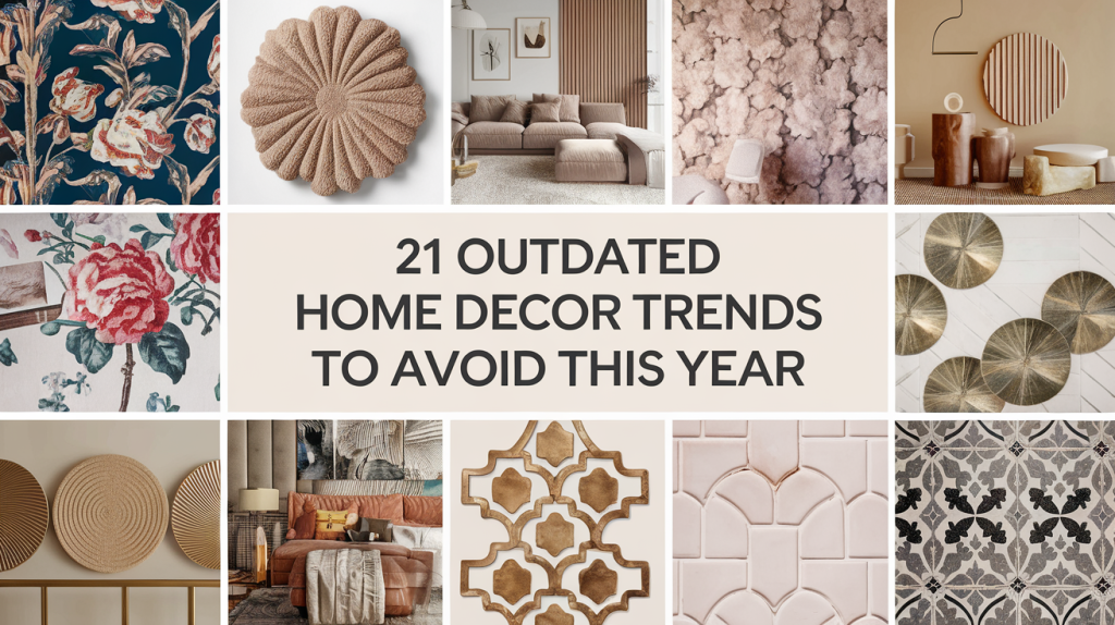
1. Gray Everything
Out: All-gray interiors feel cold and overdone.
Instead: Try warm neutrals like taupe, greige, or earthy tones for a more inviting look.
The Problem With All-Gray Interiors
For the past decade, gray was the go-to neutral. Walls, floors, furniture, and even cabinetry were drenched in 50 shades of gray (pun intended). It felt clean, modern, and safe — especially for new builds or resale value.
But now? It feels… cold. Lifeless. And honestly, kind of depressing.
Designers and homeowners are shifting away from gray because it:
Lacks warmth and emotional connection
Doesn’t play well with natural textures (unless carefully balanced)
Makes spaces feel sterile and impersonal, especially when overdone
Can clash with warmer light bulbs and make everything look dull
What to Do Instead: Warmer Neutrals & Layered Textures
Say hello to:
Greige (gray + beige)
Taupe, mushroom, ivory, and soft clay tones
Muted sage, dusty rose, or even warm terracotta
These colors feel grounded, cozy, and modern — perfect for creating a more welcoming home.
Pair those with:
Natural wood tones (light oak, walnut, rattan)
Creamy whites instead of stark ones
Textiles like linen, boucle, and chunky knits
You still get a neutral, timeless palette — but with warmth, character, and versatility.
Bonus Tip: If You Already Have Gray Walls or Furniture…
You don’t have to start from scratch. Here’s how to soften it:
Layer in warm-toned accessories — think terracotta planters, brass frames, warm-toned throw pillows.
Add natural light and swap cold LEDs for soft white bulbs.
Use wood elements to contrast the gray (like a wood coffee table or open shelving).
Try an accent wall in a warm neutral to break up the monotony.
2. Matching Furniture Sets
Out: Identical bedroom or living room sets lack personality.
Instead: Mix and match pieces with different textures, finishes, or eras for a curated, designer look.
The Problem With Matching Furniture Sets
You’ve seen it before: a perfectly matched living room or bedroom set with identical finishes, hardware, shapes, and styles — all purchased as a bundle. While this might have once been the go-to way to “furnish a room fast,” it now feels formulaic, uninspired, and a little… well, lazy.
Here’s why designers are steering away from matching sets:
It lacks personality. Instead of showcasing your unique style, it looks like a page out of a catalog.
It feels flat. Matching textures and colors across large pieces (like a bed, dresser, and nightstands) creates a monotone vibe that lacks depth or visual interest.
It limits creativity. Your space should evolve with your tastes — not be locked into one specific aesthetic.
What to Do Instead: Curated and Collected
Today’s interior design trend leans toward a layered, curated look — think of your home as a collection of pieces you’ve gathered over time, not assembled in one afternoon.
Here’s how to make it work:
1. Mix Materials and Textures
Combine wood with metal, fabric with rattan, glass with marble.
If your bed is upholstered, try wood nightstands. If your dining table is rustic wood, try mixing in metal or modern chairs.
2. Unify With Color or Tone
You don’t need everything to match, but you do need harmony.
Choose pieces that share similar undertones (like warm woods or cool neutrals), or tie them together with textiles like rugs and pillows.
3. Use Statement Pieces to Anchor the Room
Let one piece — a bold headboard, a vintage dresser, or a sculptural coffee table — take the spotlight.
Surround it with simpler, complementary items that don’t compete.
4. Blend Old and New
Contrast modern pieces with antique finds or vice versa.
Facebook Marketplace, estate sales, and vintage shops are goldmines for adding soul and character to a room.
5. Decorate with Layers
Add warmth and depth with rugs, throws, art, and lighting.
These smaller elements help create cohesion and style, even if your core furniture is varied.
Real-Life Example
Instead of buying a matching “bedroom set” with a platform bed, two matching nightstands, and a six-drawer dresser…
Try this instead:
Pair an upholstered bed with mismatched (but coordinating) nightstands — maybe one wood, one marble-topped.
Add a vintage dresser with modern hardware.
Incorporate an oversized art piece above the bed and finish with brass sconces for layered texture.
Bottom line: Matching sets are easy — but they don’t wow. Mixing thoughtfully takes more effort, but the payoff is a space that feels lived-in, intentional, and full of character.

3. Tuscan-Style Kitchens
Out: Dark wood, heavy cabinetry, and ornate details are dated.
Instead: Light, minimalist, and nature-inspired kitchens are in — think white oak, clean lines, and matte finishes.
4. Word Art Decor (e.g., “Live Laugh Love”)
Out: Overused and impersonal.
Instead: Add meaning with art, photography, or vintage finds that reflect your story.
5. Popcorn Ceilings
Out: This textured ceiling screams the ‘80s.
Instead: Smooth it out for a cleaner, modern finish — or consider adding wooden beams or subtle molding for character.
6. All-White Interiors
Out: Sterile, high-maintenance, and lacking depth.
Instead: Layer in creamy neutrals, soft textures, and warm accents to keep it cozy and current.
The Problem With All-White Interiors
For a while, “white everything” was the hallmark of minimalism and modern design — from Pinterest-perfect kitchens to farmhouse-style living rooms. It felt clean, crisp, and sophisticated… at least in photos.
But here’s the truth:
White can feel sterile — especially in spaces without texture or variation.
It lacks depth. Without contrast, your eye has nowhere to land.
It’s hard to live in. White furniture, white rugs, and white walls show everything — dirt, stains, scuffs, even sunlight damage.
It’s visually cold. In the wrong lighting (or with cool undertones), all-white rooms can feel more like a medical office than a cozy home.
It’s not that white is bad — it’s just that pure white overload is tired.
What To Do Instead: Warm Whites + Layered Neutrals
If you love light, airy spaces (and who doesn’t?), you don’t have to abandon white — just use it as a base, and layer in tone, texture, and warmth to make it feel more inviting.
1. Choose Warm-Toned Whites
Cool whites can feel harsh. Instead, go for shades like:
Swiss Coffee (Benjamin Moore)
White Dove (BM)
Alabaster (Sherwin-Williams)
Simply White (BM)
These whites have soft, creamy undertones that feel organic and fresh.
2. Add Contrast Through Materials
Instead of painting everything white — walls, furniture, curtains — bring in contrast through:
Light-toned wood (oak, maple, rattan)
Natural stone (travertine, marble)
Black or dark bronze hardware for depth
3. Layer Cozy Textures
White-on-white gets flat fast. Break it up with:
Chunky knit throws
Linen curtains
Bouclé or sherpa accent chairs
Woven baskets or natural fiber rugs (like jute)
Texture = warmth and interest.
4. Mix In Soft Neutrals
Bring in gentle shades like:
Greige (gray + beige)
Cream, sand, clay, or taupe
Pale sage or blush for subtle color
Even a hint of these tones can make your space feel more “lived in” and welcoming.
5. Use Plants and Warm Lighting
Nothing balances a white space like greenery and golden light.
Add real (or good faux) plants for color and life.
Swap harsh LED bulbs for soft white or warm Edison-style bulbs.
Use lamps with textured shades for that warm, moody glow.
Real-Life Example: From Sterile to Serene
Before:
An all-white living room with white walls, white sofa, white rug, white art. It looks bright but falls flat.
After:
The same space now has:
White walls in a warm tone (like White Dove)
A cream-colored bouclé sofa
A light oak coffee table
Linen curtains
Brass sconces
A woven jute rug and leafy plant in the corner
Suddenly, it feels intentional, inviting, and still bright — just with soul.
7. Open Shelving in Kitchens (Overdone)
Out: High-maintenance and clutter-prone.
Instead: Use a mix of closed cabinets and one or two open shelves for function and style.
8. Fast Furniture
Out: Cheap, disposable furniture isn’t sustainable or stylish.
Instead: Invest in quality statement pieces that last and tell a story over time.
9. Faux Plants (That Look Super Fake)
Out: Plastic-y, dusty greenery cheapens your space.
Instead: Use real plants or high-quality faux options with realistic textures and coloring.
10. Barn Doors (In the Wrong Context)
Out: Overused in suburban homes where they don’t match the aesthetic.
Instead: Go for hidden sliding doors or custom cabinetry if you want a space-saving solution.


11. Mosaic Backsplashes
Out: Busy glass mosaics are no longer in vogue.
Instead: Choose zellige, subway tiles, or natural stone slabs for a modern kitchen or bath.
Why Mosaic Backsplashes Are Out
Mosaic backsplashes — especially the busy glass tile kind — had their moment in the late 2000s to mid-2010s. They were often used to add “pop” or color to kitchens and bathrooms with little personality otherwise.
But in 2025, they feel:
Visually cluttered. The mix of colors and textures can make a space feel chaotic, especially in smaller kitchens.
Outdated. They’re closely tied to a specific era of design (hello, espresso cabinets and granite counters).
Hard to coordinate. Busy mosaic patterns can clash with countertops, cabinetry, and hardware, making design cohesion tricky.
Difficult to clean. Lots of grout lines = more work, especially in greasy or steamy areas like behind the stove.
They’re not necessarily ugly — just overused and not in line with today’s preference for calming, timeless spaces.
What To Do Instead: Modern, Textural, and Timeless
Want a backsplash that elevates your space without overwhelming it? Here’s what’s in:
1. Zellige Tile (Organic & Artisan)
Handmade Moroccan tiles with subtle variations in texture and tone
Slightly imperfect, glazed finish adds soul and movement without being busy
Available in soft neutrals or muted colors (sage green, blush, ivory)
Why it’s great: It adds character while still feeling clean and modern.
2. Subway Tile (But Upgraded)
The classic white 3×6 tile is always safe, but try:
Vertical stack instead of brick
Oversized subway tiles (like 4×12 or 4×16)
Matte or hand-glazed finishes
Colored grout for a contemporary twist
Why it’s great: Timeless, affordable, and endlessly customizable.
3. Full Slab Backsplashes (Minimalist Luxury)
Use the same material as your countertop (quartz, marble, or granite) to create a continuous, seamless look
No grout lines = easier to clean and more polished
Why it’s great: It screams “designer kitchen” and makes your space feel larger and more cohesive.
4. Natural Stone or Porcelain Slabs
Marble, travertine, or even realistic marble-look porcelain panels
Adds drama and movement without relying on fussy tiles
Why it’s great: Elegant and bold, perfect for modern luxury kitchens.
5. Textured Tile (Subtle Pattern Without the Chaos)
Try fluted tile, ribbed ceramic, or tiles with embossed patterns
Stick to one color, but let texture do the talking
Why it’s great: Keeps things interesting without clashing with your countertops or fixtures.
Real-Life Example: From Dated to Dreamy
Before:
A backsplash made of small square glass mosaics in a mix of gray, beige, and brown, paired with granite counters and dark cabinets.
After:
Same kitchen, now with:
Light oak cabinets
White quartz counters
A vertically stacked zellige backsplash in soft cream
Brass fixtures and warm pendant lights
The new look is fresh, calming, and layered — without being fussy.
12. Heavy Drapes
Out: Thick, ornate curtains feel dated and block light.
Instead: Opt for linen or light-filtering panels in soft, neutral tones.
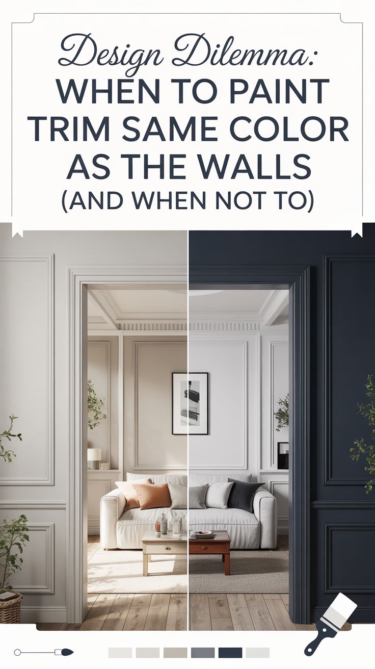
13. Accent Walls in Bold Colors
Out: A single wall in a bold hue often breaks visual flow.
Instead: Embrace color drenching or wallpaper for a more cohesive statement.
14. Shiplap Everywhere
Out: Too much shiplap can feel cliché and farmhouse-overkill.
Instead: Try tongue and groove, fluted wood panels, or limewash for subtle texture.
15. Overly Themed Rooms
Out: Nautical bathrooms or farmhouse kitchens can feel kitschy.
Instead: Pull inspiration from a theme without making it feel like a movie set.
16. Granite Countertops with Busy Patterns
Out: Bold, speckled granite looks dated.
Instead: Go for quartz, soapstone, or subtle marble-look surfaces.
17. Wall-to-Wall Carpeting
Out: Hard to clean and outdated in main living areas.
Instead: Hardwood, LVP, or tile with layered rugs for warmth and style.
18. Hollywood Vanity Lights
Out: Those bright bulbs around a mirror scream retro glam in the wrong way.
Instead: Swap for sconce lighting or backlit mirrors for a softer, elegant touch.
19. Overly Industrial Decor
Out: Cold, metal-heavy industrial styles are losing appeal.
Instead: Mix in softer elements like natural wood, textiles, and color.
Why Overly Industrial Decor is Out
The industrial look took off in the early 2010s, fueled by loft living, warehouse conversions, and that ultra-cool “Brooklyn coffee shop” aesthetic. Think:
Exposed brick walls
Edison bulb chandeliers
Black iron pipe shelving
Raw concrete floors
Leather + steel everything
At the time, it was edgy and different — a welcome break from the beige overload of the 2000s.
But now? It’s starting to feel cold, repetitive, and too masculine for many modern homes. Especially when overdone, industrial decor:
Lacks warmth and softness
Feels impersonal and unfinished
Can make small spaces feel even more rigid or cramped
Doesn’t always mesh with suburban architecture or family life
What To Do Instead: Warm Industrial or “Soft Industrial”
Rather than ditching the look entirely, modern designers are updating industrial decor by blending in natural, cozy, and organic elements to soften the edges.
Here’s how to modernize the industrial vibe:
1. Add Warm Wood Tones
Incorporate reclaimed wood shelving, oak cabinetry, or walnut furniture to offset all the metal.
Look for pieces that still feel raw or rustic — but with warmth and richness.
✅ Try this: A black metal bookshelf with live-edge wood shelves.
2. Introduce Soft Textiles
Contrast hard lines with softness through area rugs, velvet cushions, linen throws, and plush upholstery.
Bonus: These pieces also improve acoustics in echo-prone industrial spaces.
✅ Try this: A leather sofa paired with a chunky knit throw and oversized pillows in earthy tones.
3. Use Color (Sparingly but Intentionally)
Classic industrial palettes were black, gray, and brown — with maybe a red brick wall.
Update it by introducing muted greens, ochres, rust, clay, or dusty blues to warm things up.
✅ Try this: Sage green kitchen cabinets with matte black pulls and concrete-look counters.
4. Blend in Organic Elements
Add houseplants, woven baskets, clay pots, or a jute rug to bring nature into the mix.
These elements soften hard finishes and add life to the space.
✅ Try this: A monstera plant in a concrete pot on a vintage cart-turned-bar.
5. Choose Updated Fixtures & Finishes
Ditch exposed bulbs and go for modern matte black or aged brass lighting.
Swap metal bar stools for ones with a wood seat or upholstered cushion.
✅ Try this: A black-and-brass pendant over a butcher block island.
What It Becomes: “Industrial + Warm Modern”
It’s not about abandoning the character of the industrial aesthetic — just evolving it.
You can still enjoy:
Exposed beams
Black hardware
Concrete accents
But pair them with:
Soft lighting
Earth-toned textiles
Natural finishes
Curves and contrast
Real-Life Example
Before:
Concrete floors, exposed ducts, raw metal shelves, a black leather couch, and Edison bulb lighting — cool, but harsh.
After:
Same loft space now has:
The same concrete floor — but layered with a vintage rug
A warm tan leather sectional with linen pillows
A reclaimed wood coffee table with black iron legs
Brass sconces and a warm wood slat accent wall
Greenery and soft curtains to balance the harsh lines
20. Overdecorating
Out: Too many knick-knacks = visual clutter.
Instead: Embrace the “less but better” mindset — curate instead of collect.
21. Painted Chevron Patterns
Out: Once trendy, now tired and overly “DIY.”
Instead: Experiment with bold wallpaper or organic patterns for a fresh wall treatment.


One Comment
Parabéns pela matéria super explicativa e cheia de boas dicas!