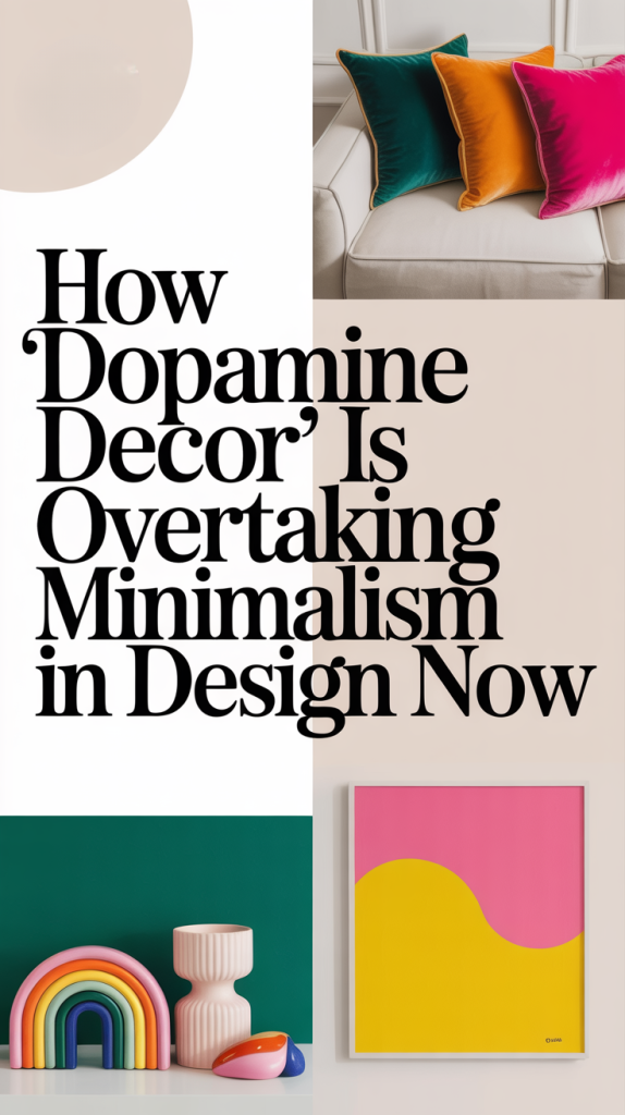
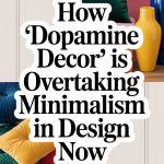
For years, the dominant home‑design aesthetic has been about restraint: soft greys, warm beiges, minimal furnishings, and a pared‑down, sophisticated look. But a fresh wave of design is rising. Enter dopamine décor — an approach to interiors that emphasizes color, pattern, texture, and personal joy. It’s the antidote to “quiet luxury,” the anti‑minimalist movement that’s gaining traction as people seek homes that feel alive.
In this article we’ll look at where this shift comes from, what dopamine décor really means, why it’s gaining momentum in 2025, how it differs from both minimalism and maximalism, and how you can bring it into your home in a way that reflects your own taste — without going overboard.
1. Why the Change? The Cultural Shift from Neutrals to Joy
The Era of Neutral Minimalism
From the 2010s into the early 2020s, neutral interiors were everywhere. Think: Scandinavian white‑washed walls, light wood, monochrome palettes, decluttered rooms. Functionality, calm, and visual serenity were the big goals. This aesthetic matched the wider cultural desire for simplicity and mindfulness. The home was (and still is) a refuge — a place to slow down.
The Emerging Fatigue of “All‑Beige”
But as life’s pace accelerated, with global uncertainty, remote work, and blurred boundaries between living and working, many homeowners began to feel that neutral palettes didn’t reflect how they felt inside. A home that’s beautifully serene can also feel emotionally flat. This shifted design thinking: people asked, “If my home is a refuge, shouldn’t it also lift me up?”
The Rise of Happiness‑Driven Design
That’s where dopamine décor comes in. The term comes from the idea of stimulating dopamine, the brain’s “feel‑good” neurotransmitter. While décor doesn’t literally deliver a drug‑like hit of dopamine, the concept is that our environments can boost mood, energy, and emotional well‑being. According to many color‑psychology experts and interior designers, vibrant colors, rich textures, playful patterns and personal touches stimulate and uplift us.
In short: instead of just reducing visual noise, the aim is to add joyful stimuli — things you love, colors that make you smile, objects that tell your story.
Social Media & the Design Movement
Social media platforms—especially Instagram and TikTok—have helped propel dopamine décor into the spotlight. Hashtags like #dopaminedecor have millions of views, and design influencers are embracing bold color, whimsical patterns, and layered textures as a way to stand out.
Search volumes for “dopamine decor” have spiked dramatically: some sources report a 200–300% increase in interest year‑over‑year.
Thus the stage is set: a cultural longing for joy, a design fatigue with neutrals, and the social‑media moment that gives us new vocabulary and visuals for “happy home.”
2. What Is Dopamine Décor, Really? Defining the Approach
Dopamine décor is defined by a few key elements:
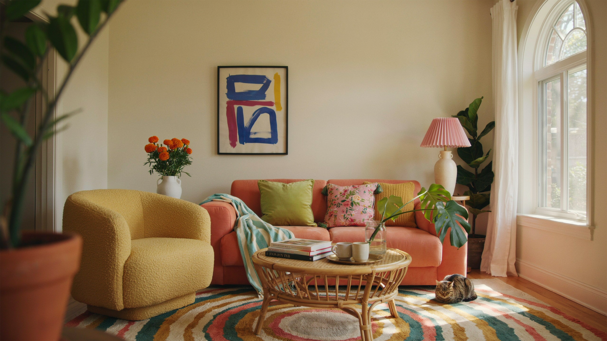
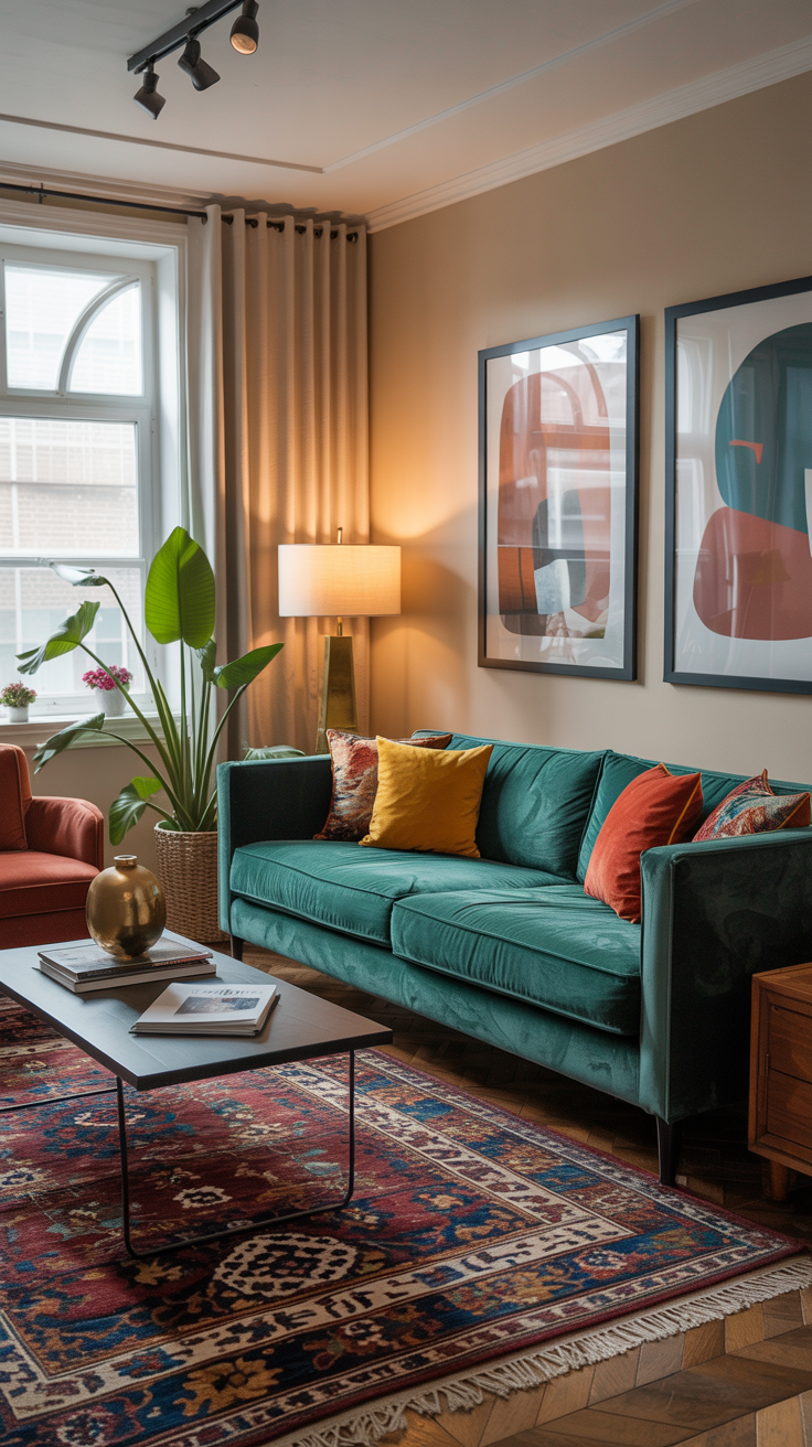
Emotionally‑charged color: Think cheerful yellow, tangy tangerine, hot pink, lime green, cobalt blue, jewel tones like emerald or magenta.
Texture & pattern play: Velvet, boucle, corduroy, geometric or animal prints, bold graphic wallpapers — sensory richness is part of the appeal.
Personalised touches: Collectibles, vintage finds, playful accessories, nostalgic pieces — this isn’t about a showroom home but a lived‑in, joyful one.
A sense of fun and energy: Not every surface needs to be calm. The idea is to surprise your eye in a positive way: quirky lighting, color drenching, unexpected shapes.
How It Differs from Minimalism and Maximalism
Against minimalism: Minimalism emphasises “less is more,” visual calm, and a limited palette. Dopamine décor says: your home can do more — more color, more personality, more joy.
Not exactly maximalism: While dopamine décor shares maximalism’s love of boldness, it’s less about “more stuff everywhere” and more about intentional joy. You can still have space, clarity and structure. As design magazines note, dopamine décor is less about overload, more about meaningful additions.

Why It Works
Psychology of color: Studies show that color influences mood, energy, and emotional response. For example, yellow is linked to cheerfulness, blue to calm, green to balance.
Desire for emotional connection: With homes doubling as workplaces and isolation increasing during recent years, people want their spaces to feel alive and reflective of self. People want their interiors to feel energizing and uplifting!
Social‑media visual culture: Younger homeowners, influenced by Instagram or TikTok aesthetics, are more willing to embrace color, personality and “photo‑friendly” spaces.
3. Why 2025 Is the Moment for Dopamine Décor
Post‑Pandemic Reset
After years of lockdowns and subdued palettes, many are done with calming neutrals and craving spaces that feel vibrant, interactive and expressive. The home is no longer just a retreat — it’s a space of identity, creativity and joy.
Generation Z & Millennials Driving Change
Younger homeowners are less bound by traditional design rules. They’re more likely to experiment with color, mix eras, and prioritise emotion over “investment” décor pieces. Indie TikTok creators and interior influencers are leading the charge.
The Visual Culture Shift
Interior design is ever more influenced by online visuals. Bold, photographable, “shareable” spaces are desirable — spaces you want to post about, not just live in. Dopamine décor fits that visual culture perfectly with its energy and color.
Movement Towards Personalisation
Generic spaces no longer satisfy many people. Instead of buying a one‑size‑fits‑all neutral sofa, the trend is to integrate your favourite color, your quirky object, that piece of wall art you love. Dopamine décor is personal. According to color‑expert Ashley McCollum: “Consumers are craving spaces that make them feel happy and highlight their interests and passions.”
4. How to Transition From Neutral to Joyful — Without Losing Style
If your current home is very neutral and you love the calm, but also want to inject more joy, here’s how to do it in a thoughtful, sustainable way.
Start Small — Joy Accents
You don’t need to repaint every wall in hot pink overnight. Instead:
Add pillows or throws in your favourite color.
Bring in one statement art piece or a bold rug.
Replace one light fixture with something playful.
These “micro‑doses” of joy ease you into the look. As one expert suggests:
Choose a Base Palette — Then Layer Joy
Maintain a foundational palette you like (maybe your existing neutral walls and major furniture). Then layer joyful pieces around it: accent chairs, vases, statement wallpaper, colorful trim. This keeps coherence even as you add color.
Pick Your Power Color(s)
Identify 1‑2 colors that you respond to emotionally (not just what’s trending). For example: coral because it reminds you of your beach trip, or mustard because you love vintage. Use that color in varying doses — small objects, large surfaces, etc. I say go for one common color and repeat it through the space for cohesion.
Balance the Bold with Neutral Spaces
A dopamine décor room doesn’t have to be overwhelming. Balance is key: a bold sofa? Keep surrounding furniture simple. Loud wallpaper? Use it on one feature wall. Use neutrals as grounding elements so the joyful accents stand out without chaos.
Introduce Texture & Pattern
Color is only one part of the game. Rich textures — velvet chairs, boucle cushions, sculptural lighting — and layered patterns bring the look alive. One note: be intentional with mixes rather than random.
Let Personality Lead
Incorporate items you love: nostalgic objects, travel souvenirs, quirky finds. Dopamine décor is about you — what makes you feel good. If an item doesn’t resonate, skip it. And as always, surround yourself with what genuinely makes you feel good.
Be Prepared to Edit
Because of the joyful, expressive nature of this style, it’s easy to overstuff. Keep functionality in mind. Before adding more: ask “Does this add joy and purpose?” If yes, great. If no, it may just be visual clutter. Some designers caution about the risk of trend‑driven overload.
5. Practical Room‑By‑Room Guidance

Living Room
Feature wall: paint it in your chosen power color or apply bold wallpaper.
Statement furniture: perhaps a curvy, colorful sofa or armchair in contrast with neutral surrounding furniture.
Art & accessories: bold graphic prints, colorful lighting, vintage‑inspired accent pieces.
Text & layers: throw pillows in mixed patterns, a textured rug, interesting lighting shapes.
Maintain balance: surround it with white or neutral walls to let the color breathe.
Bedroom
Bedding: choose a jewel‑tone duvet, color‑pop pillows or a patterned statement headboard.
Nightstands and lighting: swap in fun lamps or bedside frames.
Personal gallery wall: mix favourite photos, art prints, playful frames.
Feature accent: maybe a neon sign, colorful dresser, or a pastel wall.
Kitchen & Dining
Colorful cabinetry: if committed, change lower cabinets to a bold hue. Otherwise, color‑pop appliances or hardware.
Backsplash: playful tile or graphic patterns.
Dining chairs: one or two chairs in contrasting color to an otherwise neutral table.
Accessories: colorful dinnerware, trays, bar‑cart décor.
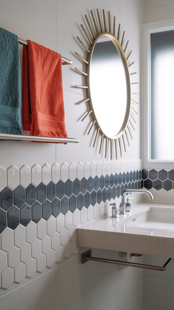
Bathroom
Towel and bath‑mat selection: vibrant hues.
Wall treatment: consider half‑wall paint or wallpaper in a fun print.
Mirrors or lighting: quirky shapes or colored frames.
Small fixture swap: brightly colored faucets or bold tile accent strip.
Entry & Transitional Spaces
A bold console or colorful bench.
Statement mirror or colorful wall hook system.
Color‑drenched doorway: paint the door inside or out in your power color.
6. Inspiring Examples & Visual References
Many homes listed or styled in 2025 reflect dopamine décor — neon walls, zebra‑runner stair, black and white checkered floors, and bold furnishings as a “dopamine décor” home.
Designers are emphasising ways to use color to evoke joy, rather than restraint. For example: Use yellow cabinets, whimsical fixtures, or animal‑print rugs.
These visuals give you license: you don’t need to be “safe.” You can experiment. But you do want to stay grounded in your own preferences, so the room still feels like you.
7. Common Mistakes & How to Avoid Them
While dopamine décor is fun, there are pitfalls:
Too much contrast, no cohesion: Without a unifying palette or texture, things can look chaotic.
Ignoring function: A bold sofa is great—but if it isn’t comfortable, it fails its purpose. Make sure that bright sofa is comfortable, durable and works for your family.
Trend‑overload: Just because it’s trending doesn’t mean it will age well. Chasing micro‑trends may lead to regret, so be wise!
Losing your personal voice: If you just copy what you see online, your home may look like someone else’s. The unique value of dopamine décor is your joy.
Neglecting visual rest: Color‑rich rooms still benefit from neutral “breathing areas” — surfaces, floors, or furnishings that allow the eyes to rest.
8. Step‑by‑Step Guide: Your Dopamine Décor Make‑over
Here’s how you can plan your makeover in 7 easy steps:
Audit your current space: What do you already love? What feels flat?
Identify your joy triggers: Colors, patterns, textures that genuinely make you smile.
Choose a base plus one power color: Keep your major pieces neutral if you like, then add a bold accent color.
Plan your ‘joy hits’: Select 3‑5 items to start with (a rug, pillow, lamp, wall art, one piece of furniture).
Layer texture & pattern: Add velvet cushions, boucle throws, patterned wallpaper or rugs.
Balance and edit: Step back — does the room feel lively yet functional, or overwhelmed? Remove or adjust as needed.
Live with it, evolve it: Dopamine décor is personal and evolving. Give yourself permission to swap pieces or color accents over time.

9. Sustainability & Budget‑Friendly Approaches
Upcycle & thrift: Vintage furniture gets personality and adds that joy factor.
Accent rather than overhaul: Paint one wall instead of the whole room; add colorful accessories rather than new big‑ticket items.
Quality over quantity: A few well‑chosen colorful items can make more impact than clutter.
Modular color swaps: Consider using removable peel‑and‑stick wallpaper, cushions, throws — easier to change if your taste evolves.
10. Looking Ahead: How Dopamine Décor Might Evolve
Designers believe the trend will shift toward more nuanced color stories — bold but refined, richer tones rather than only bright neons.
There’s growing talk of “serene dopamine” or “soft joy” — where color and mood‑boosting design meet balanced design sensibility.
Expect the trend to extend beyond home décor into product design, lifestyle goods, and hospitality — all aiming to uplift and energize.
Yet there’s also caution: experts note that if any trend becomes too ubiquitous, its emotional impact may diminish. The key will be personalisation.
The transition from neutral minimalism to dopamine décor is not merely aesthetic — it’s emotional and intentional. It reflects a home‑bodies’ desire not just to live in their space, but to feel in it — to experience joy, comfort, color, and personality every day.
But dopamine décor isn’t about wild chaos or simply “more color.” It’s about your joy, layered thoughtfully and balanced with function and foundations. It’s designing a home that makes you smile when you walk through the door.
If you’re ready to shift from calm neutrality to expressive, joyful spaces, let this be your permission slip: pick the colors you love, bring in textures you crave, and create a home that isn’t just visually beautiful — but emotionally uplifting.
Let your space reflect you. Let it spark happiness. Welcome to the era of joyful design.