Choosing an exterior paint color should be exciting—a chance to transform your home’s curb appeal and express your personal style. And yet, for most homeowners, this decision becomes one of the most overwhelming parts of home improvement. The stakes feel high. The surface area is massive. The cost isn’t small. And unlike pillows or décor accents, the wrong exterior color is not something you can easily change next weekend.
Whether you’re refreshing a faded façade, updating a newly purchased home, or preparing to sell, the right exterior paint color can make your home look polished, modern, inviting, and architecturally cohesive. The wrong color? It can clash with your neighborhood, wash out your home’s features, or make the architecture look dated.
Fortunately, choosing the right exterior paint color doesn’t have to be complicated. By understanding your home’s style, lighting, fixed elements, and environment—and by following proven design principles—you can make a confident choice that looks intentional and timeless.
This comprehensive guide will walk you through everything you need to know to choose the perfect exterior paint color for your home’s unique style—from traditional and modern to farmhouse, colonial, craftsman, and more.
1. Why Exterior Paint Color Matters (More Than You Think)
Exterior paint isn’t just cosmetic—it’s architectural. The right color:
-
Highlights your home’s best features
-
Enhances curb appeal (a big factor if you plan to sell)
-
Makes your home feel cohesive and intentional
-
Can even visually enlarge or slim the home’s silhouette
-
Creates harmony with landscaping and surroundings
Because exterior colors cover such a large area, they influence how your home feels in every season and light condition. A stunning cream may appear bright and fresh in sunlight, but washed out in shade. A rich charcoal may look modern in theory but appear almost black in a wooded lot.
Getting it right means understanding style, context, lighting, and undertones—the four pillars of good exterior color design.
2. Start With Style: Your Home’s Architecture Should Guide You
Every home has a design language. Your paint color should speak that same language—otherwise the result feels visually confusing.
Let’s break down how architecture influences the “right” color family.
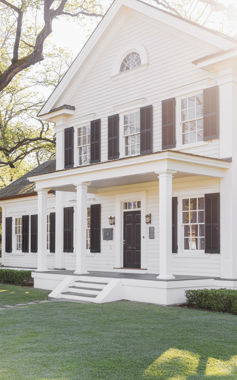
Traditional Homes
Examples: Colonial, Georgian, Victorian, Cape Cod, Tudor
Traditional homes often shine with:
-
Classic whites and creams
-
Deep navy or hunter green
-
Brick red, charcoal, or muted grays
-
Warm beiges and greiges
These styles typically favor timeless colors that won’t feel trendy—or dated—with time. Trim is usually high-contrast: crisp white or deep black to emphasize lines and symmetry.
Modern or Contemporary Homes
Examples: Minimalist, Box-style, New Construction Cubic Homes
Modern architecture frequently features:
-
Bold dark paints (charcoal, black, deep bronze)
-
Light monochromatic palettes (white on white)
-
Earthy midtones (warm gray, mushroom, café mocha)
-
Two-tone contrast blocks
These homes rely on clean lines and dramatic contrast, so the paint color should amplify that sleekness.
Farmhouse & Modern Farmhouse
Think:
-
Soft whites
-
Muted grays
-
Greige
-
Black accents
-
Sage green
Farmhouse architecture pairs beautifully with simple, earthy tones and matte finishes. Modern farmhouse often uses crisp white or greige siding with black or deep bronze trim for a timeless-yet-current look.
Craftsman Homes
Craftsman exteriors love nature-inspired colors:
-
Olive green
-
Rust
-
Navy
-
Warm browns
-
Creamy off-whites
These colors complement exposed beams, stonework, and natural materials.
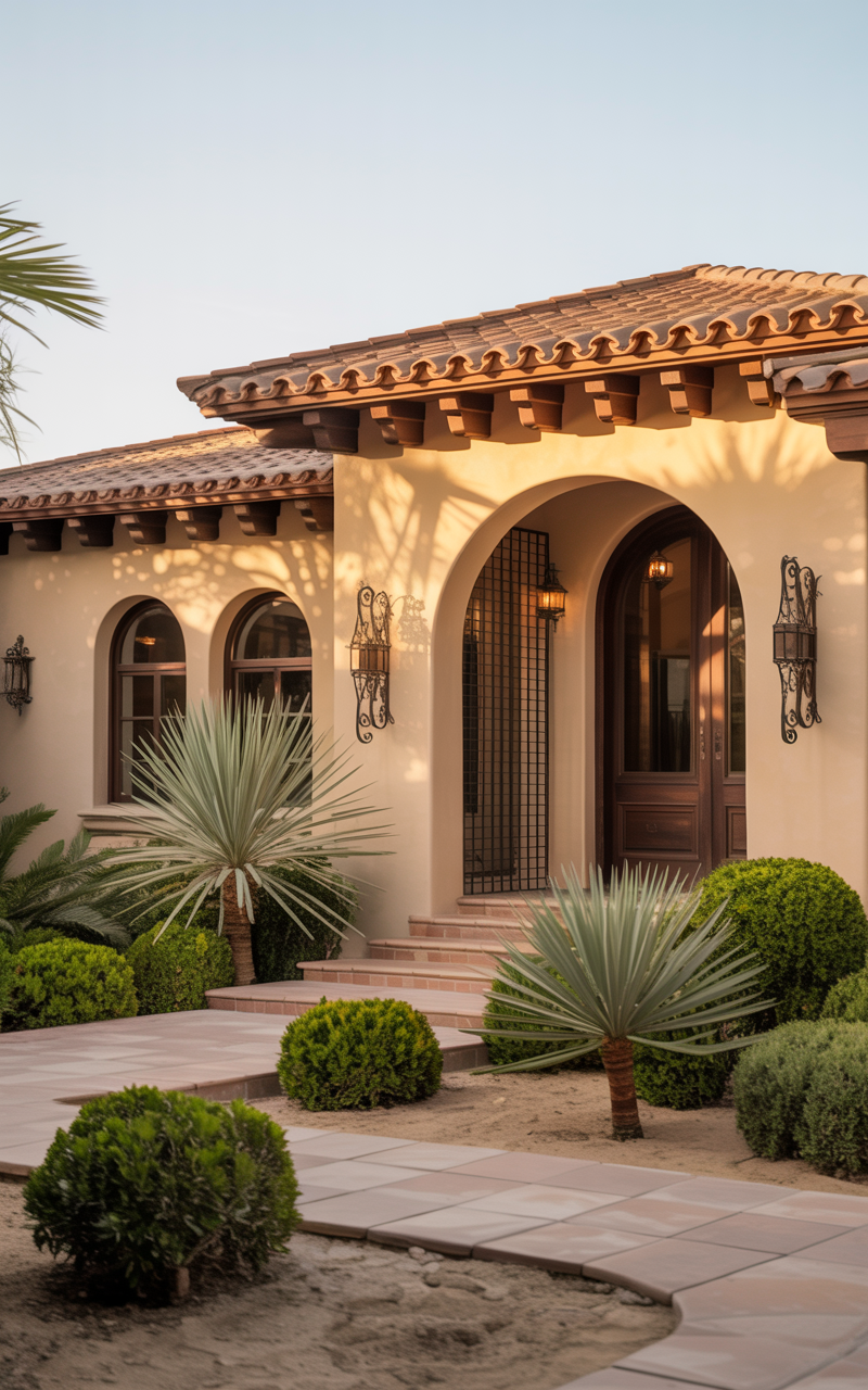
Mediterranean & Spanish-Style Homes
These homes traditionally feature:
-
Warm sand tones
-
Terracotta
-
Soft peach
-
Cream
-
Warm white
-
Desert neutrals
Deep turquoise, clay red, or deep blue also show up for accent doors.
Coastal Cottages & Beach Homes
Perfect pairings include:
-
Airy whites
-
Soft blues
-
Seafoam greens
-
Driftwood gray
-
Warm sandy tones
These homes naturally lean toward breezy, relaxed palettes.
3. Match the Paint Color to Your Home’s Fixed Elements
Your house has several “fixed elements” that you are not changing—at least not now. These have undertones you must work with:
-
Roof shingles
-
Brick
-
Stonework
-
Pathways
-
Landscaping
-
Decking
-
Window color
-
Metal/wood railings
These elements dictate which colors will harmonize—and which ones will clash.
Roof Color Matters Most
If your roof is:
-
Black or dark gray → almost any color works
-
Brown or tan → warm beige, greige, greens, creams work best
-
Red or terracotta → creamy neutrals, taupe, light tan
-
Light gray → soft blues, charcoal, white, black accents

Brick & Stone Have Strong Undertones
Brick and stone can have:
-
Red undertones
-
Pink-beige undertones
-
Orange or terra-cotta
-
Cool gray
-
Warm gray
-
Blue-gray
-
Taupe
Always sample colors directly against the brick or stone—your house’s fixed materials will instantly reveal whether a paint color belongs.
4. Consider Your Surroundings
Your home doesn’t exist in a vacuum. Its environment influences how your paint color appears.
Neighborhood Style
You don’t have to match your neighbors, but your home should feel harmonious in its context.
If every house around you is:
-
White
-
Beige
-
Gray
-
Earth-toned
…a neon blue house will feel out of place (and possibly hurt resale value).
Light Conditions
Lighting changes everything.
-
Full sun: Colors appear lighter and cooler
-
Shade or trees: Colors appear darker and more saturated
-
Open fields: Colors can look washed out
-
Wooded lots: Earth tones blend beautifully; bright whites may glare
Climate Matters
In sunny regions (Texas, Florida, Arizona), whites and warm neutrals look best.
In northern climates (Washington, Oregon, New England), deeper saturated colors thrive in overcast light.
5. Treat Exterior Paint Like a Three-Part Palette
A polished exterior typically uses three colors:
-
Main (Field) Color – the body of the house
-
Trim Color – highlights windows, fascia, corners
-
Accent Color – doors, shutters, details
How to Choose the Trio
A foolproof formula:
-
Low-contrast palette → modern, minimal, calming
-
Medium-contrast palette → timeless, balanced
-
High-contrast palette → bold, striking, architectural
Examples:
-
White house + off-white trim + black door
-
Greige house + white trim + navy door
-
Sage green house + cream trim + charcoal accents
Keep the palette to three colors max. Anything beyond that looks cluttered.
6. Undertones Make or Break an Exterior Paint Color
Understanding undertones is the secret to selecting colors that look intentional rather than “off.”
Warm Undertones
-
Beige
-
Cream
-
Tan
-
Warm gray (greige)
-
Terracotta
-
Earthy greens
Warm tones pair beautifully with clay roofs, stonework, and brown shingles.
Cool Undertones
-
True gray
-
Blue-gray
-
Charcoal
-
Blue
-
Cool whites
Cool tones suit modern homes, coastal homes, and homes with gray stonework.
Neutral Undertones
Greige (gray + beige)
Taupe
Soft whites
Neutral undertones are the most versatile and tend to be timeless.

7. Popular Color Families and What They Communicate
White + Off White
Feel: Clean, timeless, bright
Best for: Farmhouse, traditional, colonial, coastal, modern
Works with: Nearly anything, but be careful with stark whites in direct sun
Gray
Feel: Sophisticated, versatile
Best for: Craftsman, modern, ranch, colonial
Choose: Warm grays or greige to avoid looking cold
Beige + Greige
Feel: Warm, welcoming, timeless
Best for: Traditional, ranch, Mediterranean
Trend: Greige is now more popular than pure beige
Sage + Olive Green
Feel: Organic, grounding, designer-approved
Best for: Craftsman, cabins, cottages
These greens are trending due to their earthy, soothing vibe
Blue
Feel: Friendly, bold, coastal
Best for: Cape Cod, bungalows, coastal homes
Navy remains a top choice for shutters and doors
Charcoal + Black
Feel: Modern, dramatic
Best for: Modern, Scandinavian, cabin
Use: Body, trim, or accents—just not all three
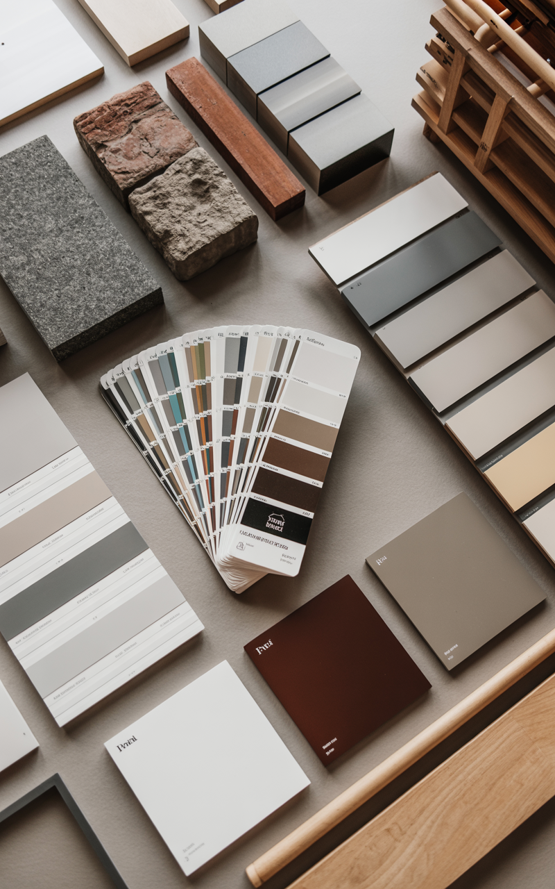
8. Sample Paint Colors—The Right Way
This is where most homeowners go wrong.
Don’t Sample Indoors. Ever.
Exterior colors look completely different outside.
Use Large Sample Boards
Paint 18×24 boards (or purchase peel-and-stick samples) and tape them to different sides of the house.
View Samples at Multiple Times of Day
Check the colors:
-
Morning
-
Midday
-
Cloudy days
-
At sunset
-
Under outdoor lighting
Test Against Fixed Materials
Hold samples next to:
-
Roof
-
Brick/stone
-
Windows
The incompatible colors will immediately stand out.
9. The Best Exterior Paint Colors for Popular Home Styles
Below are curated color suggestions often used by designers, categorized by style.
Modern Farmhouse
-
Soft White: Benjamin Moore White Dove
-
Pure White: Sherwin-Williams Pure White
-
Warm Greige: BM Revere Pewter
-
Contrasting Trim: SW Tricorn Black
Traditional Colonial
-
Classic White: BM Simply White
-
Navy: SW Naval
-
Historic Gray: BM Coventry Gray
-
Forest Green Door: BM Essex Green
Craftsman
-
Olive: SW Artichoke
-
Slate Blue: BM Van Deusen Blue
-
Warm Taupe: SW Dorian Gray
-
Cream Trim: SW Alabaster
Mediterranean
-
Clay Beige: BM Manchester Tan
-
Soft White: SW Shoji White
-
Terracotta Red Door: Traditional Spanish clay
-
Warm Taupe: BM Pale Oak
Modern / Contemporary
-
Charcoal Black: SW Iron Ore
-
Warm White: BM Chantilly Lace
-
Greige: SW Agreeable Gray
-
Black Trim: SW Tricorn Black
Coastal Cottage
-
Seafoam: BM Palladian Blue
-
Driftwood Gray: BM Shoreline
-
Nautical Navy: SW Salty Dog
-
Beachy Cream: SW Oyster White
10. When to Go Bold (And When to Avoid It)
Bold colors make a statement, but they’re not always the right choice.
Bold Choices That Work:
-
Deep navy
-
Charcoal
-
Black trim
-
Forest green
-
Red doors
-
Rich teal
Use bold hues for:
-
Front doors
-
Shutters
-
Accent siding
-
Modern homes
Bold Choices to Avoid:
-
Neon colors
-
Overly saturated primary colors
-
Pastels in non-coastal settings
-
Extremely dark colors in HOA neighborhoods
Bold choices shine when they play off architecture—not against it.
11. The Psychology of Exterior Color
Color affects how people perceive your home:
-
White → fresh, clean, upscale
-
Gray → sophisticated, calm
-
Blue → friendly, coastal, welcoming
-
Green → grounded, natural
-
Black → bold, modern
-
Beige → warm, timeless
If you intend to sell your home in the next few years, choosing psychological “crowd pleasers” is a smart strategy.
12. HOA Rules, Resale Value & Local Codes
Before selecting your dream color:
-
Check HOA-approved colors
-
Note restrictions on trim or accent colors
-
Understand neighborhood style expectations
-
Avoid overly unique colors if selling soon
Homes painted neutral, buyer-friendly colors tend to sell faster and at higher prices.
13. The Perfect Front Door Color (Finishing Touch!)
Never underestimate the emotional power of a front door.
Top Designer Picks
-
Black
-
Navy
-
Teal
-
Forest green
-
Classic red
-
Warm wood stain
Your front door is your home’s handshake—make it memorable.
14. Final Checklist: Your Foolproof Exterior Color Game Plan
Before hiring the painter, confirm these:
Does the color complement your home’s architecture?
It should feel authentic to the style.
Does it match your fixed elements?
Brick, stone, roofing—this is non-negotiable.
Have you tested samples in natural light?
Morning, noon, shade, dusk.
Are the undertones consistent?
Warm with warm. Cool with cool.
Does your trim create the right contrast level?
Low, medium, or high—choose intentionally.
Is it timeless enough for future resale?
Trendy accent, timeless base = best combination.
Does it reflect your neighborhood environment?
Stand out—but don’t clash.
15. Your Home’s Perfect Color Is a Blend of Style + Science
Choosing an exterior paint color is one part design, one part psychology, one part architectural respect—and a big dose of personal preference.
When done right, the results are stunning:
-
Your home looks polished
-
Architectural features pop
-
The style feels cohesive
-
The colors flow naturally in all seasons
-
Curb appeal skyrockets
The “perfect” color is not a random guess—it’s the result of thoughtful consideration. With this guide, you now have the insider tools designers use to confidently choose long-lasting, beautiful exterior colors.
Your home has a personality. The right color brings it to life.