

A bedroom can look expensive without containing a single new piece of furniture. In fact, the most convincing rooms rarely announce their budget through an endless parade of purchases. They feel elevated because everything in them appears intentional: the bed is dressed generously, the light is flattering, the palette is edited, the surfaces are calm, and even the ordinary dresser looks as though it belongs exactly where it is.
That distinction is liberating. If you already own a bed, nightstands, a dresser, and perhaps a chair that has seen better days, you are not starting from a disadvantage. You have the bones of a room. The goal is to make those bones read as considered rather than collected over time. A luxury bedroom is less about replacing functional furniture and more about controlling what the eye notices first, what it notices second, and what it is allowed to ignore.
These changes are often inexpensive, movable, and completely reversible. Think of the process as art directing the room you already have. A photograph taken from the doorway in daylight and at night will quickly reveal clutter, harsh lighting, undersized bedding, and awkward corners.
Start With a Cleaner, Quieter Visual Field
🛒 Simple layers for a more finished bedroom
Amazon Basics Blackout Curtains
A useful layer for controlling glare and softening a window wall.
As an Amazon Associate I earn from qualifying purchases.
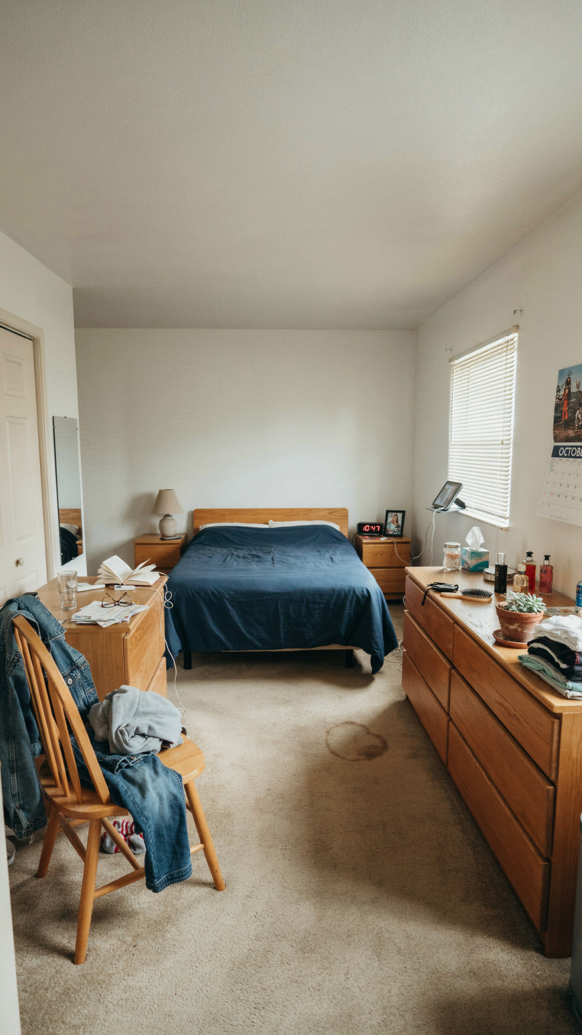
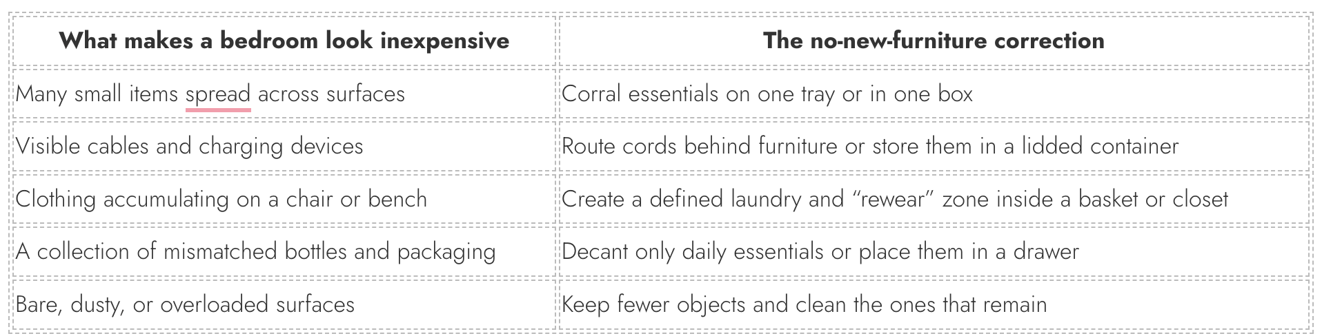
The fastest way to make a bedroom feel more expensive is also the least glamorous: remove visual noise. High-end rooms have breathing room. They are not necessarily sparse, but every visible item earns its place. A crowded top of dresser, a pile of cables, a chair functioning as a wardrobe, or ten half-empty bottles around the bed can make even beautiful furniture feel temporary.
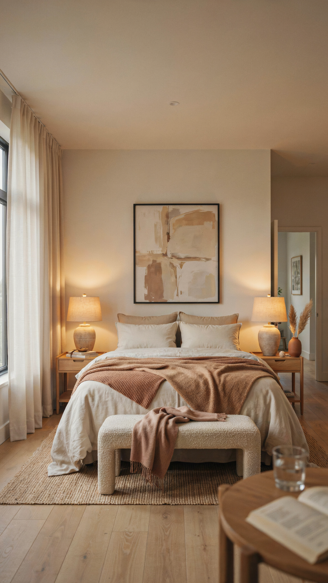
Clear every horizontal surface, then return only useful or genuinely attractive objects. A lamp, small dish, book, and carafe are enough for a nightstand; a dresser may need only a tray, a sculptural object, and one framed photograph. Grouping is more elegant than scattering.
Hide the unglamorous things in a lidded box, basket, or drawer. When every necessity has a home, the room feels resolved.
Editing does not mean making the room sterile. It means choosing a point of view. Perhaps the look is soft European hotel, warm contemporary, English country, quiet luxury, or an earthy boutique retreat. You do not need to label the style every time you pick up an object, but a loose direction helps you decide what stays. If the room is leaning warm and textural, the neon water bottle, plastic organizer, and glossy novelty décor will probably not help. Put them away and let the room make one clear argument.
Treat the Bed as the Main Event
The bed takes up the most visual real estate in a bedroom, so it has the power to make the whole room look cared for, or not. A modest bed frame can look remarkably polished when the bedding is layered with intention. This is the place to focus your energy, because changing the way you use linens is far cheaper than changing the furniture underneath them.
Start with fit. Sheets that strain across the mattress and a duvet that barely covers the sides will never look polished. If your linens fit well, keep them; smooth the duvet, press the pillowcases if you can, and make sure the blanket falls evenly. A crisp, neat bed says more than an overcomplicated one.
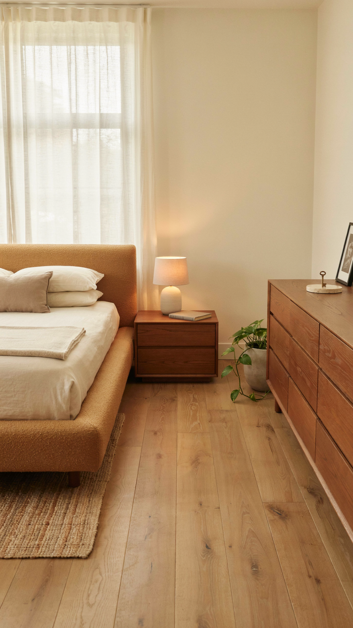
The most useful trick is to create depth with layers you already own. Place the duvet or comforter inside a cover one size larger than the bed, if possible, for a fuller, more cloudlike effect. Fold a quilt, coverlet, or lightweight blanket across the lower third. Add a throw with visible texture such as a knit, washed linen, cotton waffle weave, or even a favorite solid-colored blanket folded rather than tossed in a heap. The point is not to create a catalog display. It is to build a sequence of soft, substantial planes that make the bed look inviting from the doorway.
Pillows deserve a little restraint. Too many small decorative pillows can make a bed look fussy and difficult to use. Instead, focus on scale. Two generous sleeping pillows in matching cases, two European or square pillows behind them if you have them, and one long lumbar pillow or a pair of accent pillows is usually enough.
Color matters, but it doesn’t need to be all white. White bedding looks polished because it reflects light and feels hotel-like, yet warm ivory, oat, taupe, pale blue-gray, muted olive, and soft clay can be equally sophisticated. The key is a close, considered palette. Keep the largest textiles within two or three related tones, then introduce contrast in a smaller amount. For example, ivory sheets, a camel coverlet, and a deep brown lumbar pillow feel rich because they create warmth without chaos. Dusty blue bedding with slate accents and natural wood feels equally composed. Avoid treating every pillow and blanket as a separate opportunity for color.
If your bedding is worn but clean, consider dyeing a cotton coverlet or pillow shams rather than replacing the bed itself. A uniform, slightly moody color can make disparate textiles feel like a deliberate set. The same principle applies to a dated bed skirt: either make it disappear with a tailored, neutral option already in your linen cupboard or remove it and let the bedding fall cleanly. The goal is a bed with volume, softness, and an edited outline!
Let Lighting Do the Heavy Lifting
Nothing exposes a room faster than a single, harsh overhead light. Expensive bedrooms are designed for evening as much as daytime, and their lighting tends to be layered, warm, and gentle on texture. You may not need to buy any fixtures to achieve this. Begin by changing the bulbs in lamps and existing ceiling fittings to warm-white bulbs, ideally in the 2700K range. The difference between blue-white light and warm light is the difference between a utility room and a place you want to linger.
Then use what you already have at different heights. A bedside lamp offers intimate light for reading. A floor lamp softens a bare corner. A small lamp on a dresser creates a glow below eye level and makes the room feel established. If your lamps do not match, that is not necessarily a problem. What matters is that they share a family of shade color, bulb temperature, or visual weight. Two lamps with cream shades will look more intentional than two identical lamps with one stark cool bulb and one warm bulb.
At night, switch off the overhead light and let lamps handle the atmosphere. This one habit can transform how you experience the room. I also recommend installing a dimmer if possible. if it is not, plug-in dimmer controls can be useful where appropriate. Candlelight can add softness as well. Just remember the expensive effect comes from pools of light, not brightness. Basically, a bedroom should have shadows.
Make Existing Furniture Look Intentional, Not Dated
Furniture does not have to be new to look special, but it does need to look maintained. The difference between “vintage character” and “old stuff” is often condition. Wipe down wood with the appropriate cleaner, tighten loose hardware, remove water rings if possible, touch up obvious chips, and polish metal pulls. These small repairs are not exciting, but they communicate care. Care is central to a room that feels elevated.
Before painting a dresser or nightstand, take a pause. First try a thorough clean, different placement, or new styling. If a piece is very orange, scratched, or visually heavy, a repaint in smoky taupe, soft black, mushroom, deep olive, or warm charcoal can work beautifully. Choose a matte or satin finish, and sand and prime properly; the finish matters as much as the color.
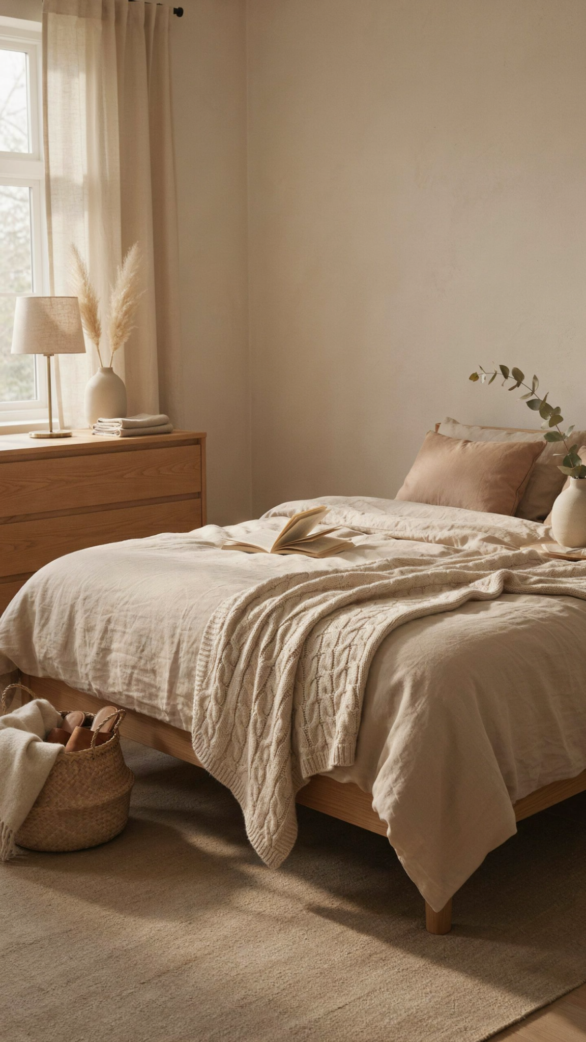
Placement can matter as much as condition. Give furniture enough clearance to read as individual pieces. Pull nightstands a little away from the bed rather than wedging them in. Center the dresser on the wall if possible. Avoid lining every piece around the perimeter simply because that is where it fits. Sometimes moving a chair toward a window or setting it at a slight angle creates the impression of a deliberate sitting area. Sometimes removing one small, unnecessary piece makes the larger ones look more important.
Try a little visual symmetry around the bed, even if the room itself is not. Matching nightstands are lovely but not required: two different tables can work when they have similar height and are balanced with lamps or objects of comparable scale. You do not always need identical things. In fact the mismatch can often bring a fresh sophisticated charm. However, it is important to create a balanced relationship between them.
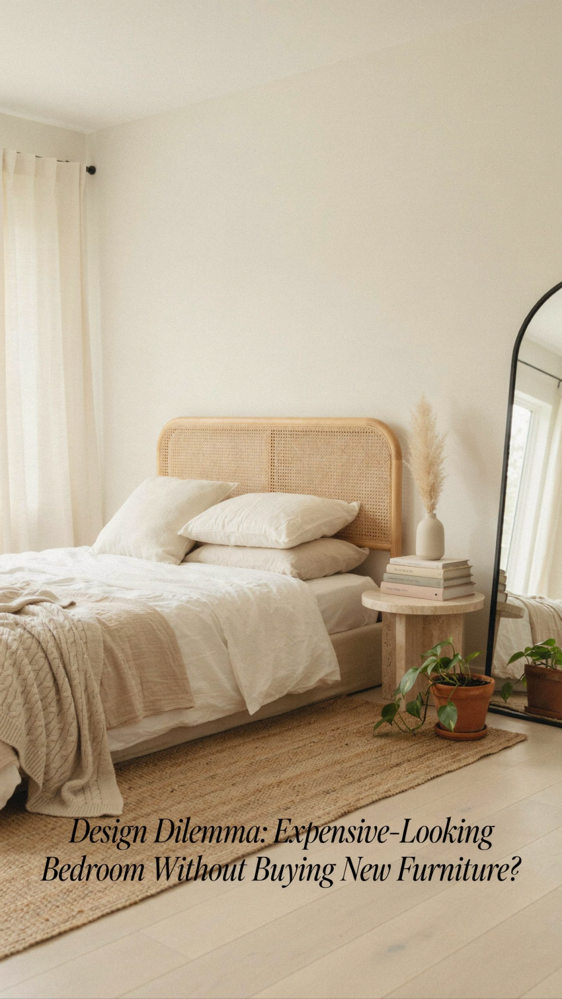
Create a Cohesive Color Story
🛒 Add personality without visual clutter
pechpell 3D Mid-Century Modern Boho Wall Art Set of 3
A flexible option for adding scale and visual interest to a blank wall.
As an Amazon Associate I earn from qualifying purchases.
An expensive-looking room usually has a disciplined palette. That does not mean it has to be beige. It means the color choices repeat often enough that the space feels connected. Start by identifying what you cannot change: the floor, the largest piece of furniture, the curtains, or the wall color. Those are your anchor notes. From there, select two or three supporting hues.
For a serene, high-end look, try one of these directions: cream, tobacco, and chocolate; warm white, olive, and aged brass; pale blue-gray, oat, and walnut; mushroom, charcoal, and burgundy; or soft blush, rust, and deep brown. What makes these combinations effective is not any individual color but the variation in value. You