

The disappointment often arrives after the curtains are hung and the cushions are fluffed. Individually, everything is lovely: the striped chair, floral pillows, rich rug, and irresistible wallpaper. Yet the finished room feels loud. Your eye darts from object to object, and instead of looking collected, every beautiful idea seems to be speaking at once.
This does not mean you have bad taste, nor does it mean pattern is only for maximalists. Rooms with memorable depth nearly always contain more visual variation than we first notice. The difference is not the amount of pattern; it is the order of pattern. A layered room guides the eye. A busy room asks it to make too many decisions at once.
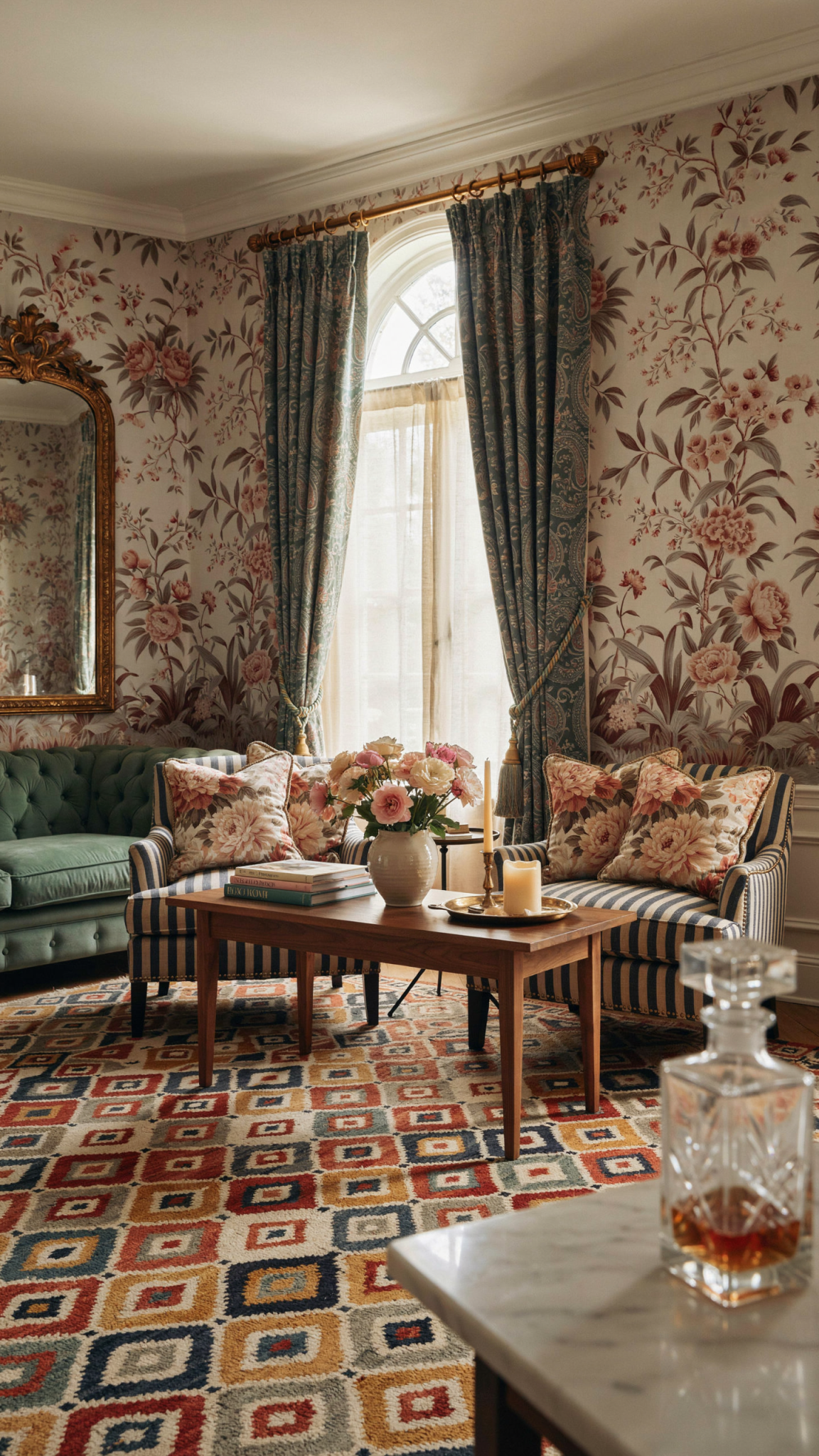
The fix is usually not a dramatic purge. You do not need to replace everything with beige or abandon the prints that made you happy. You need a clear visual rhythm. With scale, colour, contrast, repetition, and negative space working together, you can keep the personality and lose the visual static. You know floral is IN right now, so here’s how to make it work for you.
The Difference Between “Layered” and “Busy”
🛒 Quiet a visually busy room
Seagrass Wicker Storage Basket with Handles
Natural texture plus useful storage for an uncluttered room.
As an Amazon Associate I earn from qualifying purchases.
A layered room feels like a story with a beginning, middle, and background. There may be a bold wallpaper, a vintage textile, a graphic rug, and an unusual lamp, but the eye understands where to land first. One element takes the lead; a few others support it; the rest create atmosphere. The composition feels intentional even when it has a relaxed, slightly collected-over-time character.
A busy room does not necessarily contain more things. It simply contains too many elements with equal visual volume. If the wallpaper, rug, sofa fabric, window treatment, art, cushions, and decorative accessories all have strong contrast, sharp edges, or competing colours, none of them can become the main event. The eye keeps scanning in search of hierarchy and finds none. That restlessness is what we experience as clutter, even if every surface is technically tidy.
Layering is variation arranged in a hierarchy. Busyness is variation without one.
It helps to think of a room as a playlist rather than a catalogue. A great playlist can include a dramatic opening track, softer interludes, familiar refrains, and one unexpected song. But if every track is played at maximum volume, the listening experience becomes exhausting. Pattern needs the same kind of pacing. Your goal is not to mute the whole room. It is to decide where the chorus belongs.
Start by Finding the Loudest Voice
🛒 Create a clearer focal point
pechpell 3D Mid-Century Modern Boho Wall Art Set of 3
A flexible option for adding scale and visual interest to a blank wall.
As an Amazon Associate I earn from qualifying purchases.
Before buying anything else, stand at the doorway and identify what grabs your attention first. Be honest: is it the rug, the sofa, the wallpaper, the curtains, the gallery wall, or the pile of patterned cushions? In a room that feels chaotic, there are usually two or three answers. That is the starting point. You are not looking for the prettiest piece; you are looking for the piece with the strongest visual authority.
Visual authority comes from more than a large print. A small black-and-white geometric cushion can command attention because it has high contrast. A wall of closely framed art can become dominant because it creates a busy perimeter. A patterned armchair may feel larger than a solid sofa because it is isolated against a plain wall. When diagnosing a room, pay attention to contrast, not only scale. Contrast may come from colour, light and dark, line direction, shine, or an unusually crisp pattern edge.
Choose one element to remain the lead. If you adore the botanical wallpaper, let it be the lead and ask the rug, upholstery, and textiles to become quieter companions. If the antique kilim rug is the piece that gives the room its soul, then the walls and big upholstery should support its palette instead of competing for equal notice. If the sofa is upholstered in a memorable fabric, resist treating it as a neutral just because it is furniture. It is already making a statement.
Scale Is the Conductor of the Room
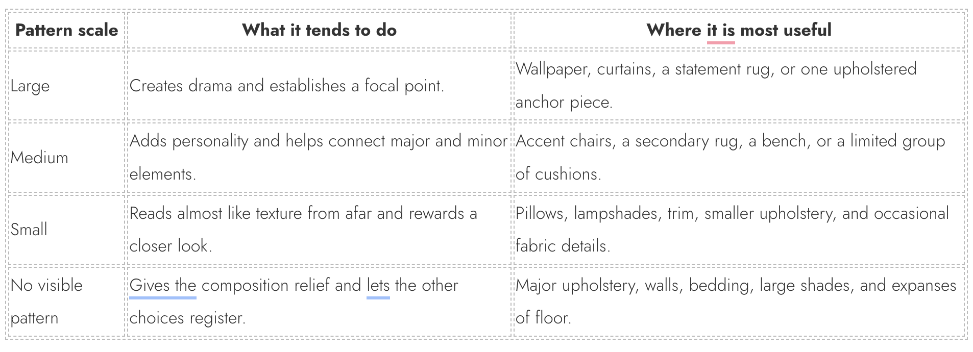
The easiest way to make multiple patterns coexist is to vary their scale. When every print is similarly sized, the room reads like a page of competing headlines. A large-scale pattern needs breathing room; a small-scale pattern can act as texture; a medium-scale pattern links the two. This is why a broad floral wallpaper can sit beautifully with a fine ticking stripe and a small block-print cushion, while three medium-scale florals often create an accidental visual muddle.
Try viewing your patterns from across the room. From a distance, a tiny repeated motif may read as a soft texture or a solid colour. A larger motif will still announce itself. That difference is useful. You can combine a large, sweeping design on one major surface with a quiet, tight print on a secondary surface because they perform different jobs. The eye does not have to decode them in the same way.
A practical rule is to use one large-scale pattern, one medium-scale pattern, and one small-scale pattern within a visual zone. A visual zone might be the seating area rather than the entire open-plan room, or the bed vignette rather than every textile in the bedroom. This is not a law, and a confident striped room can bend it, but it is a reliable reset when a space feels overdone.
Scale also applies to the shapes inside a pattern. A room with a large check, narrow stripe, dense tiny floral, and broad botanical has natural variation. A room with a mid-sized gingham, a mid-sized checkerboard, a mid-sized grid, and a mid-sized ikat might technically have different patterns, but all of them establish a similar tempo. The result can feel surprisingly relentless. When in doubt, put fabric samples on the floor, step back several feet, and squint. If the samples merge into one evenly busy field, alter the scale before adding more.
Keep the Colour Conversation Short
Pattern can look chaotic because the palette is too expansive, even when the prints themselves are well chosen. Each pattern carries a group of colours, and several multi-colour fabrics can quietly introduce eight or ten hues into a room. That can be joyful in a very intentionally maximalist space, but it takes discipline. For most rooms, a tighter palette makes even expressive prints feel related.
Begin by naming the colours that are already doing the most work. You might see warm white, moss, faded terracotta, and inky blue. Or perhaps the room wants creamy oat, tomato red, tobacco brown, and a little butter yellow. Then let each new pattern repeat at least two of those colours. A fabric does not need to match exactly, and it should not look like it came from a prepackaged set. It simply needs to sound as though it is part of the same conversation.
One of the most useful styling moves is to select an anchor neutral that appears in more than one place. It could be the warm ivory background of your wallpaper, the putty tone in the rug, the unbleached linen of the curtains, or the soft charcoal of a painted trim. Repeating that quieter background colour across major surfaces creates continuity. It makes the colourful pieces feel held rather than scattered.
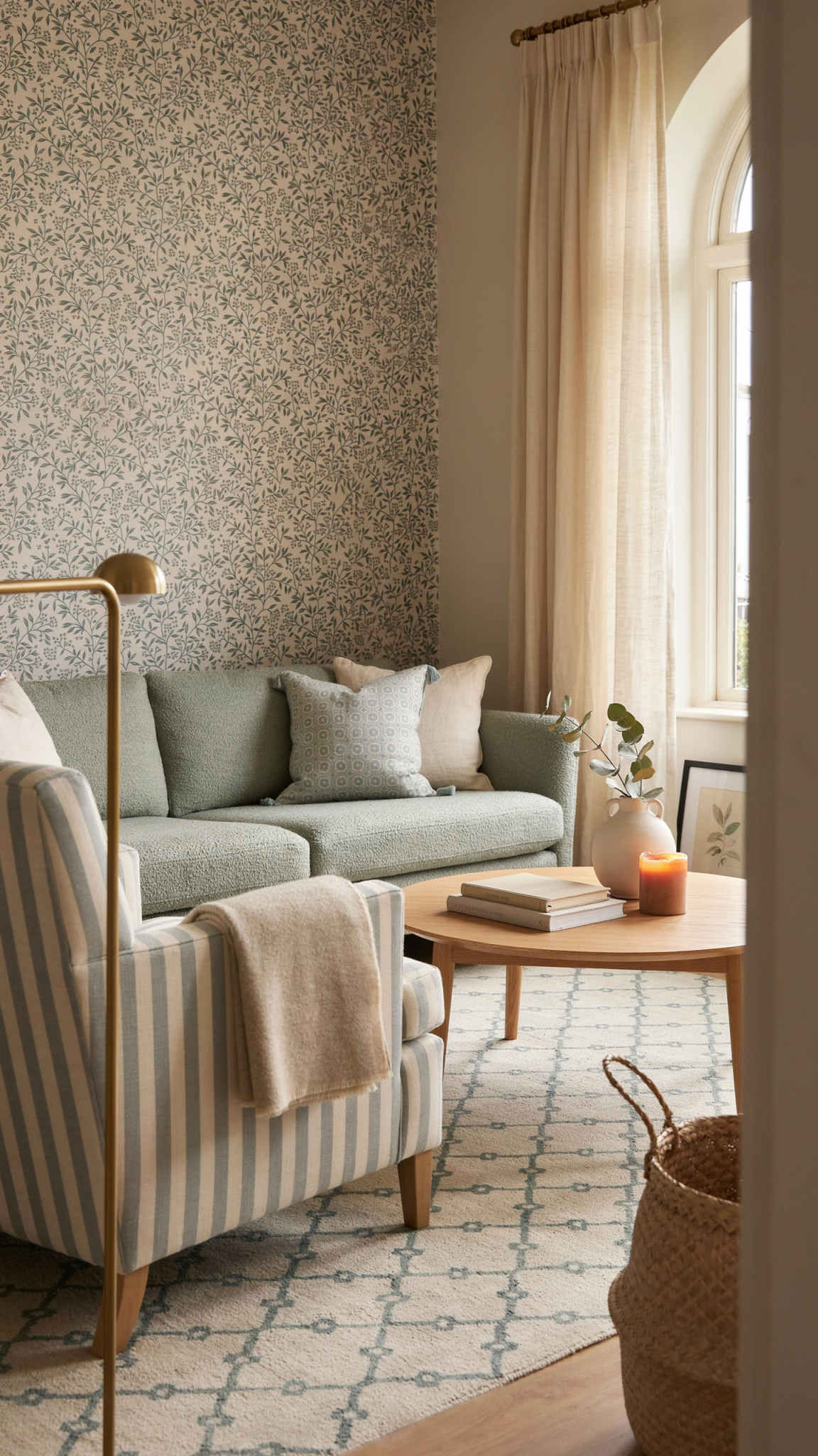
Tone matters as much as hue. A room may use both green and red, but a dusty olive and faded brick will feel calmer together than emerald and scarlet. Likewise, a blue-and-white room can become jarring when some whites are icy and others are creamy, or when navy sits beside a bright cobalt without a bridge between them. Looking at the undertones helps you decide whether a new pattern belongs. If most of your room has a softened, sun-faded quality, a digitally crisp primary-colour print may be the true source of the tension.
Repeat, Do Not Scatter
A pattern may only appear once in a room and still work. A colour, however, usually benefits from a second appearance. Repetition is what tells the eye that a choice was intentional. If you introduce a rust-and-indigo cushion on one chair, perhaps the rust reappears in a book spine, a vase, the edge of a rug, or the art across the room. The repetition does not need to be literal. It simply needs to create a visual breadcrumb trail.
Think in quiet echoes rather than matching sets. The dark brown in a patterned curtain can be reflected by a timber frame, a leather ottoman, or a narrow stripe in the rug. The blush in the wallpaper might return in a ceramic bowl and the smallest note in a throw. This layered repetition is more sophisticated than buying every piece in the same fabric, and it is much easier to live with over time.
You can also repeat a shape without repeating a print. Curvy botanical wallpaper may feel more coherent with a scalloped lampshade, rounded picture frames, or a turned wood table. A geometric rug can be supported by squared-off cushions and angular ceramic pieces. Shape repetition gives a patterned room an underlying grammar, which is often why an eclectic space appears composed rather than random.
Let Texture Do Some of the Work
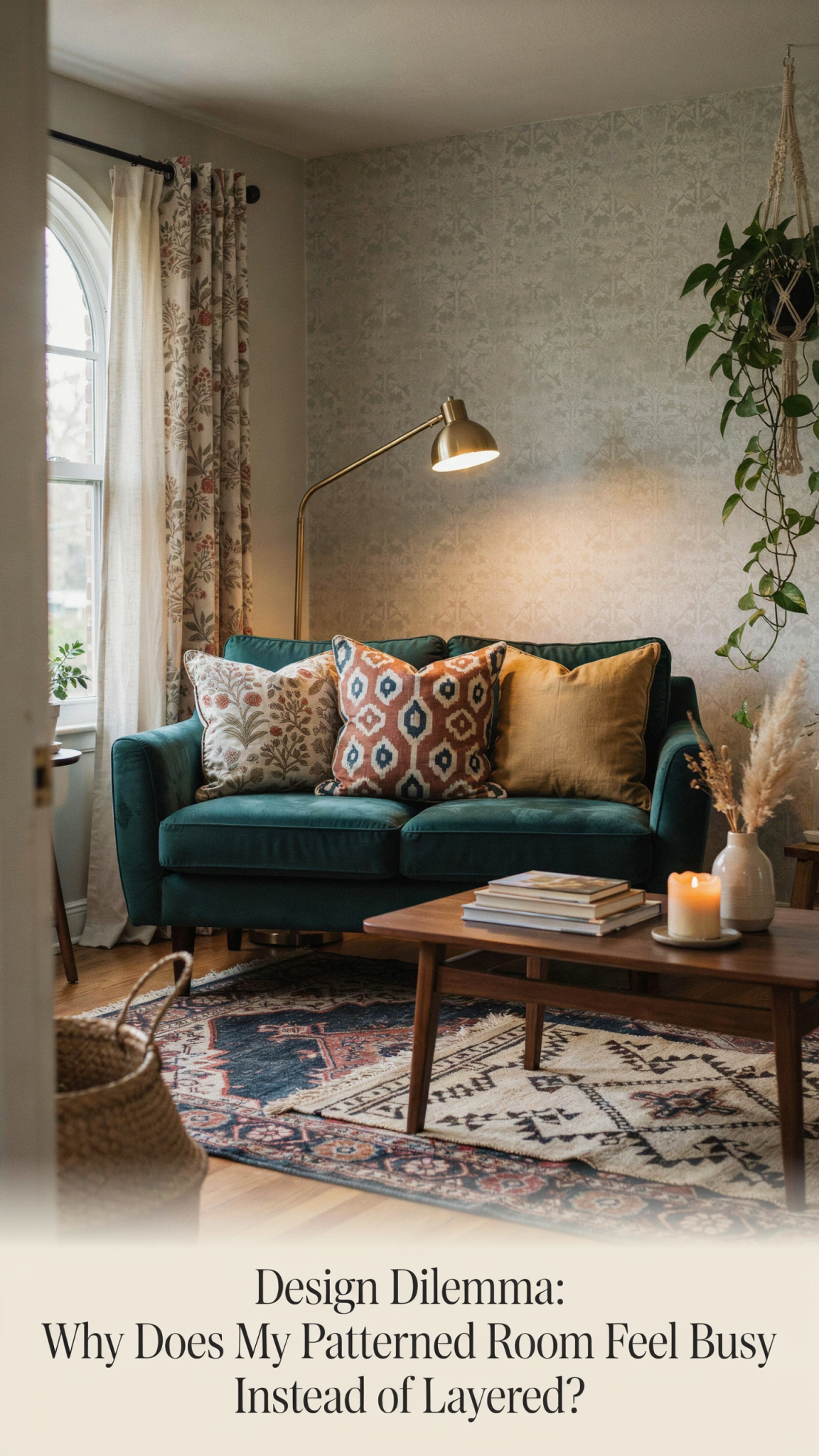
One common mistake is trying to create every layer with a new pattern. But pattern is only one form of visual interest. Texture can add richness without adding another image for the eye to process. Slubby linen, nubby wool, washed velvet, woven cane, aged wood, plaster, rattan, silk, bouclé, and handmade ceramics all create depth through light, touch, and irregularity.
When a room is already print-heavy, introduce tactile solids. A moss-coloured linen sofa, a cream wool throw, a tobacco leather footstool, or pleated natural-fibre shades can make the scheme feel more dimensional while lowering the visual volume. These pieces are not boring placeholders. They are the bass line that allows the patterned instruments to sound better.
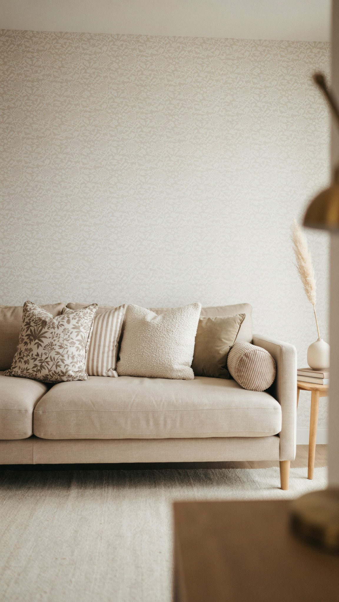
The aim is contrast in material, not endless contrast in motif. A patterned room should contain things that feel different under the hand: crisp cotton next to washed linen, smooth ceramic next to woven grasscloth, soft velvet beside aged timber. This is the sort of layering that makes a room interesting up close, even after you have edited the visual noise from across the room.
Protect the Quiet Spaces
Negative space is not empty space waiting to be filled. It is an active design choice. In a patterned room, calm surfaces allow the eye to recover and make the patterned surfaces feel more special. This might be a plain wall around a gallery cluster, a solid sofa beneath lively curtains, unadorned bedding under a patterned headboard, or simply a patch of floor not covered by a small additional rug.
The challenge is that quiet space can feel under-decorated while you are styling it. A bare section of wall may tempt you to add another picture. A solid chair may tempt you to pile it with five more cushions. A long coffee table may tempt you to fill every inch with books, boxes, and collected objects. Resist the urge to solve every gap. When you return later, those pauses are often what let the room feel expensive, calm, and deliberate.