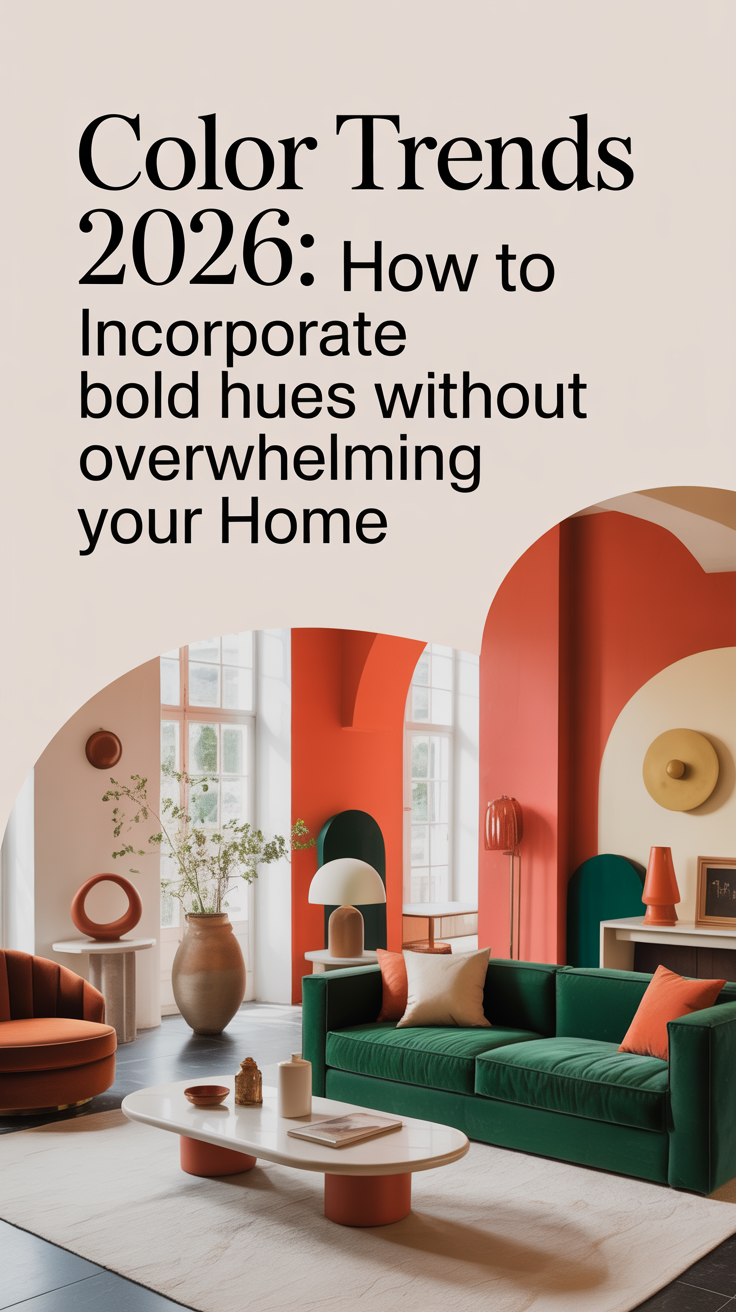
Bold color is back — more confident, more curated, and smarter than the maximalism of a few seasons ago. But “bold” doesn’t have to mean loud or permanent. In 2026, color trends are about purposeful contrast, tactile finishes, and balancing statement hues with neutral breathing room. This guide walks you through why bold colors feel modern right now, and exactly how to bring them into every room of your home so the result reads intentional — not chaotic.
Why 2026 is leaning into bolder color
After years of muted palettes and earth-toned minimalism, people want personality in their living spaces. The drivers behind the 2026 color movement:
Emotional design: People crave environments that spark joy, confidence, or calm. Color affects mood instantly, so designers are choosing hues intentionally.
Layered maximalism (but restrained): Instead of throwing everything bright at once, designers pair a strong color with sophisticated neutrals, textured surfaces, and sculptural forms.
Material-driven color: Rich velvets, matte ceramics, and metallics change how a hue reads in a room; texture lets a bold color feel luxe rather than brash.
Sustainable and long-lived choices: Bold paint, curated vintage pieces, and high-quality fabrics mean a statement can last rather than follow fast trends.
Takeaway: The 2026 approach is about selective boldness — you choose a few places to go vivid and keep the rest elegantly subdued.
Color fundamentals: how to think about bold without going overboard
Before you pick a paint swatch, here are the essential principles to keep your bold choices grounded.

1. One anchor color, two supporting tones
Pick one bold anchor (e.g., cobalt, deep teal, ember red), then add up to two supporting tones that are softer or muted versions of the anchor or a neutral that complements it. This creates cohesion.
2. Use value and saturation as control tools
Value = lightness vs darkness. A dark navy can feel less invasive than a neon sky blue because it has lower value contrast with furniture.
Saturation = intensity. Lower the saturation to make a color more forgiving.
Control either and the color will sit comfortably within a room.
3. Texture is a color’s best friend
A deep green in matte paint will read differently than the same green on velvet or glazed ceramic. Use texture to soften or heighten a hue.
4. Repetition for rhythm
Introduce the same bold hue in small doses across a space — e.g., throw pillow, lamp base, framed art — so it feels intentional rather than accidental.
5. Negative space matters
Give bold colors breathing room. Ample white, cream, or warm wood prevents visual fatigue and highlights the statement.

Palette directions for 2026 (and how to use them)
Below are trend-forward palettes with quick “how to apply” notes.
1. Deep Teal + Warm Terracotta + Soft Oat
How to use: Teal as an accent wall or sofa, terracotta ceramics or rugs, oat on walls/trim. Works in living rooms, kitchens, or offices.
Why it works: Teal provides drama; terracotta brings warmth; oat neutralizes.
2. Cobalt Blue + Chalky Grey + Brass
How to use: Cobalt on cabinetry or an entryway, chalky grey walls, brass hardware & lighting.
Why it works: Cobalt’s brightness pops against grey’s neutrality. Brass adds polish.
3. Chartreuse Accent + Mushroom Taupe + Natural Rattan
How to use: Use chartreuse sparingly — an accent chair or art. Taupe on walls and floors; rattan furniture to bring earthiness.
Why it works: Unexpected chartreuse adds energy without overtaking the organic palette.
4. Ember Red + Muted Olive + Cream
How to use: Ember on a statement wall or fireplace surround, olive upholstery, cream everywhere else.
Why it works: Warm contrast (red + green) balanced by soothing cream.
5. Lavender Smoke + Soft Black + Pale Blush
How to use: Lavender smoke in a bedroom or bath, soft black trim, blush textiles.
Why it works: Subtle, moody, and modern — a twist on traditional pastels.
Room-by-room: Practical ways to add bold color
Entry & foyer
First impressions matter. The entry is forgiving and a perfect place to test a bold hue.
Paint the front door a saturated color (cobalt, mustard, deep teal). It’s a small surface with big impact.
Consider a bold runner or wallpapered vestibule. If your foyer is compact, a saturated wallpaper on a single wall creates drama without full commitment.
Repeat the door color with a small accessory inside (console table lamp, vase).
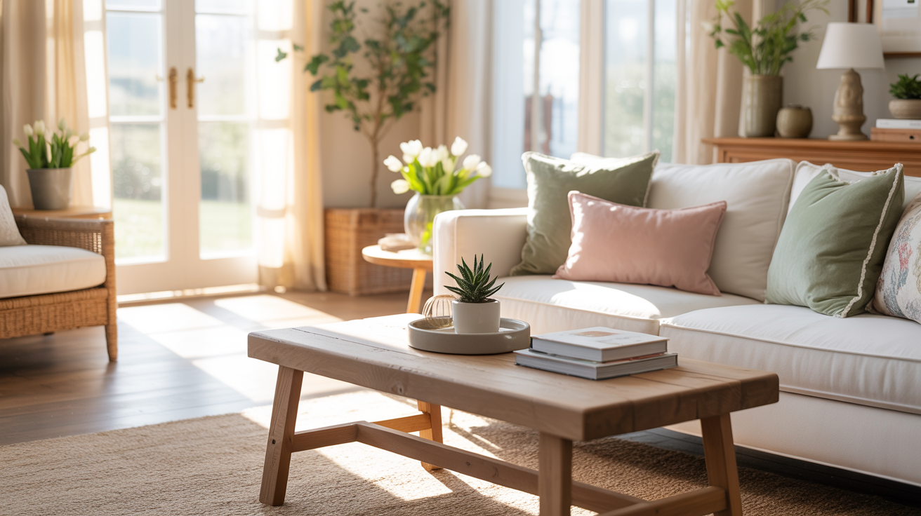
Living room
The living room is where balance shines.
Anchor with one big piece: A bold sofa or area rug anchors the space visually and allows the rest to be neutral.
Accent walls for architecture: Painting a fireplace surround, built-in, or a recessed wall is less risky than all four walls.
Cohesive accents: Use cushions, throws, and artwork to pull the anchor color into surrounding spaces.
Kitchen
Kitchens are prime spots for rich color that still reads functional.
Cabinet color: Deep blue, forest green, or matte black cabinets are a major 2026 trend. Pair with lighter countertops and warm wood shelving.
Backsplash and appliances: Colored tiles or vintage colored appliances can be statement-making without repainting.
Hardware & accents: Swap handles, faucets, and pendant finishes for brass or black to elevate bold cabinetry.

Dining room
The dining room benefits from intimacy — bold works well here.
All-over color: A moody dining room in deep green or indigo creates a dramatic restaurant-like vibe.
Ceiling as surprise: Paint the ceiling the bold hue instead of the walls for a modern twist.
Textiles: A bold runner or upholstered chairs are easier to change seasonally.
Bedroom
Bedrooms need balance between restful and expressive.
Headboard wall: A strong color behind the bed reads cozy and grounded.
Soft bedding balance: Use crisp, pale bedding to soften saturated walls, and pick two accent pillows in the bold hue.
Small furniture: A painted nightstand or bench in a jewel tone adds personality without overwhelming.
Bathroom
Bathrooms are small rooms where bold color is highly effective.
Vanity: Paint the vanity a bold tone and keep tile and fixtures neutral.
Accent tile: A splash of colored tile in a shower niche or backsplash makes the space feel designer without full renovation.
Painted ceilings: A deep color on the ceiling brings a cocooning feel to a tiny room.

Beyond paint: other ways to introduce bold color
Furniture
Investing in one bold furniture piece (sofa, armchair, dresser) gives you a focal point that’s replaceable over time. High-quality upholstery in saturated hues lasts and acts as the heart of a room.
Textiles
Throw pillows, curtains, rugs, and bedding are the easiest and most flexible ways to play with color. Change them seasonally or when trends shift.
Art
Large-scale art can define a room’s palette. Use art with one or two bold colors and echo those tones in small decor elements.
Ceramics, glass, and objects
Colored vases, bowls, and lamps are subtle connectors that create visual rhythm. Group objects in odd numbers and on neutral surfaces for balance.
Wallpaper and fabrics
Bold patterns are trending when used strategically: behind shelving, inside closets, or on a single wall as an accent.

Lighting and finishes: how they change a color
Lighting drastically alters how a color reads:
Natural daylight warms toward yellow, making blues feel slightly greener in the morning and evening.
Warm LED bulbs (around 2700K–3000K) make colors feel richer and cozier; cooler bulbs bring clarity to greens and blues.
Finish matters: Matte paints minimize reflection and make color feel more sophisticated; satin and eggshell read brighter and hold up well in high-traffic areas. Glossy finishes intensify color and are great for doors and cabinetry.
Metal finishes (brass, brushed nickel, blackened steel) also shift perception. Pair warm-toned metals with warm hues (terracotta, ember), and cooler metals with cooler hues (navy, teal).
Color-blocking and balance techniques
If you like the idea of multiple bold hues, use these techniques to keep things harmonious.
1. Horizontal banding
Paint lower walls darker and upper walls lighter (or vice versa). This visually separates the room and uses color like architectural trim.
2. Vertical color zoning
Different colors for connected zones in an open plan — e.g., living area in deep teal, dining area in terracotta — while keeping floors and major furniture neutral to unify.
3. Tone-on-tone layering
Use variations of the same hue at different saturation and values. Example: soft blush walls, mid-toned rose sofa, and a deep burgundy throw.
4. Accent framing
Use bold color to frame an architectural element — doorways, built-ins, or windows — which creates a curated designer look.
How to test color before committing
Paint large swatches: Paint 2–3 large 2’ x 2’ swatches on different walls and live with them for 48–72 hours.
View at different times: Observe the swatches in morning, midday, and evening light.
Use samples in context: Place swatch boards near your furniture and next to metallic finishes you plan to use.
Consider a smaller trial: Paint the back of a built-in or the inside of a closet to see how it reads over time.
Never rely on small paper swatches alone; lighting and texture can drastically change perception.
Shopping and sourcing for 2026 color-forward homes
Shop vintage and artisan-made: 2026 favors unique, well-crafted pieces over mass-market trends. Hunt for vintage chairs, artisan ceramics, and locally dyed textiles.
Sustainable materials: Look for low-VOC paints and naturally dyed fabrics. They often have a more nuanced, lived-in color quality.
Swatches and samples: Order fabric swatches and small tile samples to test at home before buying full quantities.
Custom options: If you’re investing in upholstery, many brands now offer custom coloring — a great way to get the exact tone you want.
Common mistakes and how to avoid them
Mistake: Going room-wide with a highly saturated color
Fix: Limit to a single wall, an architectural element, or a major piece of furniture.
Mistake: Matching everything exactly
Fix: Allow variation. Complementary shades and materials (different textures, wood tones, metals) add depth.
Mistake: Ignoring undertones
Fix: Test colors with the furniture and flooring you already own; a blue with a green undertone will clash with a true green sofa.
Mistake: Forgetting scale
Fix: Big, saturated patterns can overwhelm small rooms. Scale prints and colors to the room’s proportions.
Case studies: Quick before & after scenarios
Case 1 — Small apartment living room
Before: Beige walls, neutral sofa, no focal point.
After: Deep teal sofa, warm oak coffee table, cream walls, brass floor lamp, chartreuse throw pillow. Result: A small apartment now feels curated and cozy; the sofa anchors the color without repainting.
Case 2 — Open-plan kitchen/dining
Before: White shaker cabinets, chrome hardware, uninspired.
After: Lower cabinets painted in indigo, upper cabinets in soft grey, brass pulls, terracotta floor tiles, rattan barstools. Result: Depth and warmth added; the indigo anchors the kitchen visually without muddling the flow.
Case 3 — Primary bedroom
Before: Pale grey everywhere, minimal personality.
After: Headboard wall in lavender smoke, soft black trim, cream bedding, blush velvet bench. Result: A restful and modern retreat with clear focal intent.
DIY projects to try this weekend
Bold headboard makeover: Paint a plywood headboard in a jewel tone and upholster with a plush fabric for texture.
Painted cabinet face-lift: Remove cabinet doors, sand lightly, and paint in a bold hue; swap hardware for contrast.
Accent-shelf styling: Paint the back of a shelf in a saturated color and style with grouped ceramics and books in related tones.
Custom lamp shade: Recover a lamp shade with dyed fabric or an unexpected patterned textile.
Longevity: Making bold choices you’ll love for years
Favor high-quality paint and fabric so colors don’t fade or look tired.
Choose one or two timeless bold elements (a sofa, painted cabinetry) and cycle smaller accessories seasonally.
Document your palette: photograph your room with the chosen colors in different lights and keep a digital mood board — it helps when you shop for future pieces.
Bringing bold color in without overwhelm
Choose an anchor color and two supporting tones.
Test color samples across lighting conditions.
Use texture and finish to control intensity.
Repeat the color in small doses around the room for rhythm.
Give bold pieces negative space to breathe.
Mix metals and materials to add depth.
Start small (door, cabinet, accent wall) if unsure.
Bold color in 2026 is less about bravado and more about thoughtfully amplified personality. It’s about using hue as a design tool — to create coziness, lift mood, and define spaces — not simply to decorate. With careful testing, attention to texture and lighting, and a restrained approach to repetition and negative space, you can make striking color choices that feel sophisticated and timeless.
Go ahead: pick the one bold piece that scares you a little. Paint that door, pick the teal sofa, or lay down a ruby rug. Done right, bold will stop being risky and start being you.