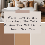
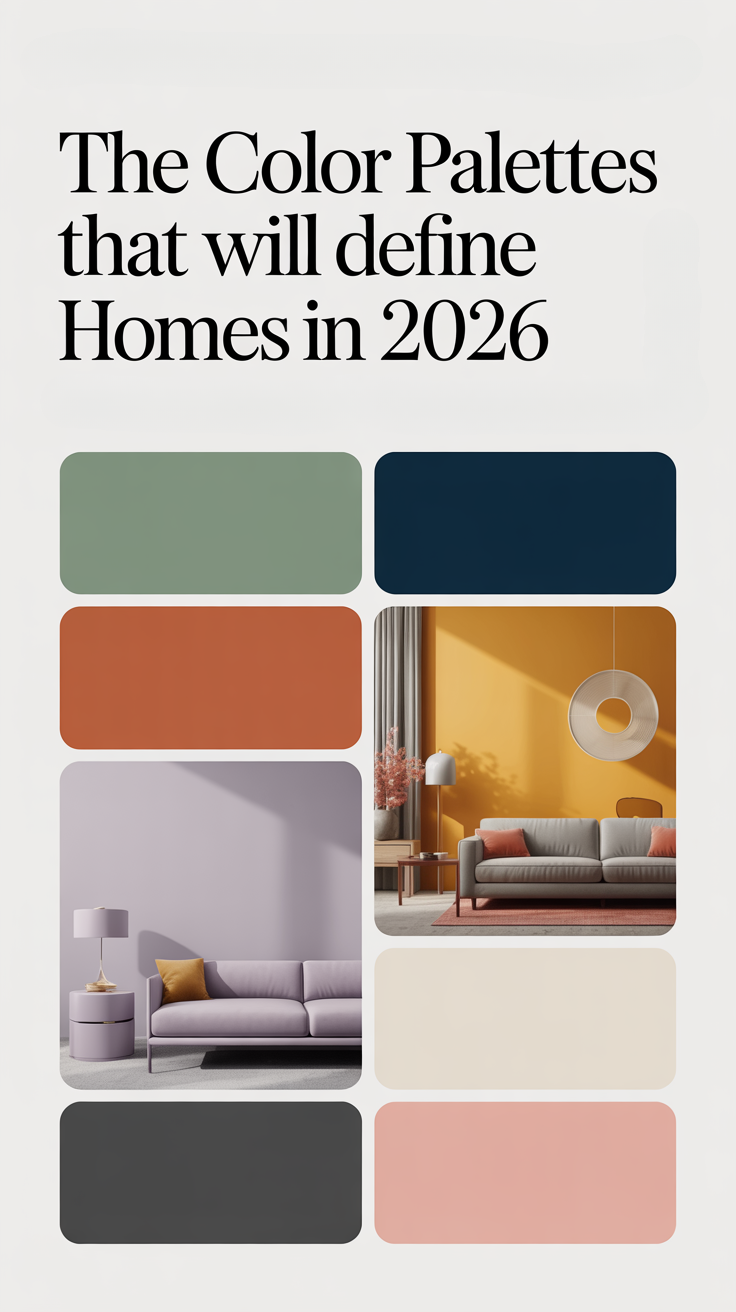
As we look ahead to the next wave of interior design, color is emerging not just as a backdrop—but as a statement. Homes in the coming year will lean into palettes that feel warm, layered, and richly luxurious. This isn’t about bold primary colors or stark minimalism; rather, the trend is toward depth, texture, and emotional resonance. Designers and color forecasters are calling it a shift to “earthy vibrancy,” “new neutrals,” and “soft color drenching.” These tones are rooted in nature, grounded in comfort, and elevated with sophistication.
In this article, we’ll explore the major color palettes set to define homes over the next year—why they’re trending, how to use them, and how to build a space that feels both timeless and deeply personal.
1. The Rise of Warm Neutrals: Goodbye Cool Gray, Hello Rich Simplicity
Why Warm Neutrals Are Making a Huge Comeback
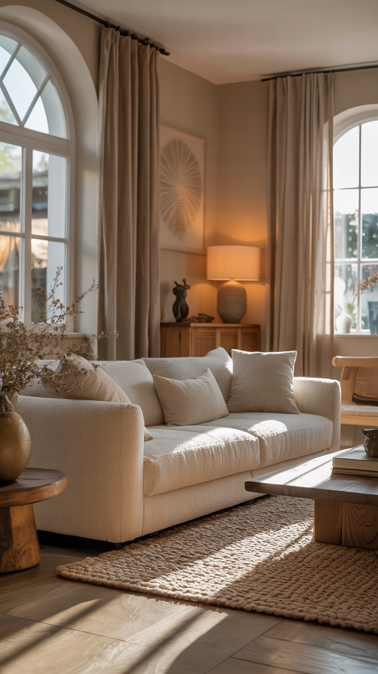
After years of cool grays dominating interiors, the design world is shifting. Warm neutrals—creamy ivories, toasty beiges, sanded khakis, soft taupes—are gaining ground. These are not flat, bland hues. Rather, they’re complex, layered, and textured, giving rooms a sense of calm and luxury.
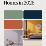
Sherwin‑Williams has spotlighted Universal Khaki as its 2026 Color of the Year, a warm, grounded mid-tone that reflects this trend. This soft, sun-warmed neutral makes a perfect foundation: for walls, trim, or built-ins, it provides a quietly strong base without being stark or sterile.
Libby Langdon of Libby Langdon Interiors notes that warm greens paired with wood and woven textures complement these new neutrals beautifully. Valspar’s 2026 Color of the Year, Warm Eucalyptus, offers another take on organic, soothing tone rooted in nature. How to Use Warm Neutrals in Your Home
Base layer: Use warm neutrals like khaki, cream, or sand on large surfaces—walls and ceilings will feel open but rich.
Textile layering: Bring in linen curtains, wool rugs, and boucle seating to play with texture rather than relying on color variation.
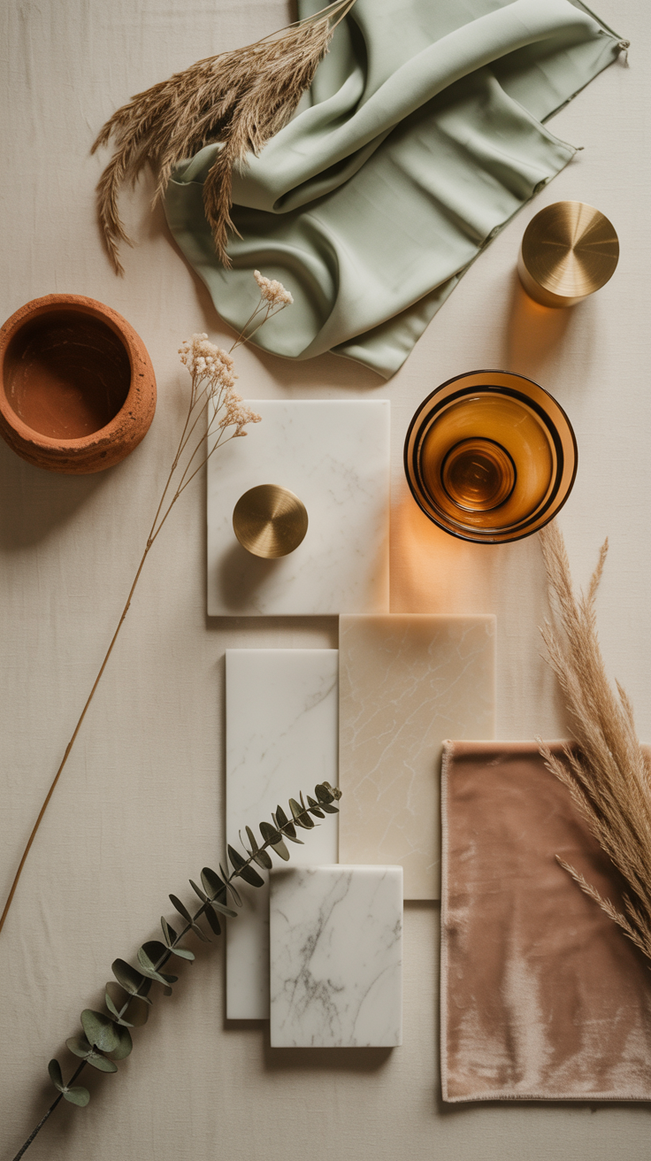
Natural materials: Pair with oak, rattan, or clay to reinforce the grounded, tactile feel.
Subtle highlights: Add accents in buttery yellow or caramel tones to maintain warmth without overpowering the neutral foundation.
2. Earthy Vibrancy: Nature-Inspired Tones with Soul
The next big trend designers are calling “earthy vibrancy” brings together warm earth tones with richer, emotional hues. It’s a palette rooted in nature but infused with depth and sophistication.
Key Hues in Earthy Vibrancy
Ochres & Honeyed Yellows: These soft, sunlit tones offer optimism and warmth.
Olive and Moss Greens: Nature’s neutrals, these greens feel restorative and grounded.
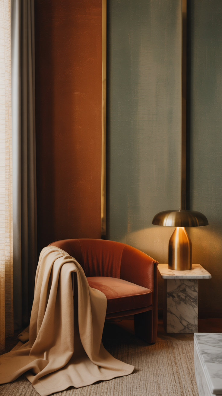
Rich Terracotta & Burnt Clay: Evoking plastered walls and Mediterranean facades, these shades exude texture and history.
Deep Muddy Blues & Plums: These moody, jewel-like tones inject sophistication and emotional richness.
Why Earthy Vibrancy Matters
This palette resonates because it meets a deeper need: authenticity. Rather than the sterile modernism of white and gray, these tones offer a sensory experience. They feel warm, grounded, and emotionally rich. As Good Housekeeping reports, designers are leaning into these shades for their calm-but-expressive power.

How to Style with Earthy Vibrancy
Use a muted terracotta as an accent wall paired with olive-green upholstery.
Create a color-drenched room by layering a deep plum ceiling with walls in a dusty rose or warm neutral for depth.
Accessorize with natural materials like unglazed pottery, wooden bowls, and woven baskets to add tactile contrast.
Introduce metallic accents—aged brass or burnished bronze hardware complements these organic tones beautifully.
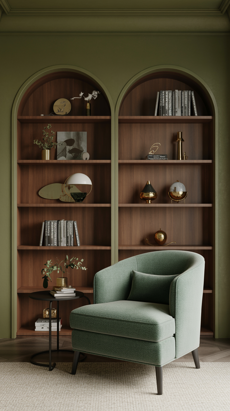
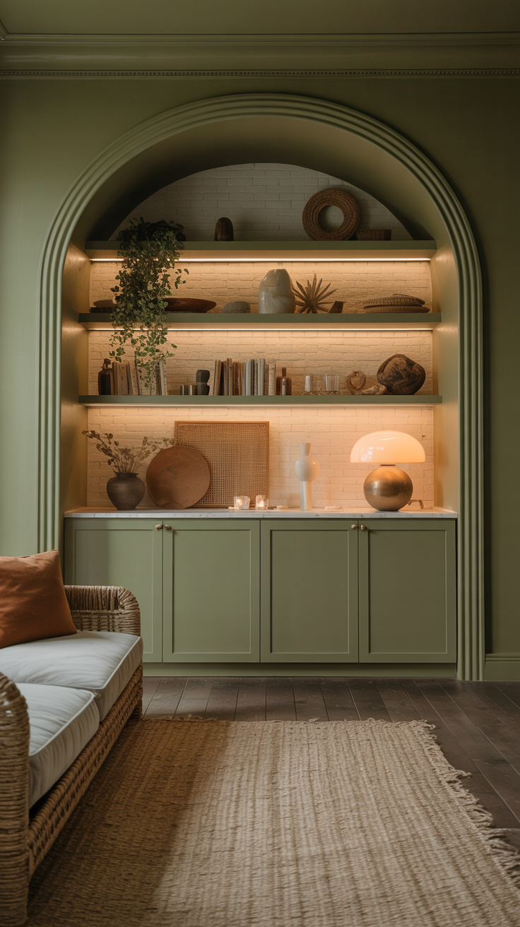
3. Soulful Greens and Playful Teals: Nature Gets Refined
Green has always played a comforting role in interiors, but in the next design cycle, it’s evolving into richer, more expressive shades.
Trends in Green for Next Year
Warm Olive and Herbaceous Greens: These “naturetune” shades are being elevated as new neutrals.
Smoky Jade and Teal: Teals like Behr’s “Hidden Gem” blur the line between green and blue—and they’re rising in popularity.
Vintage-Inspired Greens: Valspar’s 2026 “Warm Eucalyptus” offers a nostalgic, retro-green that feels both calming and rooted.
Why These Greens Work
These greens evoke nature, but in a sophisticated, layered way. They’re not too brash, yet they’re rich enough to serve as statement hues. They bring serenity and depth, nurturing a sense of indoors-meets-outdoors.
Styling Tips for Green Palettes
Use olive or eucalyptus walls with warm ivory trim and wood furniture for a balanced grounded space.
Try a teal-drenched room, where all elements (walls, cabinetry, trim) adopt the hue for an immersive, cocooning feel.
Mix in textured textiles—linen, boucle, wool—to soften the richness of the green and add tactile warmth.
4. Rich Browns and Warm Clay: Depth, Luxury, and Earth
Gone are the days when brown was considered dull. Designers are now embracing deep chocolate, clay, and smoke-tinged cocoa as rich, luxurious canvases.
Brown and Terracotta Hues on the Rise
Chestnut & Chocolate Brown: These tones evoke tradition, warmth, and timelessness.
Clay & Burnt Terracotta: Sun-baked, textured, and alive, they bring architectural drama and natural ambiance.
Ochre & Buttery Amber: Soft, golden tones create a cozy, glowing palette without being sweet or saccharine.
Why These Shades Resonate
These palettes provide a sense of rooted luxury—they feel indulgent but not flashy. In high-end villa interiors, for instance, designers are balancing earthy tones with refined neutrals, achieving a look that feels both elegant and at ease.
Ways to Incorporate Rich Browns & Clay
Paint a feature wall in deep chocolate brown, then layer in terracotta pottery and woven textiles.
Use clay or terracotta accents—vases, planters, or tile—to evoke sunlit warmth, especially in kitchens or dining areas.
Add soft upholstery in ochre or amber to break up the darkness and introduce a glow.
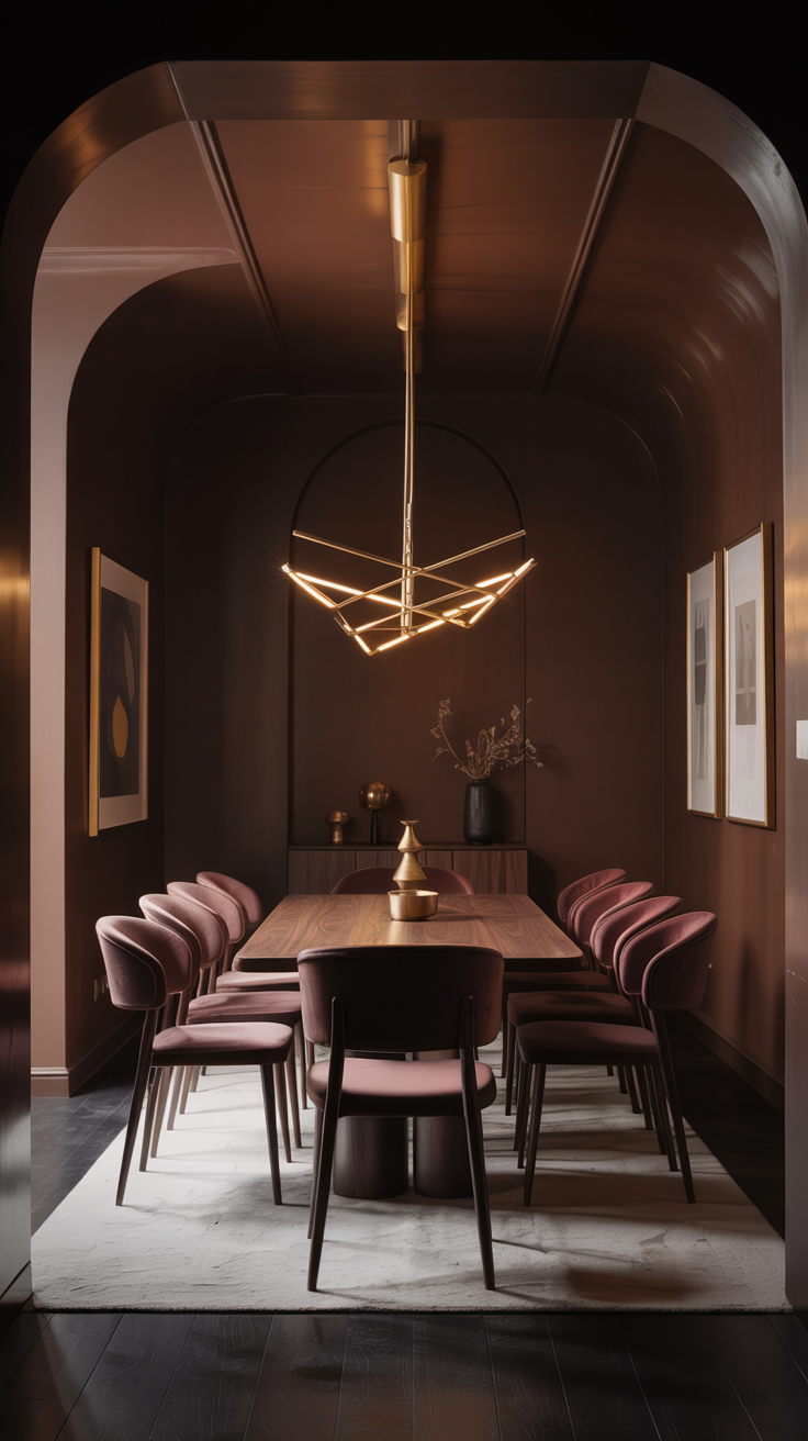
5. Moody Jewel Tones: Jewel-like Depth, Subtle Drama
While earth tones dominate, jewel tones aren’t going away—they’re just getting more muted and expressive.
Jewel Shades to Watch
Plum, Burgundy & Aubergine: Deep, moody purples offer dramatic calm and sophistication.
Muted Emeralds & Teals: These shades are jewel-like but restrained, often paired with warm neutrals or metallics.
Deep Ruby and Carmine: Rich reds with earthy undertones that feel elegant rather than flashy.

Why Jewel Tones Are Making a Comeback
These rich colors invite luxury and introspection without extravagance. They provide depth and a sense of legacy, grounding spaces in personal expression.
Styling with Jewel Colors
Use plum or aubergine on paneled walls or in a moody library for a luxe, intimate feel.
Incorporate emerald or teal through velvet upholstery or accent chairs, balanced by warm wood and brass.
Apply ruby-red accents through throw pillows, artwork, or a statement piece of furniture to punctuate an otherwise neutral space.
6. Soft Pinks, Rosy Neutrals, and “Dirty” Tones: Understated Elegance
Subtle doesn’t mean boring. In 2026, delicate pinks, rosy neutrals, and “dirty” earthy tones will be a major part of the conversation.
Key Shades in This Category
Warm Blush & Peachy Beiges: These hues feel soft, sophisticated, and a touch vintage.
Mushroom, Greige & Cognac: Designers are calling dirty neutrals—shades that mix gray, brown, and an undertone of warmth—to bring depth and comfort.
Dusty Rose & Terracotta Blush: These pink-leaning tones bring gentle drama without overt femininity.
Why These Colors Are Trending
They satisfy the desire for color while maintaining neutrality. These shades feel collected, calm, and luxurious—they don’t shout, but they linger in a space with elegance.
How to Use Them
Paint walls or ceilings in a dusty rose or greige to create a cozy, enveloping space.
Choose soft furnishings like blush velvet cushions or boucle throws to layer warmth and sophistication.
Accent with metallic elements like aged brass or gold to elevate the softness with a touch of shine.
7. Soft Color Drenching: Immersive, Tonal Rooms
One of the most compelling trends that supports these palettes is soft color drenching—the practice of using a single color family across multiple surfaces (walls, trim, cabinetry) to create a unified, cocooning effect. If you want to read more about this trend, I did a big ‘ole post about it a few months back here!
Why It Works
It creates visual harmony and simplifies design while still feeling rich.
The repetition of a hue across planes allows shadow and light to play, giving depth without clutter.
It supports layering textures, since the color stays consistent; your textures become the stars.
Ideas for Implementation
Use Universal Khaki or Warm Eucalyptus across walls, molding, and built-ins to form a soft, enveloping tone.
Try teal drenching in a bathroom or study for a bold, calm moment.
Combine muted plum or dusty rose drenching with warm wood panelling for a serene, spa-like room.
8. Layering for Luxury: Materials, Textures & Finishes
Color is only part of the equation. What truly elevates these palettes to a “luxurious yet grounded” feel is the layering of materials and finishes.
Recommended Textures & Materials
Natural Textiles: Linen, wool, wool-blend boucle—these soft, tactile fabrics add richness without overpowering the color.
Wood & Natural Elements: Oak, rattan, clay, stone, plaster. These organic materials anchor the warm palettes in nature.
Metal Accents: Aged brass, burnished bronze, and brushed gold enhance warmth and sophistication.
Matte & Satin Finishes: On painted surfaces, matte or low-lustre paint helps reflect light softly and hides imperfections; satin finishes on metal or wood provide a gentle sheen.
Layered Lighting: Warm, layered lighting—ambient, task, accent—complements the tonal complexity of these palettes.
Why Layering Matters
Layering isn’t just decorative—it’s functional. It fosters a multi-sensory experience: the warmth of color, the coziness of fabric, the texture under foot, the glow of soft light—all combine to create a deeply luxurious home that feels curated over time, not staged.
9. How to Build a Color Palette: Step-by-Step
Putting these trends into practice can feel overwhelming—but it doesn’t have to. Here’s a simple framework to follow.
Step 1: Choose Your Foundation
Pick a dominant warm or earthy neutral (e.g., Universal Khaki, Melodious Ivory, greige). This will be the base for walls, trim, or larger furnishings.
Step 2: Select 1–2 Accent Hues
Use richer or more expressive tones as accents: choose from olive green, terracotta, smoky teal, or plum.
Step 3: Layer Material and Texture
Add textiles (linen, wool), natural elements (wood, clay), and metallics (brass, bronze) to bring dimension.
Step 4: Add Contrast Gradually
Introduce jewels or darker colors like deep reds or brown in smaller doses—think accent chairs, art, or decorative items.
Step 5: Consider Color Drenching
Decide if you want a monochromatic drench look: run your primary accent across multiple surfaces for cohesion.
Step 6: Use Lighting to Your Advantage
Opt for warm ambient and task lighting so your rich, warm colors glow beautifully rather than appear flat.
Step 7: Edit with Accessories
Curated ceramics, hand-thrown pottery, woven baskets, and textured throws can tie together your palette and give personality.
10. Room-by-Room Inspiration: Where to Use These Palettes
Here are some practical ideas for applying these warm, layered palettes across different spaces in your home.
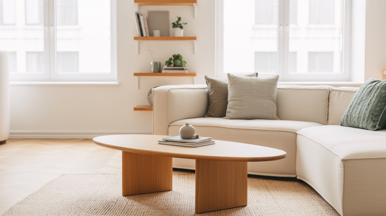
Living Room
Base walls in Universal Khaki.
Accent in smoky teal on a single wall or in upholstery.
Layer with a boucle sofa, linen curtains, and a bronze coffee table.
Dining Room
Paint trim or built-ins in deep plum or muted aubergine.
Use terracotta or clay dinnerware and woven placemats.
Add a soft ochre rug for warmth.
Bedroom
Drench the room in greige or dusty rose for a soothing, restful feel.
Incorporate walnut or oak furniture.
Use linen bedding and throw a wool blanket in olive or soft brown.
Kitchen
Use warm ivory or khaki for cabinetry.
Incorporate terracotta or clay tiles for backsplash.
Add metal hardware in aged brass or burnished bronze.
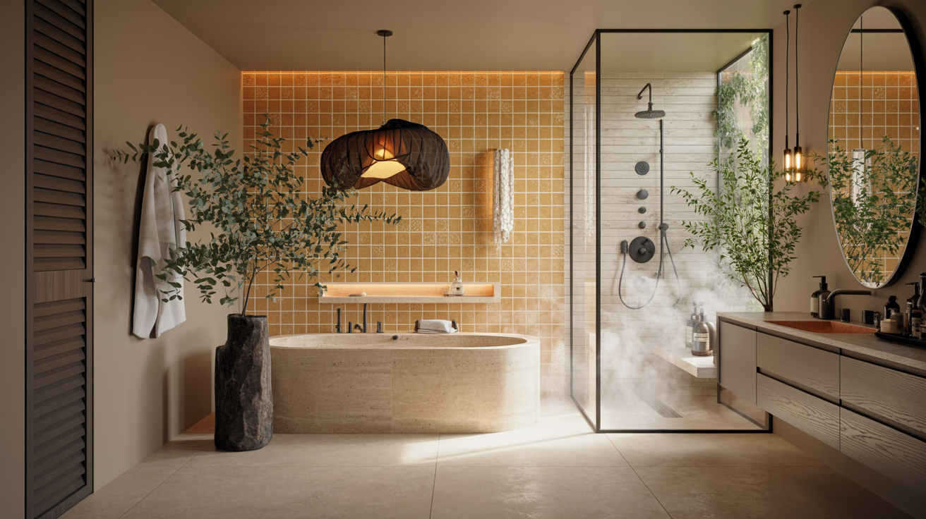
Bathroom
Try a teal-drenched vanity or cabinetry.
Use terracotta or clay vases with greenery.
Bring in linen towels and warm, layered lighting.
11. Why This Trend Resonates: Psychology of Color & Well-Being
These palettes don’t just look good—they feel good. Here’s why they resonate on a deeper level:
Comfort & Warmth: Warm neutrals and earth tones evoke feelings of security and groundedness.
Connection to Nature: Olive greens, clay, terracotta—these are colors of the land, helping interior spaces feel like a retreat.
Emotional Depth: Jewel tones like plum or plum-brown provide richness and introspection without being cold.
Texture & Layering: Using multiple materials in similar tonal families reinforces a sense of luxury crafted over time.
Intentional Living: These palettes support a more mindful approach to design—less flashy, more considered.
12. Avoiding Common Mistakes
Working with these complex, layered palettes can be tricky. Here are some mistakes to avoid:
Too Much of One Tone: If you drench everything in one shade without contrast, spaces can feel flat or monotonous.
Ignoring Light: Warm and deep tones change dramatically with different lighting—test paint samples at different times of day.
Forgetting Texture: Relying only on color without texture flattens the richness these palettes offer.
Neglecting Flow: Make sure your palette carries through rooms in a way that feels cohesive—not disjointed.
Overdoing Accents: Jewel or expressive hues should punctuate, not dominate; use them thoughtfully.
13. Sustainability & Functionality in Color Choices
These palettes align beautifully with broader design priorities for the future—especially sustainability.
Eco-Friendly Paints: Many of these shades are being released by major brands in low-VOC or natural formulations (e.g., Valspar’s Warm Eucalyptus).
Timelessness Over Trend: Warm earth tones, olive greens, and rich browns resist fad cycles, making them a smart long-term investment.
Natural Materials: These color palettes pair naturally with sustainable materials—wood, linen, clay, rattan.
Mindful Living: The layered, soulful palettes encourage slower design decisions—less waste, more intention.
14. Bringing It All Together: The Luxury of Intention
The color palettes dominating next year’s homes are not just about aesthetics—they embody a philosophy: luxury is intentionality, not excess. These warm, layered tones invite you to surround yourself with comfort, depth, and meaning. They push back against sterile minimalism and embrace texture, mood, and emotional richness.
When layered with natural materials, thoughtful lighting, and curated décor, these palettes elevate a house into a sanctuary—a place that feels deeply personal, connected to nature, and quietly elegant.
Designing for a Deeper Kind of Luxury
As we look to the future, the homes that will feel the most compelling are those that resonate with how we live and who we are. Warm neutrals, earthy vibrancy, jewel tones, rosy neutrals—these aren’t fleeting color fads. They are expressions of a desire for sanctuary, rootedness, and soulful design.
To embrace these palettes:
Begin with a versatile neutral foundation.
Layer in nature-inspired hues that reflect your personal style.
Use materials and textures to enrich the experience.
Let light and shadow shape how colors evolve in your space.
Curate thoughtfully, with intention in every piece you choose.
By doing this, your home becomes more than just a stylish space—it becomes a living, breathing reflection of comfort, luxury, and authenticity.