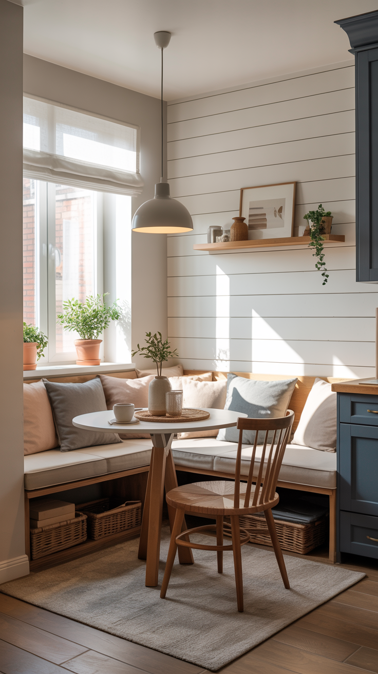
There is a particular kind of courage required to commit to a built-in breakfast nook. Unlike a dining table and chairs that can be rearranged, sold, or quietly replaced when trends shift, a nook is a declaration. It is architecture as much as furniture with millwork that becomes part of the bones of a home. And yet for years, the dominant approach to upholstering these intimate, structural seats has been more reserved and subtle: beige linen, greige performance fabric, sometimes maybe a cautious stripe in navy and taupe. Safe and inoffensive.
Time’s up.
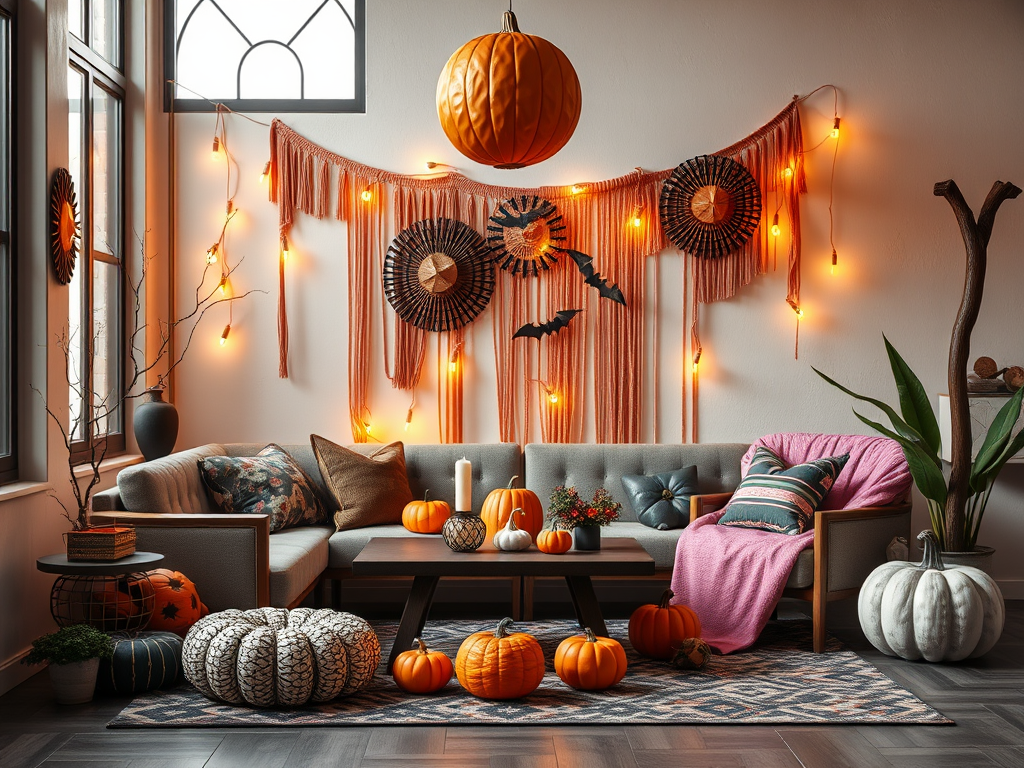
From the pages of Architectural Digest to the feeds of fearless designers, the breakfast nook is experiencing a dramatic reinvention. Upholstery is no longer an afterthought, a neutral backdrop to a centerpiece table or a statement pendant light. I’m seeing a lot of moody florals in deep burgundy and forest green. Bold, graphic stripes in navy and ivory, or black and terracotta. Jewel-tone velvets in sapphire, amethyst, and emerald. The nook, once the most understated corner of the kitchen, is becoming the most expressive room in the house.
This is not a trend born of recklessness. This is all part of a movement, especially one we are seeing in the kitchen, to create a space of joy and genuine personality.
A Brief History of the Built-In Nook
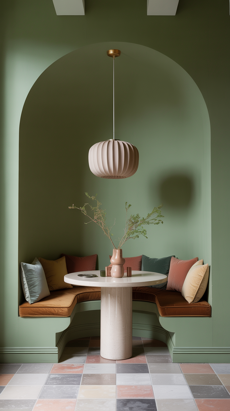
The breakfast nook as an architectural feature emerged in the early twentieth century, same time as the rise of the American bungalow. In the nineteen-teens and twenties, as smaller homes replaced the Victorian estate, home designers and millwork companies tried to find ways to convey a sense of spaciousness within smaller floor plans. The built-in breakfast nook, aka the “breakfast alcove” was one of their most elegant solutions. By tucking a table and two facing benches into a corner of the kitchen, designers created a dedicated dining space that required no additional square footage.
The nook was, from the beginning, a totally functional invention. Storage was often built into the bench seats themselves, with hinged lids that provided space for linens or dry goods. The furniture was typically painted white and kept simple, practical and unpretentious.
What’s interesting is that the nook’s original character was really more defined by restraint. The early bungalow nook was about efficiency versus display. And that utilitarian spirit persisted for a LONG time… decades….even into the 2000’s with open plan layouts. The upholstery, when it existed at all, was almost always neutral. Neutral was a practical choice for a space that saw coffee spills, children’s breakfasts, and the general chaos of daily life.
The contemporary reinvention of the breakfast nook begins with a rejection of that logic. The “new nook” takes advantage of modern performance fabrics allowing us to upholster a nook in velvet or a complex floral print without sacrificing durability. Today’s designers and DIYers understand the nook not as a utilitarian corner but as an opportunity: a contained, architectural space that can be treated with the same intentionality as a jewel-box powder room. The enclosure that once made the nook feel merely functional now feels dramatic and special.
Psychology of the Enclosed Dining Space
Before exploring the fabrics on trend now, it is worth understanding why the breakfast nook is now such a powerful canvas for dramatic design. It’s all about the principle of enclosure. People just have a primal tendency to feel more comfortable, relaxed, and socially connected in spaces that offer a degree of containment.
The nook, by its very nature, provides this. Three walls, or two walls and a window, create what is described as a “room within a room.” This enclosure activates a deep-seated sense of shelter and a place where we can linger. We feel, in some primal way, that we are in a protected space. Restaurants have understood this for decades: the most coveted seats in any dining room are invariably the corner booths, amiright?!
This is why dramatic upholstery works so well in a nook and would feel overwhelming in a larger, more open dining room. The enclosure brings the drama. A jewel-tone velvet that might feel oppressive across an entire open-plan living space becomes, within the three walls of a breakfast nook, something closer to luxury. A moody floral that would read as chaotic on a large sectional sofa becomes, on the two facing benches of a nook, it’s a different more immersive experience.
Moody Florals: The Garden at Dusk
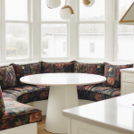
Of all the dramatic upholstery choices available to the breakfast nook, the moody floral is perhaps the most complex. It feels sort of moody, sort of gothic. We’ve graduated from the cheerful florals of Laura Ashley era (my entire childhood bedroom was covered in this!!). That look was sweet, feminine, and deliberately nostalgic. Today the moody floral is something altogether more serious. Its blooms are rendered in deep, saturated colors against dark backgrounds: burgundy roses on a near-black ground, midnight-blue peonies on charcoal, oversized dahlias in rust and ochre against forest green.
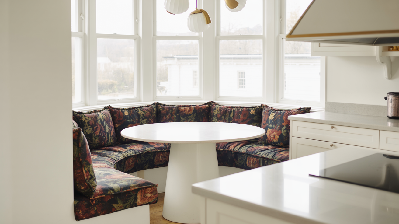
In practice, the moody floral works best in a nook when it is allowed to dominate. Don’t even think about using this look timidly. The benches should be fully upholstered including seat, back, and ideally the inside face of the bench sides so that the pattern envelops the sitter. If the nook has a back wall, consider extending the fabric onto that surface as well, or pairing it with a complementary wallpaper in a coordinating color. The table and any freestanding chairs should be kept relatively simple. Think about using a dark-stained wood, a painted lacquer in one of the ground colors of the fabric so that the upholstery can steal the show.
Color choices within the moody floral palette are expansive but require discipline. The most successful combinations tend to anchor the pattern in one or two dominant hues: deep green and burgundy, navy and rust, black and gold, rather than attempting a full spectrum. The ground color of the fabric should ideally be echoed somewhere in the surrounding: in the color of the cabinetry, the grout of the backsplash tile, or the trim of the window. Trust me, this will make the space actually feel intentional.
Bold Stripes: Structure and Personality
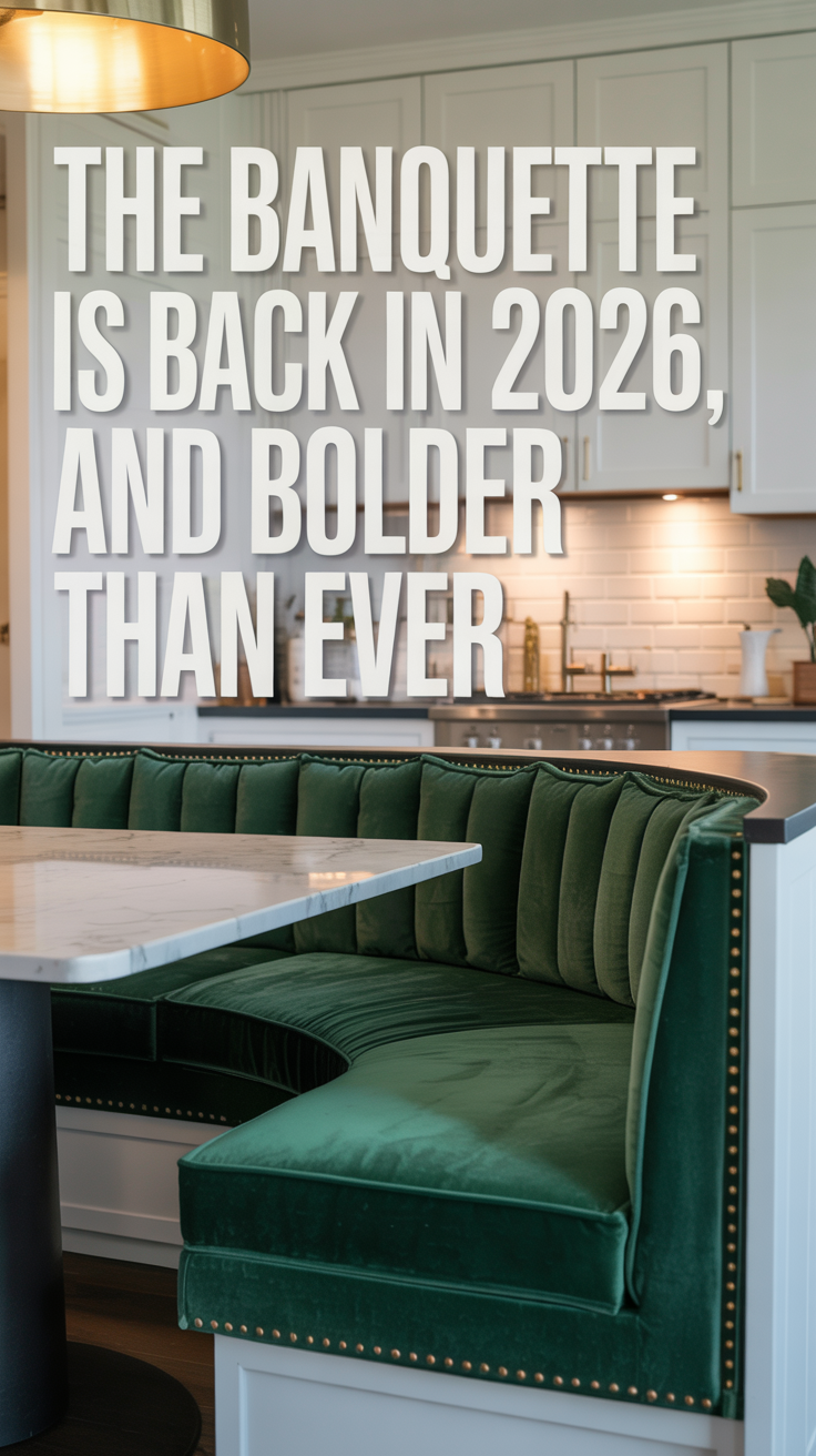
If the moody floral is the romantic choice, the bold stripe is the one that announces confidence without apology. I love the look that Shea Mcgee with Studio Mcgee has pictured in her new spring catalog released this week!
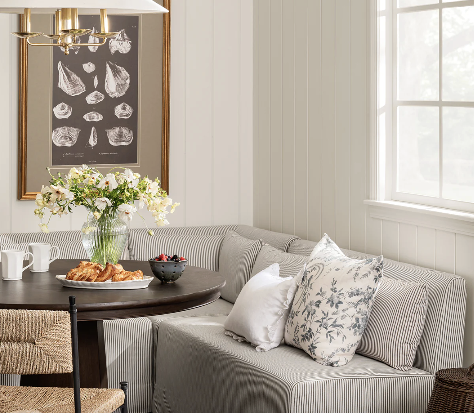
photo: McGee and Co Scaletta Banquette.
Stripes have been used in upholstery for centuries, from the awning-striped banquettes of Parisian brasseries to the ticking-stripe benches of English country kitchens. They carry with them an inherent sense of structure and order that makes them SO well-suited to the clean lines of a built-in nook.
What distinguishes the contemporary bold stripe from its more restrained predecessors is scale and color. Where the traditional ticking stripe is narrow and muted, a fine line of navy or black on cream, the bold stripe of the current moment is wide, graphic, and often unexpectedly chromatic. Think a three-inch stripe alternating between deep terracotta and warm ivory. Or a wide stripe in forest green and antique gold. Or the classic black-and-white stripe, scaled up to the point where it reads almost as an optical illusion, giving the nook a graphic, almost Pop Art quality.
The stripe’s great virtue in a nook context is its ability to simultaneously provide visual interest and maintain legibility. Unlike a complex floral or a heavily textured velvet, a stripe reads clearly from across the room. It gives the nook a strong identity, you know immediately what you are looking at, while also providing a kind of visual rhythm that is inherently satisfying. The horizontal lines of a wide stripe, running along the length of the bench, also have the practical effect of making the seat appear longer and the nook feel more expansive.
The most sophisticated stripe applications in contemporary nook design tend to involve a degree of contrast, not just between the two colors of the stripe itself, but between the stripe and the surrounding environment. A bold navy-and-cream stripe on the banquette reads as particularly striking against a kitchen with warm, natural wood cabinetry and terracotta tile. A black-and-white stripe becomes almost architectural when paired with dark painted walls and brass hardware. The stripe, in other words, does not need to match its surroundings. It needs to respond to them, to create a dialogue between the seat and the space.
One particularly effective approach is to use a stripe in a direction that defies convention. Most striped upholstery runs horizontally, following the natural orientation of the bench. But a vertically striped banquette, with the stripes running from seat to back, creates a sense of height and drama that is genuinely unexpected. It also, incidentally, tends to make the nook feel slightly more formal, more like a private dining room than a casual kitchen corner. This can be a powerful effect in a home where the kitchen is already doing significant design work.
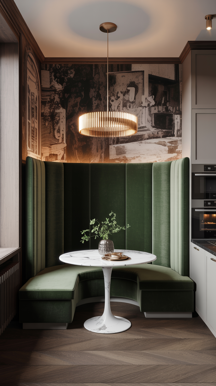
Jewel-Tone Velvet: The Luxury of Depth
Velvet is the fabric that most completely transforms a breakfast nook. No other material carries the same combination of visual depth, tactile richness, and sheer chromatic intensity. When light falls on a velvet surface, it does not simply reflect, it shifts, moving from deep shadow to brilliant highlight as the angle changes. This quality, known as “pile luster,” means that a velvet banquette is never static. It changes throughout the day, from the cool morning light that makes a sapphire velvet look almost grey-blue, to the warm afternoon sun that sets the same fabric glowing like a stained-glass window.
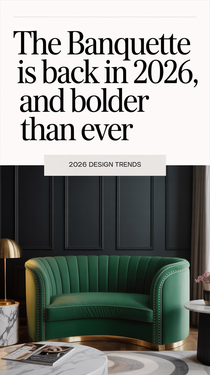
Jewel tones, the deep, saturated colors named for precious stones, are velvet’s natural partners. Emerald green, sapphire blue, amethyst purple, ruby red, and deep teal are all colors that achieve their maximum impact in velvet, because the pile amplifies the depth and richness of the pigment. A flat-woven fabric in emerald green is pleasant. An emerald velvet is extraordinary. The color seems to have an interior light source, a luminosity that flat fabrics just can’t replicate.
In the context of a breakfast nook, jewel-tone velvet performs a specific and powerful function: it elevates the mundane. The nook is, after all, the place where you eat cereal on a Tuesday morning, where children do homework after school, where the dog sits hopefully beside the table. It is not, by its nature, a glamorous space. And yet a banquette upholstered in deep amethyst velvet transforms every meal into something slightly more special. It creates the feeling irrational but entirely real that the ordinary rituals of daily life are worth celebrating.
The practical objections to velvet in a kitchen-adjacent space are real but manageable. Velvet does attract pet hair and lint, and it requires more careful maintenance than a flat-woven performance fabric. However, the development of performance velvets, fabrics that combine the visual and tactile qualities of traditional velvet with the stain-resistance and durability of synthetic fibers, has made the material genuinely viable for high-use seating. Many designers now specify performance velvet for nooks and banquettes as a matter of course, accepting a slight reduction in the depth and luster of the pile in exchange for significantly improved practicality.
The color choice within the jewel-tone palette should be made in relation to the rest of the kitchen’s color story. Emerald green velvet is a natural partner for kitchens with brass hardware, dark-painted cabinetry, or warm wood tones. Sapphire blue reads beautifully against white or cream cabinetry, particularly when paired with silver or chrome hardware. Amethyst and deep plum are perhaps the most unexpected choices, and therefore the most rewarding, creating a nook that feels genuinely singular, unlike anything seen in a showroom or a design magazine.
Styling the Dramatic Nook: Layers, Light, and Restraint Elsewhere
Choosing a dramatic upholstery fabric is only the beginning. The full effect of a moody floral, bold stripe, or jewel-tone velvet nook depends on how the surrounding elements are handled, and the cardinal rule is that the upholstery must be allowed to lead.
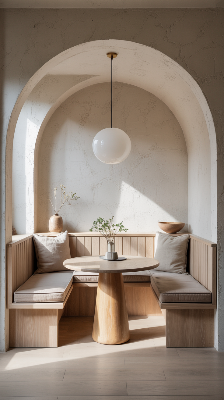
The table should be chosen to complement, not compete. A dark-stained oak or walnut table is almost universally successful with dramatic upholstery, providing warmth and weight without visual noise. A painted table in a single color pulled from the fabric, the deep green of a floral’s leaves, the rust of a stripe’s warm tone, can be a more adventurous but equally effective choice. Marble or stone tops work well with velvet, their cool hardness providing a pleasing contrast to the fabric’s warmth.
Lighting is the element most often underestimated in nook design. A pendant light hung directly above the table is not merely functional, it is a framing device, drawing the eye to the nook and creating a pool of warm light that makes the upholstery glow. For a velvet nook, a pendant with a warm-toned bulb (2700K or lower) will deepen the richness of the color. For a floral or stripe, a more directional light that casts slight shadows can bring out the texture of the fabric. Brass, aged bronze, and unlacquered copper are all excellent pendant finishes for dramatic nooks, adding warmth and a sense of craft.
Cushions and throw pillows should be used sparingly but thoughtfully. In a nook with a complex floral upholstery, a single solid-colored cushion in one of the fabric’s ground colors provides comfort without visual competition. In a velvet nook, a cushion in a contrasting texture, a nubby linen, a woven wool, a printed cotton, adds tactile interest without undermining the velvet’s dominance. The temptation to pile the nook with throw pillows should be resisted; in a small, enclosed space, too many pillows quickly become claustrophobic.
The wall treatment above and around the nook offers another opportunity for layering. A nook with bold stripe upholstery might be framed by a simple painted wall in a deep, complementary color, the stripe doing the pattern work, the wall providing a rich, solid backdrop. A floral nook might be set against a wallpaper in a coordinating botanical print, creating a fully immersive environment. A velvet nook can handle a more graphic wall treatment, a geometric tile, a lacquered paint finish, even a piece of large-format art because the velvet itself is relatively quiet in terms of pattern.
The floor beneath the nook is often overlooked, but a well-chosen rug can dramatically enhance the sense that the nook is a distinct room within the kitchen. A Persian-style rug in colors that echo the upholstery, or a simple jute or sisal in a natural tone, both work well. The rug should be large enough to extend beyond the table on all sides, anchoring the nook visually.
Durability, Maintenance, and the Case for Performance Fabrics
The most common objection to dramatic upholstery in a breakfast nook is practical: won’t it show every spill, every crumb, every mark left by a child’s sticky fingers? The honest answer is that it depends entirely on the fabric chosen, and that the range of available options has expanded dramatically in recent years.
The key distinction is between decorative and performance fabrics. Traditional decorative fabrics, standard velvet, untreated linen, delicate floral chintz, are beautiful but vulnerable. They stain easily, fade in direct sunlight, and are difficult to clean without professional assistance. These are not appropriate choices for a high-use nook in a family kitchen.
Performance fabrics, by contrast, are engineered to resist staining, moisture, and abrasion while maintaining the visual and tactile qualities of their decorative counterparts. The table below summarizes the key options and their relative strengths.
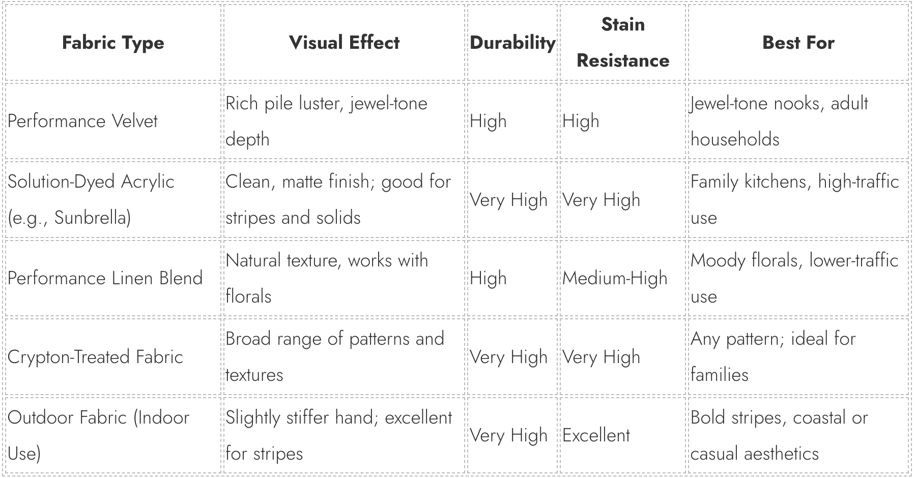
The most important specification to check when selecting an upholstery fabric for a nook is the double-rub count which is a measure of abrasion resistance. For residential use, a minimum of 15,000 double rubs is recommended; for a high-traffic nook in a family home, 30,000 or above is preferable. Many performance velvets and solution-dyed acrylics now meet or exceed this threshold while offering the full range of colors and patterns available in decorative fabrics.
Maintenance is also simpler than many homeowners assume. Most performance fabrics can be spot-cleaned with a damp cloth and mild soap, and some can be cleaned with diluted bleach without affecting color or texture. The key is to address spills immediately rather than allowing them to set which makes even the most dramatic upholstery entirely livable.
The Anti-Beige Manifesto: Why This Moment Matters
The shift toward dramatic upholstery in breakfast nooks is not merely an aesthetic trend. It reflects something more significant: a growing rejection of the idea that the home must be a neutral, inoffensive backdrop to life, rather than an active participant in it. For too long, the dominant logic of residential design, particularly in kitchens and dining spaces, has been one of resale value, of broad appeal, of the lowest common denominator. Beige banquettes exist not because anyone particularly loves beige but because no one is offended by it.
The moody floral, the bold stripe, and the jewel-tone velvet represent a different philosophy. They say, clearly and without apology, that the people who live in this house have taste, specific, developed, personal taste, and that they are not designing for a hypothetical future buyer but for their own daily pleasure. They say that the breakfast nook, this small, enclosed, architectural corner of the home, is worth caring about. Worth investing in. Worth making beautiful.
There is also something deeply democratic about this shift. The breakfast nook, historically, was invented for modest homes, for people who could not afford a separate dining room. Its reinvention as a canvas for dramatic design is not about luxury in the conventional sense. A length of bold-stripe fabric costs no more than a length of beige linen. The beige banquette had its moment. That moment has passed. In its place: the deep green velvet that makes your morning coffee feel like an occasion. The moody floral that turns a Tuesday breakfast into something worth sitting down for. The bold stripe that announces, the moment you walk into the kitchen, that this is a home where beauty is taken seriously.
That is the breakfast nook for the current moment.