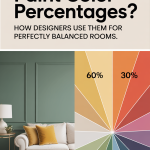
Choosing the right paint color is one of the most transformative decisions you can make in your home. But if you’ve ever fallen in love with a color swatch only to feel disappointed once it’s on the wall, you’re not alone. Designers know a secret that most homeowners don’t: paint color percentages.
This simple technique—widely used in professional interior design—allows you to create custom shades of your favorite paint colors, adjust intensity, and achieve harmony across different lighting conditions. Understanding how paint percentages work can be the difference between a room that feels “fine” and one that feels beautifully balanced.
So today I want to talk about exactly what paint color percentages are, how they’re created, when designers use them, and how you can use this insider method to get magazine-worthy results in your own home!
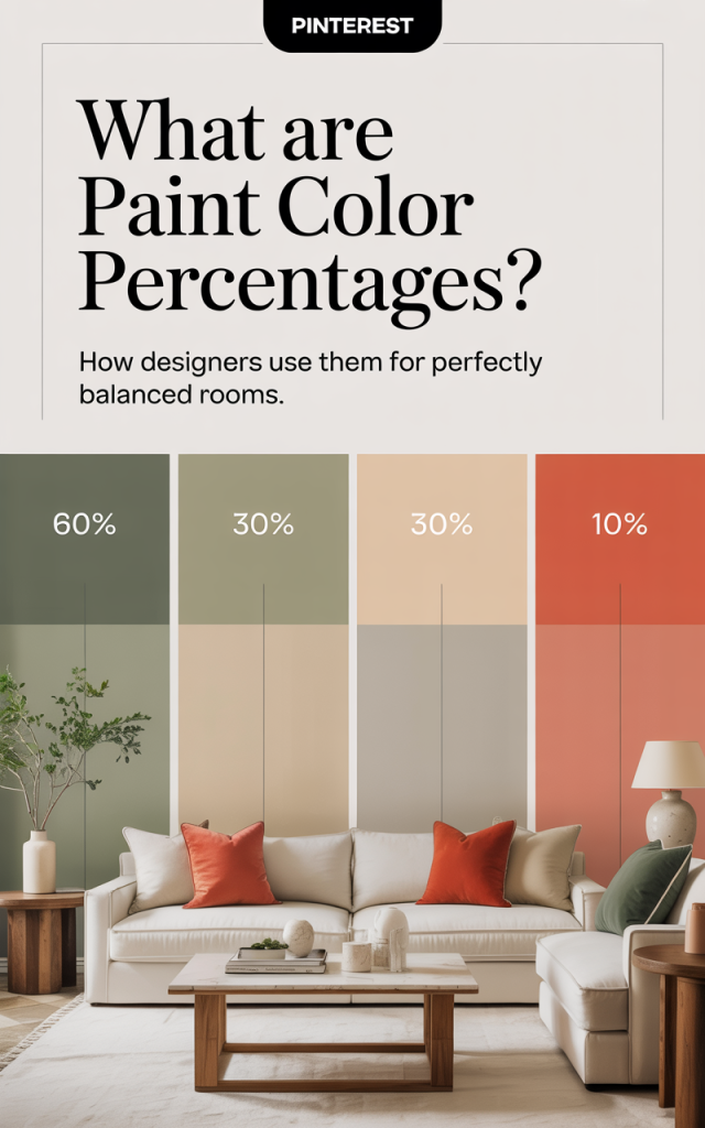
Section 1: What Are Paint Color Percentages?
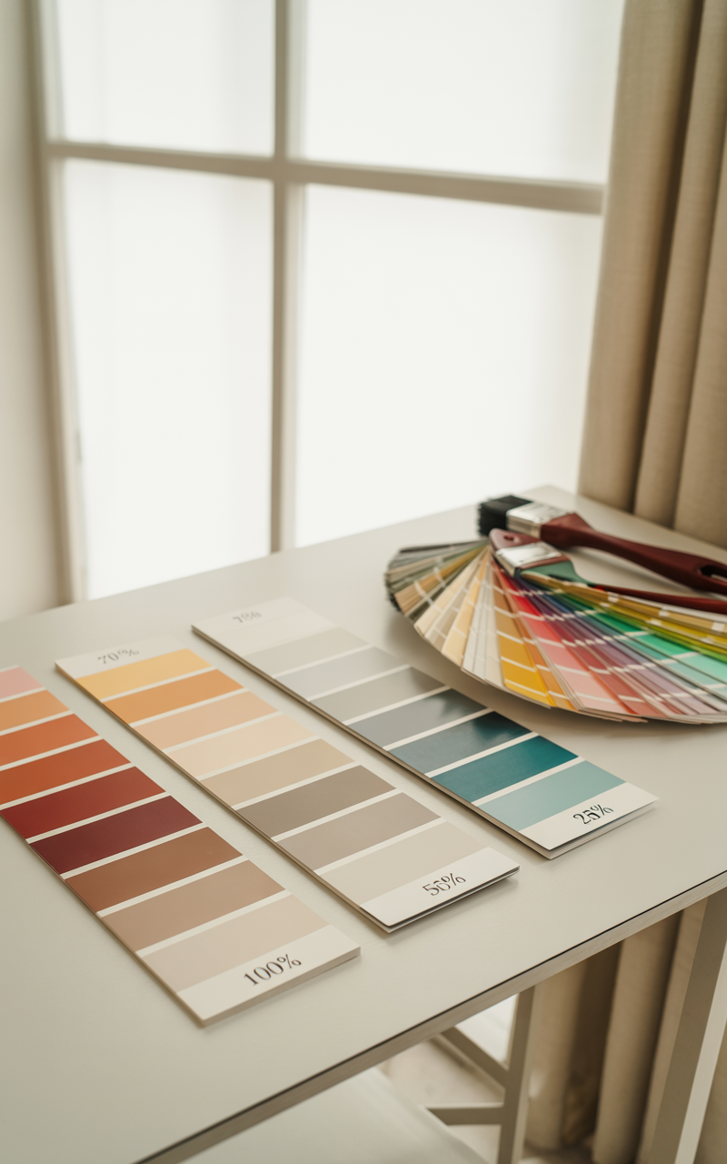
Paint color percentages refer to lighter or darker versions of an existing paint color—custom-mixed by adjusting the formula to a certain percentage of its original strength.
If you’ve ever seen terms like:
50% formula
25% strength
75% mix
125% or 150% formula (for richer color)
…these all refer to paint color percentages.
How It Works
Every paint color starts with a formula consisting of specific pigments in exact ratios. When a paint store mixes a can of paint, they use a computer to dispense these pigments down to 1/48th of an ounce.
When you ask for a color at 50% strength, the paint technician simply divides the pigment amounts by two. A 25% mixture uses one-quarter of the pigment amount. A 150% mix multiplies the pigments by 1.5.
The base remains the same—only the tint intensity changes.
This creates a custom shade that still feels related to the original color, but subtly different:
Lower percentages = lighter, softer, airier
Higher percentages = richer, moodier, more saturated
Think of it like turning a dimmer switch up or down on a color.
Section 2: Why Do Designers Use Paint Color Percentages?
Professional designers use percentages constantly because they deliver control, nuance, and cohesion—elements that elevate a room from amateur to sophisticated.
Here’s why designers rely on them:
1. To Fix Lighting Issues
Lighting dramatically affects paint color. A color that looks beautiful in a showroom or a Pinterest photo may look completely different in your home depending on:
North- vs. south-facing windows
Amount of natural light
Color temperature of bulbs
Time of day
Shadows and reflections
Designers use paint percentages to fine-tune a color so it reads how the client originally intended.
Examples:
A gray that looks too dark in a north-facing room → lighten it to 50%.
A white that looks washed out in a bright south-facing room → deepen it to 75% or 150%.
Rather than picking a totally different color, designers adjust the strength.

2. To Create a Cohesive, Whole-Home Palette
Paint percentages help create subtle shifts within the same color family.
Designers often:
Use a base color (e.g., Benjamin Moore “Revere Pewter”)
Apply 75% in hallways
50% in bathrooms
Full strength in living rooms
The house feels cohesive but not monotonous. Each room maintains its own personality while staying visually connected.
3. To Balance Color with Other Materials
Surfaces like countertops, flooring, fabric, tile, and cabinetry all carry undertones. Designers adjust paint percentages to keep colors from clashing or feeling too bold when paired with these fixed finishes.
Example:
A paint sample looks great on the swatch
But next to warm oak flooring, the color reads too intense
Solution → reduce strength to 75% for a softer effect
This is especially useful in kitchens, bathrooms, and rooms with multiple hard finishes.
4. To Re-Create Inspiration Photos
Most people bring designers inspiration from Instagram or Pinterest. But achieving the exact look is tricky because photos are edited, styled, and shot in certain lighting.
Designers reverse-engineer the color using percentages:
If a popular color (like “Agreeable Gray”) looks lighter in a photo than it does in real life → lighten it
If a moody, dramatic photo shows a color that looks deeper → request 125% or 150%
This lets you get the look you love—without guessing.
5. To Fine-Tune Whites (The Most Common Use Case)
Whites are notoriously tricky. They can lean:
too yellow
too blue
too stark
too gray
Designers often reduce or increase a white’s percentage to soften or intensify undertones.
For example:
A white that looks too cold → reduce to 75%
A white that feels too flat → boost to 125% or 150%
This creates a tailored, custom white that works perfectly in each space.
Section 3: When Should YOU Use Paint Color Percentages?
You don’t need to be a designer to use paint percentages effectively. There are clear moments when this tool makes a huge difference.
Use Paint Percentages When…
1. The Color Looks Too Dark or Too Light
Instead of hunting for a whole new color (which leads to decision fatigue), simply adjust the percentage.
Use this rule of thumb:
Too dark? Try 75% or 50%.
Too light? Try 125% or 150%.
It saves time, money, and mistakes.
2. You Want the Same Color in Multiple Rooms
If one room gets tons of light and another has none, using the same paint color at full strength will not look consistent.
Example:
Living room (bright): 100%
Bedroom (dim): 75%
Hallway (shadowy): 50%
Suddenly the house looks cohesive instead of patchy.

3. You’re Creating a Monochromatic or Neutral Palette
Using the same color at different strengths creates subtle dimension.
Perfect for:
Whole-home neutrals
Bedrooms
Mudrooms
Bathrooms
Open floor plans
Designers frequently choose one versatile color and apply multiple percentages depending on how open or dark each area is.
4. You Want That “Custom Home” Look
Ever notice how high-end homes have walls that feel soft, layered, and expensive—even when the palette is simple?
That’s because designers rarely use straight-from-the-can colors throughout an entire home.
Custom percentages feel intentional and bespoke.

5. You Love a Color, But…
Sometimes you love everything about a color except one thing—it feels too bold, too moody, too flat, or too saturated.
Adjusting the percentage solves the problem while keeping the essence of the color.
6. You’re Painting Trim, Ceilings, and Walls the Same Color
A designer favorite is painting walls, trim, and ceilings all the same color, with one twist:
Walls → 100%
Trim → 75% or 50%
Ceilings → 25%
It’s visually soft, luxurious, and creates architectural depth without using multiple colors.
7. You’re Nervous About Going Too Bold
If you love a color but fear committing to it, start with:
75% strength for color
50% strength for darker colors
This is the perfect middle ground—softened, safer, but still stylish.
Section 4: How to Ask for Paint Percentages (Step-by-step)
Here’s the good news: Every professional paint store can create percentages. You simply need to know how to request them.
1. Choose Your Base Color
Pick the original color from the brand you’re using:
Sherwin-Williams
Benjamin Moore
Farrow & Ball
Behr
Dunn-Edwards
etc.
2. Decide the Percentage
The most commonly used are:
50% (half strength)
75% (lighter but not washed out)
25% (very soft, almost pastel)
125% or 150% (richer, more saturated)
Designers rarely go above 150%.

3. Tell the Paint Technician:
“Can you mix this color at __% strength?”
Or:
“Can you reduce the formula to 75%?”
Or:
“Can you increase this formula to 125%?”
They will type in the adjustment and the computer automatically does the math.
4. ALWAYS Get a Sample
Never skip this step.
Because base paints vary (white bases, deep bases, ultradeep bases), the final result may differ slightly. Testing on your actual wall ensures the tone matches your vision.
5. Label the Can Clearly
Write something like:
“SW Alabaster – 75% Strength”
“BM Hale Navy – 50% Formula”
If you ever need touch-ups, you’ll know exactly what you used.
Section 5: Real-Life Examples of Paint Percentages
Here are scenarios where percentages create dramatic improvements:
Example 1: The Too-Dark Gray
Color: Benjamin Moore “Chelsea Gray”
Problem: Looks too heavy in a hallway
Solution: Mix at 50% → A soft, elegant greige
Example 2: The Too-Bright White
Color: Sherwin-Williams “Pure White”
Problem: Looks stark under LED lighting
Solution: 75% → Slightly softened without looking yellow
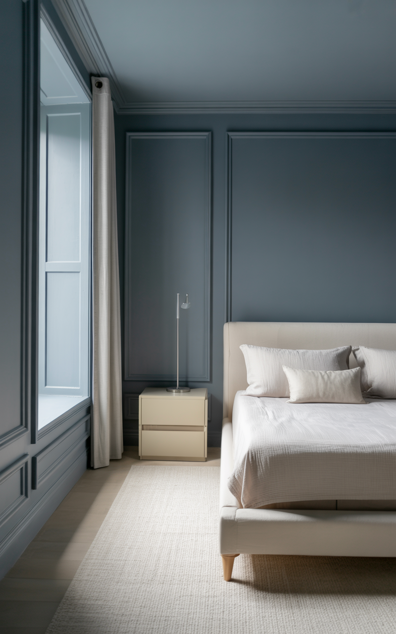
Example 3: The Perfect Coastal Blue
Color: Benjamin Moore “Hale Navy”
Goal: A softer, airy navy for a bathroom
Solution: 50% → A modern coastal blue-gray
Example 4: Matching a Pinterest Photo
Color: Sherwin-Williams “Accessible Beige”
Issue: Looks darker than the inspiration photo
Solution: 75% → Achieves that light, peaceful Pinterest look
Example 5: Whole-Home Cohesion
Color: “Repose Gray”
Living Room: 100%
Bedrooms: 75%
Bathrooms: 50%
Trim: 25%
Looks custom, cohesive, designer-level.
Section 6: Tips for Using Paint Percentages Like a Designer
These insider techniques help you get flawless results.
Tip 1: Always Test in Multiple Lighting Conditions
Morning, afternoon, evening, artificial lighting—colors shift all day long. Check all times.
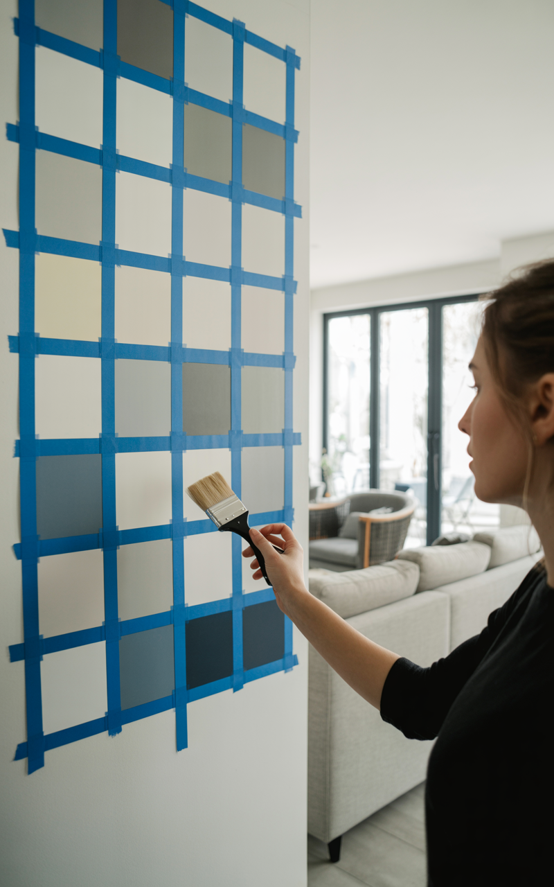
Tip 2: Paint a Large Sample (At Least 12×12 Inches)
The tiny swatch will not be accurate.
Tip 3: Look at the Color Next to Finishes
Hold samples up to:
Tile
Flooring
Fabrics
Cabinetry
This is where percentages truly shine.
Tip 4: Use Higher Percentages in Large, Bright Rooms
Sun-filled rooms can wash out colors.
Tip 5: Use Lower Percentages in Small or Dim Rooms
Dark colors get even darker in small, low-light rooms.
Tip 6: Don’t Overthink Undertones
Percentages soften undertones naturally.
For example:
Greens become sage
Blues become misty
Beiges become airy
Grays become greige
This is why designers love percentages—they often solve undertone issues.
Tip 7: Keep the Sheen Consistent
Consistency in sheen (like eggshell or satin) ensures colors look intentional.
Section 7: Common Mistakes to Avoid
Mistake 1: Forgetting to Label the Can
Touch-up disasters happen when you don’t know the percentage you used.
Mistake 2: Comparing Percentages Across Brands
100% of “Revere Pewter” is not equal to 50% of “Mindful Gray.”
Percentage only applies to the exact same paint color.
Mistake 3: Assuming 50% Always Looks Half as Dark
Lighting and base paint affect results—test before committing.
Mistake 4: Using Too Many Percentages in One Home
Stick to one or two variations for cohesion.
Mistake 5: Thinking a Lighter Percentage Means “Less Pigmented”
A lighter percentage still has undertones. It’s simply a softer expression.

Why You’ll Love Using Paint Percentages
Using paint color percentages is one of the easiest ways to get professional-level results—without hiring a designer.
It gives you:
More control
Smoother color transitions
Balanced colors in every lighting condition
A true custom home look
Fewer surprises
A palette that feels cohesive and thoughtful
Whether you’re painting a single room or your entire home, adjusting paint percentages lets you achieve a soft, layered, designer aesthetic that feels elevated, harmonious, and uniquely yours.
Once you use this technique, you’ll never look at paint color the same way again.