Embarking on a home renovation is a journey filled with excitement and anticipation. It’s a chance to breathe new life into your living space, to tailor it to your tastes, and to create the home of your dreams. Yet, in the quest for that perfect Pinterest-worthy aesthetic, a common and disheartening pitfall awaits many well-intentioned homeowners: the shrinking room effect. It’s a frustrating phenomenon where, despite significant investment and effort, renovation choices inadvertently make a space feel smaller, more cramped, and less inviting than before. This article will explore the common renovation decisions that contribute to this illusion of a shrinking space, delving into the architectural missteps, the misuse of color and light, and the critical errors in furnishing and layout that can undermine your home’s potential. By understanding these pitfalls, you can make informed decisions that will expand your home’s sense of space, creating an environment that is both beautiful and breathable.
The Architectural Culprits
The very bones of a room—its architectural features, openings, and surfaces—play a foundational role in our perception of its size. It is here, in the permanent and semi-permanent decisions, that some of the most impactful mistakes are made. These architectural choices can either create a sense of openness and grandeur or impose a feeling of confinement that no amount of clever decorating can fully overcome.
Heavy-Handed Details: When More is Less
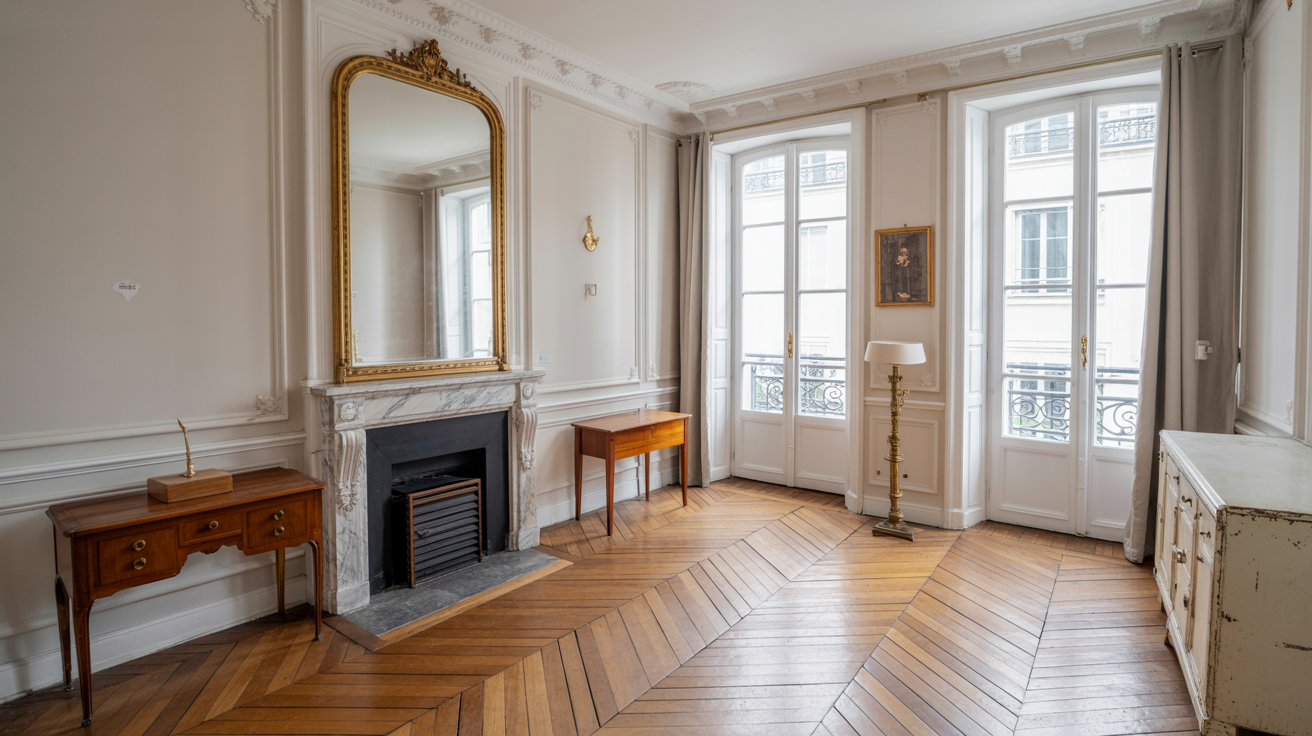
In the world of interior design, details matter. However, there is a fine line between adding character and creating clutter. One of the most common offenders in this category is heavy crown molding. While often seen as a luxurious feature, overly ornate or disproportionately large molding in a room with standard 8-foot ceilings acts as a distinct horizontal line, a “hard stop” that visually lowers the ceiling and makes the entire room feel shorter. For a room of this height, a more appropriate and space-enhancing choice would be a simpler molding profile between 2.5 and 6 inches tall. The key is proportion; the detail should complement the room, not dominate it.
Similarly, features like coffered ceilings and faux beams can be stunning in expansive rooms with high ceilings, where they add texture and architectural interest. However, when introduced into smaller, lower-ceilinged spaces, they can feel oppressive and heavy. These features break up the clean plane of the ceiling, bringing it down and making the room feel enclosed. The effect is magnified when these elements are painted in dark or contrasting colors, which further draws the eye to the lowered visual height.
Beyond the ceiling, an excess of visual breaks on the walls can also contribute to the shrinking room effect. While elements like wainscoting, chair rails, and intricate trim can add a traditional charm, using too many of them, especially in combination with color-blocked paint schemes, can chop up the walls. Each horizontal or vertical line creates a new boundary, making the walls appear shorter and the room feel busier and more constricted. The goal should be to create long, uninterrupted lines that draw the eye upward and outward.
Doors and Windows: The Unsung Saboteurs
Doors and windows are the gateways for light and movement within a home, and their treatment is critical to a room’s perceived size. A surprisingly common and easily avoidable mistake is the use of inward-swinging doors in tight spaces like small bathrooms or laundry rooms. A standard door can consume up to 10 square feet of usable floor space, creating an awkward and cramped layout. Simple yet effective solutions include installing a pocket door that slides into the wall, a stylish barn door that slides alongside it, or simply reversing the door swing to open outwards into a less critical area.
Equally important is the treatment of windows. Hanging window treatments too low is a frequent design faux pas. When curtains or drapes are hung directly at the top of the window frame, they make the window itself appear smaller and visually drag the ceiling down. The professional designer’s trick is to hang the curtain rod high, just a few inches below the ceiling, and wide, extending beyond the window frame on either side. This technique creates the illusion of taller, wider windows, allowing more natural light to enter and drawing the eye upward, which makes the entire room feel more spacious.
Flooring Faux Pas
The floor is the visual foundation of a room, and the choice of material and color can have a profound impact on its perceived dimensions. Dark statement flooring, such as deep-toned hardwood, slate, or dark tiles, can be dramatic and sophisticated, but it also absorbs a significant amount of light. In a room that is already small or lacks abundant natural light, this can make the space feel grounded in a way that shrinks its perceived boundaries. Lighter-colored flooring, by contrast, reflects light and can make a room feel more open and airy.
Beyond color, the pattern and direction of the flooring matter. Busy, small-scale patterns on tiles or carpets can create a sense of visual clutter, making the floor feel chaotic and the room smaller. Larger format tiles or broader, less intricate patterns tend to create a calmer, more expansive feel. When it comes to wood flooring, the direction of the planks can be used to manipulate the perception of space. Running the planks parallel to the longest wall of a room will accentuate its length, making it feel longer and more spacious.
The Illusionists: Color, Light, and Reflection
While architectural elements form the physical structure of a room, the interplay of color, light, and reflection are the illusionists that can dramatically alter our perception of that structure. These elements are less about physical dimensions and more about manipulating the eye to see space where it might be limited. Getting them right can make a small room feel expansive, while getting them wrong can make even a generous space feel confining.
The Color Conundrum
Paint is one of the most transformative and cost-effective tools in a renovator’s arsenal, but its power can be wielded for good or for ill. A common misconception is that painting a small room stark white will automatically make it feel bigger. While light colors are indeed reflective, a pure, clinical white can sometimes feel flat and boxy, highlighting the room’s small dimensions rather than expanding them. Often, soft, light-to-mid-tone neutrals with a hint of warmth or coolness are more effective at creating a sense of depth.
The most well-known color mistake is the use of dark, heavy colors on all walls. These colors absorb light, making the walls feel as though they are closing in. This doesn’t mean dark colors are forbidden, but they must be used with intention and in rooms with ample natural light, or to create a specific cozy, cocooning effect. A more insidious error, however, is the accent wall trap. The once-popular trend of painting a single wall in a bold, dark color can actually make a room feel smaller by breaking the visual continuity and drawing all the attention to one small section of the room, effectively foreshortening the space.
The most effective solution is to create a cohesive, seamless color palette. By painting the walls, trim, and even the ceiling in the same light-to-mid-tone color, you erase the boundaries between surfaces. This creates an uninterrupted visual field, making it difficult for the eye to tell where one plane ends and another begins, which results in a more expansive and airy feeling. This technique, often called “color drenching,” is a powerful tool for making any room feel larger.
Lighting: The Ultimate Space Expander
Lighting is, without a doubt, one of the most critical and often overlooked elements of successful interior design. The most frequent mistake is relying on a single, central overhead fixture. This type of lighting casts shadows downwards, often leaving the corners of the room dark and creating a pool of light in the center that can make the space feel smaller and less balanced. It creates a flat, one-dimensional light that lacks warmth and interest.
The solution is to implement a layered lighting scheme, which involves using multiple light sources at different heights to create a well-lit, functional, and inviting atmosphere. A successful scheme incorporates three types of lighting:
- Ambient Lighting: This is the general, overall illumination of the room, which can be provided by recessed lights, a stylish flush-mount fixture, or track lighting.
- Task Lighting: This is focused light for specific activities, such as reading or cooking. It includes under-cabinet lights in the kitchen, a floor lamp next to a reading chair, or a desk lamp.
- Accent Lighting: This is directional light used to highlight architectural features, artwork, or decorative objects. Wall sconces, picture lights, and uplighting for plants are all forms of accent lighting.
By combining these three layers, you can eliminate dark corners, create a sense of depth, and draw the eye around the room, all of which contribute to a feeling of spaciousness. Furthermore, installing dimmer switches on all light sources is a non-negotiable. Dimmers provide ultimate control over the mood and intensity of the light, allowing you to adapt the space for any occasion and prevent the harsh, space-shrinking glare of overly bright lights.
The Magic of Mirrors
Mirrors are the oldest trick in the interior designer’s book for a reason: they work. A mirror’s ability to reflect both light and the view makes it an unparalleled tool for creating the illusion of depth and space. The most common mistake is using mirrors that are too small to have a significant impact. A small, decorative mirror will do little to alter the perception of a room’s size.
The key is to think big. A large, floor-to-ceiling mirror can visually double the size of a room. The placement is also critical; positioning a large mirror directly opposite a window is the most effective strategy, as it will capture the natural light and the view, bringing the outdoors in and creating a profound sense of openness. Other powerful applications include using mirrored closet doors in a bedroom to make the room feel wider and less cluttered, or even incorporating furniture with mirrored surfaces, which can appear to float in the space, reducing their visual weight.
Furnishing and Flow: The Art of Arrangement
The final piece of the spatial puzzle lies in the objects we place within the room and how they are arranged. Furniture and decor can either enhance the flow and openness of a space or obstruct it, creating a cramped and cluttered environment. Even in a perfectly designed architectural shell with ideal lighting, the wrong furniture choices can instantly shrink a room.
The Scale and Proportion Problem
Perhaps the most prevalent mistake in furnishing a room is a misunderstanding of scale and proportion. Homeowners often fall in love with a piece of furniture in a vast showroom, only to find that the oversized, bulky sofa or massive entertainment center completely overwhelms their modest living room. Large, heavy pieces with thick arms, high backs, and solid bases that go all the way to the floor command a disproportionate amount of visual space, making the room feel overstuffed and suffocating.
The solution is to choose furniture that is appropriately scaled to the room’s dimensions. This doesn’t necessarily mean everything must be tiny, but rather that pieces should be visually light. Look for sofas and chairs with slim profiles, clean lines, and raised legs. Furniture that is lifted off the floor creates a sense of openness because you can see the floor continuing underneath it, which makes the room feel larger. Glass or acrylic coffee tables and consoles are also excellent choices, as their transparency allows you to see through them, minimizing their visual footprint.
The Layout Logjam: Blocking the Flow
Beyond the individual pieces, their arrangement is paramount. A common but misguided instinct is the “wall-hugger” layout, where every piece of furniture is pushed up against the walls. While it may seem logical to maximize the open space in the center, this approach often has the opposite effect. It creates a static, uninviting “dead zone” in the middle of the room and draws attention to the room’s limited perimeter.
A more sophisticated and space-enhancing approach is to “float” the furniture. By pulling the sofa and chairs away from the walls, even by just a few inches, you create breathing room and depth. This allows for the creation of more intimate and functional conversation areas and improves the flow of traffic through the space. The ideal layout should create clear, unobstructed pathways. A good rule of thumb is to allow for at least 35 to 40 inches for major thoroughfares.
Another critical layout mistake is using the wrong size rug. A small “postage stamp” rug that floats in the middle of the room with no furniture on it only serves to make the room look disjointed and small. The rug should be large enough to anchor the seating area, with at least the front legs of the sofa and all chairs resting on it. This creates a cohesive, unified zone that makes the entire arrangement feel more expansive.

The Clutter Catastrophe
Finally, no matter how well-designed and furnished a room is, it will feel small and chaotic if it is filled with clutter. Having too many decorative objects, piles of mail, or unnecessary items scattered about creates visual noise and distraction. This constant stimulation makes a space feel busy and stressful, rather than calm and spacious.
The solution is twofold: ruthless editing and clever storage. First, regularly declutter and scale back on accessories. Do not over-accessorize; choose a few meaningful, well-placed items rather than a multitude of small trinkets. Second, invest in smart storage solutions. Hidden storage is your best friend in a small space. Opt for coffee tables, benches, and ottomans with hidden compartments. Utilize vertical space with tall, narrow bookshelves. Built-in cabinetry that is flush with the wall is the ultimate space-saving solution, as it provides ample storage without encroaching on the room’s footprint.
By avoiding these common renovation and decorating mistakes, you can transform your home into a sanctuary of space and light. A successful renovation is not just about adding new features, but about thoughtfully considering how every element—from the height of a curtain rod to the legs on a sofa—contributes to the overall feeling of the space. With careful planning and an understanding of these design principles, you can ensure that your next project results in a home that feels not smaller, but more expansive, open, and welcoming than ever before.