

A gallery wall is supposed to make a room feel more like you: collected, layered, and a little bit storied. Yet there is a particular version of the look that can turn out less Paris apartment and more first-week-of-college bedroom. You stand back after hanging the last frame and, instead of seeing an artful composition, you see a wall of mismatched posters, overly familiar quotes, and tiny rectangles floating in a lot of empty space. The disappointment is real especially because the individual pieces may be things you genuinely love.
The good news is that a “dorm room” gallery wall is not usually a taste problem. It is a composition problem. Dorm walls are born from urgency: everything goes up at once, at the same height, with little consideration for scale, material, lighting, or the room around it. A grown-up gallery wall feels different because it looks considered, even when it is eclectic. It has a point of view. It gives the eye places to rest. It looks as though it belongs to the architecture rather than being temporarily attached to it.
That distinction matters. The most compelling rooms today are not overly precious or showroom-perfect. They mix old and new, inexpensive finds with meaningful objects, sharp graphic prints with softer photography and hand-made art. The goal is not to make your wall look expensive. The goal is to make it feel edited. If your gallery wall is giving dorm-room energy, here is how to diagnose what went wrong and how to rebuild it into something that feels collected, confident, and completely at home.
First, define what “dorm-room energy” actually looks like
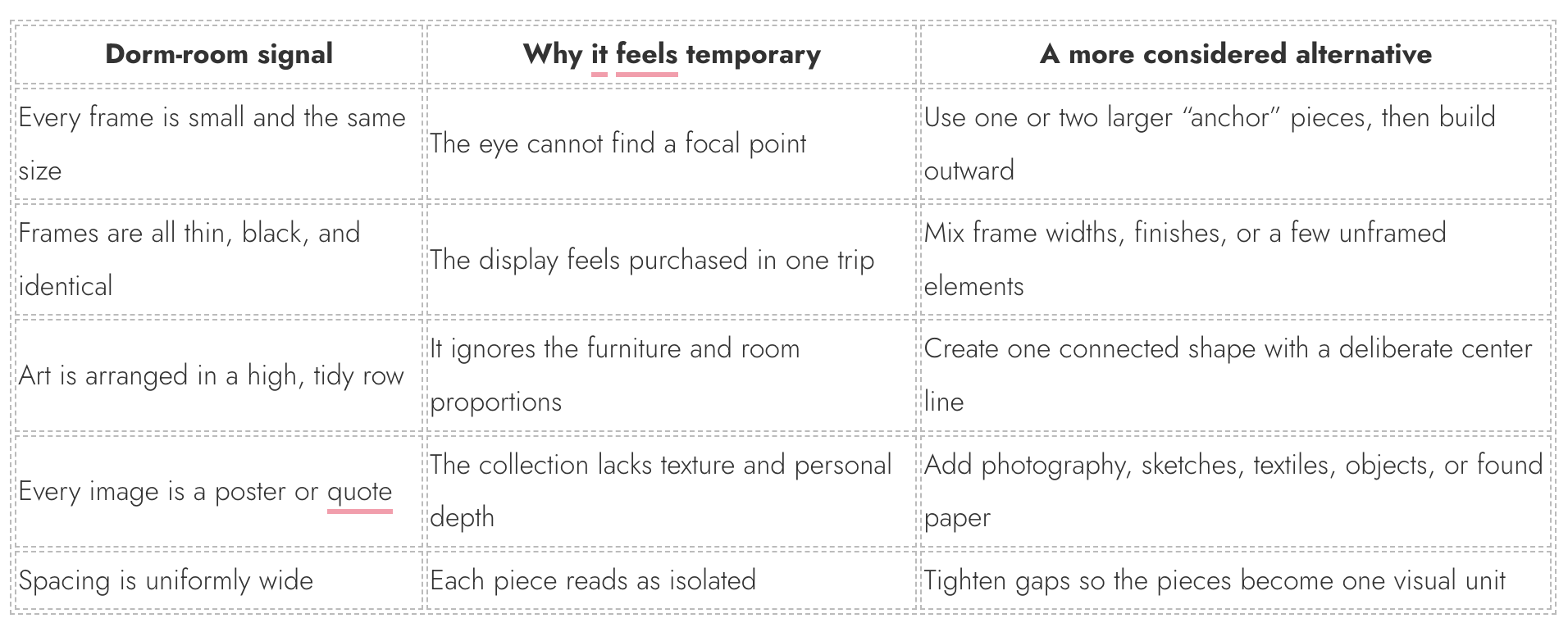
It is easy to blame a gallery wall on a lack of expensive art or matching frames, but neither is the real issue. A dorm-style arrangement typically has a few recognizable signals. The pieces are all roughly the same size and visual weight. They are placed in an arbitrary row or scattered evenly across the wall. The subject matter is too literal so think generic travel posters, fashion illustrations, motivational lines, or images selected mainly because they match a color. The frames are thin, lightweight, and visually identical, often black or white. And, most importantly, the arrangement does not respond to the furniture below it.
A polished gallery wall can absolutely include affordable prints. It can include a concert poster, a goofy family photo, a thrift-store landscape, or a postcard from a trip. In fact, those ingredients often make a wall more memorable. The difference is that the mature version treats them as ingredients in a larger recipe. It balances the playful with the quiet, the graphic with the tactile, and the sentimental with the anonymous.
The biggest culprit: no visual hierarchy
🛒 Build a more intentional gallery wall
pechpell 3D Mid-Century Modern Boho Wall Art Set of 3
A flexible option for adding scale and visual interest to a blank wall.
As an Amazon Associate I earn from qualifying purchases.
Most gallery walls that fall flat are democratic to a fault. Every frame has equal size, equal contrast, equal placement, and equal importance. In a dorm room, that makes sense: the wall is often used as a place to display everything you care about. In a more finished space, however, a wall needs hierarchy just as a room needs a sofa before it needs side tables.
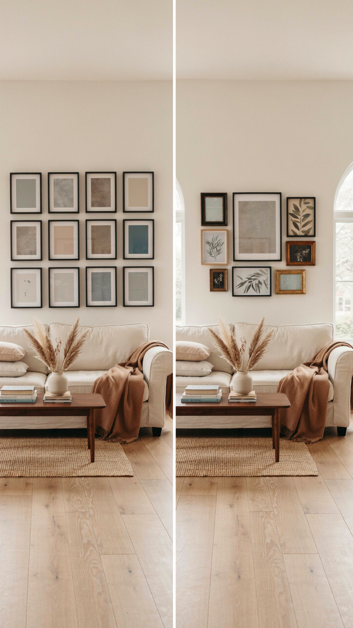
Start by choosing the piece that deserves the lead role. This might be an oversized photograph, an oil painting, a vintage poster, a large abstract print, or even a mirror. It does not need to be the most valuable thing you own. It simply needs enough scale or visual presence to hold the wall. Once you have your anchor, smaller pieces can act as supporting characters. A group that includes one large piece, several medium pieces, and a handful of smaller accents will immediately feel more intentional than twelve same-size frames.
Think in terms of visual weight, not just inches. A small black-and-white etching may feel quiet, while a medium saturated-red print can pull enormous attention. A dark wood frame has more weight than a pale oak one. A heavily matted photograph has more breathing room than an image that runs edge to edge. Spread these weights around the arrangement rather than stacking all the heavy pieces on one side. The balance does not need to be symmetrical. It simply needs to feel stable.
A useful test is to squint at the wall from across the room. When details disappear, can you still see a clear shape? Is there a point where your eye lands first? Does the arrangement feel grounded, or does it look like it is drifting upward? If all you see is a peppering of equally sized dark boxes, the wall needs a stronger anchor and a clearer rhythm.
Stop treating the wall as a blank white spreadsheet
One reason gallery walls can look young is that they are laid out as if the wall were an empty digital canvas. But walls are not blank. They have architectural context: ceilings, doorways, windows, built-ins, stair rails, lamps, sofas, consoles, and sometimes awkward vents or switches. A successful installation pays attention to those boundaries.
Before choosing a layout, identify the visual zone your wall should occupy. Over a sofa, the gallery should generally relate to the sofa’s width rather than hover as a tiny cluster in the center. Above a console, the composition should feel connected to the tabletop, perhaps with a lamp or a tall vase helping bridge the gap. Along a staircase, the arrangement can follow the angle of the rail, creating a lively diagonal that feels built into the house. In a narrow hallway, an organized salon-style grid may make more sense than a sprawling cloud.
The common mistake is hanging art too high. There is a stubborn belief that art should sit near eye level, but gallery walls must also speak to the furniture below them. When art floats far above a couch, it separates from the room and takes on that bulletin-board look. Let the lowest frames sit close enough to the furniture without feeling crowded so that the whole composition reads as one zone.
The frame problem is usually subtler than you think
The instinctive fix for a juvenile gallery wall is to buy matching frames, usually in matte black. This can be a good temporary reset, but uniformity is not the same as sophistication. In fact, a perfectly matched set of inexpensive frames can read even more like a dorm room if the art inside them is equally uniform.
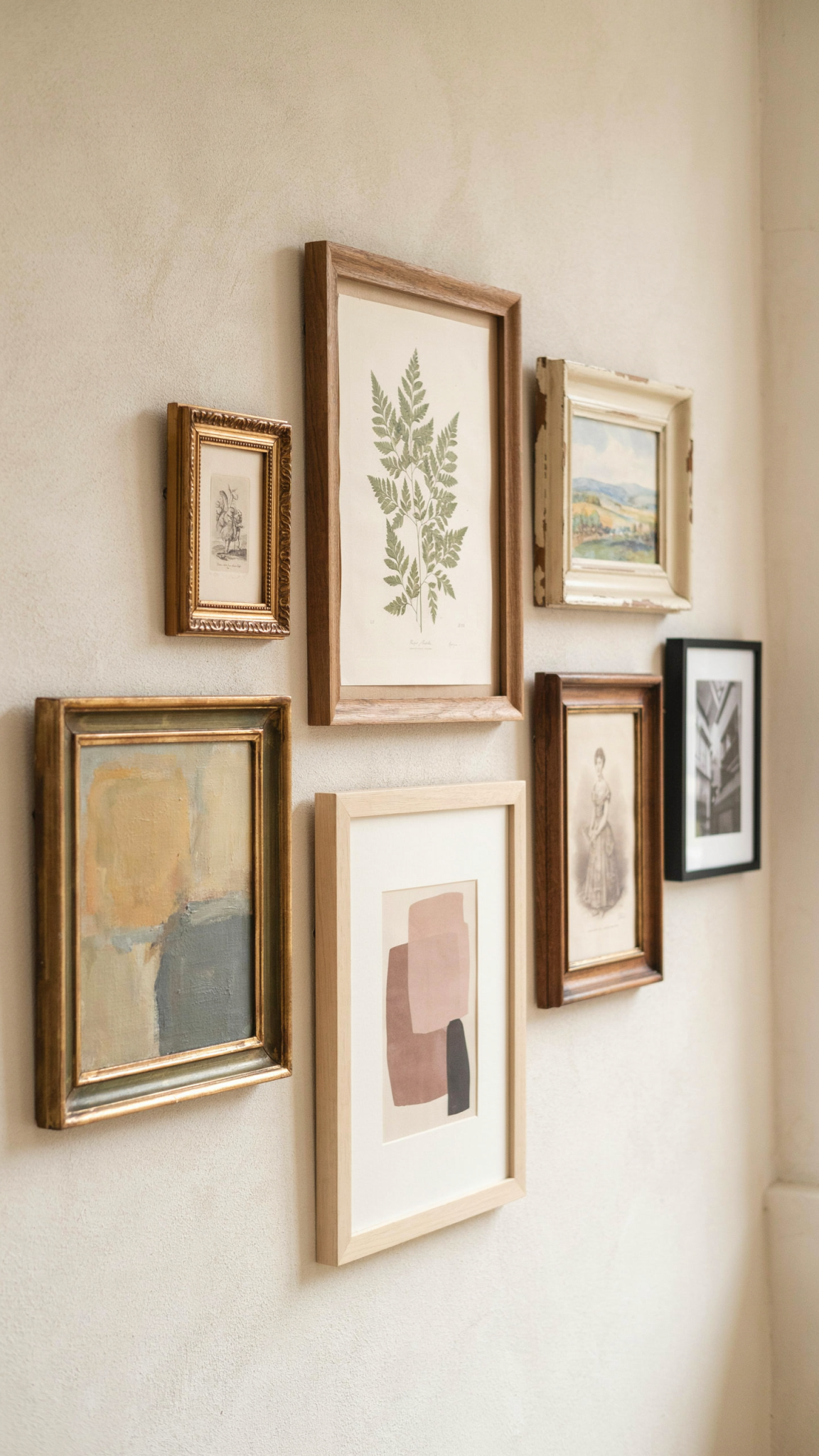
A layered frame strategy is more interesting. You might pair a slim black metal frame with a warm walnut frame, a wide cream-painted frame, and an antique brass oval. The key is not randomness; it is repetition with variation. Pick two or three materials or finishes and echo them across the wall. For example, black, natural oak, and muted gold make a flexible trio. Dark espresso wood, silver, and black can feel moodier. Pale wood, white, and unframed canvas suit a softer, Scandinavian-leaning room.
Mats are one of the easiest upgrades. They introduce negative space, which gives smaller artwork a sense of importance. A postcard in a generously matted frame can feel like a tiny treasure rather than filler. For a calmer look, keep mats in a related family like warm white, ivory, pale flax, or soft gray. If your frames are eclectic, a consistent mat color is an elegant thread that ties the collection together.
You also do not need to frame everything. A small woven piece, a ceramic wall pocket, a vintage hand mirror, a painted plate, a textile fragment, or a child’s drawing clipped to a rail can interrupt the predictable rectangle-rectangle-rectangle rhythm. These dimensional moments are especially useful if the rest of your art is flat and graphic. They introduce shadow, texture, and a sense that the wall was assembled over time.
Your art may be too literal—and too on-the-nose
Dorm decor tends to announce its interests loudly: Paris, plants, fashion, wine, travel, positivity. Adult spaces can still be personal, but they tend to leave room for interpretation. A framed menu from a favorite restaurant, an old map of a meaningful place, a candid photograph, a strange flea-market portrait, or a simple charcoal sketch often tells a richer story than a generic print that says “Dream Big.”
The quickest way to improve a collection is to edit for range. If every image is a travel photograph, include a drawing or an abstract shape. If every piece is in color, add a few quiet black-and-white works. If you have a wall full of earnest family images, introduce something anonymous and atmospheric to create contrast. You are not trying to make the display less personal. You are giving the personal pieces context, which makes them feel more special.
A good gallery wall frequently has an element of surprise. It might be a tiny formal portrait of a stranger beside a modern poster. It might be a serious architectural photograph under a cheerful child’s painting. It might be a museum postcard that feels unexpectedly perfect next to an original piece. This tension is what creates the collected look. The collection should not be overly coordinated, but it should seem as though one discerning person chose every item.
If you are shopping for new art, resist the urge to buy a pre-matched set. Coordinating diptychs and downloadable bundles are convenient, but they often make the wall feel like décor rather than a collection. Instead, build slowly. Look at vintage stores, local art fairs, independent printmakers, used bookstores, museum shops, and the back of your own closets. The best addition may be something you already own but have never given a proper frame.
A gallery wall needs a palette, not a theme
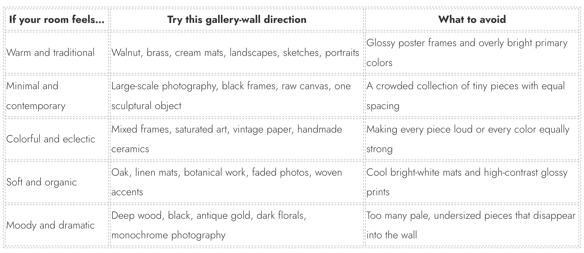
A theme can be charming, but it becomes childish when it is too literal. A beach-themed wall with shell prints, blue watercolors, and coastal quotes tells the same story over and over. A palette, on the other hand, creates cohesion without forcing everything into one category.
Choose three or four colors that recur naturally in the room. These do not need to be exact paint-swatch matches. You might work with tobacco brown, chalky blue, faded red, and cream. Or forest green, black, faded denim, and parchment. The art can vary wildly in subject matter as long as those tones reappear in small ways. The result feels layered rather than themed.
This is also where the surrounding room matters. Pulling one frame finish from the coffee table, one warm tone from the rug, or one accent color from a cushion will make the wall feel embedded in the space. If the room is already visually busy, consider a more restrained art palette: black-and-white photography, quiet botanical studies, line drawings, and a few pale washes. If the room is neutral, the gallery wall may be exactly where you introduce color and irreverence.
The layout is probably too polite
Many people default to an orderly grid because it feels safe. Grids are wonderful in the right room: they can make small photographs feel deliberate, sharpen a hallway, or bring discipline to a more maximal interior. But a loose collection that is forced into a grid often feels like a school display. Conversely, a collection with no underlying structure can look like it was hung while packing to move.
The sweet spot is a layout with an internal logic. You can build a symmetrical arrangement around a large center piece. You can create a salon-style cluster with an invisible outer boundary. You can use a tidy grid of related works, then offset it with a single sculptural object. You can run a horizontal gallery along a long dining-room wall, using the tops or bottoms of frames to create a subtle line. The arrangement need not be perfectly symmetrical, but it should contain intentional alignments.
Spacing is where the difference becomes visible. Very wide spacing turns every object into an isolated island. Very tight spacing can look cramped if all of the frames are small. A consistent, modest gap usually works best, though a few intentional shifts can keep the wall from looking mechanical. Lay everything out on the floor first. Then photograph it from directly above. Your phone turns the arrangement into a flattened composition, making balance issues much easier to spot.
Paper templates are worth the small effort. Trace every frame onto kraft paper or old wrapping paper, label the template, and tape it to the wall. Live with the arrangement for a day or two. Move the templates until the overall silhouette feels right. This low-stakes rehearsal is how designers avoid the fast, nervous hanging that produces sixteen unnecessary nail holes, and the exact awkwardness you were trying to escape.