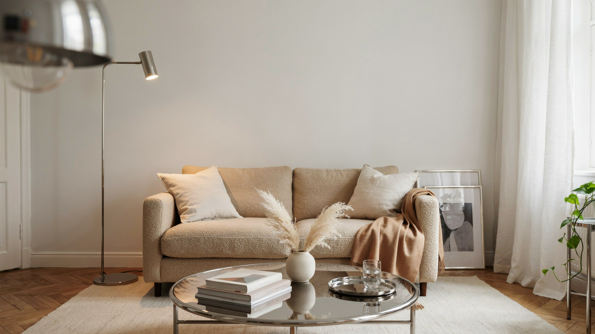
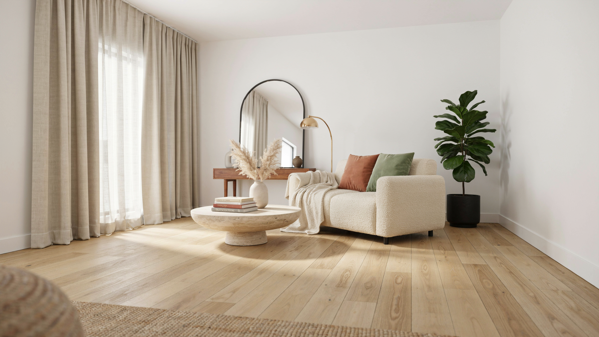
After fifteen years of helping people make their homes feel like homes, I can tell you the design pendulum has finally swung. The cold, clinical minimalism that dominated the last decade — glass, steel, flat white planes and invisible storage — is being replaced by rooms that invite touch, hold memory and breathe. People want textiles that age well, surfaces with a human hand, artfully edited collections instead of anonymous sameness. This is not a return to clutter; it’s a move toward warmth, layered texture and intentional curation that feels lived-in and considered at once.
I saw that change most clearly last winter in a Brooklyn townhouse I designed for a young family who had lived for years in a monochrome loft. We ripped out the glossy lacquer console and traded it for a low fluted oak media piece, introduced a hand-knotted kilim and a soft wool boucle sofa with a deep seat for sinking in. The client’s moment of clarity came when she ran her fingers over a plastered hearth — the tactile warmth stopped her mid-sentence and she said, “This finally feels like home.” We balanced that materiality with purposeful editing: a small shelf of family photos, a single sculptural pendant, and a built-in bench that doubles as toy storage. That combination of craft, comfort and restraint explains why this shift is happening now — people are responding to emotional needs as much as aesthetic ones.
In the pages ahead I’ll lay out the top living room trends for 2026 — from embracing biophilic textures and warm tonal palettes to the rise of artisan-made objects, layered lighting strategies, multifunctional furniture and discreet smart tech. I’ll show practical ways to mix old and new, choose durable tactile materials, and curate a room that reads as intentional rather than staged. Whether you’re starting from scratch or refreshing a single corner, you’ll find concrete ideas to make your living room feel more like refuge and less like a showroom.
1. Handmade Walls: Textured Finishes That Anchor the Living Room

Textured wall finishes have moved from boutique statements to mainstream living-room staples—not as gimmicks but as honest, craft-driven backdrops that age beautifully. In a recent Brooklyn brownstone I renovated, we replaced a flat paint finish behind the fireplace with a two-coat Marmorino Venetian plaster and a coordinating limewash on the adjacent walls. The plaster’s subtle burnish reads differently through afternoon light, while the limewash’s mineral depth softens the room and absorbs sound. These are finishes you notice with your eyes and your hands: tadelakt and Venetian plaster, limewash, woven grasscloth and heavyweight textured wallcoverings each deliver unique brushstrokes, tool marks and tonal variation that mass-produced paints can’t mimic.
If you want this look at home, start by deciding how much hands-on craft you want versus how much you’ll outsource. Plasters (Marmorino, Venetian, tadelakt) require a skilled applicator to achieve thin, polished layers and long-term durability; limewash and textured wallpapers are the more homeowner-friendly routes and still provide that hand-applied feel. Always test full-scale samples on the actual wall and evaluate them at morning and evening light. Pay equal attention to substrate prep (sound drywall or plaster, priming with a breathable primer for mineral finishes) and to how you’ll light the surface—directional wall-wash or low angled sconces reveal the texture, turning a finish into a focal point.
Key Design Elements
- Test first: order 12″x12″ sample boards of Marmorino, limewash and a grasscloth, install them on the target wall, and live with them for a week to see how light and furniture interact.
- Choose the right method: hire a plaster artisan for Venetian/Marmorino/tadelakt; for DIY, use limewash kits or high-quality textured wallcoverings and follow substrate prep instructions carefully (clean, sand, prime as required).
- Seal and highlight: finish mineral plasters with a breathable sealer or buffed wax, avoid high-gloss varnishes; add adjustable directional lighting to emphasize texture and pair finishes with matte furnishings to keep the look grounded.
Pro Tip: If you’re limewashing, thin the first coat by about 10–20% with water and apply with a natural-bristle brush in long, overlapping vertical strokes; allow 24 hours between coats so the pigments bond and create those soft, handcrafted striations that read as authentic rather than ‘painted on.’
Design Dilemma: How to Layout and Optimize a Long, Narrow Covered Patio
2. Head‑Turner Lighting: Let Your Fixture Lead

Overhead fixtures have graduated from background utility to primary personality in the modern living room. In my experience, a single chandelier, pendant cluster or sculptural lamp can establish tone immediately—whether that’s old‑world glamour, graphic modernity or a playful pop of color. In a recent Brooklyn brownstone I restored, I suspended a reclaimed 1920s Venetian chandelier that I had lacquered a deep teal and rewired to modern safety standards; placed above a neutral linen seating group it became the room’s anchor, introducing warmth, texture and a hint of theatricality before any other element registered.
If you want to adopt this approach at home, start by thinking of your fixture as furniture: size it to the seating arrangement, choose a finish that converses with your other metals, and plan for layered control so the fixture can be dramatic or soft on command. Source vintage only from reputable dealers (and budget for professional rewiring), or commission a striking new piece from an artisan if you want a custom finish. Pair a statement overhead with sconces or floor lamps and install a quality dimmer so the fixture reads like a mood setter—not a glare source.
Key Design Elements
- Scale it: choose a fixture diameter roughly 1/2–2/3 the width of your seating grouping or coffee table; if it hangs over a coffee table place the bottom 12–18″ above the table, and over walkways keep the lowest point at least 7′ from the floor.
- Source & finish: buy vintage only from vetted sellers and plan on professional rewiring, or order a custom finish from a metal finisher—limit your room to 2–3 metal finishes to avoid visual clutter.
- Control & layer: install the fixture on a trailing‑edge dimmer and use warm‑dimming LED bulbs (≈2700K, CRI ≥90); balance the overhead with sconces and a floor lamp to avoid harsh shadows and create zones.
Pro Tip: Before permanently wiring, hang the fixture temporarily at the intended height and sit in every seating position—if the fixture draws the eye without causing glare when you read, you’ve found the sweet spot. Also always use warm‑dimming LEDs with a quality trailing‑edge dimmer to preserve that golden, luxurious glow as you dim.
3. Saturated Sanctuaries: Living Rooms Steeped in Color

Homeowners are moving past the beige-and-white detachment of the last decade and embracing rooms that feel lived-in, layered and intentionally colored from floor to ceiling. In my practice that shift shows up as fully immersed palettes — think a parlor wrapped in a deep emerald that reads like velvet daylight, or a townhouse living room glazed in warm aubergine with a near-black plaster ceiling to make the room feel cocooned. In a recent Brooklyn brownstone I painted the back wall, trim and the inside of the doorway the same rich green, installed a moss-velvet sectional in a complementary tone, and anchored the space with a hand-knotted wool rug and brass wall lights; the result was not chaotic maximalism but a curated room that feels confident and restorative.
If you want to bring this into your own home, treat color-drenching as choreography rather than a paint job. Start by choosing one dominant surface — a single wall, the ceiling, or the main sofa — and commit one deep, saturated hue there. Balance that anchor with two supporting elements in softer, tactile materials (a woven rug, linen drapery, or leather side chair) and introduce small metallic accents to catch light. Use premium, removable wallpaper if you want pattern without permanence; select performance fabrics (Sunbrella or Crypton-upholstered pieces) for high-use seating; and test large swatches at different times of day so the color reads the way you intend under natural and artificial light.
Key Design Elements
- Anchor the room with one dominant surface: paint a single wall, the ceiling, or your main sofa in a saturated hue and live with a 3’x3′ sample for a week under all lighting.
- Layer at least three textures (e.g., velvet sofa, woven rug, grasscloth or matte plaster wall) plus one warm metal (brass, aged bronze) to prevent the color from feeling flat.
- Use premium removable wallpaper for a bold pattern or ceiling treatment and choose performance upholstery fabrics for the primary seating to keep the look practical.
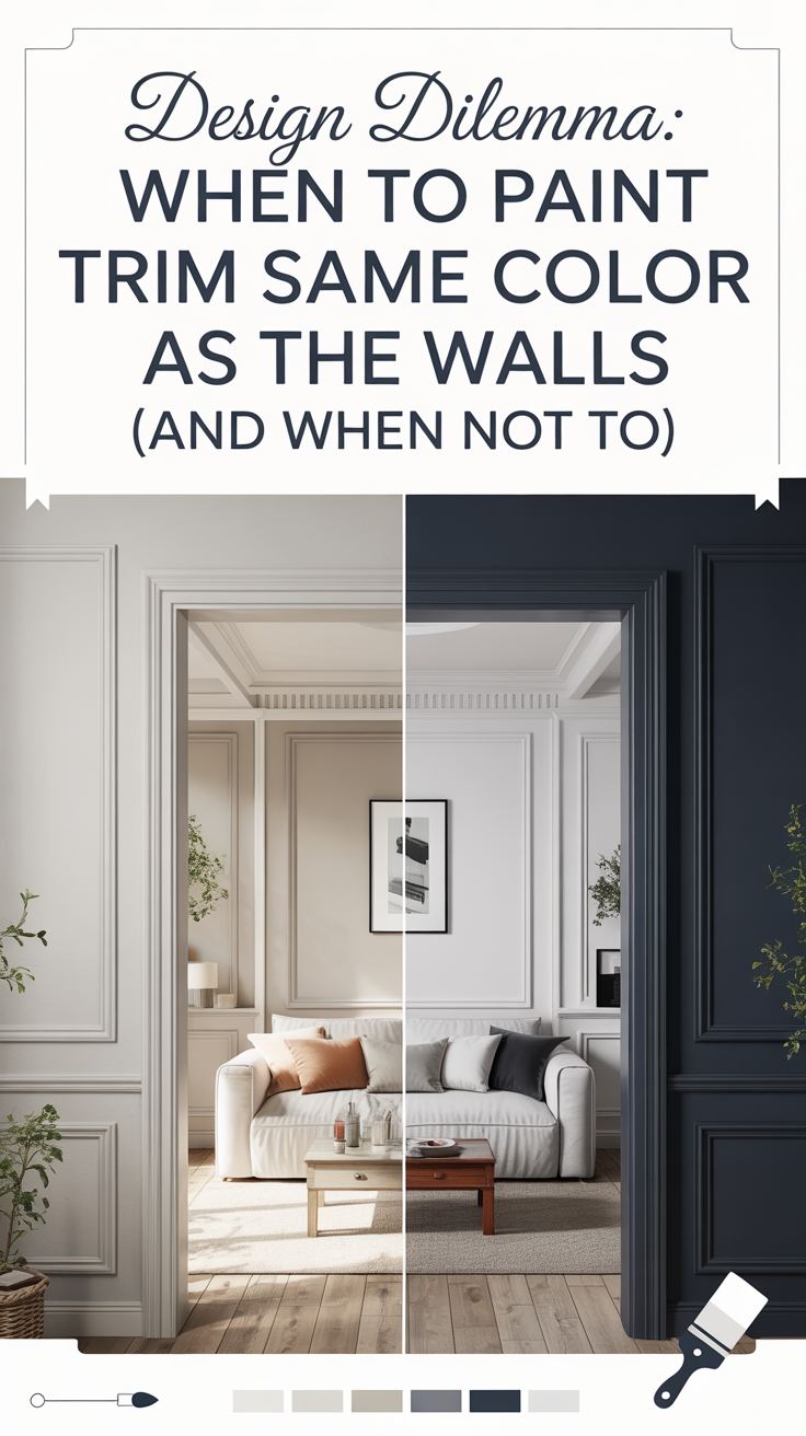
Pro Tip: When you commit to a drench, paint trim, door interiors and the back of built-ins the same color as the wall (or one shade darker) — it makes the room read as a cohesive, intentional space rather than a color splashed on top of neutrals.
4. Parlor Revival: Conversation-First Living Rooms

The formal parlor has come back—only now it’s been tuned to contemporary life: smaller-scale formality, tactile materials, and layouts designed to spark face-to-face exchange rather than passive screen time. In a recent project in a Brooklyn brownstone I converted a 12’×14′ front room into a modern parlor by stripping back the TV, plastering the walls in deep teal, and anchoring the space with a pair of cream bouclé swivel chairs, a low walnut cocktail table with a lift top that hid two upholstered ottomans, and a hand-blown glass cluster pendant that reads like sculpture. The result was layered, vividly colored, and intentionally social—seating was set to encourage eye contact, the table height favored relaxed hands-on gatherings, and the lighting sculpted faces instead of washing the room in glare.
If you want to bring this into your own home, start by treating the room as a place for people rather than a media staging area. Pick a focal point that invites conversation—a fireplace, a bold artwork, or a sculptural pendant—then plan seating in clusters that face one another. Invest in one or two quality swivel or low-backed armchairs so people can turn into conversations without shuffling furniture; add a multifunctional cocktail table with storage or hidden ottomans for flexible seating. Layer lighting (ambient plus side lighting and a statement fixture), use rugs large enough for chair legs to sit on, and embrace warm, tactile fabrics like bouclé, velvet, leather, and wool to make the space inviting and durable.
Key Design Elements
- Arrange seating for conversation: position chairs and sofas to face each other with front legs on a rug; allow 18–30 inches between coffee table and seating for easy reach.
- Choose multifunctional pieces: a low cocktail table with a lift top or hidden ottomans adds extra seats and surface without visual clutter—look for tables 16–20″ high to pair well with lounge seating.
- Layer lighting and texture: combine a sculptural pendant as a focal point with wall sconces and table lamps on dimmers; add tactile throws and a mix of materials (wood, metal, boucle) to create warmth.
Pro Tip: Hang your main pendant lower than you think—about 28–32 inches above a low cocktail table (or roughly 60–66 inches from the floor in seating zones) to create a “conversation canopy” that pulls focus inward. Always add dimmable side lighting so faces are lit softly and the room feels intimate without becoming gloomy.
5. Soft Geometry: Curved Sofas and Sculptural Seating That Invite You In

Curves are the new backbone of comfortable, contemporary living rooms. In my work I’ve moved clients away from the austerity of sharp angles toward pieces that read like modern sculpture but sit like a cloud — think crescent-sectionals, channel-tufted boucle sofas and single‑seat lounge silhouettes with generous, down-wrapped cushions. In a recent Brooklyn brownstone I specified a cream bouclé curved sectional with high-resilience foam cores and down-wrapped tops, paired with walnut-framed crescent chairs; the result was a living room that naturally directed conversation, softened sightlines and read as both intentional design and everyday comfort.
If you want to adopt this look at home, think first about scale and function: curved pieces take up more visual and physical real estate than their linear cousins, so measure and mock up the footprint before ordering. Choose durable upholstery (performance bouclé, Crypton-treated velvet or a tightly woven microfibre) and prioritize construction details — kiln-dried frames, eight-way hand-tied springs or sinuous spring systems, and a down-wrapped cushion for that pillowy silhouette. Anchor a curved sofa with a round or oval rug and balanced lighting, and introduce one or two sharp-edged accents (a metal-leg console, geometric side table) to prevent the room from feeling overly soft.
Key Design Elements
- Measure and mock up the footprint: cut a full‑scale template (cardboard or kraft paper) of the sofa’s curve and tape it in place to test scale and traffic flow before you buy.
- Select performance upholstery and the right fill: choose bouclé or performance velvet with high-resilience foam cores wrapped in down for shape and durability; confirm cushion construction with your vendor.
- Anchor and balance the curve: use a round or oval rug that extends 18–24″ beyond the sofa’s edge, place a low coffee table 12–18″ from the seating, and add one angular accent piece to introduce contrast.
Pro Tip: Always build a full‑scale cardboard template and walk the room for a few days — it reveals how the curve affects circulation, sightlines and how sunlight hits the upholstery (and it will also tell you if the sofa can physically fit through your entry or elevator).
6. Two-Tier Rugs: Scale, Texture and Storytelling

Layering rugs is one of the quickest, most tactile ways to add warmth, scale and personality to a living room. In practice it solves a common design headache: attractive vintage or ornamental rugs that give a room character are often too small for today’s open-plan seating. In a recent Brooklyn brownstone I anchored a living area by laying a 9’×12′ jute base rug under a 6’×9′ late-19th‑century Heriz; the natural-fiber base set the room’s scale and added durable texture while the Persian rug supplied color, pattern and the collected feel that makes a space read as lived-in. The result was a composed seating group where the coffee table and sofa read as one zone without losing the vintage rug’s storytelling value.
Homeowners can reproduce this look without hiring a pro by focusing on scale, material contrast and secure installation. Choose a neutral, flatweave or natural-fiber base (jute, sisal, flat-weave wool) that is large enough for the front legs of your main seating to sit on it, then layer a smaller wool, kilim or vintage piece on top for color and pattern. Use appropriate rug pads (a dense felt pad under the base for comfort and a thin anti‑slip pad under the top rug), leave a visible border of the base rug around the top piece, and center or offset the top rug in relation to the coffee table depending on whether you want a formal or intimate feel. Rotate the top rug seasonally and vacuum the base frequently to keep both looking fresh.
Key Design Elements
- Size it right: pick a base rug large enough that the front legs of your sofa and main chairs sit on it (typically 8–12″ of rug beyond furniture), then choose a top rug that’s 12–24″ smaller all around so the base creates a visible frame.
- Mix textures and fibers: pair a flat, durable base (jute/sisal/flatweave wool) with a softer, patterned top (hand‑knotted wool, kilim, or vintage Persian) for contrast and comfort; always use a felt pad under the base and a thin anti‑slip pad under the top layer.
- Placement and maintenance: center or slightly offset the top rug under your coffee table to create intimacy, secure edges with low‑tack tape if needed, vacuum both layers regularly and rotate the top rug to even out wear.
Pro Tip: If your top rug is an antique or fragile piece, have a conservator or skilled tailor stitch a lightweight cotton or linen backing before layering — it stabilizes the weave, protects against abrasion from the base, and lets you use low‑tack anti‑slip pads without harming the rug.
7. Soft-Legged Chic: Bringing Skirts and Trim Back to the Living Room

The return of skirted silhouettes and lavish passementerie is less nostalgia and more a refined reevaluation of texture and craft. Think tailored box and knife-pleat skirts, fabric-wrapped legs, corded welting and bullion fringe applied with restraint to graceful, rounded sofas and bergère-style chairs. In a recent project in a Brooklyn brownstone, I reupholstered a midcentury sofa in a heavy Belgian linen, added a 10-inch tailored skirt with hidden snaps for laundering, and anchored the seating with two antique bergères re-trimmed in silk cord and small bullion fringe. The result was a living room that reads collected and intentional — the soft edges and tactile trims temper modern steel-and-glass pieces and make the space feel layered, intimate, and timeless.
If you want to bring this grandmillennial-savvy look home without overdoing it, start by identifying one anchor piece to become the ‘trim story’ — an accent chair, a sofa, or even window treatments. Choose durable upholstery (linen blends, cotton duck, or performance fabrics) for everyday pieces, and reserve delicate silk passementerie for low-wear accents like cushions, lampshades, or occasional chairs. Balance is key: pair a skirted sofa with a streamlined coffee table, and scale trims to the furniture — narrow cords on small cushions, wider fringe on skirts or valances. For longevity, work with a local upholsterer and a reputable trim house for samples (Samuel & Sons, for example) and request removable skirts and snap-on trims so pieces can be refreshed without a full reupholster.
Key Design Elements
- Choose one statement piece (sofa or accent chair) to introduce skirts and trim, using a durable upholstery fabric and a 6–12″ tailored skirt depending on your ceiling height.
- Order trim samples and test them on-site; match trim scale to furniture size (thin cords for cushions, medium welting for arms, wider fringe or bullion for skirts).
- Work with an upholsterer to make skirts removable (hidden snaps or zippers) and to baste passementerie onto a separate tape or welting for easy repair or replacement.
Pro Tip: When adding passementerie, have your upholsterer baste the trim to a narrow cotton tape or welt rather than sewing directly to the face fabric — this lets you replace worn trim later without disturbing the upholstery and prevents puckering along seams.
8. Crowned Windows: Drapery That Reads Like Architecture

Statement drapery is no longer an afterthought — it’s the architectural punctuation of a room. Think floor-to-ceiling velvet or silk panels paired with carved or upholstered cornices, trimmed in passementerie: bullion fringe, gimp braid, or tasseled cords. In a recent Brooklyn brownstone I renovated, we mounted a hand‑painted, hand‑carved wood cornice above 10‑foot windows, hung double‑lined silk velvet with 2.5x fullness and French pleats on a heavy traverse rod, then edged the top with antique‑gold bullion fringe. The result read as built‑in millwork: the window stopped being just a hole in the wall and became the room’s anchor, balancing the scale of the coffered ceiling and large-scale art across the room.
If you want this look at home, start by thinking like a millworker: proportion and attachment matter more than the fanciest fabric. Measure carefully (you’ll usually hang the rod or cornice 6–12 inches above the trim and extend it 8–12 inches past each jamb to show full panels when open), pick a fabric weight suited to the window’s use (linen and silk for passive rooms, heavy velvet or interlined panels where insulation or blackout is needed), and choose a cornice strategy that fits your budget — a simple upholstered MDF cornice upholstered in the same fabric can read as luxury without the price of carved wood. Local workrooms can sew the panels and install passementerie; for a budget route, buy ready‑made panels and have a carpenter build a shallow box cornice you upholster or paint.
Key Design Elements
- Measure & scale: Hang hardware 6–12″ above the window and extend 8–12″ past each side; order panels at 2–2.5x fullness and finish them to just brush the floor for an elevated, tailored look.
- Choose fabrics & construction: Use interlining behind face fabric for depth and insulation, line panels for longevity, and prefer medium‑to‑heavy weights (velvet, silk dupioni, heavy linens) where you want drama; add passementerie only after testing scale against the window.
- Cornice & hardware options: For a built look, commission an upholstered MDF cornice or use sectional carved wood mounted on a French cleat; pair with heavy‑duty traverse rods or pocketed drapery headings (French pleat or pinch pleat) to support weight and create neat stackback.
Pro Tip: Attach any wood or upholstered cornice to studs with a French‑cleat system and make it sectional so the drapery can be removed for cleaning — nothing ruins a statement window faster than an immovable cornice that traps dirty, unwashed panels.
9. Built to Keep: The Return of Heirloom Living Room Pieces

The design pendulum has swung away from disposable décor toward furniture that earns a place in the family narrative. Homeowners are choosing pieces designed and built to be lived in for decades — think kiln-dried hardwood frames, 8‑way hand‑tied springs or sinuous-coil suspension, down‑wrapped cushions, full‑aniline leathers and tightly woven natural fibers. In a recent Brooklyn brownstone I renovated, we swapped out an aging flat-pack sectional for a custom walnut‑framed sofa with down-wrapped cushions and Belgian flax linen; we paired it with a restored 1930s oak coffee table I sourced from a local salvage shop and an armchair reupholstered in waxed Italian leather. The room immediately read as layered and personal rather than ephemeral, because each piece carried quality, provenance and a story.
You can adopt this approach without a billionaire budget by shifting how you buy: slow down, prioritize, and learn to evaluate construction as carefully as style. Start by deciding which one or two pieces you use daily (usually the sofa and an occasional chair) and put most of your budget there. Mix in rescued or well-made vintage items for character, and commission local makers for pieces where scale or material matters. Over time, add accessories and textiles that complement the bones of your room rather than masking them—this is slow decorating in practice: a home built thoughtfully, piece by piece.
Key Design Elements
- Prioritize one investment piece first (sofa or primary chair): when sourcing, ask for a written spec sheet listing frame wood species, joinery method, suspension type and cushion fill; sit in the piece—test seat depth, edge comfort and lumbar support.
- Hunt smart in the secondhand market: inspect joints (dowels or mortise‑and‑tenon are good), pry at exposed corners for movement, check upholstery seams and foam density, and budget for professional reupholstery rather than replacing the whole item.
- Work with a local craftsman for custom needs: bring room measurements, photos, and a fabric sample; request material swatches, a production timeline and a limited warranty so your custom piece ages like an heirloom, not a gamble.
Pro Tip: Always ask vendors for a detailed spec sheet. If a sofa or chair doesn’t specify ‘kiln‑dried hardwood frame,’ the type of suspension (8‑way hand‑tied vs sinuous springs), and cushion fill (down‑wrapped vs foam density), walk away—true heirloom makers are proud to tell you exactly how something is built.
10. Monolithic Moments: Marble Fireplaces That Anchor the Room

Stone has stepped out of the kitchen and bathroom and into living rooms as the new language of luxury — not as timid accents, but as architectural gestures. Deeply veined marbles, smoky soapstones and richly hued travertines are being used to clad fireplace walls, run continuous shelving, and top furniture so that a single material can read like sculpture. In a recent Brooklyn brownstone I renovated, we wrapped a double-height fireplace in bookmatched Calacatta with a 45° mitered edge, extended the veining into a floating walnut bench and flanked the surround with matte-black steel trim; the result read as one cohesive, elevated element that anchored the entire room without feeling fussy.
If you want to bring this look into your home, think in terms of scale, finish and practicality. Pick one dominant stone application — a surround or a mantel slab — and keep surrounding materials simple so the pattern can be read clearly. For tighter budgets, large-format porcelain slabs and marble remnants give the same visual impact with better durability and lower cost. Always factor in fabrication details (bookmatching, edge profiles, grout color) and maintenance (sealants, honed vs. polished finishes) up front so the installation looks intentional and lasts a long time.
Key Design Elements
- Choose one focal application: clad the fireplace surround in one continuous material (full slab or large-format porcelain) rather than scattering small stone accents across the room.
- Save money without losing impact by using large-format porcelain slabs or marble remnants for tabletops and hearths; specify a honed or leathered finish to hide fingerprints and soot.
- Engage a skilled stone fabricator early — request bookmatching for veined slabs, 45° mitered corners for a monolithic look, and a digital mock-up or sample panel before fabrication.
Pro Tip: To make two slabs read as one monolith, ask your fabricator for a 45° mitered corner instead of a butt joint — it hides the seam and creates a seamless, furniture-like edge that elevates the whole installation.
Conclusion
After years of cool minimalism and swipe-right sameness, 2026 feels like a deliberate turn inward — a reclaiming of warmth, craft, and personality in the places we live. In my projects this year I’ve pushed warm, tactile materials (oiled walnut tables, handwoven rugs, boucle and raw linen upholstery), layered light with dimmable 2700K sources and brass task lamps, and mixed eras so a vintage carved coffee table can sit comfortably beside a new curved sofa. The through-line is always humanity: visible joinery, artisan ceramics, hand-stitched leather, and a palette that leans toward cozy ambers, moss greens, and terracotta accents. These are not fussy prescriptions but practical moves that make rooms feel lived-in, intentional, and unmistakably yours.
If you’re tempted by the trends but worried about doing too much, here’s the simplest rule I give clients: edit first, add one handcrafted thing you genuinely love. Remove what you don’t use or look at, then introduce a single tactile object — a woven throw, an artisan vase, or a small walnut side table — and let the room evolve around it. That one human-made piece anchors warmth and personality without overwhelming your budget or your senses; the rest can be curated slowly, with confidence.