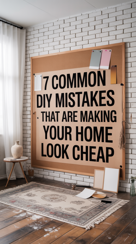
Ever dreamt of transforming your home with your own two hands? The DIY bug bites hard, right? There’s something incredibly satisfying about saving a buck, putting your personal stamp on your space, and just plain making stuff happen. Whether you’re slapping on a fresh coat of paint or tackling a bigger reno, DIY projects can feel super empowering. But here’s the thing: sometimes, those good intentions can go a little sideways. What seems like a small shortcut or a minor detail can actually end up making your home look, well, a bit cheap. And nobody wants that after all that hard work!
So, let’s dive into seven common DIY blunders that, despite your best efforts, might be secretly downgrading your home’s vibe. We’ll chat about what these mistakes look like, why they can make your place feel less polished, and most importantly, how to fix ’em up. Our goal here is to arm you with some savvy tips so your next home improvement adventure actually boosts your home’s style and value. From the basics like painting to those tiny details you might not even think about, understanding these common slip-ups is key. Because making your home look amazing doesn’t always mean hiring a pro; it often just means paying a little more attention to the details yourself. Let’s get your DIY game strong!
II. The 7 Common DIY Mistakes
Mistake 1: Poor Paint Application and Neglected Walls
Painting a room feels like the ultimate quick fix, right? It’s supposed to be easy, affordable, and instantly transform a space. But here’s where a lot of DIYers trip up. It’s not just about picking a pretty color; it’s about how you get that paint on the wall, and whether you’ve actually prepped the wall for it. And trust me, these little painting oopsies can make your whole house look a bit… sad.
Picture this: you walk into a room, and the walls are scuffed, maybe a bit dirty, or the paint job is just plain patchy. You can see every brush stroke, the old color is peeking through, and the lines where the wall meets the ceiling or trim are all wobbly. Ugh. These aren’t minor flaws; they’re screaming, “I did this myself, and I rushed it!” Old, trendy colors can also make your room feel stuck in a time warp instead of fresh and modern. And if your walls have a weird texture or you’ve used the wrong kind of paint for a busy area (like flat paint in a hallway), you’re just asking for scuffs and a perpetually neglected look. It’s like putting on a fancy outfit but forgetting to iron it – it just doesn’t look right.
The Fix: Okay, so how do we fix this? It all starts with prep, prep, prep! Seriously, don’t skip this part. Before you even think about opening that paint can, give your walls a good clean. Get rid of any dirt or grease. Then, patch up any holes or cracks and sand them smooth. This is your canvas, so make it perfect! For colors, think timeless. Soft whites, cozy taupes, or calming blues and greens are always a safe bet. They’re like the little black dress of paint colors – they go with everything and never really go out of style. If you want a pop of color, go for something classic and rich, not just whatever’s trending this season. A smooth, well-painted wall just looks professional and shows you actually care.
And let’s talk about paint finishes. It might sound boring, but it’s super important. Flat or matte paints look gorgeous and velvety, but they’re not great for high-traffic areas because they scuff easily. Save those for your bedroom or a formal living room. For places like living rooms or dining rooms, an eggshell or satin finish is your best friend – they’re more durable and have a nice subtle sheen. And for kitchens, bathrooms, or trim, go for semi-gloss or high-gloss. They’re tough, easy to clean, and can handle moisture. Picking the right finish isn’t just about looks; it’s about making your paint job last and keeping that ‘cheap’ look far, far away. A well-painted wall is one of the biggest upgrades you can make, instantly making your home feel more expensive and put-together.
Mistake 2: Outdated or Inconsistent Lighting Fixtures
Lighting is a huge mood-setter in any room, right? It can make a space feel cozy, bright, or even dramatic. But here’s the thing: a lot of us totally forget about it when we’re doing DIY projects. We leave the old, ugly light fixtures in place, or just slap up whatever’s cheapest. And that, my friends, is a big mistake. Those basic “builder-grade” lights (you know, the ones often called “boob lights” – hilarious, but true!) or anything that screams “I’m from the 90s!” can instantly make your whole house feel dated and, yep, cheap.
It’s not just about how they look, either. Bad lighting can actually make your room feel weird. If you’ve only got one harsh overhead light, it can create weird shadows and make the space feel cold and unwelcoming. And if it’s too dim, your room can feel cramped and sad. Plus, if all your lights are a mismatched mess – different styles, different finishes, different sizes – it just looks chaotic. It’s like your lights are having an argument, and your room is caught in the middle. This lack of thought in lighting design is a dead giveaway that the home improvement was done on a super tight budget, without much love.
The Fix: Time to brighten things up! The secret to great lighting is picking the right fixtures and layering them. Ditch those old, ugly lights and go for something timeless. Think clean lines, classic finishes like aged brass, polished nickel, or even matte black. These can instantly make your space feel more sophisticated and modern. Don’t be afraid to make a statement! A cool chandelier in the dining room or a unique pendant light over the kitchen island can totally transform the space and become a real focal point. And for those wall sconces, why not add a fun or custom shade to give them some personality?
But here’s the real game-changer: layer your lighting. You want ambient light (your main overhead lights), task lighting (like a lamp for reading or under-cabinet lights in the kitchen), and accent lighting (to highlight art or cool architectural features). This mix makes your room super versatile and well-lit. Oh, and pay attention to your light bulbs! Warmer, softer bulbs (think 2700K-3000K) create a cozy, inviting vibe. Cooler bulbs (over 4000K) are better for places where you need to focus, like a home office. By choosing good-looking fixtures and using a layered lighting plan, you’ll go from just having lights to having beautifully lit spaces that feel way more valuable and comfy. It’s a total glow-up for your home!
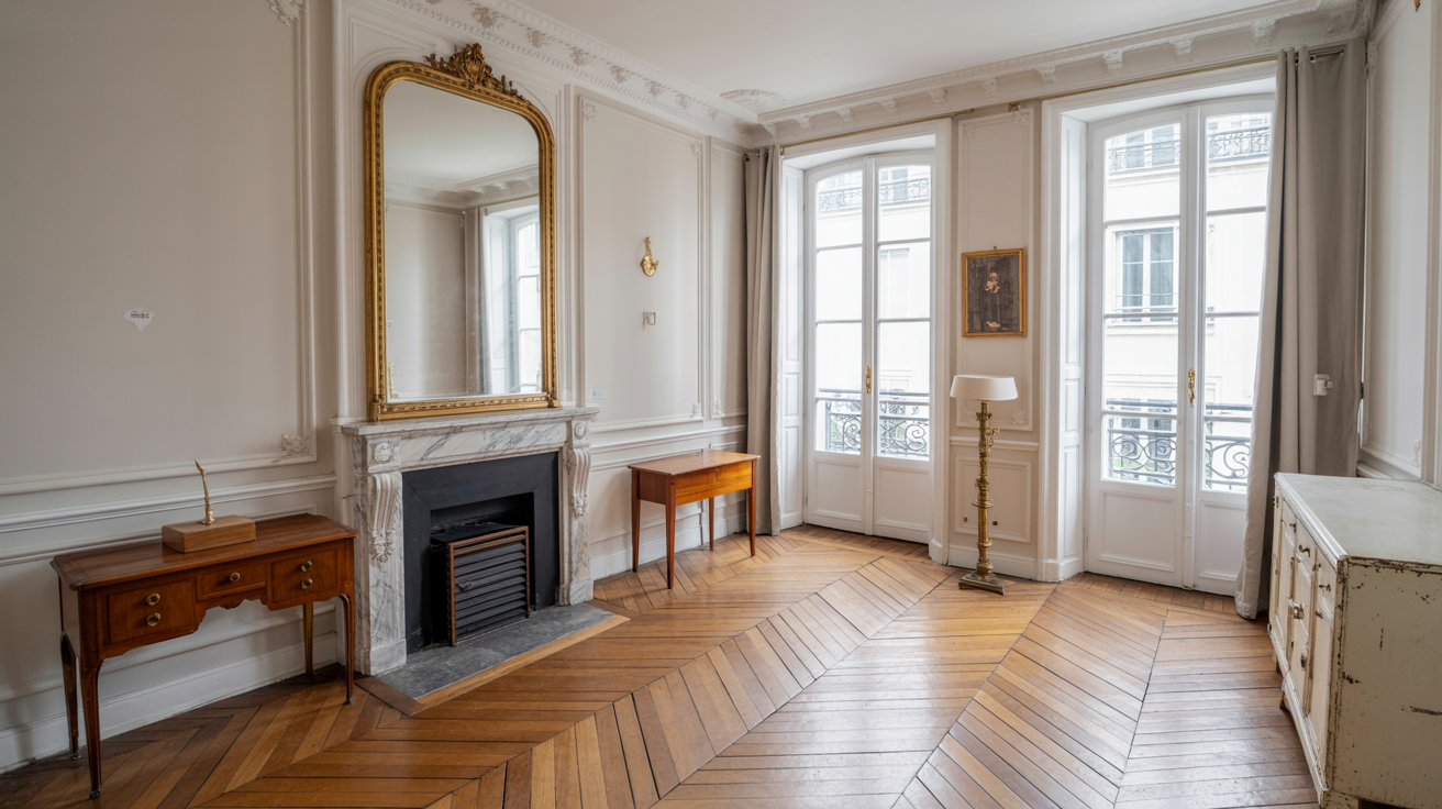
Mistake 3: Incorrectly Hung Curtains and Window Treatments
Okay, let’s talk about curtains. They might seem like a small detail, but trust me, they can make or break a room. A lot of DIYers totally miss the mark here, and it ends up making their home look, well, a bit sad and unfinished. The biggest offender? Curtains that are too short. You know the ones – they barely hit the windowsill, or worse, they’re awkwardly floating mid-wall. It’s like wearing pants that are too short; it just looks wrong and chops up the room, making your windows seem tiny. And if your curtains are too narrow, they look skimpy and don’t even cover the window properly when closed. Not a good look.
It’s not just about length and width, though. How you hang them matters a ton. If your curtain rod is just barely above the window frame, it makes your room feel shorter and less grand. And don’t even get me started on cheap plastic blinds, flimsy vertical blinds, or those curtains with big, clunky grommets made from thin, synthetic fabric. They just scream “budget buy” and can look stiff and dusty. It’s like they were an afterthought, not a part of a well-designed room. All these little things add up to make your whole space feel less polished.
The Fix: Alright, here’s the golden rule for curtains: hang them high and wide! Seriously, this is a game-changer. Install your curtain rods several inches above the window frame – think closer to the ceiling than to the window. This trick makes your windows look taller and your ceilings seem higher. And extend the rod beyond the window frame by at least 6 to 12 inches on each side. This way, when your curtains are open, they stack neatly off the window, letting in maximum light and making the window appear much wider.
When you’re picking curtains, go for quality fabrics that drape nicely, like linen, cotton, or even velvet. You want them to just kiss the floor, or even puddle a little bit for a super luxurious look. And ditch those grommeted tops; they can look a bit dated. Instead, go for back tabs, ring clips, or a rod pocket for a cleaner, more elegant vibe. If curtains aren’t your thing, consider tailored options like woven wood shades, Roman shades, or plantation shutters. These give you a custom, sophisticated feel while still giving you light control and privacy. By getting your window treatments right, you’ll totally transform your windows and make your home feel way more refined and put-together. It’s a DIY win!
Mistake 4: Undersized or Mismatched Area Rugs
Area rugs are like magic carpets for your home – they can define a space, add warmth, and bring in some much-needed texture and color. But if you pick the wrong one, or put it in the wrong spot, it can totally mess up your room’s vibe and make it look, you guessed it, cheap. The biggest no-no? A rug that’s just too darn small. It’s like your furniture is floating in a sea of flooring, not really connected to anything. This makes the whole room feel awkward and disjointed, like it’s missing something important.
And it’s not just about size. If your rug has a crazy pattern that clashes with everything else, or it’s made of some flimsy material that keeps curling up at the edges, it’s going to drag down the whole look. You know, those rugs that just look sad and worn out? Or if you’ve got a bunch of tiny, random rugs scattered around an open-concept space, it just looks messy and chaotic instead of pulled-together. While a big, stylish rug can totally hide some less-than-perfect flooring, a bad rug can actually make things worse, screaming, “I didn’t really think this through!”
The Fix: Alright, so here’s the golden rule for rugs: go big or go home! Seriously, your rug needs to be big enough to anchor your furniture. In the living room, make sure at least the front legs of all your main seating pieces (like your sofa and armchairs) are on the rug. Even better if all your furniture can sit entirely on it – it creates a cozy, defined zone. For the dining room, your rug should be large enough so that chairs stay on the rug even when they’re pulled out. A good trick is to have at least 18-24 inches of rug extending past the table on all sides.
When you’re picking a rug, think about the material and how it feels. Wool, jute, or good quality synthetics are great because they’re durable and feel nice underfoot. And make sure the color and pattern actually work with your room’s style – the rug should tie everything together, not fight with it. If you can’t afford to replace your flooring, a well-chosen, large area rug can work wonders, adding warmth and making your space feel super luxurious. Get the rug right, and your home will feel intentional, polished, and definitely not cheap!
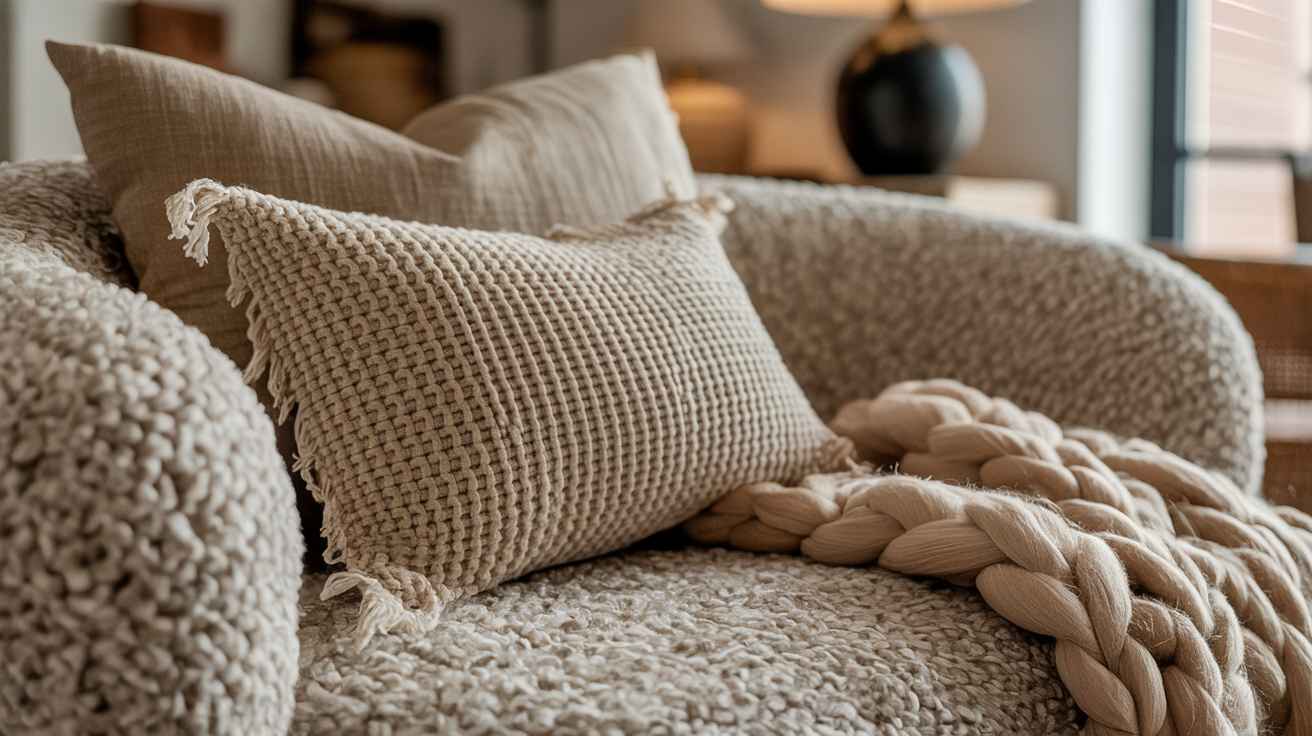
Mistake 5: Buying Matching Furniture Sets
Remember those furniture showrooms where everything was perfectly matched? The sofa, the loveseat, the armchair – all from the same collection. Or a bedroom set where the bed, dresser, and nightstands were identical twins? While it seems easy and convenient, buying entire matching furniture sets is a huge DIY mistake that can make your home look bland, uninspired, and frankly, a bit cheap. It’s like your home is trying too hard to be perfect, but ends up looking like a catalog page instead of a real, lived-in space.
The big problem with these matching sets is that they lack personality. Everything looks the same – the style, the material, the finish. There’s no interesting mix of textures, no cool contrasts, and no sense of discovery. A room full of perfectly matched furniture can feel sterile, generic, and just plain boring. It doesn’t tell your story or show off your unique taste. Instead, it feels more like a temporary display than a cozy, cherished home.
The Fix: The secret to a truly stylish home isn’t about matching; it’s about mixing! Think of your home as a curated collection, not a pre-packaged deal. Instead of buying sets, aim to mix and match different styles, finishes, and materials. This gives you so much more freedom and lets you bring in pieces you genuinely love. It creates a layered, collected look that feels like it’s evolved over time, not just bought in one go. For example, pair a comfy upholstered sofa with a cool vintage wooden coffee table. Or mix different metals in the same room, like brass and iron, for some extra visual interest.
When you’re building your furniture collection, look for pieces that complement each other without being identical. Play with textures – maybe a plush velvet armchair next to a sleek leather sofa, or a rustic wooden dining table with some modern upholstered chairs. And don’t forget to throw in some unique finds! Vintage pieces, family heirlooms, or treasures from your travels can add so much character and tell a story. The goal is to create a harmonious blend of old and new, soft and hard, smooth and textured. This thoughtful approach to furniture will make your home feel genuinely unique and far from cheap. It’ll feel like you!

Mistake 6: Visible Cords and Clutter
Let’s be real, in today’s world, we’re surrounded by gadgets. And with gadgets come cords, chargers, and wires. While they’re totally necessary, letting them sprawl out in a tangled mess is a surefire way to make your home look messy, chaotic, and yep, cheap. That spaghetti monster of cables behind your TV, computer, or charging station? It’s a total eyesore and screams “I don’t care about the details!” It just ruins the clean look of even the most beautifully designed room.
And it’s not just cords. General clutter is another huge culprit that cheapens a home’s appearance. Too many little knick-knacks, piles of mail, overflowing shelves, or just too much stuff without a clear home can make your room feel overwhelming and cramped. While it’s great to personalize your space, too much clutter makes it feel less intentional and more like a storage unit than a cozy, curated home. It’s a sign that things are just piling up, rather than being thoughtfully placed.
The Fix: Time to get organized! For those pesky cords, there are tons of simple and cheap solutions. Think cable ties, cord organizers, cable management boxes, or even adhesive clips. These little helpers can bundle wires neatly, hide them behind furniture, or run them along baseboards so they virtually disappear. If you’ve got a wall-mounted TV, consider running the cables through the wall for a super clean, professional look. It’s a small effort that makes a huge difference.
For general clutter, remember this mantra: quality over quantity. Instead of displaying every single thing you own, try to curate your decor. Group items in odd numbers, play with different heights and textures, and leave some empty space so your favorite pieces can really shine. Get smart with storage solutions too – decorative baskets, stylish bins, and clever shelving can hide everyday items while still looking good. And try to get into a regular decluttering habit. Maybe the “one in, one out” rule works for you: if something new comes in, something old has to go. By taming your cords and embracing a more minimalist approach to decor, you can transform a chaotic space into a calm, intentional, and sophisticated haven that feels anything but cheap.
Mistake 7: Neglecting Hardware and Small Details
Okay, so you’ve painted the walls, picked out some cool furniture, and even got your curtains looking sharp. But then you look around and something still feels… off. Chances are, it’s the little things you’ve overlooked. Many DIYers focus on the big stuff and totally forget about the small details, and that’s a huge mistake. Cheap, old, or worn-out hardware can instantly make your home look dated and, you guessed it, cheap. Think about those flimsy cabinet knobs, chipped doorknobs, or those brass fixtures from the 80s that just scream “out of style.” These tiny pieces are things you touch every single day, and their quality (or lack thereof) leaves a big impression.
And it’s not just hardware. Neglecting other small details can also make your home feel less polished. Things like yellowed light switch plates, mismatched outlet covers, or even unpainted trim and baseboards. Maybe there are gaps around your windows or doors that need a little caulk. These small imperfections might seem minor, but they add up. They create a sense of disarray and make it look like you didn’t quite finish the job. It’s the difference between a home that feels thoughtfully put together and one that feels like a bunch of unfinished projects.
The Fix: This is where you can get a lot of bang for your buck! Upgrading your hardware is one of the easiest and most impactful ways to instantly elevate your home. Ditch those flimsy cabinet pulls and old doorknobs for something classic and well-made. Aged brass, polished nickel, matte black, or brushed chrome are all fantastic choices that can instantly modernize your kitchen, bathroom, or doors. Just feeling the weight of a quality knob can make a huge difference in how your home feels.
And don’t stop there! Pay attention to those other small details. Replace old, discolored light switch plates and outlet covers with fresh, clean ones that match your decor. Make sure all your trim and baseboards are perfectly painted and free of scuffs. Take a few minutes to caulk any gaps around windows, doors, or built-ins for a seamless, finished look. Even simple things like cleaning your grout lines or polishing your fixtures can make a surprising difference. These small, inexpensive changes add up to create a sense of polish and quality. By focusing on these often-forgotten details, you’re showing that you care about craftsmanship, and that’s what makes a home feel truly refined and expensive, not cheap.
So, there you have it! The DIY journey is awesome, giving you that sweet satisfaction of creating something with your own hands and saving some cash along the way. But as we’ve seen, it’s also super easy to accidentally make your home look less than stellar if you’re not careful. From how you slap on paint to those tiny little hardware bits, every DIY project has the power to either boost your home’s style or, well, make it look a bit cheap.
We’ve talked about seven common DIY slip-ups: bad paint jobs, ugly light fixtures, curtains that are all wrong, rugs that are too small, buying furniture in sets, messy cords and clutter, and totally forgetting about the small details. Usually, these mistakes happen because we’re rushing, or we just don’t realize how much those little things actually matter. But here’s the good news: every single one of these can be fixed, and often, it’s not even that hard or expensive!
The biggest takeaway for any DIY enthusiast, whether you’re just starting out or you’ve got a few projects under your belt, is to plan things out and pay attention to the details. Don’t just rush through it. Think of each project as a chance to really make your home shine with quality and intention. Do a little research, maybe spend a tiny bit more on materials where it counts, and take your time to get those details just right. Remember, a truly beautiful home isn’t necessarily one packed with super expensive stuff. It’s a home that shows care, feels cohesive, and has that thoughtful touch. By knowing these common DIY blunders and actively avoiding them, you’ll make sure all your hard work actually pays off, creating a space that’s not just functional and comfy, but also looks amazing and feels totally you. Happy DIYing!