The Magic of Visual Elevation
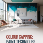
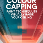
Ever walked into a room and felt an immediate sense of spaciousness, almost as if the ceiling stretched endlessly upwards? It’s not always about grand architectural designs or towering ceilings. Sometimes, the magic is just in clever paint techniques that trick the eye, making a room feel significantly taller than it actually is. “Colour Capping,” a design secret that’s gaining immense popularity among interior enthusiasts and DIYers alike. If you’ve been dreaming of transforming a cozy, perhaps slightly cramped, space into an airy, expansive haven, you’re in the right place. This article will guide you through the art of colour capping, focusing on the elegant and effective method of tonal layering—using lighter walls, mid-tone cornices, and darker ceilings—to create a visually taller room. We’ll break down the theory, provide step-by-step DIY painting tips, and recommend the essential tools you’ll need to achieve this stunning effect in your own home. Get ready to elevate your space, one brushstroke at a time!
Understanding Colour Capping and Tonal Layering: The Illusion of Height
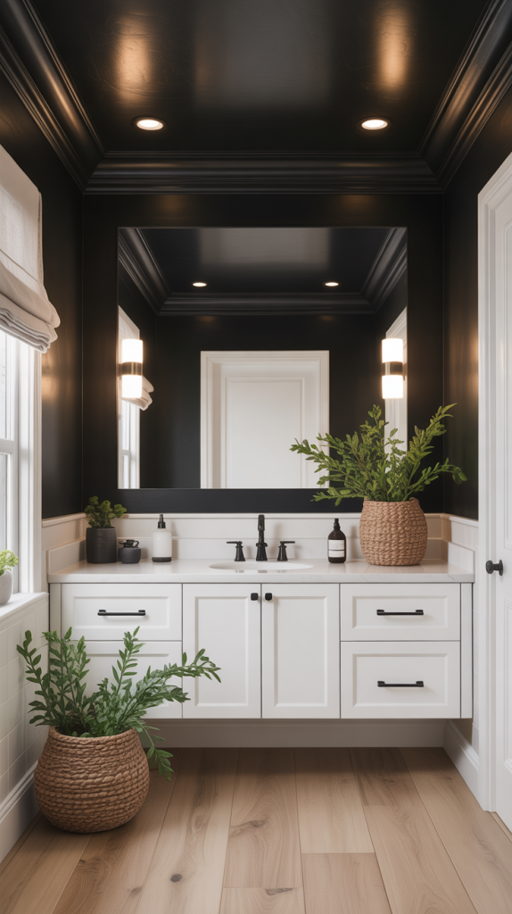
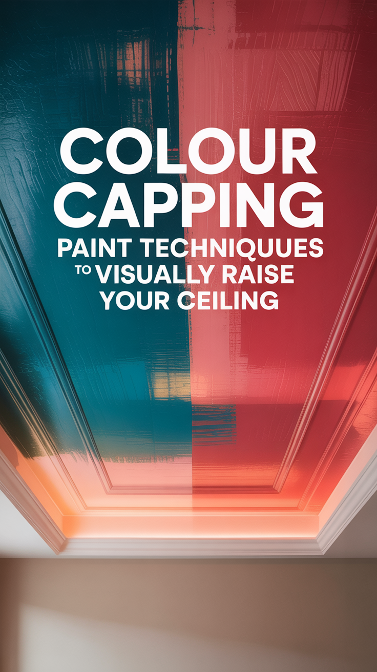
At its heart, colour capping is an ingenious painting technique designed to manipulate perception. It’s about creating an optical illusion that draws the eye upwards, making the ceiling appear higher than its physical dimensions. While there are various approaches to achieving this, our focus today is on tonal layering, a sophisticated method that leverages the power of color gradients to create a sense of vertical expansion. This technique is particularly effective because it mimics the way light naturally falls in a room, creating a subtle yet powerful visual effect.
The Tonal Layering Principle: A Gradient to Grandeur
The core idea behind tonal layering for visual ceiling elevation is to create a gradient of color from the bottom of your walls up to the ceiling. Imagine a gentle fade, where colors transition seamlessly, guiding your gaze upwards and making the room feel more expansive. Here’s how the specific combination works:
- Lighter Walls: The foundation of this technique begins with lighter shades on your walls. Think soft whites, pale grays, light pastels, or muted neutrals. These colors reflect more light, making the walls feel open and pushing them visually outwards, contributing to an overall sense of spaciousness. Lighter walls also serve as a perfect backdrop, allowing the subsequent layers to stand out without overwhelming the space.
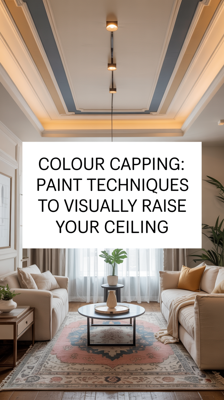
- Mid-Tone Cornices (or Crown Molding): The cornice, or crown molding, is the architectural trim that bridges the wall and the ceiling. In tonal layering, this element plays a crucial role as the transitional mid-tone. By painting your cornices in a color that is slightly darker than your walls but lighter than your ceiling, you create a visual break that defines the top of the wall without abruptly cutting off the upward flow. This mid-tone acts as a subtle buffer, preventing the darker ceiling from feeling too heavy or oppressive. It’s about creating a soft, elegant separation that enhances the illusion of height rather than hindering it.
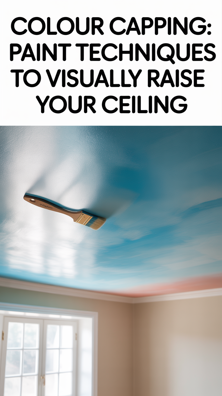
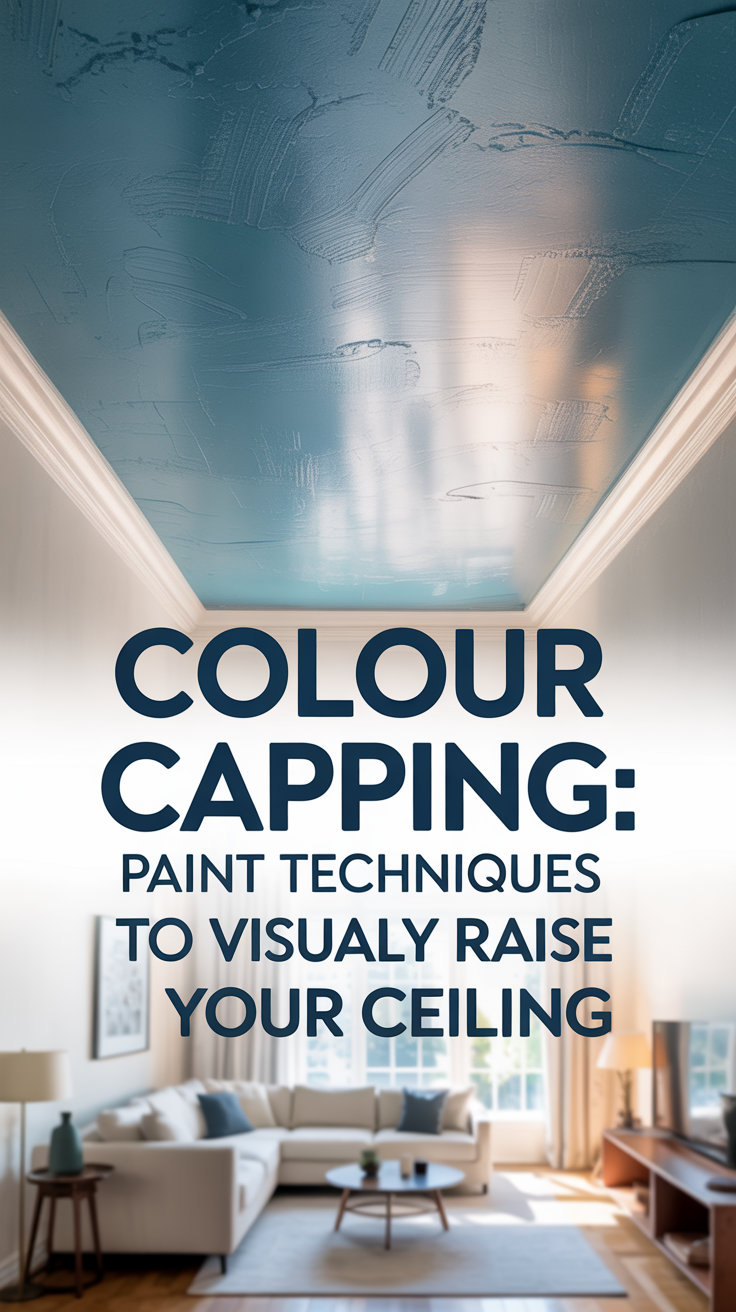
- Darker Ceilings: This might sound counterintuitive at first, as conventional wisdom often suggests painting ceilings white to make them feel higher. However, in the context of colour capping with tonal layering, a darker ceiling is the secret weapon. When combined with lighter walls and mid-tone cornices, a darker ceiling creates a sense of depth and distance. Instead of feeling like a low lid, it recedes into the background, almost like the night sky, drawing the eye upwards and creating an impression of infinite space above. The contrast with the lighter walls and mid-tone cornice is key here; it’s not about making the ceiling disappear, but about making it feel like a vast, open expanse.
This deliberate progression of color—light to mid-tone to dark—works harmoniously to stretch the perceived height of your room. It’s a sophisticated approach that adds character and depth while delivering on the promise of visual elevation. Now that we understand the “why,” let’s dive into the “how” and get our hands dirty with some DIY painting tips and tool recommendations.
Planning Your Colour Capping Project: Preparation is Key
Before you even think about opening a paint can, a successful colour capping project hinges on meticulous planning and preparation. This isn’t just about picking pretty colors; it’s about understanding your space, choosing the right hues, and getting your room ready for its transformation. Think of it as laying the groundwork for a masterpiece – the more effort you put into this stage, the smoother your painting process will be, and the more stunning your results.
Step 1: Choosing Your Palette – The Art of Tonal Harmony
Selecting the right colors is perhaps the most crucial step in achieving the desired visual elevation. Remember, we’re aiming for a subtle gradient that guides the eye upwards, not a jarring contrast that chops the room into segments. Here’s how to approach your color choices:
- Start with the Walls: Begin by choosing the dominant color for your walls. As discussed, lighter shades are your best friends here. Consider off-whites, very light greys, soft creams, or muted pastels. These colors will make your walls feel expansive and airy. When testing colors, paint large swatches on different walls and observe them throughout the day under various lighting conditions. Natural light, artificial light, and even the time of day can dramatically alter how a color appears.
- Transition to the Cornice: Once your wall color is settled, move to the cornice. The key here is to select a mid-tone that bridges the gap between your light walls and your darker ceiling. This mid-tone should be a shade or two darker than your wall color, but still within the same color family or a complementary one. For instance, if your walls are a pale cream, your cornice could be a light beige or a warm greige. If your walls are a very light grey, a slightly deeper grey would work beautifully for the cornice. The goal is a gentle progression, not a stark contrast. If you don’t have cornices, you can create a faux cornice effect by painting a band of this mid-tone color just below the ceiling line. This can be a crisp, straight line or a more artistic, feathered edge, depending on your desired aesthetic.
- Embrace the Darker Ceiling: Now for the exciting part – the ceiling! This is where you introduce your darker shade. Don’t be afraid to go bold, but remember the principle of tonal harmony. Deep blues, charcoal greys, rich greens, or even a dark, muted plum can work wonders. The darker the ceiling, the more it will recede, creating that illusion of infinite height. However, ensure the dark color complements your wall and cornice colors. A good tip is to choose a darker shade from the same color family as your mid-tone cornice, or a color that provides a sophisticated contrast without being overwhelming. For example, a deep navy ceiling could pair beautifully with light grey walls and a mid-grey cornice.
- Consider Undertones: Pay close attention to the undertones of your chosen paints. Warm undertones (yellow, red, orange) will create a cozier feel, while cool undertones (blue, green, purple) will evoke a more serene and expansive atmosphere. Ensure the undertones across your wall, cornice, and ceiling colors are harmonious to avoid a disjointed look.
Step 2: Room Preparation – The Unsung Hero of Painting
Once your color palette is finalized, it’s time to prepare your room. This stage is often overlooked or rushed, but it’s absolutely critical for a professional-looking finish and to protect your belongings. Don’t skip these steps!
- Clear the Room: Remove all furniture, decor, and wall hangings from the room. If large furniture cannot be moved, push it to the center of the room and cover it completely with plastic sheeting or drop cloths. This protects your items from paint splatters and gives you ample space to work.
- Protect Your Floors: Lay down drop cloths or old sheets to cover your entire floor. Secure them with painter’s tape to prevent slipping and ensure full coverage. Even if you’re careful, drips and spills are inevitable, and protecting your floors will save you a lot of headache later.
- Clean the Surfaces: Dust, grime, and cobwebs can prevent paint from adhering properly. Use a damp cloth or a mild detergent solution to clean your walls, cornices, and ceiling. Pay special attention to areas near windows, doors, and high-traffic zones. Allow all surfaces to dry completely before proceeding.
- Repair and Smooth: Inspect your walls and ceiling for any cracks, holes, or imperfections. Fill small holes with spackle or joint compound, sand them smooth once dry, and wipe away any dust. For larger cracks, you might need to use a patching compound. A smooth surface is essential for an even paint application and a flawless finish.
- Tape Off and Mask: This is where precision comes in. Use high-quality painter’s tape to mask off any areas you don’t want to paint. This includes window frames, door frames, baseboards, light fixtures, and any other architectural details. For creating a crisp line between your wall and cornice, or if you’re creating a faux cornice, painter’s tape is your best friend. Press the tape down firmly to prevent paint from bleeding underneath. Take your time with this step; a well-taped room is half the battle won.
- Prime (If Necessary): While not always mandatory, priming can make a significant difference, especially if you’re painting over a dark color with a lighter one, or if your walls are stained or porous. Primer creates a uniform surface for the paint to adhere to, improves paint coverage, and can help achieve a truer color. If you’re making a drastic color change, or if your walls are particularly absorbent, a good quality primer is a worthwhile investment.
With your colors chosen and your room prepped, you’re now ready to dive into the actual painting process. The next section will walk you through the step-by-step application, ensuring you achieve that stunning colour capping effect with confidence.
Step-by-Step DIY Painting Tips: Bringing Your Vision to Life
Now for the fun part – painting! With your room meticulously prepped and your colors chosen, you’re ready to transform your space. This section will guide you through the painting process, offering practical tips and techniques to ensure a smooth application and a professional-looking finish. Remember, patience and precision are your best allies in any painting project.
Step 1: Painting the Ceiling – The Darker Sky Above
Start with the ceiling. This is often the most challenging part, but tackling it first prevents drips onto your freshly painted walls. For your darker ceiling color, consider using a paint specifically designed for ceilings, as these often have a flatter finish that helps to hide imperfections and reduce glare.
- Cutting In: Begin by ‘cutting in’ the edges of the ceiling. This involves using a brush to paint a strip (about 2-3 inches wide) along the perimeter where the ceiling meets the cornice (or wall if you don’t have a cornice). Use a high-quality angled brush for precision. Load your brush with paint, but don’t overload it. Apply the paint in smooth, even strokes, maintaining a steady hand. If you’ve taped off your cornice, paint carefully up to the tape line. If you’re freehanding, take your time and use the natural stiffness of the brush bristles to create a clean line.
- Rolling the Ceiling: Once the edges are cut in, use a paint roller with an extension pole to paint the main area of the ceiling. A roller with a medium nap (around 3/8 inch to 1/2 inch) is generally suitable for most ceiling surfaces. Pour your paint into a paint tray and load your roller evenly. Start rolling in one corner of the room, working in small sections. Apply the paint in a ‘W’ or ‘M’ pattern, then fill in the pattern with straight, overlapping strokes. This technique ensures even coverage and helps to prevent roller marks. Maintain a ‘wet edge’ – always overlap your previous stroke while the paint is still wet to avoid lap marks and streaks. Work quickly but carefully, moving across the ceiling in a systematic manner. For optimal coverage and a uniform finish, two coats of ceiling paint are usually recommended, allowing adequate drying time between coats as per the manufacturer’s instructions.
Step 2: Painting the Cornice – The Mid-Tone Bridge
After your ceiling has dried completely, it’s time to tackle the cornice. This is where your mid-tone color comes into play, creating that crucial visual transition.
- Precision is Key: If you’ve already taped off the cornice from the ceiling, ensure the tape is firmly pressed down. Use a smaller angled brush for this detailed work. Carefully paint the cornice with your chosen mid-tone color, ensuring a clean line against both the ceiling and the wall. If you’re creating a faux cornice with tape, apply the tape precisely to create your desired band width and paint within those lines. For intricate moldings, a smaller, more flexible brush might be helpful to get into all the nooks and crannies.
- Even Coats: Apply two thin, even coats of paint to the cornice, allowing sufficient drying time between each. Thin coats are always better than one thick coat, as they dry more evenly and are less prone to drips or brush marks. Once the final coat is dry to the touch, carefully remove any painter’s tape. Pull the tape off slowly at a 45-degree angle to prevent peeling the paint.
Step 3: Painting the Walls – The Lighter Foundation
With your ceiling and cornice complete, it’s time to paint the walls with your chosen lighter shade. This is typically the largest surface area and will set the overall tone for the room.
- Cutting In Again: Just like with the ceiling, start by cutting in the edges of the walls. Use an angled brush to paint along the top edge where the wall meets the cornice, around windows, doors, and along baseboards. Again, maintain a steady hand and a clean line. If you’ve taped off your baseboards and door/window frames, paint carefully up to the tape.
- Rolling the Walls: Use a roller with a medium nap for your walls. Load the roller evenly and apply the paint in sections, using the ‘W’ or ‘M’ pattern to ensure consistent coverage. Roll from top to bottom, overlapping each stroke slightly to maintain a wet edge and avoid streaks. Work your way around the room systematically. For most colors, two coats will provide the best coverage and a rich, even finish. Allow each coat to dry completely before applying the next.
Step 4: The Finishing Touches – Stepping Back and Admiring Your Work
Once all the paint has dried, it’s time for the final steps.
- Inspect and Touch Up: Carefully inspect all painted surfaces for any missed spots, drips, or uneven areas. Use a small brush to touch up any imperfections. Take your time with this; it’s the difference between a good paint job and a great one.
- Clean Up: Remove all drop cloths, painter’s tape, and dispose of them properly. Clean your brushes and rollers thoroughly with soap and water (for latex paints) or mineral spirits (for oil-based paints). Proper cleaning will extend the life of your tools.
- Reassemble the Room: Carefully move your furniture back into place and rehang any decor. Step back and admire your newly transformed space! The subtle gradient from light walls to mid-tone cornice to darker ceiling should now be evident, creating that beautiful illusion of increased height and spaciousness. You’ve successfully mastered the art of colour capping!
Essential Tools for Your Colour Capping Project: Your DIY Arsenal
No DIY painting project is complete without the right tools. Having the proper equipment not only makes the job easier but also contributes significantly to the quality of your finish. Here’s a rundown of the essential tools you’ll need to successfully execute your colour capping project:
1. Paint Brushes: For Precision and Cutting In
- Angled Sash Brush (2-2.5 inches): This is your workhorse for cutting in. The angled bristles allow for precise lines, making it ideal for painting along edges, corners, and around trim. Invest in a good quality brush; it will hold more paint, provide smoother strokes, and last longer.
- Smaller Detail Brush (1 inch or less): Useful for intricate areas, touch-ups, and getting into tight spots, especially if your cornices have detailed carvings.
2. Paint Rollers: For Efficient Coverage
- Roller Frame: Choose a sturdy, comfortable roller frame. A lightweight frame with an ergonomic handle will reduce fatigue.
- Roller Covers (Naps):
- Medium Nap (3/8 inch to 1/2 inch): Ideal for most wall and ceiling surfaces. It holds a good amount of paint and provides even coverage on slightly textured surfaces.
- Smooth Nap (1/4 inch): If your walls and ceiling are perfectly smooth, a shorter nap will give you a finer finish.
- Extension Pole: Absolutely essential for painting ceilings and the upper parts of walls without straining your back or neck. It allows you to reach high areas comfortably and apply paint more evenly.
3. Paint Trays and Liners: For Easy Loading and Cleanup
- Paint Tray: A standard paint tray with a ribbed surface helps load the roller evenly and remove excess paint. Choose one that accommodates your roller size.
- Paint Tray Liners: These are a game-changer for cleanup. Simply place a liner in your tray, use it, and then dispose of it. This saves you from having to wash out the tray after each use.
4. Painter’s Tape: For Crisp Lines and Protection
- High-Quality Painter’s Tape: Don’t skimp on this! Good quality tape (like FrogTape or ScotchBlue) creates sharp lines and prevents paint bleed. Choose a tape designed for the surface you’re masking (e.g., delicate surfaces, multi-surface).
5. Drop Cloths: For Ultimate Protection
- Canvas Drop Cloths: Durable, reusable, and less slippery than plastic. They absorb paint drips, preventing tracking. Ideal for floors.
- Plastic Sheeting: Good for covering furniture and fixtures. It’s lightweight and provides excellent protection against splatters.
6. Preparation Tools: The Foundation of a Flawless Finish
- Spackle or Joint Compound: For filling small holes and cracks in walls and ceilings.
- Putty Knife: To apply spackle or joint compound.
- Sanding Sponge or Fine-Grit Sandpaper: For smoothing patched areas and preparing surfaces for paint.
- Cleaning Supplies: Buckets, sponges, mild detergent, and clean cloths for washing surfaces.
7. Safety Gear: Protect Yourself!
- Safety Glasses: To protect your eyes from paint splatters, especially when painting ceilings.
- Gloves: Disposable gloves will keep your hands clean and protect them from paint.
- Old Clothes: Wear clothes you don’t mind getting paint on.
8. Ladder or Step Stool: For Reaching High Areas
- Sturdy Step Ladder: Essential for cutting in and reaching areas that the extension pole can’t cover. Ensure it’s stable and safe to use.
9. Paint Can Opener and Stir Stick: Simple but Necessary
- Paint Can Opener: A dedicated tool makes opening paint cans easy and mess-free.
- Stir Stick: Always stir your paint thoroughly before and during use to ensure the color is consistent and the pigments are well-mixed.
By assembling this arsenal of tools, you’ll be well-equipped to tackle your colour capping project with confidence and achieve professional-looking results. Remember, good tools are an investment that will pay off in the quality of your work and the ease of your painting experience.
Elevate Your Space, Elevate Your Life
Okay, that just sounds dramatic but I think we can all agree that our environment shapes our mindset, emotions, and well-being.
Colour capping, particularly through the elegant technique of tonal layering, is more than just a painting trend; it’s a powerful design strategy that can seriously impact the feel and perception of your living spaces. By strategically employing lighter shades on your walls, mid-tones on your cornices, and deeper, more recessive colors on your ceilings, you create a visual symphony that guides the eye upwards, transforming even the coziest rooms into airy, expansive spaces. This method not only adds an illusion of height but also imbues your space with a sophisticated depth and character that traditional single-color schemes often lack.
Is it me or does the beauty of DIY lies not just in the cost savings, but in the satisfaction of elevating the home with our own hands?
Don’t be afraid to experiment with color combinations, always keeping the tonal gradient in mind. And as always, pay attention to the light in your room since lighting will play a major role in how your colors interact and create the desired illusion.
Get your tools your tools, choose your palette, and get ready to visually raise your ceiling. You’re not just painting a room; you’re elevating your space, and in doing so, you might just elevate your everyday living. Have fun!!