A designer-approved guide to bringing bold prints, rich textures, and layered visuals into your home—without the chaos.
Mixing patterns is one of the most exciting ways to give a room personality, depth, and visual story. When done well, a space feels curated, intentional, and full of character—like something straight out of a designer’s portfolio. But when done not so well? It can look loud, confusing, or downright cluttered.
Many people avoid patterns altogether because they fear getting it wrong. But the truth is: pattern play is not magic—it’s method. Designers rely on time-tested principles and subtle formulas to ensure a mix looks balanced rather than busy.
Think of this as your ultimate guide to balancing bold choices with effortless cohesion. Whether you love florals, stripes, geometrics, animal prints, block prints, or trendy texture-rich patterns, here’s how to blend them together beautifully.
1. Why Mix Patterns at All? The Case for Going Bold
Before we get into how, let’s talk about why.
Patterns bring life, sophistication, and personality like nothing else can.
Patterns add depth
Even neutral patterns—think taupe stripes or beige herringbone—create layers that make a room feel finished, not flat.
Patterns create visual movement
They guide the eye around the room. A stripe leads the gaze upward. A floral adds softness. A bold geometric anchors a space.
Patterns express your personality
Minimalism is beautiful, but a space with thoughtful patterns feels like a peek into your style, interests, and creativity.
Patterns make a room feel professionally designed
Layered patterns are one of the most recognizable signatures of interior stylists and decorators. When used correctly, even affordable pieces look upscale.

2. The Secret to Mixing Patterns: Think in Scales
If you take only one thing from this article, let it be this:
Pattern scale is the #1 rule of successful pattern mixing.
Mixing prints becomes easy once you understand small scale, medium scale, and large scale patterns—and how they interact.
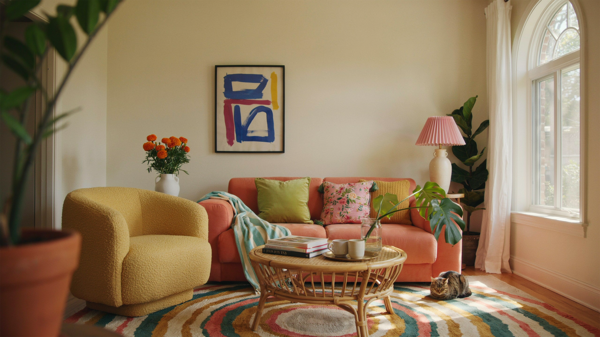
Large-scale patterns (the “statement” pattern)
These set the tone. Examples:
Big florals
Oversized geometrics
Bold plaid
Large abstract prints
Use these for items like drapes, a large rug, wallpaper, or bedding.

Medium-scale patterns (the “bridge” pattern)
These support your statement pattern and blend visually. They could be:
Tighter, repeating geometrics
Medium florals
Ikat
Damask
These usually go on throw pillows, accent chairs, or ottomans.
Small-scale patterns (the “detail” pattern)
These add texture and subtle interest:
Thin stripes
Tiny dots
Small checks
Houndstooth
Micro florals
Use these for small pillows, blankets, lampshades, or decorative accents.
The magic formula:
One large-scale + one medium-scale + one small-scale = a cohesive, beautiful pattern mix.
This prevents everything from competing for attention. Instead, each pattern has a job and plays its part.
3. Choose a Color Story to Tie Everything Together
Even the boldest pattern combinations can live happily together when they share common colors.
Option 1: Use a dominant color
Choose one primary shade that appears in all your patterns—navy, olive, cream, rust, etc.
Example:
Large-scale floral with navy, blush, and green
Medium striped pillow with navy and cream
Small dot pattern in navy
This creates instant harmony.
Option 2: Use complementary colors
Patterns can also balance each other if you use opposite shades on the color wheel, like:
Blue + orange
Green + pink
Purple + yellow
Just keep one color muted or textured so the room doesn’t feel too loud.

Option 3: Use monochromatic layering
One of the easiest ways to mix patterns with confidence.
Think:
Black and white
All neutrals
Shades of green
Tonal blues
This feels sophisticated and serene even when patterns contrast.
4. Start With One “Hero” Pattern
Instead of mixing patterns blindly, designers typically begin with a single “hero” pattern.
This is:
The boldest print in the room
The one that inspires your palette
The anchor for scale and movement
This could be:
A dramatic wallpaper
A large area rug
A floral duvet
A statement curtain fabric
A patterned sofa (for the brave!)
Once you choose your hero pattern:
Pull colors from it
Choose medium and small patterns that complement its scale
Choose textures that echo its mood (more on this next)
This makes choosing additional patterns far easier.
5. Patterns Aren’t Only Visual—They’re Textural
Texture counts as a pattern.
Even if it’s not printed, a material can have pattern-like presence.
Examples:
Woven cane
Bouclé
Shaggy rugs
Rattan
Ribbed velvet
Rough linen
Basketweave throws
When you mix these textures with printed patterns, the result is layered and inviting, not busy.

Why it matters
A room filled only with printed patterns can feel chaotic.
But a room that mixes printed patterns and textured patterns feels curated and cohesive.
6. Create Pattern Zones Within a Room
One mistake people make? Putting all patterns in one visual corner—like stacking patterned pillows, blankets, and art all on the sofa.
Instead, balance pattern around the room by creating “zones.”
Zone 1: Walls & windows
Wallpaper, curtains, Roman shades
Zone 2: Furniture
Patterned sofas, chairs, ottomans, or headboards
Zone 3: Textiles
Throw pillows, rugs, bedding, blankets
Zone 4: Decorative accents
Lampshades, vases, trays, baskets, artwork
Spread patterns among these zones for a professionally styled look.
7. Use Pattern Progression: Bold → Soft → Subtle
Another designer trick is the idea of pattern progression. It prevents overload and makes your room feel cohesive.
Start with the boldest pattern on the largest surface.
Example: a big patterned rug.
Balance with medium patterns on supporting surfaces.
Example: pillows or chairs near the rug.
Finish with small, light patterns that add finesse.
Example: a striped throw or tiny-check lampshade.
This helps your eye move naturally through the space instead of getting “stuck.”
8. Mix Different Types of Patterns—But Do It Intentionally
The most interesting rooms use contrast: florals against stripes, geometrics against animal prints, checks with ikat.
Here’s how to combine them without clashing.
Florals + Stripes
An iconic pairing—timeless, classic, sophisticated.
Why it works: florals are organic and curvy; stripes are structured and linear.
Tip:
Match the stripe thickness to the scale of the floral.
Geometrics + Organic Prints
Think Moroccan tile patterns with leafy botanical prints.
Why it works: structure + movement.
Tip:
Use colors to tie them together.
Plaid + Floral
Traditional and cozy, like English country interiors.
Why it works: both have repeating rhythms.
Tip:
Ensure at least one color overlaps.
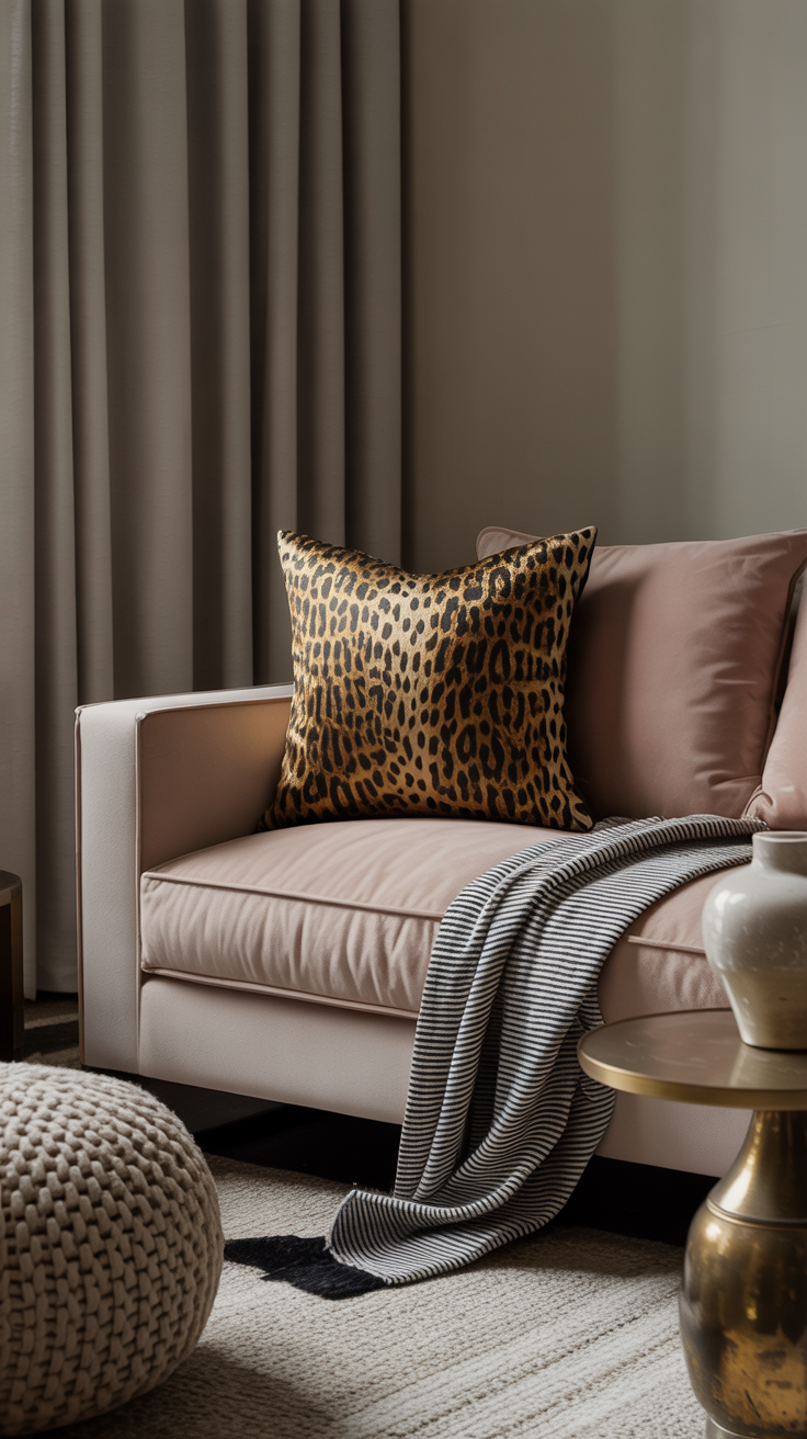
Animal Print + Anything
Leopard, zebra, and cow print are neutrals in disguise.
Tip:
Use small doses—pillows, footstools, picture-frame mats.
Ikat + Stripes
Perfect for boho, global, or modern eclectic spaces.
Tip:
Let one be the star, and use the other in a supporting role.
Abstract + Classic Prints
This creates playfulness without losing structure.
Tip:
Use similar tones to soften the contrast.
9. The 60-30-10 Pattern Rule
This classic interior design formula doesn’t only apply to color—it applies beautifully to pattern.
60% = main pattern
This includes rugs, wallpaper, or bedding.
Choose something that feels grounded and central.
30% = supporting pattern
Use this on drapes, accent chairs, or large pillows.
10% = accent pattern
Tiny touches that complete the room—throw blankets, lampshades, small pillows.
Keeping these proportions helps prevent visual overload.
10. Test Patterns with “The Squint Trick”
Designers swear by this.
Once you’ve layered your patterns, step back and squint your eyes slightly.
This reduces detail and shows you the visual balance.
Ask:
Is one area too heavy?
Are all patterns competing?
Does the color story still feel cohesive?
Do I need more texture and fewer prints?
It’s an instant way to spot imbalance.
11. Let Neutrals Do Some of the Work
Neutrals give your eye a place to rest.
Even if you’re mixing bold patterns, you want grounding elements like:
Solid-color sofas
Neutral walls
Simple bedding
Unpatterned rugs
Plain throw blankets
These act as negative space, letting your patterns shine.
12. When in Doubt, Use Symmetry
Symmetry brings order to bold choices.
If a room feels too chaotic, place patterned items in symmetrical arrangements:
Matching pillows on both sides of a sofa
Twin lamps with matching patterned shades
Balanced gallery walls
Identical curtains framing a window
Symmetry calms complexity.

13. Think About Pattern Mood (Yes, It’s a Thing)
Patterns carry emotional energy.
Make sure the moods align.
Calming patterns:
Watercolor prints
Subtle botanicals
Soft stripes
Washed-out ikat
Tonal textures
Energetic patterns:
Geometrics
Bold stripes
Animal prints
High-contrast florals
Checkerboard
If everything is energetic, you’ll get overwhelmed quickly.
Blend calm and bold for balance.
14. Don’t Forget Scale Within the Room Itself
Pattern scale should fit room size and furniture size.
Small rooms:
Use smaller-scale patterns on wallpaper or upholstery.
Too-large patterns can dominate and feel cramped.
Large rooms:
Use bigger prints so the room doesn’t feel empty.
Tiny patterns get lost.
Tall ceilings:
Vertical stripes create height and feel architectural.
Wide rooms:
Horizontal stripes widen and add harmony.
15. Patterned Rugs: The Unsung Hero of Pattern Mixing
A rug is the largest pattern in most rooms, so it sets the tone.
Good rug strategies:
If the rug is bold, keep medium patterns minimal.
If the rug is subtle, layer in more playful patterns.
Rug types that mix well:
Turkish or Persian rugs (tons of soft, blended pattern)
Geometric Moroccan rugs
Neutral abstract rugs
Striped flatweaves
Tonal patterned rugs (easy for beginners!)
Rugs frequently solve the “something feels off” problem in pattern mixing.
16. Pattern Mixing in Different Rooms
Living Room
Best surfaces for patterns:
Rug
Pillows
Curtains
Artwork
Side chairs
Pro tip: keep the sofa neutral if you’re unsure.
Bedroom
Best surfaces:
Bedding
Wallpaper
Throw pillows
Upholstered headboard
Curtains
Pro tip: start with patterned bedding—it’s the easiest and most affordable anchor.
Bathroom
Best pattern surfaces:
Shower curtain
Bath mat
Towels
Wallpaper
Tile
Pro tip: If doing patterned tile, keep shower curtain simple.
Kitchen
Surfaces:
Tile backsplash
Patterned dishware
Barstool cushions
Rug runners
Window treatments
Pro tip: Keep backsplashes classic; mix patterns in textiles.
17. Three Designer-Approved Pattern Combos That Always Work
If you’re unsure where to start, use one of these foolproof pairings.
Combo #1: Floral + Stripe + Dot
Large floral pillows
Striped throw blanket
Tiny dotted lampshade
Perfect for cottage, transitional, or romantic spaces.
Combo #2: Plaid + Herringbone + Organic Print
Plaid rug
Herringbone throw
Botanical artwork
Ideal for heritage, farmhouse, or Old World styles.
Combo #3: Geometric + Abstract + Texture
Geometric wallpaper
Abstract pillows
Bouclé chairs
Great for modern or eclectic aesthetics.
18. The Beginner’s Pattern Capsule (You Only Need 4!)
If mixing patterns feels overwhelming, start with this capsule.
1. Stripe (always safe)
Goes with everything.
Works in any style.
2. Floral or Botanical
Adds softness and movement.
3. Geometric or Check
Adds structure and contrast.
4. One strong texture
Bouclé, rattan, cane, linen, wool.
Keeps the mix grounded.
Use these four in different scales and you’ll never go wrong.
19. Pattern Mixing Mistakes to Avoid
Even designers break rules—but these mistakes almost always cause visual chaos.
Mistake #1: Using all large-scale patterns
They’ll compete and overwhelm.
Mistake #2: Mixing patterns with clashing undertones
Cool vs warm can feel disjointed.
Mistake #3: No solids or resting points
Your eye needs breathing room.
Mistake #4: Too many bold colors
Stick to 2–3 main colors max.
Mistake #5: Overloading one area
Spread patterns around the room.
Mistake #6: Ignoring texture
Texture balances print-heavy spaces.
20. How to Build a Pattern Palette (Step-by-Step)
Here’s your blueprint for mixing 3–7 patterns like a designer.
Step 1: Choose your hero pattern
Make it bold enough to guide the theme.
Step 2: Pull your color palette
Use 2–3 main colors and 1–2 accents.
Step 3: Add one medium-scale pattern
Preferably in a different pattern family.
Step 4: Add one small-scale pattern
Keep it subtle.
Step 5: Add one strong texture
Bouclé, rattan, velvet, woven linen.
Step 6: Add solids as grounding elements
A neutral rug or sofa works wonders.
Step 7: Step back and edit
Remove one item if it feels crowded.
21. Pattern Mixing Doesn’t Have to Be Maximalist
Patterned rooms aren’t automatically bold or loud.
You can still create peaceful, airy spaces with thoughtful pattern layering.
Serene pattern mixes:
Tonal stripes + soft floral + linen texture
Neutral geometric + herringbone + bouclé
Blue-on-blue botanical + hand-painted pottery + woven shades
Patterns become softer when:
Color contrast is low
Textures do the heavy lifting
The palette is warm or earthy
22. Pattern Mixing for Bold, Maximalist Looks
If you do want a more maximalist aesthetic, pattern mixing becomes your playground.
Tips for going bold intentionally:
Use high contrast (black/white, navy/mustard)
Use patterns that vary dramatically (floral + check + zebra)
Add artwork with pattern-like qualities
Choose patterned lampshades
Layer multiple throws or quilts
Say yes to wallpaper and curtains
Maximalism thrives on abundance—but still relies on rules of scale and color harmony.
23. Don’t Forget the Ceiling (A Designer Secret)
Patterned ceilings—also called “fifth walls”—are trending.
Options:
Wallpaper
Painted stripes
Stenciled geometrics
Wood planking patterns
Coffered ceilings in contrasting colors
This is especially impactful in:
Powder rooms
Nurseries
Dining rooms
Bedrooms
If you’re nervous about pattern overload, the ceiling is surprisingly safe because it’s visually separated.
24. How to Mix Patterns on a Budget
Pattern mixing doesn’t require luxury fabrics or custom upholstery. You can achieve a designer look affordably.
Best budget sources:
Throw pillows (swap seasonally!)
Remnant upholstery fabric
Wallpaper samples (frame them as art)
Shower curtains (cut and sew into café curtains)
Thrift-store rugs
Peel-and-stick wallpaper
Discount rug sites
An easy rule of thumb:
Invest in one high-impact pattern. Save on everything else.
25. Pattern Mixing Cheat Sheet
Here’s a quick reference you can screenshot:
✔ Always mix scales: large + medium + small
✔ Choose a cohesive color palette
✔ Use one hero pattern to guide the room
✔ Add texture to calm and balance
✔ Spread patterns evenly around the space
✔ Incorporate solid colors as breathing room
✔ Combine pattern families for interest
✔ Use symmetry if things feel chaotic
✔ Test with the squint trick
✔ Edit until the room feels balanced

Confidence Is the Secret Ingredient
Mixing patterns isn’t about memorizing rules—it’s about understanding balance, color, and visual rhythm. Once you master scale and color, the rest becomes intuitive. You’ll start to trust your eye, take creative risks, and create spaces that feel layered, soulful, and unmistakably your own.
Your home is your canvas—patterns are the paint.
Use them boldly, thoughtfully, and joyfully.