

Fall always makes me want to refresh my surroundings. I notice the quality of light changing, the evenings arriving earlier, and the house beginning to feel more important as a place to gather. I want softer textures, warmer colors, better lighting, and rooms that invite people to linger. As a designer, I also know that the easiest way to make a home feel seasonal is not to buy an entirely new collection of decorations.
This fall, I am shopping with intention. I am buying a few pieces that improve the way my home functions and feels. I am not buying disposable décor, exact duplicates of what I already own, or items that create clutter after the season ends. My goal is to make rooms feel warmer without making them look overly themed.
FYI, today I am allowing a little fashion into the conversation because interiors and personal style often speak the same language. The colors, patterns, textures, and proportions I like to wear are often the same ones I want to see at home. Animal print is a good example. In clothing, I can use leopard, zebra, or snakeskin as a neutral with personality. In interiors, I can use a small animal-print pillow, rug, throw, stool, or framed textile in much the same way.
The difference is scale and commitment. A scarf can be changed in seconds. A sofa or wallpaper cannot. For the home, I use animal print thoughtfully, usually as an accent that adds movement to quieter materials. I want my fall spaces to feel collected, comfortable, and personal, not like a store display that must be replaced every few months.
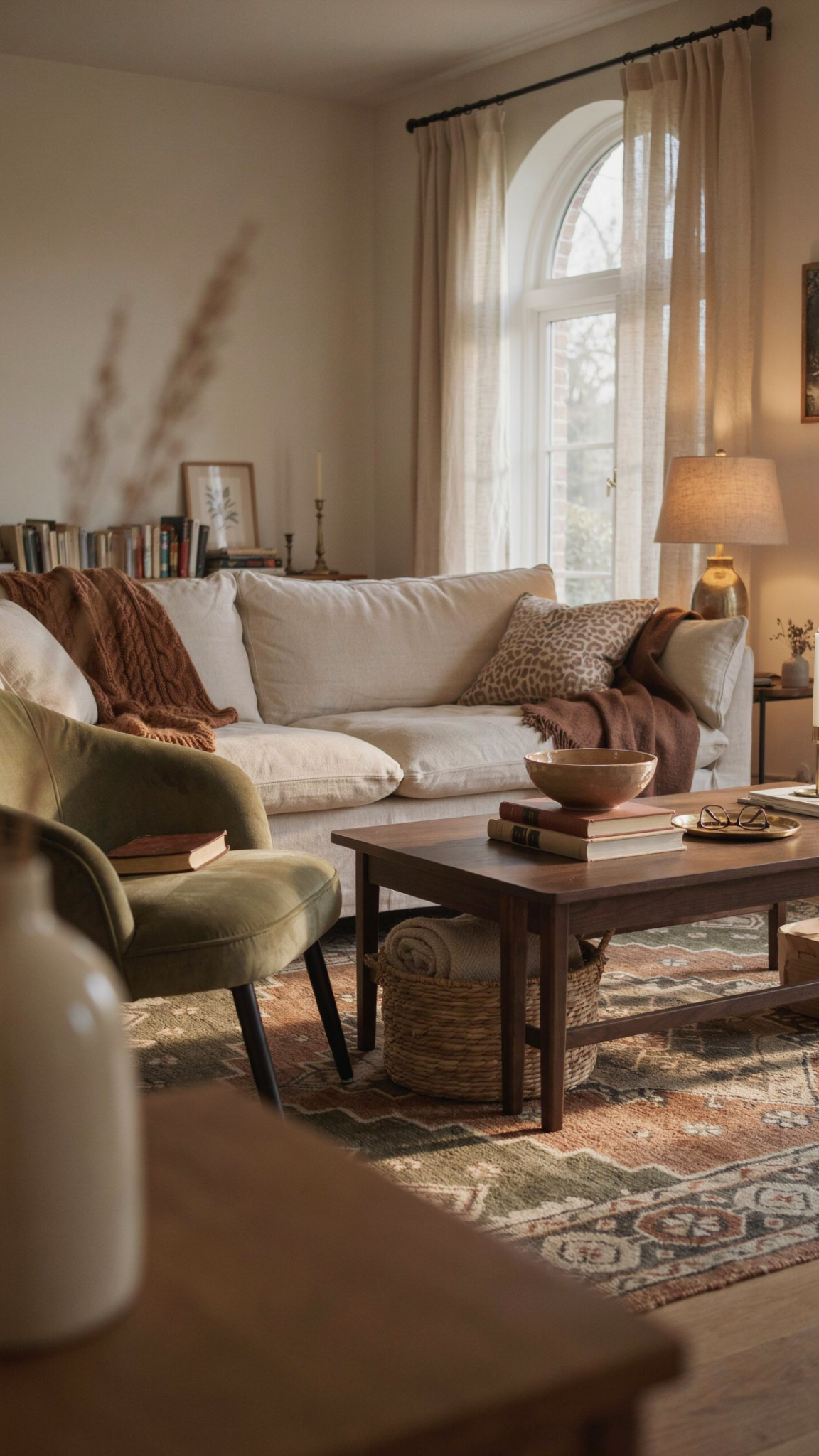
My Fall Design Philosophy
My first rule is to edit before I add. I walk through the house and remove pieces that feel misplaced, damaged, or visually noisy. Sometimes a room needs a new object. Sometimes it needs fewer objects and better placement.
I also look at how each room is used. A living room may need more comfortable seating rather than another decorative pillow. An entryway may need a basket for scarves and shoes rather than a seasonal sign. A dining table may benefit from better lighting rather than a large centerpiece that takes up useful space.
My second rule is to create atmosphere through layers. A room feels seasonal when several small elements work together: light, texture, color, scent, sound, and arrangement. One orange pillow rarely transforms a room. A warmer lamp, a wool throw, a bowl of apples, and a rearranged seating area can make a much greater difference.
My third rule is to buy for a long life. I ask whether an item will still work after the pumpkins are gone. A brown ceramic bowl, a wool blanket, a brass lamp, or a woven basket can feel appropriate in fall and remain useful throughout the year.
Finally, I leave room for delight. A home should not be so carefully edited that it loses humor. A leopard-print stool, a peculiar piece of art, a bright red candle, or an unexpected patterned pillow can give a room energy. The goal is not to make everything quiet. The goal is to make the contrast feel intentional.
What I Am Buying: Better Lighting
The first thing I am buying for fall is better lighting, if my rooms need it. Earlier sunsets make lighting quality more noticeable, and a single overhead fixture rarely creates a warm atmosphere. I am looking for table lamps, floor lamps, plug-in sconces, or small rechargeable lights that allow me to create several layers of illumination.
I prefer lighting that can be adjusted according to the activity. A reading corner needs a focused lamp. A dining area benefits from a softer glow. A hallway may need only a small accent light. When every light is equally bright, the room can feel flat. When the light sources vary in height and intensity, the space feels more welcoming.
I am paying attention to the shade as much as the base. There are also so many fun shade options out there like this company if you are looking to infuse some pattern! Linen, paper, frosted glass, and fabric shades can soften the quality of light. A metal shade may create a stronger, more directional effect. I also consider the color of the bulb and whether the lamp can be dimmed.
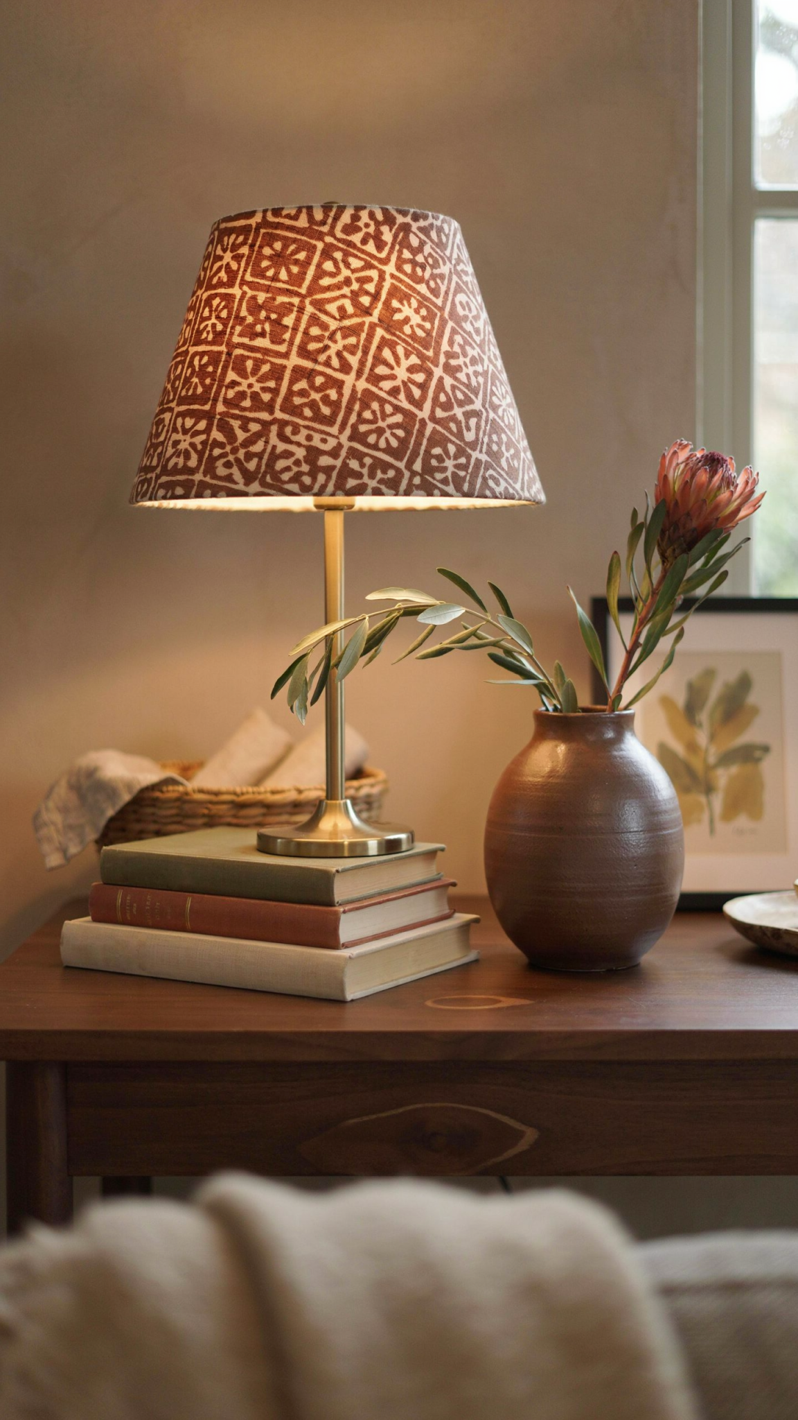
A lighting purchase is worthwhile because it changes how I experience everything else in the room. The same sofa, artwork, and rug can feel entirely different under harsh overhead light and warm, layered light. Before buying decorative objects, I want to make sure the room is illuminated well enough to enjoy them.
If I am working with a limited budget, I look for secondhand lamps, replaceable shades, and fixtures that can move between rooms. A lamp does not have to be expensive to be useful. It needs the right scale, safe wiring, and a shape that supports the room rather than overwhelming it.
What I Am Buying: Textiles With Real Function
Fall is the season when textiles do the most work. A blanket can provide warmth, a rug can soften sound, curtains can make a room feel finished, and cushions can make a chair more comfortable. I am buying textiles that improve daily life rather than merely photograph well.
I am especially interested in wool, cotton, linen blends, corduroy, boucle, velvet, and woven materials with visible texture. I do not need every surface to be soft. Contrast matters. A smooth wood table looks richer beside a nubby textile. A velvet cushion is more interesting when paired with crisp cotton or worn leather.
I am looking for colors that can transition beyond fall: tobacco, olive, rust, camel, cream, charcoal, chocolate, muted blue, and burgundy. These shades feel warm without requiring a room to become orange and brown. I may add a small amount of pumpkin or ochre, but I do not want those colors to determine the entire palette.
Before buying a pillow or throw, I check its size and care instructions. A beautiful textile that cannot be washed in a busy household may not be practical. I also measure the furniture. Oversized cushions can make a small sofa look crowded, while a very small throw may disappear on a large sectional.
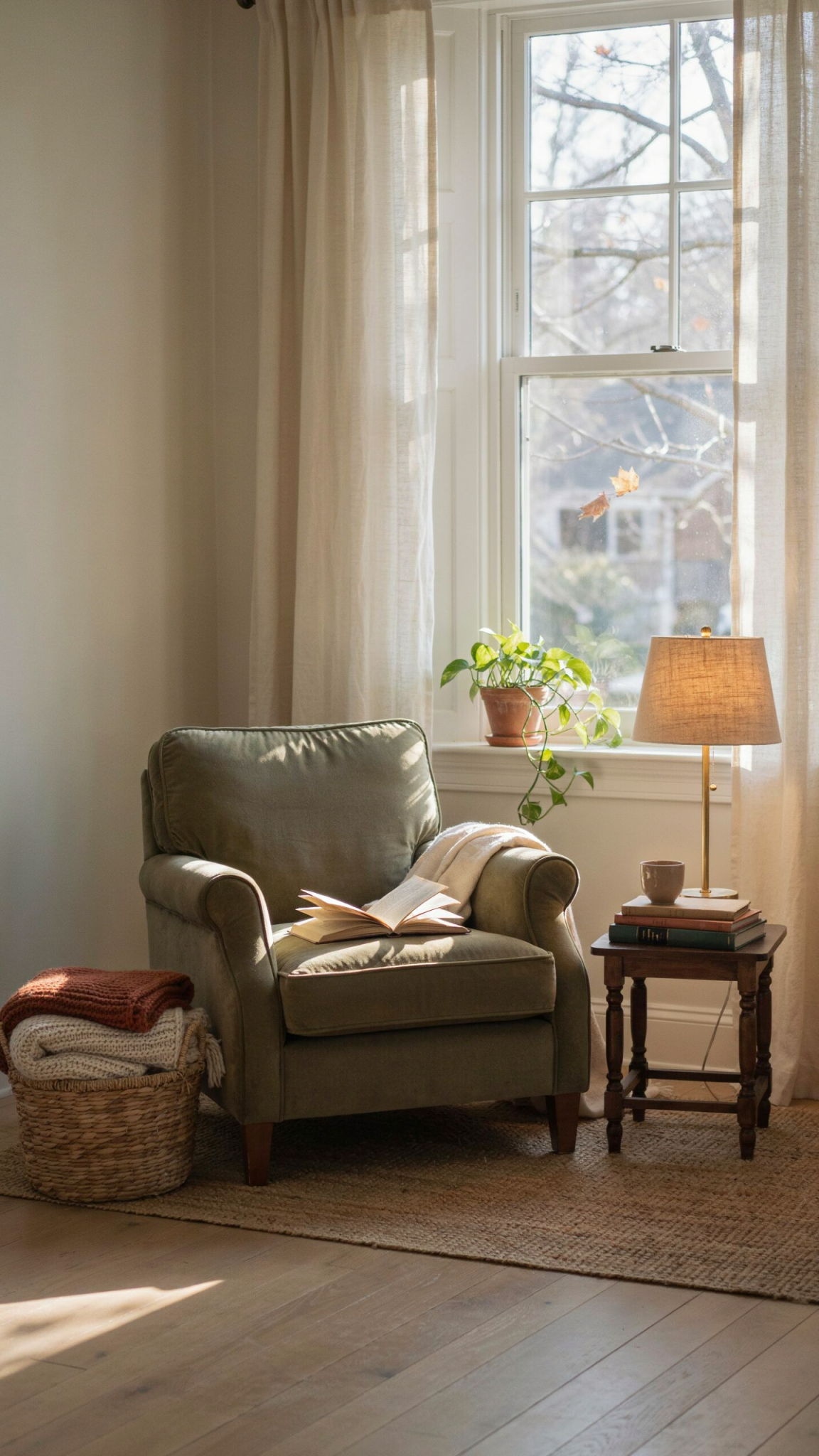
The best textile purchases are often the ones that solve a problem. A blanket can make a drafty reading chair usable. A runner can protect a table and add color. A washable rug can make a high-traffic area more comfortable. Function gives seasonal style staying power.
What I Am Buying: One Distinctive Natural Material
I am planning to bring in one natural material with presence. That might be a carved wooden bowl, a stone vessel, a woven basket, a rattan tray, a ceramic lamp, or a small piece of unfinished wood furniture.
Natural materials add visual warmth because they have variation. Grain, knots, irregular edges, hand-shaped surfaces, and subtle color changes keep a room from feeling manufactured. I do not need a rustic room to appreciate these qualities. A single wooden object can add warmth to a modern space, while a clean ceramic piece can keep a traditional room from feeling heavy.
I prefer objects that can be used. A large bowl can hold fruit, blankets, or children’s supplies. A tray can organize remotes or serve drinks. A basket can store shoes, toys, or extra linens. When an object is both beautiful and useful, I am more likely to keep it visible and care for it.
Secondhand shopping is particularly effective for this category. Older wood, pottery, and woven pieces often have the variation I am looking for. I check for cracks, odors, instability, and damage before buying, but I do not require every piece to look brand-new. A little evidence of use always makes a room feel more lived in.
How I Am Using Animal Print in Interiors
Animal print is one of my favorite ways to add personality to a room. In my humble opinion there is always a place for a little fun with animal print, but right now it’s definitely trending in interiors. I approach it as a pattern with neutral potential, not as a seasonal theme. Leopard can introduce warm brown and black. Zebra can add graphic contrast. Snakeskin can suggest texture without being visually loud. Cowhide can bring irregular shape and organic pattern.
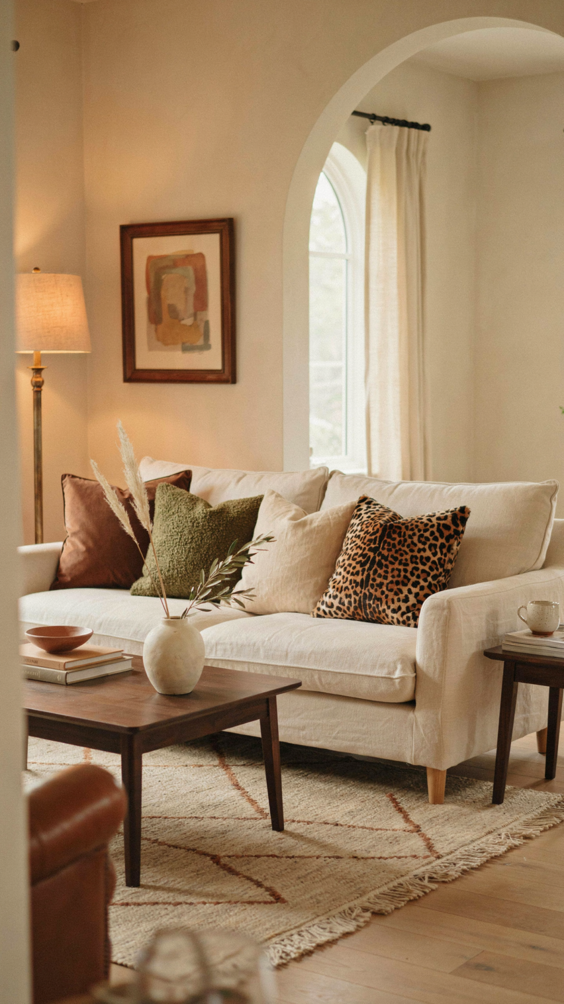
The first step is to choose the role the print will play. Is it an accent, a bridge between colors, or the focal point? If it is an accent, I keep it small: a pillow, tray, lampshade, stool, framed textile, or book cover. If it is a bridge, I use it to connect existing tones, such as black, cream, cognac, and brown. If it is the focal point, I let the rest of the room become quieter.
Begin With a Small Accent
A single animal-print pillow can bring energy to a neutral sofa. I like to place it alongside solid pillows in cream, chocolate, olive, rust, or black rather than pairing it with several unrelated patterns. The print does not need to match everything. It needs to share at least one color with the surrounding palette.
An animal-print tray can be even more flexible. It can sit on a coffee table, ottoman, bar cart, or dresser. A small tray gives the pattern a defined boundary, which makes it feel intentional rather than scattered.
Use It on a Small Piece of Furniture
A leopard-print stool or upholstered bench can be a strong design accent without dominating an entire room. I might place one near an entryway, at the end of a bed, or beside a reading chair. The small scale makes the print easier to live with.
When using printed upholstery, I pay attention to the shape of the furniture. A simple, clean-lined stool can handle a bold pattern. An ornate piece may become visually busy. The print and the silhouette should not compete for attention.
Try Animal Print Underfoot
A small rug or runner can be a sophisticated way to use animal print. A muted leopard pattern in a hallway, bedroom, or dressing area adds movement while remaining grounded. Because the pattern sits below eye level, it can feel less intense than a large printed wall or sofa.
I keep the surrounding pieces relatively calm. A printed rug works well with solid upholstery, natural wood, simple art, and one or two repeated colors. I also think about traffic and maintenance. A beautiful rug that cannot tolerate daily use may be better in a lower-traffic room.
Frame a Textile or Wallpaper Sample
If I love a print but do not want to commit to upholstery, I can frame a textile remnant, wallpaper sample, or small piece of fabric. This creates art that can be moved or replaced easily. It is also a good way to test whether the pattern works with the room’s lighting and colors.
I prefer a generous mat or simple frame so the print has breathing room. The piece should look like art, not like a leftover sample pinned to the wall. This approach allows me to experiment with scale before making a larger purchase.
Pair It With Quiet Materials
Animal print looks strongest when it is surrounded by materials that do not compete with it. Wood, linen, wool, leather, stone, plaster, and simple ceramic forms provide a calm setting. The contrast is what makes the pattern feel elevated.
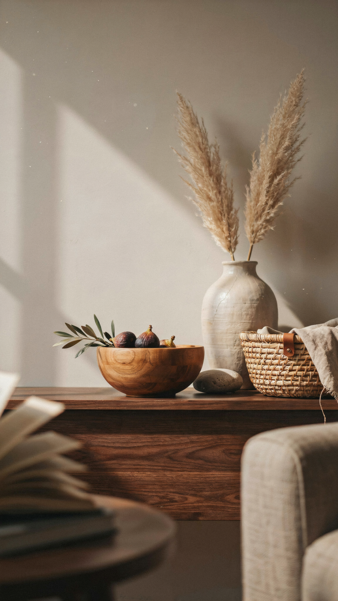
I avoid combining several unrelated animal prints in the same small room. One dominant print can be exciting. Three competing prints can make the room feel accidental. If I use more than one, I keep them in the same visual family or separate them across larger spaces.
What I Am Buying: Fall-Ready Kitchen and Dining Pieces
Fall makes me want to host casual meals, so I am considering a few kitchen and dining pieces that support gathering. I am not shopping for an entirely new table setting. I am looking for objects that make ordinary food feel cared for.
A large serving bowl, a wooden salad bowl, a ceramic pitcher, cloth napkins, or a stack of sturdy dessert plates can be useful additions. I’m still loving the splatterware trend for bowls and trays. Splatterware just sparks so much joy for me, and what is better than dining peices that spark joy around a table with my favorite people? I also like pieces that work for weeknight dinners as well as guests. A bowl should be large enough for food, not just decorative. Napkins should be washable. Plates should be easy to store.