At seven o’clock in the evening, a room tells the truth about its design. In daylight, almost any interior can look composed. Sunlight smooths over awkward proportions, brightens pale finishes, and makes a neatly arranged room feel more generous than it may actually be. But after dark, when the overhead lights are switched off and the lamps begin to glow, a home reveals whether it has depth.
This fall, depth is the point.
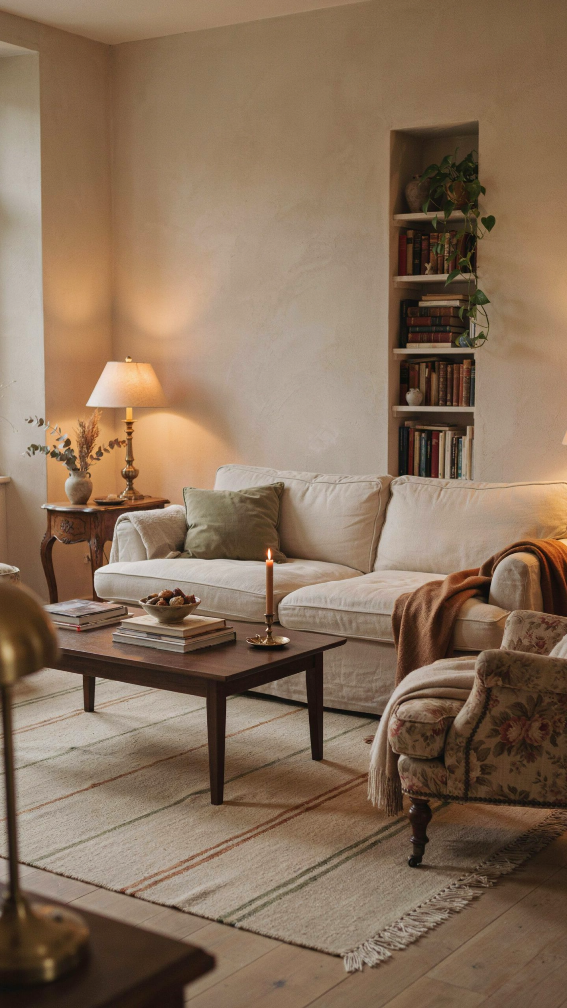
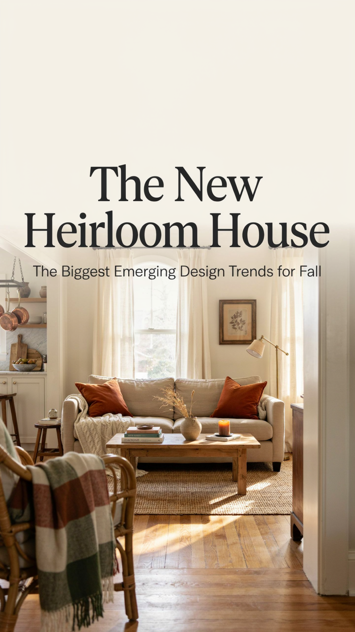
The strongest design signals for the season are not really about pumpkins, orange leaves, or a new collection of decorative objects. They point to a broader change in taste: a movement away from the pale, frictionless, perfectly coordinated room and toward interiors with weight, history, texture, and personality. The emerging look is warm but not bland, traditional but not formal, layered but not cluttered. It is a room where a dark walnut table can sit beside a contemporary sofa, where a floral chair does not have to match the curtains, and where a slightly imperfect ceramic vase may be more valuable than a flawless accessory because it gives the eye somewhere to pause.
Call it New Heritage. It is the productive meeting of old-world reference and present-day ease. It borrows the turned leg, the cabriole foot, the canopy bed, the skirted ottoman, the botanical textile, and the aged metal finish, but removes the preciousness. The goal is not to recreate a historical interior. The goal is to make a new room feel acquired, inhabited, and capable of becoming part of a family’s history.
That idea appears in different forms across the work of Shea McGee, Chris Loves Julia, and April Tomlin. Studio McGee’s fall direction has been described through the appealing phrase “something old, something new,” a shorthand for combining fresh furnishings with patina and soul. Chris Loves Julia continues to develop a moody modern-traditional language through dark wood, antique-derived silhouettes, mixed metals, and rooms designed to be used. April Tomlin’s work brings the same warmth through organic shapes, nuanced neutrals, collected natural materials, and a determination to make a house feel like its occupants rather than like a showroom.
Current coverage from shelter magazines and design trade reporting points in the same direction. Dark walnut and espresso oak are replacing the dominance of pale wood. Tobacco, chocolate, moss, clay, plum, and oxblood are being treated as livable colors rather than dramatic exceptions. Velvet, mohair, brushed wool, cashmere, suede, rattan, embroidery, quilting, and visible handwork are adding sensory richness. Curves are softening traditional forms, while bronze mirrors, smoked glass, lacquer, and polished metal are giving warm rooms a controlled flash of reflection.
The governing rule is simple: layer, do not theme; collect, do not coordinate.
1. Dark, expressive wood becomes the room’s baseline
The most consequential shift for fall is the return of wood with depth. Walnut, mahogany, espresso oak, smoked oak, wenge, cherry, rosewood, burl, and reclaimed timber are appearing across furniture, cabinetry, wall treatments, and small accessories. These finishes bring a visual bass note to a room. They make pale stone look more luminous, warm ivory look creamier, brass look less shiny, and upholstery feel more substantial.
This does not mean that every room needs dark paneling or that light oak has suddenly become unusable. The change is more nuanced. Designers are treating wood as a character material rather than a neutral background. Grain, figuring, age, and tone matter. A table can have a visible history. A cabinet can look as though it was chosen for its shape rather than purchased as part of a matching collection.
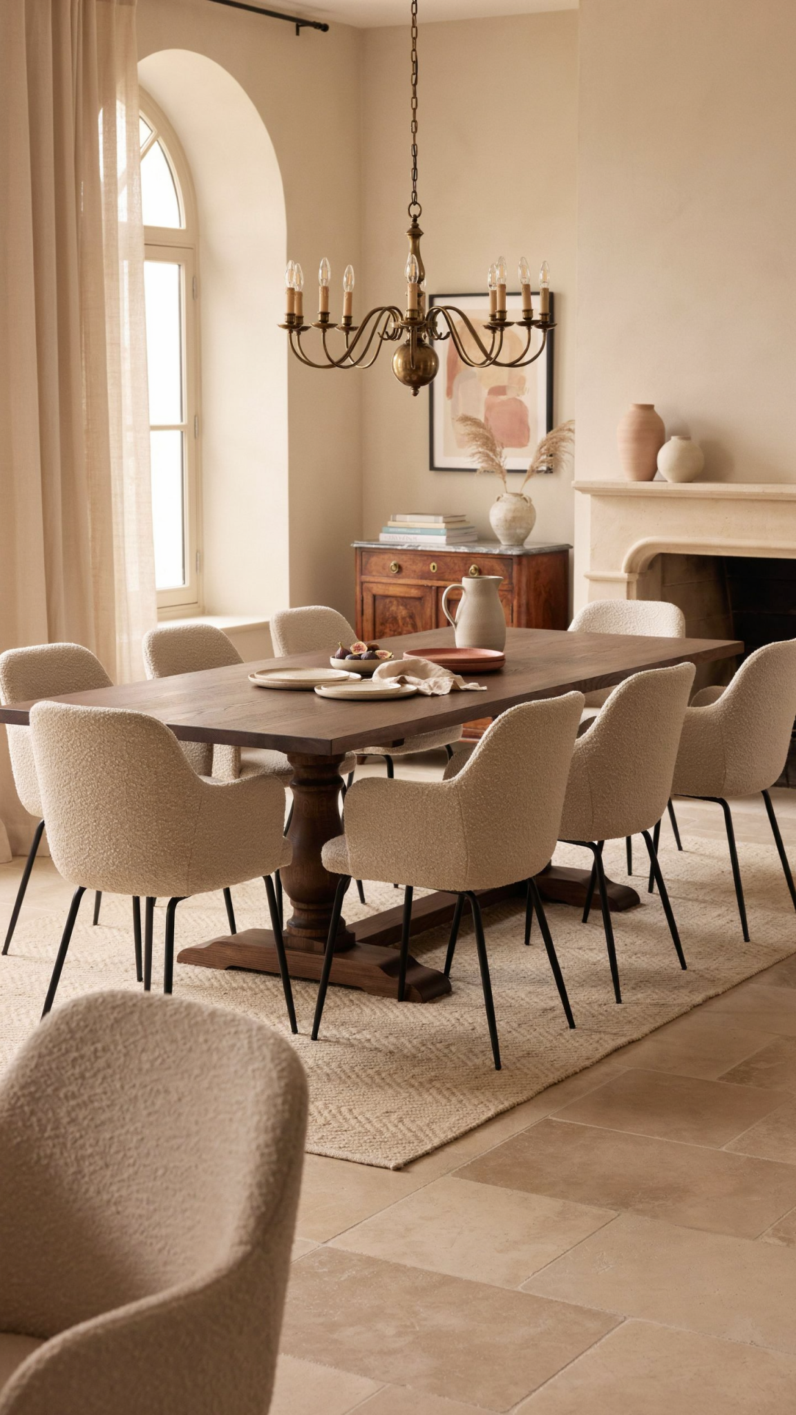
Studio McGee’s fall vocabulary makes this especially approachable through walnut, burl, woven materials, and traditional furniture shapes. Chris Loves Julia’s recent work gives the direction a more architectural expression, with dark paneling, mahogany references, carved pedestal tables, and furniture that looks as though it could have belonged to another generation without feeling antique-shop heavy. April Tomlin’s interiors show how dark or medium wood can coexist with relaxed upholstery, organic shapes, and a family-ready atmosphere.
The easiest way to try the trend is not to replace an entire kitchen or refinish every floor. Start with one object that gives the room a point of gravity. A small antique chest in an entryway can do it. So can a walnut side table, a dark writing desk, a burl tray, a mahogany frame, or a bookcase with enough room for books and objects that are not color-coordinated.
The contrast surrounding the wood matters. Dark timber is most effective when it is allowed to breathe against something lighter or more tactile. Pair it with honed limestone, warm plaster, oatmeal upholstery, chalky paint, ivory linen, or a rug with quiet variation. For a more enveloping room, combine it with dark stone and deep upholstery, but introduce a reflective or pale element so the result does not become visually flat.
The important distinction is between dark wood as atmosphere and dark wood as a uniform finish. A room full of matching espresso furniture can feel just as generic as a room full of bleached oak. The fall approach mixes species, grain directions, and ages. It allows a new pedestal table to sit alongside a vintage frame or a contemporary chair. It gives the eye evidence that the room was assembled over time.
2. The palette moves from pumpkin to nuanced earth and mineral color
Fall color is becoming more sophisticated than the familiar orange-and-rust formula. The season’s most useful colors are tobacco, chocolate, chestnut, camel, cinnamon, clay, terracotta, deep olive, moss, mineral green, plum, aubergine, burgundy, and oxblood. These colors are rich without being theatrical. They can cover a wall, upholster a chair, appear in a rug, or show up in a small object without making the room feel like a seasonal display.
Brown is particularly important because it is being treated as a true foundational neutral. Chocolate and tobacco can perform the role that gray and beige have held for years, but they create a different emotional temperature. They make a room feel closer, especially at night. They also connect naturally to wood, leather, brass, stone, and woven fiber.
Green is following a similar path. The most current greens are not bright botanical greens. They are moss, mineral, olive, loden, and softened sage. They can be quiet in one room and dramatic in another, depending on the finish and the amount of natural light. A moss armchair can act as a restrained color accent against dark wood. A deeper mineral green on walls can create an enveloping library or bedroom.
Oxblood, burgundy, plum, and aubergine supply the season’s drama. They are best used as concentrated notes rather than applied indiscriminately. A burgundy sofa can be a magnificent anchor in a large room, but a plum throw, a pair of velvet cushions, or a branch of dark flowers may be enough for someone who wants flexibility.
Warm ivory, dusty straw, pale blue, and muted gold keep this palette from becoming heavy. The point is not to create a brown room with no relief. It is to establish a deeper field and then add moments of light. A chocolate wall with warm ivory trim can feel elegant. Olive upholstery with pale blue ceramics can feel fresh. Tobacco velvet beside aged brass can feel autumnal without looking themed.
April Tomlin’s approach is useful here because it resists the pressure to choose one “color of the season.” Her work often depends on subtle repetition: a warm tone in the upholstery, a related tone in the wood, a quieter version in the rug, and a slightly unexpected note in the art. The result has cohesion without uniformity.
For a low-commitment update, bring color in at three scales. Use one small object, one textile, and one medium-size piece. For example, try an oxblood book or ceramic, a moss cushion, and a tobacco-colored throw. If the combination feels right, you can make a larger move later. If it does not, the room has not been permanently redesigned around a trend.
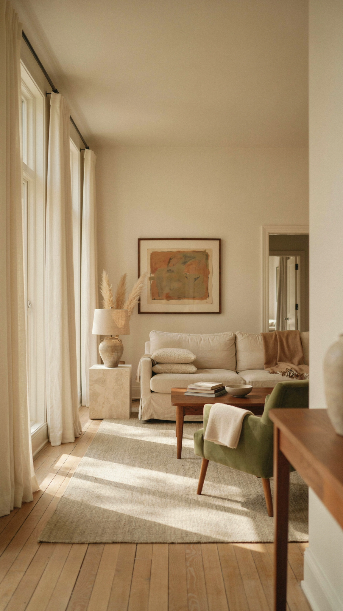
3. Modern traditional silhouettes get softer, not fussier
Traditional design is returning, but it is not returning as stiffness. The most appealing silhouettes for fall have old-fashioned references and relaxed proportions. Turned legs, carved feet, pedestal bases, cabriole details, furniture-style vanities, canopies, sleigh beds, skirted forms, scallops, and Regency-scale mirrors are appearing alongside barrel chairs, rounded backs, curved edges, and generous low seating.
This is an important distinction. The new traditional room is not a museum room. It does not require every object to belong to the same period. A carved table can sit next to a clean-lined sofa. A grand mirror can hang above a simple console. A canopy bed can be dressed with plain linen rather than ornate bedding. A skirted ottoman can make a contemporary room feel softer without turning it into a country-house imitation.
Chris Loves Julia’s recent collection illustrates the direction through moss-green chairs with exposed wood trim, turned front legs, carved-foot tables, furniture-leg vanities, and a deep mahogany Regency mirror. The individual references are recognizable, but the overall feeling remains practical and current. The pieces can work in an airy room or an enveloping one because the surrounding materials determine the mood.
Studio McGee takes a similarly edited approach. Traditional forms appear with tailored upholstery, ruffled edges, twisted details, pleated shades, and floral textiles, but the shapes are used as punctuation. One chair, one lamp, or one mirror can carry the decorative message. The rest of the room can remain quieter.
April Tomlin brings softness through organic forms and a relaxed sense of scale. Curving seating, arced beds, rounded tables, and comfortable upholstery prevent a room with traditional details from feeling overdesigned. This is especially relevant in family spaces, where formal beauty has to coexist with a place to sit, read, gather, or put down a glass.
The best way to use this trend is to choose one silhouette with a strong point of view. A round pedestal table may be enough. So may a barrel chair, a canopy bed, a carved mirror, or a small vanity with visible legs. Surround it with pieces that are simpler and less self-conscious. Historical references become modern when they are not repeated in every corner.
4. Pattern layering becomes expressive, but remains edited
The return of pattern is one of the clearest signs that interiors are moving away from frictionless minimalism. Florals, botanical scenes, Palampore-inspired motifs, Turkish medallions, checks, gingham, ticking stripes, tartans, plaids, tapestry references, and murals are all gaining ground. The common thread is not a specific print. It is the desire for rooms to carry a story.
Pattern is becoming a way to introduce memory. A floral chair can suggest a garden. A checked cloth can recall a kitchen or dining room. A Turkish-style rug can give a new house the feeling of having received a previous life. A striped cushion can make a plain sofa look more personal. The effect is strongest when patterns are not selected from one coordinating display.
Studio McGee’s fall direction leans into heritage florals, gingham, plaid, and romantic English-country references. Chris Loves Julia’s rug collaborations bring in traditional Turkish motifs, organic florals, English-cottage botanicals, and aged colorways. These examples are useful because they show how pattern can be accessible without being disposable. A rug, chair, or quilt can become the long-term character piece around which a room grows.
The practical rule is to give patterns a shared atmosphere rather than an identical color match. A floral, a stripe, and a check can live together if they share warm brown, moss, cream, or faded blue. They need different scales so that the room has rhythm. One pattern should be large, one medium, and one quiet. Solid upholstery, dark wood, and plain walls give the eye intervals of rest.
A small room does not need to be pattern-free. In fact, a compact space can be a good place to take a more decisive step. Try one patterned chair, one checked cushion, and one quiet rug. Or use a botanical wallpaper on the ceiling while keeping the walls and upholstery simple. If you prefer not to commit to wallpaper, introduce a quilt or a large textile as art.
Pattern also needs to be allowed to look slightly imperfect. A handmade-looking print, a faded rug, or a fabric with a little variation can be more convincing than a perfectly crisp pattern repeated across multiple surfaces. The goal is not visual noise. It is visual evidence of choice.
5. Texture is the new visual abundance
When a room becomes richer, it does not necessarily need more objects. It needs more surfaces that respond differently to light and touch. This fall, texture is doing the work that excessive decoration once attempted to do.
Mohair, cashmere, velvet, brushed wool, silk velvet, suede, leather, bouclé, linen, quilting, embroidery, braid, tassel, fringe, jute, rattan, and woven fiber are all part of the season’s material vocabulary. Their appeal is not merely that they look cozy. They change throughout the day. Velvet absorbs light. Silk catches it. Wool softens a hard edge. Woven fiber gives a smooth room a little irregularity.
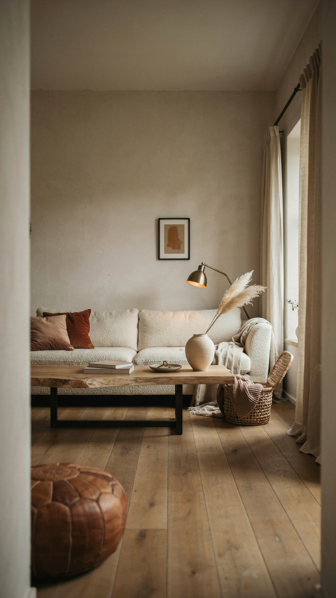
April Tomlin’s forecast specifically emphasizes mohair, cashmere, and collected natural materials. Her interiors demonstrate that tactile luxury does not have to look formal. A substantial sofa, a textured rug, wood beadboard, aged brick, a stone surface, or an unpolished metal fixture can all make a room feel considered without making it precious.
The best rooms use contrast rather than covering every surface in the same idea of coziness. Put a velvet pillow beside a raw wood table. Place a wool blanket over a leather chair. Use a mohair cushion in a room with plaster walls. Pair a woven pendant with polished stone. Let a smooth ceramic object sit on a nubby textile.
Texture is also an effective bridge between old and new. A contemporary sofa becomes more settled when it is paired with an antique textile. A new bed feels less showroom-like beneath a quilt. A modern lamp can feel more integrated with a pleated or embroidered shade. These are small adjustments, but they change the perceived age of a room.
For renters or cautious decorators, texture is one of the safest seasonal moves. A cashmere-like throw, a wool rug, a quilted coverlet, or an embroidered lampshade can be moved from room to room. It can also be stored or replaced without creating renovation waste. Fall’s version of luxury is not about owning the most expensive finish. It is about creating a room that feels good to inhabit.
6. Patina, visible making, and the anti-catalogue finish
One of the most important cultural shifts in design is the growing preference for evidence of life. Worn wood, aged metal, uneven glaze, handblown glass, visible grain, antique textiles, repaired upholstery, and objects with a trace of the maker are replacing the perfectly pristine finish.
Shea McGee’s “something old, something new” language captures the mood well. The new piece does not have to pretend to be old, and the old piece does not have to be polished into submission. The point is to let them coexist. A new room gains soul when at least a few things appear to have been selected for their character rather than their ability to complete a matching set.
This does not mean that every home should be filled with distressed furniture or indiscriminate vintage objects. Artificially chipped paint is not the same as patina. A room can be full of flea-market finds and still feel generic if the objects have no relationship to the people who live there.
Real patina is evidence of material, use, and care. It may appear in the softened edge of a wooden table, the darkening of unlacquered brass, the variation in a ceramic glaze, or the uneven surface of an antique mirror. It makes an object more specific. It gives the home a sense of time without requiring a historical narrative.
Visible making is part of the same movement. Hand-thrown ceramics, handmade tile, handworked glass, woven rattan, embroidered textiles, shell details, and dimensional wall treatments are gaining attention because they introduce physical labor into increasingly digital lives. They remind us that interiors are not only images. They are environments made from material decisions.
The most effective use of this trend is selective. Add one antique wood piece rather than scattering generic rustic accessories everywhere. Choose one handmade lamp, a crafted vase, a woven screen, or a textile with an irregular edge. Put it somewhere the eye can find it. The item should have room to be individual.
The anti-catalogue room is not messy by definition. It is edited, but the editing is personal. Books can be left where they are used. Art can be hung at slightly different heights. Chairs do not need to match. A favorite object can remain even if it does not complete the color scheme. The room becomes more current when it stops trying to look universally appealing.
7. Material tension gives the cocoon a pulse
Warm, tactile interiors can become visually sleepy if every finish is matte, soft, and earth-toned. The solution emerging this fall is material tension: the deliberate pairing of reflective surfaces with quiet, natural ones.
Bronze mirrors, smoked glass, tinted glass, lacquer, polished nickel, chrome, glossy paint, marble, and reflective metal are returning, but they are not being used in isolation. They are set against timber, honed stone, plaster, leather, suede, bouclé, and soft upholstery. The effect is not simply “shiny is back.” It is controlled friction.
A bronze mirror in an entryway can deepen the room while reflecting the glow of a nearby lamp. Smoked glass can make a cabinet or bar feel more atmospheric. A polished metal light can sharpen the edge of a space filled with wool and wood. A gloss-painted ceiling can bounce light around a small room. A green-marble lamp can add a mineral flash to a bookshelf without requiring a full renovation.
Chris Loves Julia’s current vocabulary demonstrates the domestic version of this idea through pewter, brass, nickel, bronze, rattan, glass, stone, and dark wood. The finishes do not match perfectly, and that is part of their appeal. A softened pewter candleholder can sit near a brass lamp. A stone surface can meet black woodgrain. A woven basket can interrupt a polished cabinet.
The proportion matters. Too much reflection can make a room feel commercial or overly glamorous. Too little can leave dark colors without animation. Use one reflective finish in a threshold, one lamp, one mirror, or one tabletop moment. Then ground it with materials that have visual absorption.
Material tension is particularly useful in small spaces. A reflective surface can create the impression of depth, while a dark color makes the room feel intentional rather than merely compact. A powder room, bar, entryway, or bedroom can carry a more concentrated version of the trend because it does not need to coordinate with every other room.
8. Layered light replaces the single overhead verdict
No fall design update will be convincing if the lighting remains a single bright fixture in the center of the ceiling. This season’s rooms are designed to change after sunset. Their atmosphere depends on pools of light rather than one universal wash.
Table lamps, low-watt floor lamps, picture lights, pleated shades, striped shades, sconces, hurricanes, and taper candles are all part of the strategy. The goal is to create several levels of light so that the room can support conversation, reading, dining, or quiet without looking equally bright everywhere.
Chris Loves Julia’s fall interiors are notably lamp-lit, with small lamps, marble-and-brass forms, shaded fixtures, and candlelight. April Tomlin’s work similarly uses low-watt lighting and pools of warmth to create intimacy. Broader fall coverage is describing entries with a boutique-hotel feeling, and that feeling begins with the light: a welcoming glow at the threshold, a softer lamp near seating, and a little reflection on metal or glass.
Try an evening edit. Turn off the main overhead light. Add one light at table height, one at floor height, and one near eye level or above a piece of art. Use a candle or hurricane as a fourth, lower point. The room will immediately reveal which areas are too bright, too dim, or lacking a reason to exist.
A shade can make a larger difference than the lamp itself. Pleated, striped, linen, parchment, and patterned shades introduce texture and soften the bulb. A warm bulb temperature helps, but the quality of the shade and the placement of the fixture matter just as much.
Layered lighting also makes dark wood and saturated color easier to live with. A brown room that looks flat under bright overhead light can become enveloping and elegant under several warm lamps. This is one reason fall’s richer palette feels practical rather than merely dramatic.
9. Livable luxury is the real status signal
The most durable fall trend is not a color or a silhouette. It is the growing insistence that beauty should support real life.
That means performance fabrics with an indoor hand, rugs that can tolerate traffic, storage ottomans that conceal daily clutter, tables that invite games and conversation, benches that can move between rooms, and outdoor furniture that feels as carefully composed as indoor furniture. It means reusing a good chair, upholstering a family piece, or choosing a table that can serve as a work surface, dining surface, or puzzle table depending on the day.
April Tomlin’s “no-fuss house” approach is a useful emotional anchor for this idea. Her work does not confuse a relaxed house with an unfinished one. Warmth comes from the combination of comfortable proportions, organic materials, layered art, useful lighting, and objects that belong to the people who live there. A home can be carefully designed and still feel ready for children, pets, friends, and an unplanned dinner.
Chris Loves Julia’s collections similarly emphasize pieces that can move between rooms and uses. A round table can anchor an entry, serve as a dining table, or become a place for games. A furniture-style vanity can make a utility room feel intentional while preserving visible floor space. A patterned rug can establish personality without requiring architectural change.
Studio McGee’s fall styling translates livable luxury into seasonal rituals: heavier textiles, layered bedding, candles, weightier tabletop materials, and a table set even before guests arrive. These are changes in use as much as changes in appearance. The room becomes richer because it is being inhabited more deliberately.
Wellness is part of this broader lifestyle conversation, but it needs to be treated honestly. Saunas, cold plunges, meditation rooms, and spa-like bathrooms can be meaningful additions when they are planned with drainage, ventilation, insulation, waterproofing, and plumbing. They are not cosmetic accessories. For most homes, the more immediate wellness upgrade is simpler: a comfortable chair near a window, better bedside lighting, a bathroom that stores what is actually used, or a bedroom that can become dark and quiet at night.
The fall room is luxurious when it makes staying feel easy.
What to watch without treating everything as a mandate
Not every idea appearing in a trade fair, product launch, or trend report deserves to become a universal rule. Neo-Deco rooms, trompe-l’oeil draped furniture, full-scale glossy ceilings, sculptural seasonal objects, and elaborate wellness suites are all credible emerging subcurrents. They may be exactly right for a particular home, but they require more commitment and have narrower applicability than the broader fall signals.
The same caution applies to literal seasonal décor. Sculptural pumpkins, wreaths, and autumn-colored accessories can be beautiful, especially when they are made from ceramic, wood, metal, or natural fiber. The problem is not the object. The problem is allowing a seasonal motif to substitute for atmosphere.
The strongest ideas for fall have a life beyond fall. Dark wood will still work in spring. A moss chair will still work in summer. A hand-thrown vase will not become irrelevant in January. A layered lamp plan will improve the room every evening. That is the difference between a trend worth watching and a theme that expires with the calendar.
A one-weekend, one-investment plan
If the goal is to make a home feel more current without starting over, begin with the evening. Change the light before changing the paint. Add a lamp, replace a cold shade, install a picture light, or move a fixture closer to where people actually sit.
Next, swap the lightest textile layer. Bring in a wool throw, a quilt, a velvet cushion, a plaid cloth, or a textured rug. Choose one color with depth, such as tobacco, moss, chocolate, clay, plum, or oxblood. Let the rest of the room remain quiet.
Then add one object with material character. It could be a dark wood tray, an antique frame, a stone bowl, an aged metal candlestick, a handmade ceramic, or a woven basket. Avoid buying several small objects simply because they are labeled “fall.” Look for something you would keep after the season ends.
If you are ready for one larger investment, make it a piece that can anchor the next decade: a walnut table, a vintage chest, a well-made chair, a patterned rug, a dark bookcase, or an upholstered ottoman with useful storage. Choose something that can be repaired, reupholstered, or moved. A good investment should become more valuable to you as the room changes around it.
That is ultimately what the biggest fall design trends are saying. The future of the beautiful room is not more perfection. It is more attachment. It is a room with a dark table that catches the light, a chair that came from somewhere, a textile that feels good under the hand, a lamp that makes people stay longer, and a color that grows more convincing as the year goes on.
The most current fall interior is not the one that announces September. It is the one that feels more like itself in November, in February, and five years from now.
That is the promise of the New Heritage house: not a seasonal makeover, but a home beginning to acquire a past.